Tag Archives: Pottery

Thanksgiving Colors

We spent Thanksgiving up in my hometown of York Harbor, Maine, which is only about an hour north of Salem. When we arrived York looked very different than still-green Salem, coated in icy snow. Many people in the southern counties of Maine and adjacent counties of New Hampshire lost their power due to a Thanksgiving-eve snowstorm, but we were fortunate to have light and heat and lots of food and drink. While waiting to eat on Thanksgiving Day, we took a drive around the grey town: York (encompassing York Harbor, York Village, York Beach and Cape Neddick) is a summer town and it always looks strikingly stark to me in the winter. I’ve also got some pictures of my stepmother’s Thanksgiving table here–before we messed it up. When we returned to Salem, all was icy and white but today is forecasted for the 50s so the terrain is returning to that golden brownish-green hue so characteristic of November.

Thanksgiving 001

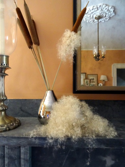
This cat o’nine tail exploded before we left; the rest burst while we were away (just one day and night!) Impossible to clean up all this fluff.

Thanksgiving 009

Thanksgiving 011

Thanksgiving 015

Thanksgiving table: Della Robbia plates and Shaker chairs.

Thanksgiving 042

Fifty shades of grey off Nubble Light.

Thanksgiving 069

Thanksgiving 078

White on white: one of my favorite houses in York, and the gargoyle outside my parents’ house.

Thanksgiving 080

My favorite childhood painting.

Thanksgiving Colors 002

Back home; sunny Sunday.


From Cure-all to Confection

The amalgamated Holidays officially kick in this week, so it’s time to think about festive things to eat and drink. Last year at this time, I seemed preoccupied with the latter, but now I’m thinking about food. I came across my grandmother’s recipe for molasses cookies–very thin, crispy and buttery, my absolute favorite, and started wondering about the principal ingredient. There must have been tons of it here in Salem in the nineteenth century, as it was the key ingredient in rum production and there were so many distilleries here. I know that molasses was imported into New England from the West Indies in the colonial era, but it think there were domestic refineries in the nineteenth century: was it produced in Salem? If so, where? Molasses-making is a messy business: was Salem ever in danger of experiencing its own version of the disastrous 1919 Great Molasses Flood in Boston? And what about consumption (besides rum): molasses does seem to have been much more in demand a century or so ago than now: why? There are so many recipes out there–for Black Jacks, still produced by America’s oldest candy shop, Ye Olde Pepper Candy Companie right here in Salem, as well as for another local molasses creation, Anadama bread, not to mention Indian Pudding, Boston baked beans and Boston brown bread. Molasses seems to be as characteristically New England  or “Boston” as the Red Sox. Then the English historian in me kicked in and I confronted the age-old question:  what’s the difference between molasses and treacle? Then the sixteenth-century historian in me kicked in, and I wondered what was the connection between molasses and the root of that old English word treacle, theriac, which was sold as a powerful panacea across early modern Europe. And just like that, my mind had wandered/wondered from cookies and candy to plague cures.

maryjane-directmailer

Advertisement for the famous Mary Jane molasses and peanut butter candy, made first by the Charles N. Miller Company in Boston in 1914  and later by the New England Confectionery Company (Necco).

The migration of medieval medical recipes into the culinary sphere was not always a straightforward process, but it’s best to proceed from the past rather than the other way around. Theriac was an ancient electuary (medicinal paste) used first and foremost as an antidote to venomous snake bites. In the classic case of fighting fire with fire, The flesh of the snakes themselves was an essential ingredient, along with lots of others–64 in all in the classic Galenic recipe. In the course of the Renaissance, theriac was compounded to various formulas and came to be regarded as a universal antidote and panacea, with that produced in Venice generally regarded as the most effective, and the most expensive, naturally. As poison was associated with plague in the late medieval medical mentality, so theriac became the key plague antidote and consequently its preparation was serious business: under official supervision to ensure the proper process and correct composition.

Theriac Hortus Sanitatis 1491

V0010760 An apothecary publically preparing the drug theriac, under t

L0057175 Albarello vase for theriac, Italy, 1641

Theriac preparation from snakes (the origins of snake oil???) from the Hortus Sanitatis of Jacob Meydenbach, Mainz, 1491; woodcut illustration by Hieronymus Brunschwig of a physician supervising the manufacture of theriac by an apothecary, Liber de Arte Distillandi de Compositis, 1512, and seventeenth-century Italian majolica theriac jar, Wellcome Library.

Despite its (undeserved) reputation for efficacy, Venetian theriac could not crowd out the market in plague cures and regional recipes began to develop. In England, there were several major developments in the use and perception of theriac over the sixteenth and seventeenth centuries: in typical English fashion, the foreign word had long been anglicized as “treacle”, and  “Venetian Treacle” became an ingredient in variant plague cures and preservatives, rather than the exclusive antidote at about the same time that the London College of Pharmacists ruled that treacle need not contain snakes, and treacle (sans Venetian) started appearing in both medicinal and culinary recipes. Everything really changed–or came together–in the course of the seventeenth century, an era that was characterized by many, many recipes for “treacle water” as well as increasing imports of refined sugar from the West Indies, along with its by-products. These sweeter syrups, collectively called treacle, began to replace honey in the medicinal “London Treacle”, at about the same time that they started to appear as key ingredients in recipes for gingerbread, tarts, and puddings. So treacle comes to mean any syrup made during the sugar-refining process: black treacle, golden syrup, blackstrap, and molasses–all of which were relatively cheap ways to sweeten your plague water or your pudding. There were also treacle “lozenges” that soothed the throat and provided a bit of “sweatmeat” at the same time, and a recipe for gingerbread cakes that closely resembles that for my grandmother’s molasses cookies.

Treacle Water 1660

PicMonkey Collage

Treacles

A mid-17th century recipe for Treacle water containing Venice Treacle and less exotic ingredients, Wellcome Library Manuscripts; recipes from Mary Kettilby’s Collection of Above Three Hundred Receipts in cookery, physick, and surgery: for the use of all good wives, tender mothers, and careful nurses (1714–Thick Gingerbread) and Hannah Glasse’s Art of Cookery, Made Plain and Easy (1747–Gingerbread Cakes); The two British treacles: plain treacle or “golden syrup” and “black treacle”, the closest approximation of American molasses.


What I Want Now: Green Men on Plates & Paper

The acquisitive instinct in me has been kicking in lately, which I think is a good thing. I’ve been working very hard for the past year or so, and focusing on more material things gives my mind a rest. It’s really all about the search: I don’t have to buy, I can just look (really)!  Looking around, I get little short-lived obsessions, and right now I’m very focused on the creations of the prolific artistic partnership of Kahn/Selesnick, whose work spans decades and genres and explores a myriad of alternative historical and futuristic themes in ways that are both conceptually and visually panoramic. Be prepared to be submerged into other worlds if you check out their website or those of any of the galleries that showcase their work, most of which is way beyond my ability to acquire except, perhaps, for a few of their Green Men. When I was browsing around the online shop of the Morbid Anatomy Museum (which has quite an eclectic collection, let me assure you), I became immediately fixated on the Kahn/Selesnick calendar plates, which feature a different Green Man for each month, and then I was off on a mission in search of more.

Green Man November

Green Man November 2

Green Man December

Green Man December 2

I think I can swing one or two plates (of course I want them all) but the Green Man photographs are a bit too dear for me. I would love a few of the amazing hand-colored “souvenir” playing cards from Kahn & Selesnick’s Eisbergfreistadt (a fictitious independent city-state located on a Baltic iceberg in the 1920s) series, but they seem to be long sold out, so I suppose my only paper option is a seed pack designed by the dynamic duo for Hudson Valley Seed Library. I can frame it!

on a flowering path_d

Green Man Garden Suburb

PicMonkey Collage

teddy_bear_done

Kahn/ Selesnick “On a Flowering Path” and “The Green God” photographs @ the Carrie Haddad Gallery; Eisbergfreistadt playing cards at the Kahn/Selesnick online store; and sunflower seed pack at Hudson Valley Seed Library. More Green Men.


Salem Harbor, Rediscovered

I strive to feature primarily pretty pictures of Salem (except, perhaps, for Halloween season), so there have been no images of one of Salem’s most prominent landmarks: the Salem Harbor Power Station, a coal-fired electric power plant which has been looming over the city since 1951. But not for much longer: in 2012 the plant’s owner, Dominion, announced plans to shut it down due to growing public and legal pressures that included a citizens’ suit against the plant’s violations of the Clean Air Act. Last year Dominion sold the plant to the New Jersey–based Footprint Power, which announced its intentions to convert part of it into a natural gas facility set to go online in 2016. The plant went off-line at the end of last month, and now its gray towers–sadly my marker for home when I’m out on Route 128, will soon be taken down. Of course a natural gas-powered plant takes up a lot less space than a coal-powered one (the old plant is located on 65 waterfront acres, but apparently the new plant only needs 25) , so there will be a lot of redevelopment on its prominent site–redevelopment that will no doubt take advantage of the harbor views, rather than obliterate them. We already have our ferry to Boston, water taxis are commencing this summer, and apparently cruise ships are coming: after a half-century of neglecting the Harbor that made Salem, we appear to be rediscovering it.

Artistic depictions of Salem Harbor parallel, or reflect, its commercial history: up to about 1920 or so, there are first realistic and then more romanticized images of its wharves and ships–after that, the artists seem to withdraw, or go completely sentimental–but I’m sure that we’ll see some interesting views going forward.

Salem Harbor 1796-001

Salem Harbor Plate

Salem Harbor Fitz Hugh Lane

Salem Harbor Head

Salem Harbor Prendergast-001

Salem Harbor DL

Salem Harbor Scene

Engraving of a busy Salem Harbor, 1796, for the Salem Marine Society membership certificate; Wedgwood Creamware Plate, c. 1803, Northeast Auctions; Fitz Hugh Lane, Salem Harbor, 1853, Museum of Fine Arts, Boston; The Head of Salem Harbor, from Julian Hawthorne’s article, “Hawthorne and Salem”, The Century 28 (May 1884); Maurice Prendergast, Salem Harbor no.1, c. 1920-23, Colby College Museum of Art; Daniel Low mail-order catalog for 1946-47; a harbor-side installation appears poised to take down the towers, this past weekend.


Willow Ware Redux

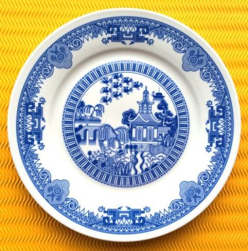
I am not fond of blue-and-white china (or anything blue, to tell you the truth), nor do I particularly like the Willow pattern, one of the most popular and replicated in the western world for several centuries. But I do love both the idea and the act of updating something that is classically familiar—even overly familiar–in a clever and creative way. So when I saw a little story about Calamityware, in which flying monkeys and flying saucers, along with robots and Renaissance sea creatures, are right there on the plate along with the traditional “Chinese” structures, figures, and landscapes, I went right to the source: artist Don Moyer’s site, on which his earlier drawings are coming to life (or pottery) on a Kickstarter-funded production line. So many things about these plates appeal to me (despite their color): they are blatantly anachronistic, purely whimsical, and perfect examples of my favorite fusion of past and present, traditional and modern, new and old. The flying monkeys were first off the line, and we may see kings and oligarchs later, though surely they won’t be as scary.

Calamityware

New Willow Ware Calamity 2

New Willow Ware Calamity 3

Calamityware is not the first variation on the Blue Willow pattern; in fact it was inspirational almost from its inception–and wildly popular. I’ve got a bowl full of Willow shards uncovered in my back yard when I was digging out my herb garden. Willow ware was first produced in the late eighteenth century by Thomas Minton, an English potter who adapted designs featured on Chinese export porcelain for domestic production. There was no patent protection, and his competitors–Wedgwood, Royal Worcester, Spode–began producing their own Blue Willow, and continued to do so for the next two centuries. In an early stroke of advertising genius, a story was composed to sell the dishes: when a powerful Chinese lord discovers that his daughter has fallen in love with his lowly clerk, he locks her up in a secluded pagoda behind a fence and betrothes her to a rich and elderly duke. The young couple flee before the wedding, but are hunted down and killed (there are different versions of their deaths). True love prevails, however, as the gods transform the lovers into a pair of lovebirds which remain together forever, hovering above the willow tree that once shaded their clandestine meetings. The story expanded the reach of Blue Willow–beyond the pottery business and into popular culture: poems, books, textiles, and pictures told the Blue Willow love story over and over again in the Victorian era, and after.

Willow ware Spode V & A-001

New Willow Wares Mercer-001

Spode Blue Willow plate, c. 1800-1820, Victoria & Albert Museum; Joyce Mercer (1896-1965) illustration, 1920s.

And now, Willow ware seems to be having a moment, once again. In fact, this “moment” seems to encompass the past decade or so, or perhaps the pattern, in all of its variations (and colors–I could go for the red), is always having a moment. And that, of course, is the definition of classic. In 2005 ceramicist Robert Dawson digitally-designed a line of “After Willow” dishes for Wedgwood, and more recently we have Pokemon Willow by Olly Moss (note the lovebirds, still flying above!) and there are more calamities to come.

Willow Ware Dawson V and A-001

pokemonwillow


Decorative Directions

Samuel Emery (1787-1882) made compasses and other nautical and mathematical instruments here in Salem for more than half a century–both during and after the city’s great age of sail. His work can still be seen today, at auctions and in museums, but most often in museum shops. Recently I stumbled across one, and then another and another, reproduced and transformed into pendants and pins. What made Emery’s compasses so decorative? It’s not the fleur-de-lis marking north–that is traditional from the fourteenth century when French makers used a fancy “T”, resembling a flower, to mark the north wind or Tramontana. The two surveyors’ compasses below are nearly identical and were both made by Salem craftsman: the one on the left by John Jayne and the smaller one on the right by Emery, both sold at Skinner auctions.

Emery label Harvard-001

PicMonkey Collage

Samuel Emery Box Label, Collection of Historical Scientific Instruments, Harvard University.

I’m sure Emery’s instruments were well-made or he wouldn’t have been in business for as long as he was, but his designs look pretty conventional for their time. I suspect that the reason Emery’s compasses are still for sale is the original copper plate in the possession of the Peabody Essex Museum, enabling fresh and adapted impressions and models to be made, as well as the traditional appeal of the compass rose (first in maritime communities, then more broadly), which has emblazoned textiles, pottery, and other decorative accessories for centuries, so why not jewelry–among other things–now?

Compass Rose Brooch PEMCompass Rosette Brooch Morgan

Compass Quilt NE Auctions

Compass Bowl Sunderland V and A

Compass Fabric Better than Jam

Compass Rose brooches from the PEM and Morgan shops (just click on the picture and you’ll get there); Early Connecticut pieced quilt with Mariner’s Compass, Northeast Auctions; Sunderland Pink Lustre bowl, c. 1820-1830, Victoria & Albert Museum; Better than Jam fabric.


Double Faux

For some time I’ve been captivated by a covered cup and saucer in the collection of the Museum of Fine Arts in Boston: the pieces were made by the Niderviller Manufactory in France just before the Revolution but somehow the combination of two illusory design motifs–faux bois and trompe l’oeil–make them seem very modern to me. I love everything about them and want to learn more and see more.

Faux Bois MFA

It was relatively easy to find more faience from the Niderviller Manufactory: below are a plate dated 1774 in a French private collection and another at the Minneapolis Institute of Arts, along with a tray and teapot dated the very same year in the collection of the Victoria & Albert Museum. Look at the little nail on the teapot, “tacking” the print to its surface–amazing! The Niderviller Factory was a rare pre-revolutionary aristocratic-owned operation situated in the Duchy of Lorraine where it was exempt from French laws protecting the royal monopoly of the Sèvres porcelain factory. Production at Niderviller commenced by 1750, but I seem to like the more whimsical creations of the 1773-93 period when the factory was owned by the Count de Custine. The Minneapolis plate below is signed by “J. Deutsch” which is a rather imprecise name–I wonder if this almost-anonymous artist was responsible for the other trompe l’oeil pieces? The signatures look similar on the Victoria & Albert tray and teapot. Despite the Count de Custine’s sympathy for both the American and French Revolutions, he was guillotined in 1793, but the Niderville Factory survived both the Revolution and the ensuing Napoleonic Wars and continues to operate today. Trompe l’oeil decoration was wildly popular in the eighteenth century, but the combination of “wood” and “paper” and ceramics is a little more unusual–though I did find a few more examples beyond Niderviller: an early nineteenth-century plate produced at the Imperial Vienna Porcelain Factory and a very rare “solitaire” set, also made in Vienna. I’m not as taken with these Vienna pieces: they lack the whimsy and detail (folded edges) of the Niderviller pieces.

faience-de-nidervillerDSC08907_medium

Faux Bois Minneapolis 1774

Faux Bois Tray V and A

Faux Bois Teapot V and A

Faux Bois Teapot V and A focus

Faux Bois Vienna Plate c. 1810 Victoria and Albert Museum

Faux Bois Trompe

This faux bois/faux papier decoration doesn’t have to be confined to ceramics, of course: we can and should go back–and forward. Both the faux bois and trompe l’oeil techniques seem to have been perfected in the seventeenth-century paintings of still-life artists like Cornelius Norbertus Gijsbrechts (c. 1630-after 1683) and Edwaert Colyer (or Collier, 1642-1708), which must have influenced the ceramic artists of the next century. The “wooden” background and affixed objects certainly seem very real in the former’s Trompe l’Oeil with Riding Whip and Letter Bag (1872), one of many “paneled” and “cabinet” paintings at the National Gallery of Denmark, and Colyer’s letter racks and “portraits” often have faux bois backgrounds (and folded corners).

Faux Bois Gijsbrechts Riding Whip 1872

Trompe l'Oeil Portrait of a Lady (oil on canvas)

Cornelius Norbertus Gijsbrechts, Trompe l’Oeil with Riding Whip and Letter Barg, National Gallery of Denmark; Edwaert Colyer, Trompe l’Oeil Portrait of a Lady, Ateneum Art Museum, Finnish National Gallery.

Both faux bois and trompe l’oeil techniques continue to be expressed and adapted up to the present day, with varying degrees of detail and in various mediums–but combinations are a bit more rare. In the realm of ceramics, I have yet to see anything as appealing as the Niderviller pieces, but I’m always looking. ….so far the closest I’ve come–not too close at all, really—are plates in the “Texquite” pattern from Bongenre, made in that most modern of materials: melanine.

The One Key to It All

Faux Bois Texquite

Otis Kaye (1885-1974), The One Key to It All, 20th Century, Private Collection, photo © Christie’s Images / The Bridgeman Art Library; Melanine plate in the “Texquite” pattern, Bongenre.


Hearts in Hand

For this St. Valentine’s Day I thought I would explore the heart in hand motif, which is probably familiar to most: there are countless items out there with this emblem, produced for or by the Shakers, the Order of the Odd Fellows, heartfelt lovers and/or mourners in the nineteenth century and a whole host of artisans and entrepreneurs more recently. It’s a captivating image, easily accessible and “read”, and highly decorative, but how did it emerge and evolve?

Hearts in Hand Am Folk Art Museum

Love Token, c. 1840-60, anonymous American artist, possibly from Connecticut, American Folk Art Museum.

Before the love token, declaring that hand and heart shall never part, or the fraternal staff, denoting “cheerful giving”, there was of course the Sacred Heart of Jesus, the object of intense veneration in medieval Europe. While the spiritual origins of today’s generic and secular symbol seem pretty clear to me, the road between past and present is not precisely a straight path. The image of the Sacred Heart is quite standardized in illuminated medieval manuscripts from the thirteenth century on: a heart, often flaming and always pierced, with attendant Crown of Thorns and the Five Wounds of Christ, wounds which were of course on his hands and feet. But there are evolving variations: the late medieval images below have already made the transition to a more worldly message, encompassing pity, love and charity.

Heart in Hand First

Heart in Hand Second

Princeton University Library MS Taylor 17, c. 1500.

Several of the most important medieval saints, including Augustine, Catherine of Siena and Bernardino of Siena, literally hold hearts in their hands as ever-attendant attributes: Augustine’s restless heart is guided by the Lord, and Catherine actually exchanges hearts with Christ. It seems to me that representations of these two saints humanize the heart somewhat, and late medieval romances contribute to that trend. You begin to see quite average people (well maybe not average, but certainly not saints) with hearts in hand. I suppose that the medieval-clothed Caesar is giving his heart to Rome.

Heart of Augustine

heart-catherine MET

Heart in Hand 3

Heart in Hand Via

St. Augustine with heart in hand, Nationale Bibliotheek van Nederland MS KB 76 F 2; Giovanni di Paolo, Saint Catherine of Siena Exchanging her Heart with Christ, after 1460, Metropolitan Museum of Art; Arras Tapestry, Offering of a Heart, c. 1400-1410, Louvre Museum; Master of the Vitae Imperatorum, Illumination from Suetonius, Life of Caesar, 1433, Princeton University Library MS Kane 44.

The literal and the spiritual depictions of hearts in hand continue right through the Renaissance into the Reformation, eras of intense lay piety and scholarship. Nothing represents this better than the amazing painting by an anonymous Flemish master of a young man holding a heart-shaped book–he may or may not have been a member of a confraternity devoted to St. Augustine– but this focus on the word anticipates the Reformation, when John Calvin adopted the emblem of a flaming heart resting in a hand outstretched to God for his personal seal. So the Sacred Heart would survive the Reformation, in a way. The influences of classicism and realism affected the motif as well–so we also see hearts in real hands, and in that of Cupid, of course.

Heart Shaped Book

Heart Sincerity

Heart burning cupid ceiling

Master of the View of Sante Gudule, Young Man Holding a Book, c. 1485, Metropolitan Museum of Art; Carlo Dolci, Study for the figure of “Sincerity”, mid 17th century, British Museum; Francesco Mergolo, Design for a painted ceiling, 1770s, Cooper Hewitt, National Design Museum.

And then we’re off: it’s a straight line from the delftware plate below, commemorating a marriage, to the sentimental tokens of today. The heart in hand motif loses its specific Christian meaning and comes to signify charity, friendship, love, benevolence, sentiment–much more general concepts. The Odd Fellows emblem appears not only on signs and banners, but on a myriad of more mundane items, including tools and flyswatters. Valentine’s Day become a holiday–with all that entails.

Heart in Hand Plate 1798 Delft Northeast

Heart Odd Fellows

Heart in Hand Folk Art

Heart in Hand Bonnie Cashin Gloves

Heart Warhol

Dutch Delftware marriage plate, 1798, Northeast Auctions; Heart in Hand, Independent Order of Odd Fellows, c. 1890 Museum Victoria; 19th century paper love token, Peggy McClard Antiques; “Heart in Your Hand” Gloves by Bonnie Cashin, 1974, Metropolitan Museum of Art; Heart in Hand by Andy Warhol, 1954, Christies “Love” Auction.


In the Bleak Midwinter

Its title does not really conjure up Christmas cheer, but In the Bleak Midwinter is one of my favorite carols. I heard its melody repeatedly over the holidays and made a mental note to look into it a bit. And now that we are in the post-Christmas bleak not-quite-midwinter it seems like an appropriate time to do that. Surprisingly it is a creation of the Victorian era and after: I thought it was much older. Two early nineteenth-century composers set Christina Rossetti’s 1872 poem (first published in Scribner’s magazine) to music, creating an almost-instant classic: In the bleak midwinter, frosty wind made moan, Earth stood hard as iron, water like a stone; Snow had fallen, snow on snow, snow on snow, In the bleak midwinter, long ago. 

While the rest of Rossetti’s poem is Christocentric, this opening stanza, setting the scene, is universal. Combined with the melodies of Gustav Holst and Harold Darke, the song seems ageless, which is why I thought it was older than it actually is. Darke’s version (a nice version of which is here) won “best Christmas Carol” in a poll of the world’s leading choirmasters in 2008. Besides the beautiful melodies assigned to Rossetti’s words, I’m interested in the use of the word “bleak” here: usually this term connotes a definite pessimism, despair, even hopelessness; but I think the combination of words and music creates a feeling of comfort and hopefulness, to get everyone through the bleak midwinter. My own understanding of bleakness comes more from images than sounds, and I think midwinter can be beautiful, both as a barren landscape and as a setting for all the little details within.

Midwinter Pickering House 1900

Midwinter Boston Common 1904

Midwinter A Wolf Had Not Been Seen at Salem for Thirty Years Pyle

Midwinter Museums Karolik Collection MFA

Midwinter Tile Kate Greenaway

Favorite midwinter images, not so “bleak”:  the Pickering House, Salem, c. 1900 from a private family collection; Boston Common, c. 1904, E. Chickering & Co., Library of Congress, Howard Pyle, “A Wolf Had not Been Seen in Salem for Thirty Years”, illustration for his 1909 Harper’s Monthly story, “The Salem Wolf”, Delaware Art Museum; Anonymous American painting, 19th century, Karolik Collection, Museum of Fine Arts, Boston; Kate Greenaway wall tile for Burslem, c. 1881-1885, Victoria & Albert Museum, London.


A Clean Bill of Health

There are several things that interest me about this 1787 “Bill of Health” issued by Massachusetts Naval Officer/customs official Joseph Hiller for the (first) Salem ship Grand Turk, an item that comes up for auction next week (in a lot that includes a personal dinner invitation to the ship’s captain, the son and namesake of America’s first millionaire, Elias Hasket Derby, from the Marquis de Lafayette). The first thing that caught my attention is the seal, which is quite faint in this scan so I doctored it a bit (and you can click on the document to examine it in more detail):

Derby Bill of Health

Derby Bill of Health seal

I still can’t really make it out, but it’s clearly not the official Massachusetts or US seals, both of which had been adopted by this time. The Commonwealth seal was a Nathan Cushing-designed, Paul Revere-engraved version of the older Massachusetts Bay Colony seal, with a Native American at its center but the unfortunate wording “come over and help us” left out. Instead, what I can barely see here is the faint outline of a pine tree, a symbol which was adopted by the Massachusetts navy after the Battle of Bunker Hill, and later incorporated into the new state’s naval and maritime flags. For naval-officer Hiller, this was obviously the ultimate seal of authority, the seal of his office, rather than his commonwealth or country.

Massachusetts Seal

Mass Flag

Library of Congress.

The other thing that intrigues me about this document is its dating, or more precisely, the wording of its dating: the sixth day of December in the twelfth year of American Independence, and in the year of our Lord One Thousand Eight Hundred and Eighty-Seven. It is double-dated, in standardized format, with reference not only to conventional western dating but also to the American Revolution. Very interesting: I knew that the French Revolutionaries recognized the importance of the calendar as a nationalistic medium, but I had no idea that the Americans did–I wonder how many other official documents utilized this wording, and for how long?

I haven’t even addressed the content of this document: clearly Derby could not sail his ship to to the Isle de France (Mauritius) until it had received a clean bill of health from the authorities. The Grand Turk, the first of several Salem ships bearing that name, was at this time perhaps the most famous ship in New England, if not the new nation, having returned from a voyage to China and the East Indies earlier in 1787. Mauritius was becoming the gateway to this potentially lucrative trade, and its French governors were clearly aware of its emerging importance. I know of no global plague pandemic at this time (the last one was in the port of Marseilles in 1721) but the document uses the phrase Pestilence or contagious Distemper which is not plague-specific. Smallpox was rampant in New England at this time so that was probably the primary concern.

Mauritius Lodge 1781 BPL

John Lodge, A Correct Map of the African Islands of Bouron and Mauritius or the Isle of France, The Political Magazine, London, 1781; Norman B. Leventhal Map Center at the Boston Public Library.

Having received his clean bill of health from Naval Officer Hiller, Derby embarked for the east. Shortly after the Grand Turk arrived in port on the Isle de France, its fame (and size) attracted an offer that apparently could not be refused, and the ship was sold to a French merchant. More Salem ships would follow in its pioneering path, and more Grand Turks would be launched, but the exploits of the first one would be remembered not only because of surviving documents like this form, but also through its starring role as the original Old Spice ship.

PicMonkey Collage

Hull Pottery Old Spice Shaving Mug, 1930s, and lots of other examples of “Old Spiceiana”, available here.


%d