Tag Archives: Smithsonian

Fabricating Revere’s Ride

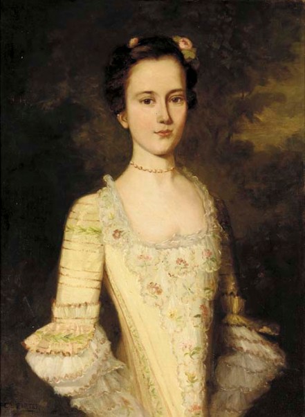
Because of his entrepreneurial engravings, his silverwork, portraits of him and by him, his storied ride, and his boundless brand, Paul Revere as always been the most material of our Founding Fathers: he didn’t just act, he produced, and after his legendary life was over he continued to be a focus and force of production. As we head into (a rather early) Patriots Day weekend, I am thinking about Revere, mostly in reference to Grant Wood’s 1931 painting The Midnight Ride of Paul Revere, which supposedly aims to highlight the mythology overwhelming the event from the publication of Longfellow’s 1863 poem. The painting is so very accessible, however, that I fear that it simply reinforces Revere’s singular ride, or it has just become an aesthetic object: Wood himself transformed the image into a textile design (in which the rider gets lost in the landscape) for the Association of American Artists, and now you can even buy laminated placemats of it on Etsy! Revere the Midnight Rider was featured in a design by Anton Refregier in another “Pioneer Pathways” design, issued in several colorways by Riverdale Fabrics in 1952. A few decades earlier, Walter Mitschke also included Paul Revere’s ride in drawings for his “Early America” series of textile designs produced by R. Mallinson and Company.

Revere Wood

Reveres Ride of Paul Revere Textile

Revere the Rider Pioneer Pathways

Revere Red

Reveres Ride Mallinson

Grant Wood, The Midnight Ride of Paul Revere, 1931, Metropolitan Museum of Art. Textile designs by Grant Wood and Anton Refregier for the Association of American Artists, produced by Riverdale Fabrics as part of the “Pioneer Pathways” series, 1952, Cooper Hewitt Museum; Walter Mitschke’s drawings for the Mallinson Company, 1927, Museum of Fine Arts, Boston. 

Obviously Paul Revere’s Ride is larger than the man himself in terms of its myriad representations in text, image, and fabric, but I think the most effective displays are those that were created close to home: Robert Reid’s 1904 mural in the State House, the iconic statue of Cyrus Dallin, the Paul Revere pottery produced by the Saturday Evening Girls Club, all those calendars issued by another institution with a founding- father-affiliation, the John Hancock Life Insurance Company. For a more updated presentation of the route rather than the ride, there is an exhibition of drawings by artist and illustrator Fred Lynch on view now at the Scottish Rite Masonic Museum & Library in Lexington (which used to be called the National Heritage Museum) titled “Paul Revere’s Ride Revisited”.

Massachusetts-State-House-Mural-Paul-Reveres-Ride-Boston-MA-2016-09-26

pp-caproni-and-brother-painted-cast-plaster-relief-panel-paul-reveres-ride (1)

Reveres Ride Tile MFA

Revere Calendars

Robert Reid mural in the Massachusetts State House, 1904, Caproni Brothers plaster bas-relief sculpture, Skinner Auctions, Tile by Paul Revere Pottery of the Saturday Evening Girls Club, 1917 (decorated by Sara Galner), Museum of Fine Arts, Boston; 1889 & 1903 calendars by the John Hancock Life Insurance Company, Historic New England.


Topsy-Turvy

I find myself these days full of feelings of dissent and resistance but looking for more whimsical ways to express the same, as you can’t be strident all the time. It’s boring, and exhausting. So a flashing reference caught my attention, to a dinner party in Baltimore in February of 1777 attended by two of the most strident people in history: John and Samuel Adams of Massachusetts. The next day, John noted in his diary [II, 434]: Last evening I supped with my friends, Dr. Rush and Mr. Sargeant, at Mrs. Page’s, over the bridge. The two Colonel Lees, Dr. Wisherspoon, Mr. Adams, Mr. Gerry, Dr. Brownson, made the company. They have a fashion, in this town, of reversing the picture of King George III in such families as have it. One of these topsy-turvy kings was hung up in the room where we supped, and under it were written these lines, by Mr. Throop, as we are told: Behold the man, who had it in his power/ To make a kingdom tremble and adore, Intoxicate with folly. See his head Placed where the meanest of his subjects tread. Like Lucier, the giddy tyrant fell; He lifts his heal to Heaven, but points his head to Hell.

George III

King George III by Nathaniel Dance-Holland, National Trust, Uppark

Well I like this “fashion”, and can certainly think of one or two people I’d like to turn upside down at the moment. I’m sure we all can. Apologies to my British friends: I couldn’t find an image of a Baltimore dining room with a topsy-turvy portrait of King George, so I simply turned him upside down myself. But we must note that like so many of their revolutionary sensibilities, the new Americans were simply following a British example: in this case the “world turned upside down” sentiments of the English Revolution in the previous century. The leader of that revolution, Oliver Cromwell, was himself turned upside down when an Indian monarchist of the Victorian era purchased his portrait and displayed it topsy-turvy in a delayed protest of the regicide: the Inverness Museum and Art Gallery followed suit when it acquired the portrait, and Tate Britain when it exhibited it. Another topsy-turvy ruler is Philip V of Spain, whose portrait is traditionally upended in the Almodí Museum in Xàtiva, in retribution for the burning of the city at the close of the War of the Spanish Succession.

Topsy Turvy Tate cromwell_for_web_0

Robert Walker (in the style of), Inverness Museum and Art Gallery

Topsy Turvy King 2

The first Bourbon King of Spain, Philip V.

Later in the eighteenth century and into the nineteenth, the upside-down, topsy-turvy motif was mostly used in a satirical or critical way, the point having been established: “it is monstrous that the feet should direct the head” (in the words of my favorite queen, Elizabeth I, to make up for turning George III upside down) or something’s not right here. There was also a two-sides-of-the-same-coin message in some topsy-turvy images, as well as a general sense of we’re being tossed about/PLAYED. That’s how I feel.

topsy turvy collage

TOpsy Turvy Economy 1979 Jean-Michel Folon Smithsonian NPGTopsy-turvy “Talons” Kaiser Wilhelm I and Emperor Napoleon III, 1878, Victoria & Albert Museum; the Topsy-turvy Economy, 1978, Jean Michel Folon, Smithsonian/National Portrait Gallery.


Great Wars and Ghosts

Despite my dislike for Haunted Happenings, I have to admit that the range of offerings is much more diverse and engaging than a decade or so ago, as nonprofits in Salem have entered the fray in a big way. A good example: on this Friday, Peter Manseau, the Lilly Endowment Curator of American Religious History at the Smithsonian Institution’s National Museum of American History, will be speaking about his new book, The Apparitionists: A Tale Of Phantoms, Fraud, Photography, And The Man Who Captured Lincoln’s Ghost at the Gothic Revival Chapel at Harmony Grove Cemetery. This setting seems perfect for this talk, which is co-sponsored by the Cemetery, the Salem Athenaeum, and the Salem Historical Society.

Apparitionists

The Apparitionists is about spirit photography in general and America’s first “photographer of disembodied spirits” in particular: William H. Mumler, who set up shop in Boston in 1862 after producing a dual image by accidental double exposure. He offered up an embellished story to The Liberator in November of that year: alone in the photographic saloon of Mrs. Stuart, 258 Washington Street, trying some new chemicals, and amusing himself by a taking a picture of himself which, when produced, to his great astonishment and wonder, there was on the plate not alone a picture of himself, as he supposed, but also a picture of a young woman sitting in a chair that stood by his side. He said that, while standing for this picture, he felt a peculiar sensation and tremulous motion in his right arm, and afterwards felt very much exhausted. This was all he experienced that was unusual. While looking upon the strange phenomenon (the picture of two persons upon the plate instead of one) the thought and conviction flashed upon his mind, this is the picture of a spirit. And in it he recognized the likeness of his deceased cousins, which is also said to be correct by all those who knew her. At first, Mumler disavowed any connection to the Spiritualist community which seemed to give him more credibility, as his doctored cartesdevisites of reunited husbands and wives and parents and children separated by death were much in demand. His claim was that his camera could capture these spirits, in medium-like fashion, yet he was not a medium himself.  Mumler’s time in Boston came to a close when several of his “spirits” were recognized as real live Bostonians, but he moved on to New York, where his continued success drew the attention of investigators and detractors like showman P.T. Barnum, and where he was ultimately prosecuted for “obtaining money from the public by fraud, trick, and device” in a sensational trial held in the spring of 1869, the very same year that Mary Todd Lincoln visited his studio to secure a photograph of herself and her dearly-departed husband. Mumler was acquitted due to lack of evidence, but spirit photography lived on, in America and especially in England. That’s the story for me: the survival, the hope, even after the notorious trial and all sorts of revelations about the technical process that could produce multiple images on one print.

Spirit Photography 1869

Spirit Photographs MET

Spirit Photograph Holmes MFAHarper’s Weekly, May 8, 1896; page from an album of spirit photographs by Frederick Hudson, 1872, Metropolitan Museum of Art; spirit stereoview from the collection of Oliver Wendell Holmes, 19th century, Museum of Fine Arts, Boston.

The context for that story has to be the wars–the great wars: the Civil War for America and the First World War for Britain. The collective mourning for the victims of these conflicts seemed unprecedented, unfathomable, and never ending–but of course it wasn’t. Just last week I was talking about all the crises of the fourteenth century with students in my Introduction to European History class: famine, war and plague, leaving millions dead, suddenly, languishing up there in Purgatory, without hope of salvation, unless some action was taken by the living. And suddenly the dead are everywhere: dancing, in the mirror, appearing in threes without warning at any time. Ghost stories emerged for the first time. Late medieval ghosts are often admonishing the living, to get their (spiritual) affairs in order or seize the day, whereas the spirits of the later nineteenth and early twentieth centuries seem to be conjured up for comfort only. In either case, medieval or modern, it’s more about the living than the dead. Given the long trend towards rationalism, it is difficult to understand how an essentially superstitious spiritualism would resurface in the nineteenth century, if viewed apart from the tremendous grief unleashed by the wars. All indications seem to point to the Spiritualism “conversion” of Arthur Conan Doyle, a physician as well as the creator of the ever-rational Sherlock Holmes, as occurring coincidentally with the Great War and the death of his son Kingsley: his earnest Case for Spirit Photography was first published in 1922, and was followed up by aspeaking tour across the United States which the New York Times labeled “The Second Coming of Sir Arthur”.

Spririts Medieval Getty

Spirit Photograph 3 LC 1901

Hutchinson-1922-12-14-the-case-for-spirit-photographyThe Three Living and the Three Dead from the Crohin-LaFontaine Hours, c.1480—85, Master of the Dresden Prayer Book or workshop, The J. Paul Getty Museum, Ms. 23, fols. 146v–147; A girl with three spirits, c. 1901, Library of Congress; the first edition of Arthur Conan Doyle’s The Case for Spirit Photography, 1922.


Preparing to Paint

Is there anything more engaging than an artist’s sketchbook? Or even a notebook with a few sketches in it? I suppose the end product doesn’t have to be visual, it’s the insight into that conception/creation/ working it out process that I’m interested in, but imagery tends to be far more accessible, of course. I use Leonardo’s notebooks extensively in my Renaissance, Scientific Revolution, and early modern courses, and students are immediately engaged, entranced even, far more than they are when I show them the finished product. It’s interesting to see the wanderings of a very fertile mind in his case, what inspired him and what he also had to work out: perspective, motion, hands. Most of Leonardo’s sketches never made it onto canvas; once a particular challenge was overcome he moved on to the next one, but the sketchbooks of more (focused, disciplined, on-task???? it’s hard to compare Leonardo negatively to anyone) artists illustrate the progress from page to paint: those of Claude Monet immediately comes to mind. But again, it doesn’t have to be about images. The sketchbooks of  Massachusetts artist Alvan Fisher (1792-1863), a pioneer in American landscape, genre, and “view” paintings, gives us insights into his preparation for one of the first views of Salem from “Gallows Hill”, a scene that would be imitated time and time again over the course of the nineteenth century. Fisher jotted down notes about the Salem Witch Trials in his sketchbook, indicating that his inspiration for the Salem painting was not just the view he saw before him, but the events that brought him to this particular place.

Fisher View of Salem from Gallows Hill

Fisher Sketchbook no 5 1824

Alvan Fisher’s View of Salem from Gallows Hill (1818), Collection of the Peabody Essex Museum, Salem, and Sketchbook no. 5, containing notes about the Salem Witch Trials, Museum of Fine Arts, Boston. With the recent validation of Proctor’s Ledge below rather than Gallows Hill above as the 1692 execution site, it occurs to me that the inspiration for this famous “view” is based on a falsehood! Indeed, I think that the figures in the foreground are sitting on THE ledge. But clearly a perspective from that point would not be as revealing of the city below.

From what I can see, most of the sketches in Fisher’s notebooks in the Museum of Fine Arts contain more conventional preparatory sketches: houses, hills, streams, animals. Creatures, particularly creatures in motion and even more particularly birds, seem to captivate artists for centuries, from Leonardo to Salem’s most famous artist, Frank Benson. Browsing around sketchbooks which have been digitized (especially those included in this archived exhibition at the Smithsonian’s Archives of American Art), I can’t tell which is more captivating to me: individual sketches or the entire sketchbook, the works themselves or the works in progress. 

Fisher Notebook 1

Benson Sketchbook 1882

Bird Collage

Sketchbook Rockport

Sketchbook Porter

Page from Alvan Fisher’s Sketchbook no. 1, Museum of Fine Arts, Boston; Autographed sketch by Frank Benson, 1882, Skinner Auctions; Leonardo’s sketches from the Codex on the Flight of Birds and one of Benson’s bird sketches, Northeast Auctions; Covers of sketchbooks of Harrison Cady (1943) and Fairfield Porter  (1950) from the Archives of American Art.


Bowditch’s Birthday

I hope that mariners all over the world are celebrating the birthday of one of Salem’s most eminent native sons, the nautical scientist Nathaniel Bowditch, who was born on this day in 1773. The author of the encyclopedic, and still authoritative, New American Practical Navigator, I like to think of Bowditch as one of the last self-taught, “practical” scientists: he was forced by family necessity to abandon his academic studies at a young age and taught himself classical and modern languages, algebra, calculus and astronomy while working as an apprentice at a ship chandlery in his teens. Here we have a perfect example of the determinative role of birthplace: Bowditch is clearly a product of worldly Salem in its golden age, when opportunities were many and limitations few, for men that applied themselves–and had connections and resources, of course. Even an apprentice ship’s chandler accountant, Bowditch had access to the 116-volume library of Irish scientist Richard Kirwan (1733-1812). Acquired by a Beverly privateer during the Revolutionary War and auctioned off in Salem in 1781, it is one of the foundational collections of the Salem Athenaeum. Armed with his self-education from books, Bowditch went to sea following the completion of his apprenticeship and in the course of seven voyages gained the empirical experience and data that enabled him to correct some 8000 errors in the then-authoritative navigational manual, John Hamilton Moore’s Practical Navigator and eventually issue his own American Practical Navigator in 1802. Thereafter his life was one of choices (except, of course, for his unfortunate death from cancer in 1838) and he chose the more practical role of insurance-company financial statistician rather than the academic offers that came his way, first in Salem and after 1823 in Boston: the laudatory speeches given at his farewell dinner at Hamilton Hall are still ringing in the eaves!

Bowditch Birthplace Kimball Court

Bowditch Apprentice Carry On 1956

Bowditch Navigator

Bowditch Hastings Smithsonian

Bowditch Bust Smithsonian

Nathaniel Bowditch’s birthplace on Kimball Court in Salem; Bowditch as role-model apprentice in Jean Lee Latham’s influential Carry On, Mr. Bowditch (1956); The Title Pages of the first edition of The New American Practical Navigator (1802); Artist Pattie Belle Hastings’ take on the Practical Navigator, from the Smithsonian Institution’s 1995 exhibition “Science and the Artist’s Book”; Engraving of Bowditch by J. Gorss from a drawing by J.B. Longacre, Smithsonian Institution Libraries.  


Illustrating August

August is probably one of my least favorite months, but I’m trying to adopt a different attitude this year. As I’ve either been in school or teaching school for my entire life (except one year) it is generally the last, fleeting, month of freedom before the resumption of academic responsibilities (I know everyone is really feeling sorry for me now): the first part of the month is really hot and the last part is all about completing my syllabi. But since I’ve been chair of my department, my perspective has changed, because the administrative responsibilities lighten, but do not cease, in June and they definitely intensify in August. So there really is no going back; and consequently there is no fleeting end of the summer. Chairs also teach less, so there are fewer syllabi to complete and more time to enjoy September, which is truly one of the most glorious months of the year. While there is a general perception that August is a transitional “back to school” time for everyone today; this was not always the case. Calendar pages, seeking to characterize each month according to activities, originally focus on work (the ever-present scythe, threshing) and later on leisure (tennis, boating, wandering among the flowers) but always in a lush landscape. August, for the most part, is all about abundance, until we get to the more-stark present.

August MS KL

August MS KB

August Bening V and AM

August Fruits Detail 1732

August Fruits 1732


August Grasset 2p

August Mucha crop

August 1969 Marchbanks

August 2012 DV

Illustrating August in three Renaissance Books of Hours ( The Hague KB 76 F 14, Paris, c. 1490-1500; The Hague KB 133 D 11, Liège, c. 1500-1525; Simon Bening, 1510-60, Victoria and Albert Museum); details from the August page of  Robert Furber’s Twelve Months of Fruit, by John Clark et. al. after Peiter Casteels, 1732, Rooke Books; two art nouveau Augusts (Eugene Grasset, La Belle JardiniereAugust, 1896; Alphonse Maria Mucha, 1899, Mucha Foundation); modern Augusts–a bit more stark–by Harry Cimino and Dione Verulam


Merchant Princesses

I recently found another Salem painting in the Christie’s Auctions archive that captured my attention and fancy: “Portrait possibly of a Girl of the Derby Family” by C.L. Carter, early nineteenth century (she actually looks more eighteenth-century to me). She’s a lovely girl, but I think she entranced me not only because of her Salem connection, but because she reminds me of another “merchant princess” from long ago and far away: Bia Medici, the illegitimate daughter of Cosimo I de’ Medici, as envisioned by Bronzino.  I say “envisioned” because while the portrait of the Salem girl captured the fullness of life (I think), the Bronzino portrait is a memorial image of the recently deceased girl. In life and death and in these paintings, both girls represent the privileged positions their respective families held in two mercantile oligarchies, centuries and an ocean apart.

Merchant Princess CL Carter Christies

Merchant Princesses  Bronzino

C.L. Carter, Portrait Possibly of a Girl of the Derby Family, Christie‘s; Angelo Bronzino, Untitled, known as Portrait of Bia Medici, Daughter of Cosimo I or Portrait of Bia, illegitimate daughter of Cosimo I de’ Medici, Uffizi Gallery, Florence.

Bronzino’s Medici princess has become iconic I think; I use her in my Renaissance classes to illustrate contemporary themes of family, death and remembrance, and Medici power and the students are always very taken with her, perhaps because of the angelic quality Bronzino (working from a death mask) gave her. Joseph Cornell was apparently taken with her as well, as she is the featured image of his 1948 collage sculpture that was part of the Navigating the Imagination exhibition originating at the Smithsonian American Art Museum and shown here in Salem at the Peabody Essex Museum. Another artist who seems to have been inspired by the portraits of these and other merchant princesses is the Australian photographer Bill Gekas, who has posed his very alive 5-year-old daughter in a series of  “reimagined” scenes, with adorable, and engaging, results.

Merchant Princess Cornell

Merchant's Daughter

Joseph Cornell, Untitled (Medici Princess), c. 1948, Private Collection; Bill Gekas, The Merchant’s Daughter, © Bill Gekas.


The Art of Letters

I wanted to follow up my Post Office post with one featuring the art of letters, but I’m not sure exactly how to categorize these images:  these are not examples of typographic art, as they feature script rather than print, or ephemeral art, because I’m including works of art which feature letters as well as a few letters that I believe rise to an artistic level.  I looked up “scriptural art”, but that category seems to be reserved for religious works, and scribal art for calligraphy.  So that leaves me with the rather bland title “the art of letters”.***  It happens that some of my favorite images have a focus on reading or writing letters, or present an assemblage of writing materials, or a scrap of paper, with writing, that makes us wonder what’s going on here?  what does that letter say?  The letter is a great device to draw us into the painting: we want to read it!  Look at the note in the hand of this Victorian governess in Richard Redgrave’s 1844 painting:  it–or rather her reaction to its contents–has separated her from the “lighter” children under her watch. The painting was exhibited with the quotation “She sees no kind domestic visage here”, indicating that the letter brought memories of a missed home at best, and news of a death in her family at worst.

Letter Governess

Richard Redgrave, The Governess (1844), Victoria & Albert Museum, London

My very favorite letter painting doesn’t really delve into the emotional aspects of letters and their reception, but rather it presents us with a trompe l’oeil display of printed and writing materials:  an early modern bulletin board!  This is a very ephemeral painting in several ways:  the newspapers and almanac represent the “news” of Queen Anne’s accession in 1702, as does the medal representing her grandfather, Charles I. The painter has included his “signature” on the folded sheet in the center. I love trompe l’oeil in general, but this particular painting has captivated me since the first time I laid eyes on it several years ago; I think that George Tooker’s 1953 painting, The Letter Box, is its perfect companion piece.

Colyer Tromp l'oeil

George_Tooker_The_Letter_Box

Edward Collier (Collyer), Trompe L’Oeil with Writing Materials, c. 1702, Victoria & Albert Museum, London; George Tooker, The Letter Box, 1953, Hirshorn Museum and Sculpture Garden, Washington, D.C.

Moving back to my period, I noticed a while ago that the Tudor court painter Hans Holbein the Younger often included scraps of paper with writing, tucked into a book, laying on a table, or even posted to the wall, in a number of his portraits. The well-known portrait of Thomas Cromwell (of whom I am a fan) is a good example, as is the amazing portrait of Georg Gisze, a German merchant stationed in London (like Holbein). I think the use of written and writing materials is a bit more straightforward here:  Cromwell wants to present himself as a pious public servant and a master of the (written) law, while Gisze is an equally-earnest man of business who holds in his hand a letter from his brother, back home.

Cromwell Frick Collection

Hans-Holbein-the-Younger-Portrait-of-Georg-Gisze-Oil-on-Wood-Panel-1532-Staatliche-Museen-Berlin--904x1024

Hans Holbein the Younger, Portrait of Thomas Cromwell, 1532-33, Frick Museum; and Portrait of Georg Gisze, 1532, Staatliche Museen, Berlin.

I’m including a few actual letters in this post, both because I spent quite a bit of time searching through the digital collection of the National Postal Museum at the Smithsonian for my last post and because many of the letter “covers” in this collection do rise to the level of art, in my humble opinion. The range is incredible, encompassing patriotic examples from all the American wars, letters from the prisoners of those wars which were delivered in specially-marked envelopes, and letters delivered by planes, trains, and zeppelins. These covers are also a way to look at print and script together. This first envelope, from my own collection, was issued by the Locke Regulator Company of Salem in 1899 (as you can see by the postmark), and then there’s a letter from a Union prisoner of war from 1864 and a letter carried out of Paris by balloon in 1871.

Scan0004p

Letter from Union Prisoner of War

Letter Smithsonian

Covers from 1864 & 1871, National Postal Museum, Smithsonian Institution.

These letters look like likely candidates for a John Derian decoupage tray to me: that man loves his fonts and scripts!  But letters moved to the foreground in the decorative arts a while ago, as exemplified by the beautiful silver cigarette case below, “postmarked” in 1903. I wish we could bring these cases back (with an alternative use), and while we’re at it, letters too!

LT-Script-Sampler_1_large

Silver Cigarette Case Albert Barker Ltd London

John Derian “Sample Script” decoupage tray; Silver cigarette case by Albert Barker, Ltd., London, Collection of the Victoria & Albert Museum.

***EPISTOLARY Art!!! As recommended by Secret Gardener, who has one of the most beautiful blogs out there.


On Gossamer Gowns

As part of my own little Inauguration celebration, I’ve been looking at the Smithsonian’s collection of Inaugural ballgowns of our past and present First Ladies and one thing is clear: the lighter in color and more crystalline the fabric, the more timeless the dress. Nellie Taft, one of my very favorite First Ladies (think cherry trees, subtle support for the Suffragettes and attendance at the opposition Democratic National Convention to quell criticism of her husband) and the first to walk in the Inaugural Day parade alongside her husband and donate her ballgown to the Smithsonian, started the trend with her embellished white silk dress, and those First Ladies who chose more vibrant frocks pale by example. Certainly Mrs. Obama followed Mrs. Taft’s example with her 2009 Jason Wu gown–a century later.

Inaugural gown Nellie Taft 1909

Helen Taft                  53791/ 12858

Inaugural gown of M Obama

Mrs. Taft in her 1909 Inaugural ballgown (Library of Congress), and the gown in the Smithsonian First Ladies Exhibition, along with the Jason Wu gown worn by Mrs. Obama in 2009. Though Mrs. Taft’s dress has discolored with time, both dresses are made of white silk chiffon.

I don’t have any historical evidence, but it seems to me that two more fashionable First Ladies were mindful of Mrs. Taft’s example when they chose their Inaugural ballgowns:  Mrs. Kennedy and Mrs. Reagan, twenty years apart. Both ladies chose gowns that were creamy and embellished, regal and ethereal.

Inaugural Gown of Mrs. Kennedy

Inaugural gown of Mrs. Reagan

The Bergdorf Goodman gown of Mrs. Kennedy (1961) and the James Galanos gown of Mrs. Reagan (1981), Smithsonian Institution First Ladies Exhibition.

Two First Ladies who abandoned the Taft tradition for their first Inaugural balls and then reverted to form for their second galas were Mrs. Clinton and Mrs. Bush. The fashion parallels seem striking with these two ladies!  Both picked lesser-known designers from their home states and bright partisan colors for their first Inaugural gowns–Democratic blue for Mrs. Clinton and Republican red for Mrs. Bush–and then chose more neutral gossamer gowns in gold and silver by Oscar de la Renta for their second balls, in 1997 and 2005, respectively, making them look above-the-fray, transcendent.

Inaugural Collage Clinton

Inaugural Collage Bush

Mrs. Eisenhower’s 1953 Inaugural gown was not really neutral, but rather (and of course) pink and with a distinct 1950s silhouette. Still, I think its 2000 rhinestones render it rather regal–and it is pale pink. I think it might be my favorite, even though it is not as timeless as the columns that came before and after.

Inaugural ballgown of Mrs. Eisenhower 1953

Mrs. Eisenhower’s Nettie Rosenstein Inaugural ballgown, 1953, Smithsonian Institution First Ladies Exhibition.

While looking for Mrs. Johnson’s Inaugural gown, I had a happy surprise.  Lady Bird wore a buttery yellow, very 1960s satin gown to the 1965 Inaugural ball, but four years earlier, just before President Kennedy’s Inauguration, she and her daughters posed in their gowns:  on the right, Lynda Bird Johnson is wearing my wedding dress:  the same Harvey Berin dress that I bought from a Boston vintage dealer years ago. It’s really fun to see it on her.

AP6101~2

Lady Bird Johnson with her daughters Luci Baines Johnson, left,  and Lynda Bird Johnson, right (in my dress!), 1961. Getty Images.

One last Inaugural gown:  this one worn by a mere guest rather than a First Lady. Actually, I don’t think the word mere is appropriate when referring to someone who wore this gown:  the “Four Leaf Clover” gown designed by Charles James for Mrs. William Randolph Hearst, Jr. to wear to the 1953 Eisenhower Inaugural ball. Too conspicuous and architectural for a First Lady, perhaps, but WOW.

Inaugural Gown by Charles James 1953

Brooklyn Museum Costume Collection at the Metropolitan Museum of Art; Gift of Mrs. Cornelius V. Whitney, 1953.


Best Bedside Books 2012

Well, it’s the time of year for lists, lots of lists:  best and worst, most important, so on and so forth, lists of ten things that characterize the passing year in one way or another. I’ll do my part with a best books list, with a qualification:  these are titles that were published in 2012 which I consider to be essential for bedtime reading, or bedtime reference, to be more precise. I do like to read in bed before I sleep, but I drop off quite rapidly, so I need a quick hit of compelling information, and/or some visual stimulation, before I’m gone. I’ve given up fiction altogether for this purpose, and I never read any sort of academic history later at night:  my bedside books need to be “dippable”; I will pick up one or the other from the stack–too tall for the bedside table–and dip into it every other night or so, in order to see or learn something before I fall asleep (books that do not perform these services leave the stack rather quickly). Several amazing natural histories were published this year which are perfect for this purpose, so I’ll start with them.

Natural Histories cover

Natural Histories. Extraordinary Selections from the Rare Book Archive of the American Museum of Natural History Library. Edited by Tom Baione.  Sterling Signature, 2012.

Nothing fascinates me more than the merger of art and science and this first book illustrates that historical merger in an extraordinary way. It is the ultimate gift and coffee table book, as it comprises a collection of historical sources relating to every branch of natural history from anthropology to zoology, succinct yet substantive contextual essays, and lots of images, as well as frame-ready prints, but it is also incredibly informative and inspirational. Similar in its historical range and the compelling nature of its images is the National Library of Medicine’s Hidden Treasure, and rather more whimsical (yet still empirical) is Caspar Henderson’s The Book of Barely Imagined Beings.  A 21st Century Bestiary. These books are just visual feasts, and I also learn something every time I pick them up.

Hidden Treasure

the-book-of-barely-imagined-beings-a-21st-century-bestiary

Hidden Treasure:  the National Library of Medicine.  Edited by Michael Sappol.  Blast Books, 2012; The Book of Barely Imagined Beings by Caspar Henderson.  Granta Books, 2012.

I’ve been interested in folklore for quite some time, and an amazing new edition of Grimm’s Fairy Tales was published this year: this bicentennial edition of The Annotated Brothers Grimm was edited and annotated by Maria Tatar, Chair of the Program in Mythology and Culture at Harvard.  It really is a definitive edition, and also includes many classic illustrations.  There’s nothing better than reading Grimm fairy tales before you fall asleep:  food for dreams!

9780393088861_custom-4b83bd148becf10073c6395f14fbda06c18a1daf-s6-c10

The Bicentennial Edition of the Annotated Brothers Grimm. Edited by Maria Tatar.  W.W. Norton, 2012.

I always have architecture and design books in my bedside stack, also good for dreaming, and the ones I purchased this year are American Decoration by Thomas Jayne and London Hidden Interiors by Phillip Davies.  Their titles are self-explanatory. I love Jayne’s traditional style, and with its 180 properties and 1200 photographs, Hidden Interiors is positively encyclopedic.

Book Jayne

philip-davies-london-hidden-interiors1

American Decoration:  A Sense of Place, by Thomas Jayne. Monacelli Press, 2012. London Hidden Interiors, Phillip Davies. An English Heritage Book, Atlantic Publishing, Ltd., 2012.

Both art history and history texts seldom function well as bedside books, as they require a bit more sustained concentration. If they are far removed from my academic interests, sometimes I can make them work out of sheer ignorance/ interest and curiosity (or if they have relatively short chapters!)  Right now I have two books in these categories by my bed, both very recently published:  Eleanor Jones Harvey’s The Civil War and American Art, which is the companion volume to the exhibition that’s on right now at the Smithsonian Museum of American Art, and Todd Andrlik’s Reporting the Revolutionary War, which presents a narrative of the American Revolution through contemporary newspaper reports, including several from the Salem Gazette.

CivilWar_500

Reporting

Eleanor Jones Harvey, The Civil War and American Art. Yale University Press, 2012; Todd Andrlik, Reporting the Revolutionary War. Before it was History, it was News.  Sourcebooks, 2012.

Salem is a “walkable city”, and I think more places in car-obsessed America should be walkable cities, which is why I purchased urban planner Jeff Speck’s Walkable City. How Downtown can Save America, One Step at a Time. I’m learning a lot from this book, but I do think it is better read in the daytime rather than just before bed. And last but not least, a perfect bedside book that my brother just gave me for Christmas:  Simon Garfield’s Just My Type. A Book about Fonts. This was actually published in 2010, but I also have another Garfield book that was published this year, On the Map: A Mind-Expanding Exploration of the Way the World Looks, (Gotham) so together they can fill out my top ten list.  Typography and cartography: two very interesting, yet contained topics.  Perfect for end-of-day reading.

Walkable City

Just-My-Type

Jeff Speck, Walkable City. How Downtown can Save America, One Step at a Time. Farrar, Straus and Giroux, 2012; Simon Garfield, Just my Type. A Book about Fonts. Gotham reprint, 2012.


%d bloggers like this: