Tag Archives: Graphic Design

Selling Seeds

A rather fluffy post on seed packets for this week: it’s grading time! This combination of gardening + paper, two of my favorite things, is irresistable to me at all times, but I have also noticed a trend over the last decade or so. I was thinking about my 2007 wedding the other day, as our anniversary coming up at the end of the month. The reception was held outside under a fairytale tent at the House of the Seven Gables, and so there was not much decoration, just some beautiful simple arrangements to complement the colonial revival garden. With that theme in mind, I made my own seed packets with custom labels for favors, as it was next to impossible to find decorative packets at the time. Now there are many sources for packets with striking graphics, with or without seeds! I seldom sow seeds, but whenever I have, I’ve always purchased the most decorative packets I could find: Renee’s Garden Seeds and Monticello were my go-to purveyors, and the Hudson Valley Seed Company, which has always had the most creative packets. These are still great sources, but there seem to be many more now; this particular post was inspired by some gorgeous packets designed for the Italian seed company Piccolo by the London-based studio Here Design. These packets look like little Penguin books, another obsession of mine! Once I saw them, I knew I was not up to date in the dynamic development of seed packets, so I dug in and looked for more.

Hudson Valley Seed Co. and Monticello seed packets; Piccolo packets by Here Design, London; Floret’s Flower Farm Seeds by illustrator Nina Sajeske, with design by Nicole A. Yang; Row 7 vegetable seeds; Baker Creek Heirloom Seeds; Lesley Goren’s packets for Artemesia Nursery in California; Anellabees Pollinator Seed Blends at Terrain; Kew Gardens seed packets, which are beautiful but unfortunately not available in the US.

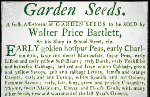
Going back a bit: because of course I’ve got to delve into the history of the seed packet, which seems to be an eighteenth-century innovation here in the United States. It is tied to, and illustrative of, the emergence and development of a commercial retail market for gardening supplies. Usually the D. Landreth Seed Company, founded in 1784 in Philadelphia by brothers David and Cuthbert Landreth and still very much in business, is given credit for the first seed packets, but a few years ago some packets were found in the eaves of the eighteenth-century Woodlands Mansion just up the river from the famous Bartram’s Garden in Philadelphia (clearly a horticultural nexus): whether they were for storage or sale is unclear. There were several seed shops in Salem in the mid and later 18th century, like Mr. Bartlett’s below, but I have no idea how they sold their seeds: perhaps people just came in and grabbed a handful? In any case, moving forward into the nineteenth century, there is no doubt that the entrepreneurial Shaker colonies were pioneers in the mail-order seed trade, to which many plain “papers,” or packets testify.

Essex Gazette 27 April 1773; Shaker, Landreth & Woodlands seed packets.


Decorating the “Little Room”

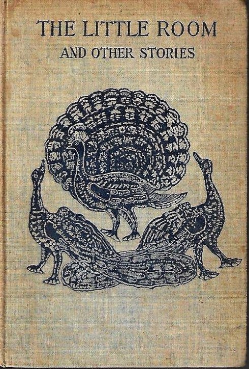
Happy June! I’m going to transition into a summer of lighter fare here: houses, gardens, non-academic books, events with people! In my contrary fashion, I’m going to start this transition with a spooky short story: one of the spookiest and shortest stories I’ve ever read. Madeline Yale Wynne’s “The Little Room” was first published in the August 1895 issue of Harper’s Magazine and then in The Little Room and Other Stories (1906). It’s a story about memories and perceptions, with a lot of ambiguity balanced by (in contrary fashion) very precise details, material details.

I’ll let you read it for yourself (it’s right here), but the basic problem is whether a certain space in an old Vermont farmhouse inhabited by two old maids was in fact a china cupboard or a “little room” complete with a green Dutch door exiting to the outside and a couch “covered with blue chintz—Indian chintz—some that had been brought over by an old Salem sea-captain as a ‘venture'” and given to one of the ladies when she was at school in Salem (yes, there is always a Salem connection). This chintz was described in more detail by those who saw the little room, and not the cupboard: it was “the regular blue stamped chintz, with the peacock figure on it. The head and body of the bird were in profile, while the tail was full front view behind it.” There were also hanging shelves with leather-bound books in the room, from which one bright red volume stood out, titled the Ladies’ Album, which “made a bright break between the other thicker books.” On the lowest shelf was a pink seashell, “lying on a mat of made of balls of red shaded worsted.” Not just a mat: a mat made of balls of red shaded worsted! Can we have any doubt that such a room, such a couch, such a shell, such a mat existed? Yes, we can. The room also contained several bright brass objects, a braided rag rug, and was wallpapered with “a beautiful flowered paper—roses and morning glories in a wreath on light blue ground.” How can this room not have existed? Wynne ensures that we will never know whether it did or not, but at least it can exist in some digital form with a bit of foraging and filtering.

The green Dutch door:

On the walls: I couldn’t find the wallpaper so precisely described by Wynne so I altered the color a bit from a 1960s floral paper on Etsy (which is the best place to find vintage wallpaper) and a watercolor possibly by John Hancock from the Carnegie Museum of Art (this is a lovely painting and I’ve really mucked it up with my filtering so make sure you see the original).

On the Settee: this first fabric looks very “stamped” but it’s really going to clash with my wallpaper, the second is softer but would still make for a very vibrant room!

On the Shelves: Wynne refers to hanging shelves very particularly, not a bookcase. I think of hanging shelves as more contemporary, but there are examples from the 18th and 19th century: the shelves below look appropriate to me, although with everything on them I think they would have to be bigger. These Waverly novels look weighty, but you can see how a slim red Ladies’ Album might pop out: perhaps it was Ladies Home Journal (which used red extravagantly) rather than Ladies Album? I’ve got lots of brass objects for this digital shelf/room (although maybe I should have polished them), and I stole the ultimate shell from my husband’s study. No mat though: I looked far and wide for a mat made of balls of shaded red worsted with no success, so the shell is sitting on a throw (but I used a “faded” filter). And finally, an amazing braided rag rug, which (hopefully) will pull this very interesting room together.

So that’s my “little room,” which was fun to put together. While this little story of a little room is an amusing diversion, it’s really not just about material stuff: it’s about the truth, and that awful scenario when two people, or three or four, or more, cannot decide or agree on what the truth is. This little story is a lot more timely now than when I first read it, maybe twenty years ago: then I think we all knew what the truth was.


My Favorite Penguins

Happy New Year! And my very best wishes to all for a better year than last! I’m a little bleary-eyed, having worked very hard over the holidays on grading and my forthcoming book, which is due at the publisher on March 1. And I’ve got to prep for next semester, which will include a brand new course on English legal history of all topics (yawn: a requirement for our department’s pre-legal concentration). So my posts are going to be a bit sporadic over the next few months but I did want to ring in the New Year with a post and give you all the heads up. Even after ten years, there’s still quite a few Salem topics I want to take on, and I’m hoping, like many of you I am sure, to travel at some point in 2021 so I should have some interesting posts after my big delivery date!

Normally I’m all about books on the blog this time of year: end-of-year best booklists, books I’m looking forward to reading, books for my courses. I’m so focused on my own book this year that I can’t really think about other people’s books during this particular January, except for very specialized academic books which I must include in my bibliography. Books for me are not just things to read however, they are objects which I like to have around, to dip into and just to look at. I love everything about book-objects: fonts, paper, cover design, illustrations, formats, colors. And my favorite books of all are Penguins: plain old orange-and-white paperbacks with yellowed pages and very pretty clothbound classics of more recent vintage and everything in between. I have evolving favorite series, and when I’m focused on a particular series I want to collect every volume possible: a couple years ago it was mid-century King Penguins and I remain very fond of them. People have given me gifts so I have quite a few now: I received “Compliments of the Season” this very Christmas.

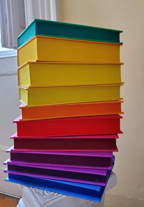
My most recent Penguin obsession, however, is the Drop Caps series, a colorful collection of twenty-six classic hardbound books designed by Jessica Hische, lettering artist extraordinaire. I saw one in a bookshop this summer and suddenly had to have all of them, and I have collected quite a few in the past six months or so. They are very object-like: you can shelve them and stack them in all sorts of interesting combinations. This makes them the perfect Penguins for me now, as I don’t actually have time to read them. But I will soon.


The Mayflower Magazine

Happy Thanksgiving! Those of you who have followed the blog for a while know that I’m a big fan of graphic design and typography, especially from the earlier part of the last century. I love fonts from the entire era of print actually, and script as well now that I think about it, and paper: so when it all comes together in an integrated design, I’m pretty impressed. It’s been such a weighty few months, with the pandemic, and the election, and hours and hours of writing for me everyday: I think I’m going to get a bit lighter for the next month or so, to lift my spirits and yours! I’m beginning with this very festive magazine/catalogue from the late nineteenth and early 20th centuries, titled The Mayflower. It has nothing to do with the ship Mayflower, or Plymouth, or the Pilgrims: it’s all about flowers—and the most robust lettering and chromolithography I have ever seen.

The covers might be somewhat sedate (except for this last one above), but as soon as you delve inside: wow! color—so vibrant you need sunglasses. The magazine was an advertisement for the big botanical business of John Lewis Childs, one of several garden entrepreneurs of this era and the first to establish a mail-order seed business. He created an entire town on Long Island named for his product: Floral Park. The Mayflower was published from 1885 to 1906, offering gardening tips and seed packets to an international audience as well as 2 or 3 colored plates in each issue. Childs also issued seasonal seed catalogs with the same combination of flourishing lettering and vibrant plates of perfect plants, or perhaps I should say too-perfect plants.

The Mayflower magazine covers from Magazineart.org (a great website!); many more Childs seed catalogs at the Smithsonian.


Hildegarde’s Gardening Book

The granddaughter of Nathaniel Hawthorne, Hildegarde Hawthorne (Oskinson) followed in the family business and published a wide variety of works over her lifetime (1871-1952), including children’s books, travel books, poetry, and biographies. I posted previously on one of her “rambles” books, Old Seaports of New England, because it features Salem prominently, but it is not my favorite of her titles: that preference is her garden book, The Lure of the Garden (1911). Gardening books by society ladies such as Hildegarde are a dime a dozen in this era, but The Lure of the Garden is different: it’s not a practical tome or simply an appreciation of the botanical beauty, but rather a series of essays on different cultural aspects of the garden, in her time and over time: from “Our Grandmother’s Garden” to “Childhood in the Garden” to “The Social Side of Gardens” to “Gardens in Literature”. It’s beautifully written (I think shorter-form essays are her strong suit) and beautifully illustrated, by Maxfield Parrish, Jules Guérin, Sigismond de Ivanowski, Anna Whelan Betts, and others, with plates in both color and black and white, paintings, drawings, and photographs. Throughout the book, the theme of the garden as a private refuge and true reflection of one’s inner self emerges, both very literally in considerations of enclosure and garden gates as well as through textual and visual illustration, as she shows off her connections and takes us into the “Gardens of Well-Known People” such as Parrish, Augustus Saint-Gaudens, Cecilia Beaux, Edith Wharton, and Stephen Parrish. For all this (and because I am dealing with the menace of powdery mildew right now), I think my favorite chapter is “Some Garden Vices”, in which the garden is portrayed as an autonomous entity, showering “pity and love to its ugliest weed” to a touching though infuriating extent: it will spare no pains to convey to this voracious plant all the delicately prepared food destined for your lilies or your phlox, will discover the utmost art in draining its water toward the thick roots of its favorite, give it sun and shadow, sweat and labor for it. If you snatch the hateful progeny from its arms, leave only the slightest portion of root behind, that patient, devoted garden will nurse the battered and wounded thing back again to life and health, to flaunt triumphantly in bed and border. As this is Hildegarde’s extravagant prose in reference to weeds, you can imagine her descriptions of more covetous cultivations.

Lure of the Garden Cover

Lure 21

Lure 18

Lure 8

Lure 17

Lure 16

Lure 15

Lure 14

Lure 13

Lure 12

Lure 11

Lure 6

Lure 9

Lure 10

Lure 1

Hildegarde Hawthorne’s The Lure of the Garden is available here.


Striking Fourths

No heavy lifting/posting for me this week, although I did want to offer up something celebratory for the Fourth, so I went through some of my digital files and favorite pictorial resources (MagazineArt.org and the Magazine Rack at the Internet Archive) to come up with a portfolio of July covers from the “Golden Age” of American illustration. It’s interesting to me how different types of magazines use patriotic themes and tropes to fashion images for their particular audiences: just the colors and perhaps a few artfully-placed stars and stripes can be evocative of the holiday without adding Uncle Sam and George Washington. For the most part, I’ve avoided the very literal in favor of the suggestive, although I can’t resist some of the “playing with fire” images which are pretty striking before World War One: the Comfort lady below looks quite uncomfortable, and like she is quite literally blowing off her hand with firecrackers, but the Puck lady seems quite happy to be ablaze. Some of the most illustrative Fourth of July images from this era can be found in children’s magazines (Harper’s Round Table and John Martin’s Book), but women’s and shelter magazines also signaled the holiday in style.

Fourth Harpers Roundtable Maxfield Parrish 1895

Fourth Lippincotts July 1896

Playing with Fire Collage

Fourth Puck 1902

Fourth John Martin_s Book 1920-07

Fourth Harpers Bazaar 1930

Fourth Delineator 1930-07

Fourth Dance 1931-07


Fourth House Beautiful 1933

Fourth House Beautiful 1934

Fourth WomansHomeCompanion1937-07

July magazine covers 1896-1937: from the Digital Commonwealth (Harper’s Round Table), the Library of Congress (Lippincott’s and Puck), CuriousBookShop@Etsy (House Beautiful , 1933) and the great site MagazineArt.org.


“Salem” Houses, 20th-century Style

There are two deep rabbit holes around which I must tread very, very carefully, or hours will be lost instantly: the Biodiversity Heritage and Building Technology Heritage digital libraries housed at the Internet Archive. One leads me through a never-ending cascade of flora and fauna; the other through the built environment–or prospective built environment, I should say, as many of its sources are building plans and catalogs. Just yesterday, when it started to snow and afternoon classes were cancelled, I thought to myself, let me just pop in there and see if I can find some inspiration for interior shutter knobs, and hours later I emerged with no knobs but lots of images of “Salem houses” instead. So here they are in chronological order: you will no doubt conclude, as I did, that “Salem” style loses its meaning over the twentieth century: the last house is from 1963, and it is difficult to see how it was inspired by Salem. Well, now that I’m looking at them altogether, it’s difficult to see how Salem was inspirational at all, except perhaps for a brief spell in the 1930s. House parts stick to their Salem inspiration, as there are plenty of mid-century “colonial” mantels, doors, and windows inspired by the craftsmen of “Old Salem”, but houses seem to break free of any connection to classical Salem influences: just look at the 1949 “Sam’l McIntire”! The concept of Salem seems to retain some currency throughout the century, but what it really means in terms of design or construction is anyone’s guess.


Salem Houses Herbert C. Chivers 1903 (2)

Salem Houses Aladdin 1915

Salem Houses 1915 collage

Salem Houses 1929 PicMonkey Image

Salem Houses 1933 PicMonkey Image

Salem Colonial 1933

Salem Houses 1936 Sears

Salem Houses Sears 2

Sam McIntire 1949

Salem Houses 1954

Salem Houses Collier-Barnett Co._0029 1963

“Salem Cottage” from St. Louis architect Herbert Chivers’ Artistic Homes, 1903; Aladdin Houses, 1915; the first “Readi-cut” Salem model, 1915; a “bungalow with the pleasing lines of the Colonial type” in The Book of 100 Homes, 1929; the reproduction “Pequot House” was included in the Ladies Home Journal House Pattern Catalogue of 1933, the same year that “a Salem Colonial” was published in Samuel Glaser’s Designs for 60 small homes from $2,000 to $10,000 : showing how to build, buy and finance a small home; two Sears “Salem” houses from 1936 and 1940; The “Sam’l McIntire” from the Warm Morning Small Homes plan book for 1949; Bennett Homes, 1954; a Salem “rambler” from There’s a Miles Home in your Future” book from the Collier-Barnett Co., 1963.


Allegorical Arrows

Historical imagery often contains symbols and emblems that we don’t understand:  we must learn to read them; whereas a contemporary audience could simply see them and understand the message within. I enjoy teasing out the meanings behind images from the past both here and in class–though here I’ve got a bit more creative freedom, and can chart the evolution of images all the way up to the present, when they have often lost their associations and exist simply as images. A great case in point (literally) is the simple and straightforward arrow: once I’ve swept away my seasonal decorations at home I’m often left with a bunch of arrows here and there as they are seasonless, timeless, and largely meaningless: I simply like their form. This is an Americana week for several auction houses, and yesterday as I was perusing the digital catalog for an important auction of folk art at Sotheby’s (The History of Now: The Important American Folk Art Collection of David Teiger|Sold to Benefit Teiger Foundation for the Support of Contemporary Art) all I could see was arrows, which for the most part had assumed their modern directional meaning on myriad weathervanes.

artful arrows horse weathervane

artful arrows diana the huntress sothebys

artful arrows soaring bird sothebys

artful arrows goddess of liberty sothebysPrancing Horse, Diana the Huntress, Soaring Bird, and the Goddess of Liberty weathervanes from the Teiger collection, Sotheby’s.

Another lot in this same auction is an incredible later nineteenth-century Chinese wall plaque representing the Great Seal of the United States, with the emblazoned bald eagle clutching a cluster of arrows in his left talon—thirteen to be exact, representing the thirteen colonies, but also strength through unity. There is an explicit sense of martial strength on display as well, projected through the contrast with the olive branch in the eagle’s right talon. The Great Seal’s designer, Charles Thompson, was influenced in his use of arrows by other confederations such as the Iroquois (with their five nations) and the Dutch Republic (with its seven provinces) as well as by early modern emblem books such as Joachim Camerarius’s Symbola et Emblemata (1590-1604), merely substituting them for the more classical lightening bolts.

artful arrows chinese eagle sotheby's folk art auction 20 jan

Obverse Great Seal.tif

arrows symbols 16th c.The Chinese Great Seal and Charles Thompson’s original sketch, US National Archives; Joachim Camerarius, Symbola et Emblemata.

Emblem books are one of the rabbit holes of early modern literature, as you will see if you go here: but you can also find many arrows, representing not only military force, but also time and inevitable mortality, flight, children (Psalm 127), punishment, and of course love, when in one of the countless cupids’ bows. Medieval arrows are never ambiguous: they represent force and violent death in general, and martyrdom in particular. Saint Sebastian (died 288) and King Edmund the Martyr (d. 869) were both attacked by hordes of pagan/heathen archers, and so often depicted as shot so full of arrows they resemble porcupines; arrows remained their essential attributes as their cults developed over the medieval era. In the later medieval era, Sebastian re-emerged as the most popular plague saint, as the arrow came to symbolize the plague itself: the most dramatic expression of this motif is a fourteenth-century fresco on the wall of the former Benedictine Abbey of Saint-André-de-Lavauadieu in France, depicting a faceless woman armed with the arrows of plague and her pierced victims all around her.

arrow 2 collage

love removed

arrows of black death

arrows pub

Some early modern arrow emblems: “Ich fliehe sehr schnell”– Fly far and fast; “Vis nescia vinci”–force cannot be overcome with force; “Supplicio laus tuta semel”—he that was worthy of praise was one free from punishment; Cupid holds up the world: “Sublato Amore Omnia Ruunt“–When Love is Removed, All things tumble down; the Lavaudieu fresco, and a street sign in Bury St. Edmunds, bearing the three arrow-crossed crowns that have come to symbolize the Anglo-Saxon king Edmund the Martyr.

Back to the future: I guess arrows are just arrows, or mundane symbols telling us where to go, BUT who knew there was a hidden arrow in the FedEx logo? Not me.

arrows collage

arrow fed ex

Mid-century textile design by Tommi Parzinger, Cooper-Hewitt Museum.


Reverence for Ruzicka

I’ve long admired the prints of Bohemian-born Rudolph Ruzicka (1883–1978), both pictures and fonts—both are characterized by the “optical ease” which he sought for all of his work. Ruzicka migrated to the United States as a child, and received his art training in Chicago and New York City before launching his career as an engraver and designer: he operated his own shop but also worked for the Mergenthaler Linotype Company for his entire professional life, as well as for Merrymount Press in Boston. His body of work includes several portfolios of prints of New York City, Newark and Boston, at least four typefaces (including the classic Fairfield which I use a lot), and a beautiful book of calligraphic fonts titled Studies in Typeface Design (1968). Ruzicka’s pictorial work looks to my untrained eye like the perfect combination of early to mid-twentieth-century central European and American aesthetics (they have that WPA look before the WPA!), and I love that he obviously loved New England: he moved to Massachusetts in 1948 and then to a farm in Brattleboro, Vermont. While he portrays an obvious appreciation for the “pictorial aspects” of New York (and Newark as well) his scenes of greater Boston are beautiful. And as a bonus, the series of greeting cards designed by Ruzicka and produced by the Merrymount Press from 1911-1941 include several prints of notable Salem landmarks, which you can see below.

ruzicka louisberg square carnegie

ruzicka beacon hill gardens carnegie

ruzicka beacon hill view

ruzicka charles street church

ruzicka cornhill boston

ruzicka granary burying ground

ruzicka washington monument

ruzicka frog pond carnegieRuzicka’s views of Boston (including the old Cornhill and swimming in Frog Pond) above, and of greater Boston (including Peacefields in Quincy, Walden Pond in Concord, McIntire’s Gore Place in Waltham and Derby summer house in Danvers, and the House of the Seven Gables and Old Town Hall in Salem) below.

ruzicka carnegie 3

ruzicka quincy

ruzicka walden pond

ruzicka gore place

ruzicka glen magna carnegie

ruzicka gables carnegie

ruzicka market house carnegieAll images from the collection of the Carnegie Museum of Art; the Harvard Museums also have a large collection of Ruzicka prints.


Victory New Year, 1919

All New Years are special as they are embedded with thoughts of hopefulness and fresh starts, but I think the dawn of 1919 might have been particularly so: the themes of victory and peace following the Great War ring out in all the accounts of its celebration, which might also have been particularly joyous as it marked the last “liquid” New Year with the onset of Prohibition approaching. The New York Times proclaimed 1919 the “Victory New Year” and the Boston Globe bid adieu to a battle-scarred pirate-gladiator representing 1918. Probably the best image expressing contemporary hopes for the coming year was a seemingly-ubiquitous poster equating world peace, (lady) liberty and (American) prosperity produced by the United Cigar Stores Company: this theme is manifest in all of the accounts of New Year celebrations and forecasts which I sampled, and most mentions of Prohibition were below the fold!

Victory New Year 1919 NYT

New Year 1919 Boston Globe

New Year's collage

I think I must have posted on all of the New Year’s traditions and symbols over the past eight (!!!) years, and horseshoes, pigs, toadstools, shamrocks, and chimney-sweeps are still in evidence on New Year’s postcards in 1919, but change was also inevitable, as the dominant German postcard industry collapsed with the onset of the war, and domestic producers gradually altered the style and substance of holiday cards. During and right after the war, there are a profusion of babies and comforting hearth scenes on holiday postcards, but also more patriotic and elevated expressions. The French influence seems strong, but American illustrators also shaped the image of seasons’ greetings—with emphasis on both domestic prosperity and universal peace: a major cultural consequence of World War I is the emergence of peace on earth as a popular holiday sentiment.

New Year 1918

New Year silk

New Year 1919 Card

Santa Snowman Delcampe (1)

_Peace._Your_Gift_To_The_Nation._A_Merry_Christmas.__-_NARA_-_512601

New Year RuzickaFrench silk New Years’ postcards for 1918 and 1919 featuring the Allied flags, Europeana; Xavier Sager and Santa planting the American flag on the North Pole postcards, 1919, Delcampe.net; Santa’s gift of peace poster by the U.S. Food Administration, Library of Congress; Rudolph Ruzicka holiday card for 1918-1919, Harvard.

But all was not completely calm in the United States on January 1, 1919. Deaths from the Spanish Flu epidemic of the fall had dwindled, but they were still being reported. As President Wilson made his way to the Paris Peace Conference, there was both evident pride and anxiety about America’s evolving role in world affairs. As always, everyone was concerned about the economy. The front page of the Boston Herald shows a cartoon in which all of Paris’s landmarks have been renamed “Wilson” (Place de la Wilson, La Tour Wilson, etc.), but also features an interview with Massachusetts Governor-elect Calvin Coolidge who prescribes “thrift and industry” and expresses what seems to be a very real concern that now that Europe is peaceful, all Americans of European descent will return there! This is Calvin Coolidge in a new light for me (remember, I am not an American historian), expressing concerns over the labor market as well as the loss of “so many men who during their stay with us have given us so many models of good citizenship” and suggesting cash payments as enticements for these men to stay put!

New Year Boston Herald

New Year Coolidge Collage

The Suffragist leader Alice Paul also identified 1919 as the “Victory New Year” as she was determined to bring the long struggle for votes for women to a triumphant close in that year. President Wilson’s commitment to freedom and democracy overseas was recognized as a wonderful opportunity to expose his hypocrisy at home (as this was an age when people recognized hypocrisy) and so the Suffragists burned “watchfires” in front of the White House, “to consume every outburst of the President on freedom until his advocacy of freedom has been translated into support of political freedom for American women”. From New Year’s Day into February, the watchfires burned, despite the cold, the harassment, and the arrests, igniting the final push towards the passage of the 19th Amendment in the Congress in May and June of 1919, and its eventual ratification in August of 1920. And so it seems that victories were both in hand and at hand on New Year’s Day, 1919.

Watchfires LC

The+Suffragist,+June+14,+1919_NMAH-AHB2013q013138Library of Congress & National Museum of American History.


%d bloggers like this: