Happy New Year! And my very best wishes to all for a better year than last! I’m a little bleary-eyed, having worked very hard over the holidays on grading and my forthcoming book, which is due at the publisher on March 1. And I’ve got to prep for next semester, which will include a brand new course on English legal history of all topics (yawn: a requirement for our department’s pre-legal concentration). So my posts are going to be a bit sporadic over the next few months but I did want to ring in the New Year with a post and give you all the heads up. Even after ten years, there’s still quite a few Salem topics I want to take on, and I’m hoping, like many of you I am sure, to travel at some point in 2021 so I should have some interesting posts after my big delivery date!
Normally I’m all about books on the blog this time of year: end-of-year best booklists, books I’m looking forward to reading, books for my courses. I’m so focused on my own book this year that I can’t really think about other people’s books during this particular January, except for very specialized academic books which I must include in my bibliography. Books for me are not just things to read however, they are objects which I like to have around, to dip into and just to look at. I love everything about book-objects: fonts, paper, cover design, illustrations, formats, colors. And my favorite books of all are Penguins: plain old orange-and-white paperbacks with yellowed pages and very pretty clothbound classics of more recent vintage and everything in between. I have evolving favorite series, and when I’m focused on a particular series I want to collect every volume possible: a couple years ago it was mid-century KingPenguins and I remain very fond of them. People have given me gifts so I have quite a few now: I received “Compliments of the Season” this very Christmas.
My most recent Penguin obsession, however, is the DropCaps series, a colorful collection of twenty-six classic hardbound books designed by JessicaHische, lettering artist extraordinaire. I saw one in a bookshop this summer and suddenly had to have all of them, and I have collected quite a few in the past six months or so. They are very object-like: you can shelve them and stack them in all sorts of interesting combinations. This makes them the perfect Penguins for me now, as I don’t actually have time to read them. But I will soon.
Happy Thanksgiving! Those of you who have followed the blog for a while know that I’m a big fan of graphic design and typography, especially from the earlier part of the last century. I love fonts from the entire era of print actually, and script as well now that I think about it, and paper: so when it all comes together in an integrated design, I’m pretty impressed. It’s been such a weighty few months, with the pandemic, and the election, and hours and hours of writing for me everyday: I think I’m going to get a bit lighter for the next month or so, to lift my spirits and yours! I’m beginning with this very festive magazine/catalogue from the late nineteenth and early 20th centuries, titled The Mayflower. It has nothing to do with the ship Mayflower, or Plymouth, or the Pilgrims: it’s all about flowers—and the most robust lettering and chromolithography I have ever seen.
The covers might be somewhat sedate (except for this last one above), but as soon as you delve inside: wow! color—so vibrant you need sunglasses. The magazine was an advertisement for the big botanical business of John Lewis Childs, one of several garden entrepreneurs of this era and the first to establish a mail-order seed business. He created an entire town on Long Island named for his product: Floral Park. The Mayflower was published from 1885 to 1906, offering gardening tips and seed packets to an international audience as well as 2 or 3 colored plates in each issue. Childs also issued seasonal seed catalogs with the same combination of flourishing lettering and vibrant plates of perfect plants, or perhaps I should say too-perfect plants.
The Mayflower magazine covers from Magazineart.org (a great website!); many more Childs seed catalogs at the Smithsonian.
The twentieth-century American artist Walter Ernest Tittle (1883-1966) was sought after on both sides of the Atlantic for his etchings, illustrations, and contemporary portraits. Among his diverse works are magazine covers, presidential portraits, and a whole series of drypoint “international dignatories” rendered in the 1920s, but also two slim volumes—advertised as “gift books”— in which he merged both original and historical texts and images to create a “lost” world of colonial holidays: The First Nantucket Tea Party (1907) and Colonial Holidays (1910).
These books are gorgeous, even though the images inside are a bit…….overwrought. I’m willing to leaf past some of the colorful colonial “belles” just so I can see Tittle’s fonts and illuminations: everything works together. As its subtitle reveals, Colonial Holidays is a compilation of historical references to Christmas and other holidays, embedded in Tittle’s gilded pages. He wishes the Puritans were more joyous in their celebrations, but “time brings change” and William Pynchon’s diary reveals some holiday merrymaking in Salem during the Revolutionary War. The new Assembly Room seems to have been very busy during the extended Christmas season with concerts and dances; “the elders shake their heads with, What are we coming to?” And so many sleds in the streets of Salem!
Tory that he is, Pynchon is not interested in George Washington’s Christmas, but patriot that he is, Tittle shows us Mount Vernon at Christmas—-no Valley Forge for his illuminated pages, but rather Christmas with the President and Mrs. Washington in 1795 and another reference to 1799–though Washington would have just died so certainly that was no festive occasion. The First Nantucket Tea Party does not have a Christmas setting perse but is also all about Colonial festivity, on the particular occasion of the return of Captain Nathaniel Starbuck Jr. from his “late long” voyage to China supplied with a chest of Chinese tea. Everyone is very excited about the tea, but for me it’s all about the amazing font used throughout the text. Merry Christmas!
I’ve long admired the prints of Bohemian-born Rudolph Ruzicka (1883–1978), both pictures and fonts—both are characterized by the “optical ease” which he sought for all of his work. Ruzicka migrated to the United States as a child, and received his art training in Chicago and New York City before launching his career as an engraver and designer: he operated his own shop but also worked for the Mergenthaler Linotype Company for his entire professional life, as well as for Merrymount Press in Boston. His body of work includes several portfolios of prints of New York City, Newark and Boston, at least four typefaces (including the classic Fairfield which I use a lot), and a beautiful book of calligraphic fonts titled Studies in Typeface Design (1968). Ruzicka’s pictorial work looks to my untrained eye like the perfect combination of early to mid-twentieth-century central European and American aesthetics (they have that WPA look before the WPA!), and I love that he obviously loved New England: he moved to Massachusetts in 1948 and then to a farm in Brattleboro, Vermont. While he portrays an obvious appreciation for the “pictorial aspects” of New York (and Newark as well) his scenes of greater Boston are beautiful. And as a bonus, the series of greeting cards designed by Ruzicka and produced by the Merrymount Press from 1911-1941 include several prints of notable Salem landmarks, which you can see below.
Ruzicka’s views of Boston (including the old Cornhill and swimming in Frog Pond) above, and of greater Boston (including Peacefields in Quincy, Walden Pond in Concord, McIntire’s Gore Place in Waltham and Derby summer house in Danvers, and the House of the Seven Gables and Old Town Hall in Salem) below.
All images from the collection of the Carnegie Museum of Art; the Harvard Museums also have a large collection of Ruzicka prints.
I enjoyed clicking around a crowdsourced graphic design project called RecoveringtheClassics the other day featuring new covers for old classics produced by anyone and everyone who had the inclination. Bibliographic art is always interesting to me, and I think it is a dynamic genre as interest in things that appear to be fading naturally and conversely escalates. Even though some of the cover designs are a bit simplistic (or confusing, or not particularly representative of what’s inside), it’s interesting to compare them: just click on a big image and you will see all the other submissions for the same title. I am naturally drawn to the starker, more symbolic designs as well as those which are slightly retro or antiqued in some way, and I am a sucker for nearly every new cover of Hawthorne’s Scarlet Letter that I encounter: they are always an easy A in my book.
Book covers by MrFurious (The Scarlet Letter), Huy Ho (Jane Eyre); Ji Sug Kang (The Wonderful Wizard of Oz); J.R.J. Sweeney and Roberto Lanznaster (Metamorphosis); Ioannis Fetanis and MrFurious (Dr. Jekyll and Mr. Hyde); Michelle Kondrich (The Jungle); Nick fairbank..f9 design (The Jungle Book); Steve St. Pierre (Dracula); and Luis Prado, Alexis Tapia, and Ed Gaither–Modern Electrographic (Frankenstein). I don’t know why no one has caught the prominent typo yet!
Big time transition here from the 1180s to the 1930s but that’s my life! As even the casual reader of this blog may know, I’m an avid classic film buff who is regularly tuned in to Turner Classic Movies–on which I watch (or glance at, while I’m doing other things) even bad movies. It doesn’t matter: if the plot doesn’t hold my attention something else will: the sets, the costumes, even the titles. The other night an extremely lightweight Ann Sothern film from 1936 entitled The Smartest Girl in Town (working model “Cookie” Cooke seeks rich husband and reluctantly falls for a man whom she presumes is another model but is in fact–and of course–a millionaire) caught my attention simply by its title sequence, featuring an amazing font which I had never seen before. I taped the film and have since gone back again and again just to look at these letters:
And aren’t they amazing? Look at all those circles and parallelograms–they really liven up what looks (to my untrained eye) like a pretty standard 1930s font. My preoccupation with this particular title drove me to look for those of some of my favorite films from this era, and led me to discover a great resource: the website of Dutch graphic and web designer Christian Annyas, who has collected hundreds of screen shots of film titles from the 1920s to the present in his The Movie Title Stills Collection. You can search by title, designer, director, or actor, but the best thing to do is just browse through the decades so you can see the evolution of letters on film. I did that briefly, and then went right back to the 1930s, which produced my favorite films and my favorite fonts, and here are just a few of them:
Design for Living (1933): almost as good a title as The Smartest Girl, but a much better film. It’s very modern, and is basically about a menage à trois!
The 39 Steps (1935): Hitchcock attended to every little detail–all his titles are great.
Theodora Goes Wild (1936): not sure this is as classic as some people say, but it is charmingly well-acted by Irene Dunne and Melvyn Douglas–and I love this font!
My Man Godfrey (1936): more 1930s shadows–the “forgotten man” gets into the picture!
Dead End (1937): a more realistic Depression-in-New-York film by William Wyler with Humphrey Bogart and one of my favorites, Joel McCrea.
Only Angels have Wings (1939): I don’t really care for this sandy font, to tell the truth, but as this is probably my favorite movie of that stellar movie year 1939, I felt I had to include it. You can tell we’re about to go through a typographical transition…….
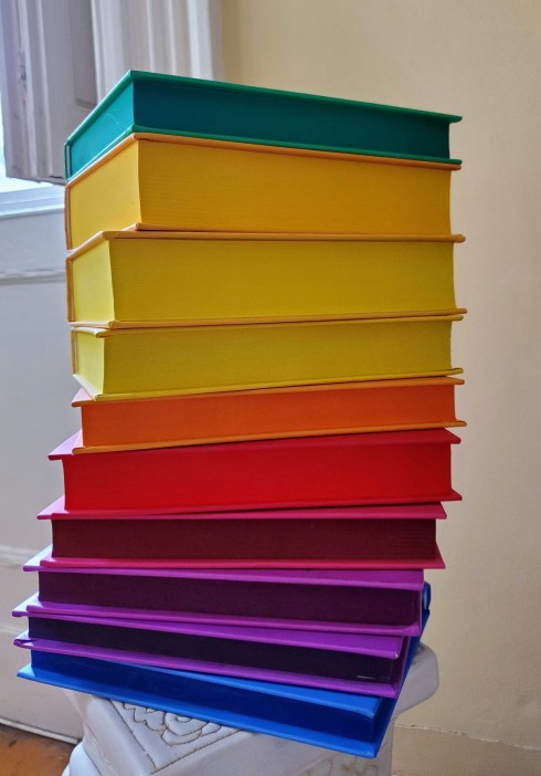
Well, it’s the time of year for lists, lots of lists: best and worst, most important, so on and so forth, lists of ten things that characterize the passing year in one way or another. I’ll do my part with a best books list, with a qualification: these are titles that were published in 2012 which I consider to be essential for bedtime reading, or bedtime reference, to be more precise. I do like to read in bed before I sleep, but I drop off quite rapidly, so I need a quick hit of compelling information, and/or some visual stimulation, before I’m gone. I’ve given up fiction altogether for this purpose, and I never read any sort of academic history later at night: my bedside books need to be “dippable”; I will pick up one or the other from the stack–too tall for the bedside table–and dip into it every other night or so, in order to see or learn something before I fall asleep (books that do not perform these services leave the stack rather quickly). Several amazing natural histories were published this year which are perfect for this purpose, so I’ll start with them.
Natural Histories. Extraordinary Selections from the Rare Book Archive of the American Museum of Natural History Library. Edited by Tom Baione. Sterling Signature, 2012.
Nothing fascinates me more than the merger of art and science and this first book illustrates that historical merger in an extraordinary way. It is the ultimate gift and coffee table book, as it comprises a collection of historical sources relating to every branch of natural history from anthropology to zoology, succinct yet substantive contextual essays, and lots of images, as well as frame-ready prints, but it is also incredibly informative and inspirational. Similar in its historical range and the compelling nature of its images is the National Library of Medicine’s Hidden Treasure, and rather more whimsical (yet still empirical) is Caspar Henderson’s The Book of Barely Imagined Beings. A 21st Century Bestiary. These books are just visual feasts, and I also learn something every time I pick them up.
Hidden Treasure: the National Library of Medicine. Edited by Michael Sappol. Blast Books, 2012; The Book of Barely Imagined Beings by Caspar Henderson. Granta Books, 2012.
I’ve been interested in folklore for quite some time, and an amazing new edition of Grimm’s Fairy Tales was published this year: this bicentennial edition of The Annotated Brothers Grimm was edited and annotated by Maria Tatar, Chair of the Program in Mythology and Culture at Harvard. It really is a definitive edition, and also includes many classic illustrations. There’s nothing better than reading Grimm fairy tales before you fall asleep: food for dreams!
The Bicentennial Edition of the Annotated Brothers Grimm. Edited by Maria Tatar. W.W. Norton, 2012.
I always have architecture and design books in my bedside stack, also good for dreaming, and the ones I purchased this year are American Decoration by Thomas Jayne and London Hidden Interiors by Phillip Davies. Their titles are self-explanatory. I love Jayne’s traditional style, and with its 180 properties and 1200 photographs, Hidden Interiors is positively encyclopedic.
American Decoration: A Sense of Place, by Thomas Jayne. Monacelli Press, 2012. London Hidden Interiors, Phillip Davies. An English Heritage Book, Atlantic Publishing, Ltd., 2012.
Both art history and history texts seldom function well as bedside books, as they require a bit more sustained concentration. If they are far removed from my academic interests, sometimes I can make them work out of sheer ignorance/ interest and curiosity (or if they have relatively short chapters!) Right now I have two books in these categories by my bed, both very recently published: Eleanor Jones Harvey’s The Civil War and American Art, which is the companion volume to the exhibition that’s on right now at the Smithsonian Museum of American Art, and Todd Andrlik’s Reporting the Revolutionary War, which presents a narrative of the American Revolution through contemporary newspaper reports, including several from the Salem Gazette.
Eleanor Jones Harvey, The Civil War and American Art. Yale University Press, 2012; Todd Andrlik, Reporting the Revolutionary War. Before it was History, it was News. Sourcebooks, 2012.
Salem is a “walkable city”, and I think more places in car-obsessed America should be walkable cities, which is why I purchased urban planner Jeff Speck’s Walkable City. How Downtown can Save America, One Step at a Time. I’m learning a lot from this book, but I do think it is better read in the daytime rather than just before bed. And last but not least, a perfect bedside book that my brother just gave me for Christmas: Simon Garfield’s Just My Type. A Book about Fonts. This was actually published in 2010, but I also have another Garfield book that was published this year, On the Map: A Mind-Expanding Exploration of the Way the World Looks, (Gotham) so together they can fill out my top ten list. Typography and cartography: two very interesting, yet contained topics. Perfect for end-of-day reading.
Jeff Speck, Walkable City. How Downtown can Save America, One Step at a Time. Farrar, Straus and Giroux, 2012; Simon Garfield, Just my Type. A Book about Fonts. Gotham reprint, 2012.
Last week was a bit unnerving, unsettling, disconcerting. Not only because of the unseasonably warm weather, but also because of a word (or two): dystopia or dystopian. The opposite of utopia, not a perfect, elusive place, often in the future, but rather a repressive and hostile place, definitely in the future, where individual freedoms are subjected to some all-powerful system.Whenever I was near a radio or a television, I kept hearing that word, at least 20 times, more than I have ever heard that word in my life. The primary contexts for the word were reviews of the Hunger Games film, set in a decidedly dystopian future, and related stories about the popularity of dystopian themes in young adult fiction, which is itself disconcerting.
As is always the case when things are not just quite right for me, I retreat to the past. What better way to counter dystopia in the present than with some utopias of the past? I really don’t know that much about ancient history, so I skipped the Garden of Eden, the Isles of the Blessed and Elysian Fields and went back to the Renaissance Utopia, Thomas More’s 1516 book, and then moved forward, more happily, toward the present.
Early Modern Utopias: More’s Utopia, Tommaso Campanella’s City of the Sun (1602), Bartolomea del Bene’s City of Truth (1609), and Francis Bacon’s New Atlantis (1624).
As you can see (you’ll have to take my word on the cropped Bacon image), all of these utopias are self-contained islands or cities, apart from the corrupt world, and their very existence is a commentary on that world. It’s also very interesting to me that in these four works, two written by Englishmen and two by Italians, a distinct nationalistic vision of utopia has emerged: More and Bacon have located their utopias on islands and Campanella’s and del Bene’s utopias are walled cities. The Italians seem to think they can find utopia through urban planning, which was both an artistic and a logistical enterprise. Not only did the Italian Renaissance inspire and create paintings like Piero della Francesca’s Ideal City (c. 1470) but also the Venetian “development” of Palmanova in 1593, a real “ideal city”.
With the coming of industrialization in the modern era, cities could not possibly be utopian. The ideal life/world could now only be found in a long-lost Arcadian past or a pastoral enclave in the present. American utopianism in the nineteenth-century seems to be best represented by the romantic landscapes of the Hudson River Valley school, like Thomas Cole’s Dream of Arcadia below, and social experiments like Brook Farm here in Massachusetts, where Nathaniel Hawthorne spent a few (apparently miserable) months in 1841. A young and struggling writer at the time, Nathaniel clearly did not find his utopia at Brook Farm: too much manure.
Thomas Cole, Dream of Arcadia, 1838. Denver Art Museum.
Joseph Wolcott, Brook Farm with Rainbow, 1845. Massachusetts Historical Society.
I’m not sure how the quest for utopia has fared in the twentieth century, and into the twenty-first. Have we given up on it? Are utopian ideas and ideals so personal that we don’t have a collective cultural vision? Is is all about dystopia? At least in the first part of the century, and despite the dreadful First World War, the Bauhaus movement was definitely driven by utopian ideals as well as the passion for modernism and the desire to integrate art, design and technology. All of these goals are exemplified by the title and the typography of their publications from the early twenties: the volumes of Utopia: Dokumente der Wirklichkeit (Utopia: Documents of Reality) were designed by Oskar Schlemmer in a style that still looks modern today.
An etching by the American artist Peter Larsen from just about the same time as the beginning of the Bauhaus School shows a decidedly more inaccessible Utopia, like that of Thomas More. So we’re right back where we began, with those who believe that Utopia is within reach, or at least worth striving for, and those that believe it’s just a fantasy.
Peter Larsen, Utopia,1919. Smithsonian American Art Museum.