Tag Archives: Color

Local Color: Salem June 2022

This is going to be an odd post which will start out sweet and end up a bit sour, but I can promise you that it will be colorful throughout. There’s one aspect of Salem’s history that I never seem to be able to cover completely, despite the longevity of this blog: its horticultural history. Salem was really famous for its horticulture a century or so ago: you can’t browse through a stack (or a database) of house and garden magazines from the first half of the twentieth century without encountering articles on the “old–fashioned” gardens of Old Salem. Several really notable cultivators and landscapers lived here, and one still does! There is continuity: the city still has some wonderful private and public gardens: among the latter are the Ropes Mansion and Derby House gardens, which are open to the public. There are so many flowering trees and to see in Salem just while walking down the street, especially at this time of year or a bit earlier. So I’ve got some nice photos from the past two weeks or so, and that was going to be the exclusive focus of this post: a parade of colors in Salem for Pride month! But, stuff happens, and in the middle of this very a trouble man painted the Bewitched statue in Town House Square red, setting off a wave of national headlines and local commentary. So I think I’ll add Samantha to this colorful mix. But first: Ropes and Derby:

Salem in June: the Peabody Essex Museum’s Ropes Mansion garden is really more of a high/late summer garden, but the Derby House garden at the Salem Maritime National Historic site is perfect in June.

My garden can’t really compete but I do want to show you my lady’s slippers and I really like the meadow rue that blooms at this time of year. I’ve thinned out my rose bushes, because they just don’t earn their keep in my small garden, so I only have the best bloomers and they are putting on a show right now. This the lady’s mantle time too: I’ve been training my younger cat Tuck on a leash, and the minute he gets it on he goes right for it, so you can see pre-bloom last week and bloom this week. Then there is the vertical garden at the new downtown condo building named Brix (not a fan of this building but I do like its exterior embellishments), peonies from around town, an impressive plant for which I need an identification outside the Peirce-Nichols house (baptisia?) and more roses, on Cambridge Street.

So that brings us to more unnatural color: blue trees and a red Samantha. In the side yard adjacent to the Peabody Essex Museum, the trees have been painted bright blue, a very bright royal blue. This is the 27th international installation of the artist Konstantin Dimopoulos’s The Blue Trees, an “environmental call to action” with watercolor which will fade with time. Very striking, especially at this time of year. With no manifesto and paint that was certainly not biologically-safe, a homeless man spray-painted the upper part of the Bewitched statue a few blocks away in downtown Salem in the middle of this past week. Red Samantha didn’t last long; indeed I’ve seldom seen a quicker response by the City. By the end of the day she was cleansed and a gofundme account set up to restore her to her former “glory”. For those of us in the never-Samantha camp, it was hard to bear the comments on social media protesting this act of vandalism as “disgusting” and “disrespectful” because that’s just how we view the statue: as disgusting and disrespectful to the victims of the 1692. Or maybe I should just speak for myself. As the story created regional and national headlines that night and the next day, I just couldn’t bear the use of the word “landmark” applied to this horror: a landmark should be something that one points to with pride, not embarrassment, which is generally how I feel every time I pass by Samantha. Salem Mayor Kim Driscoll praised the quick cleanup by her public services team and opined that “Samantha brings a degree of joy and whimsy to our downtown and has become a landmark location for thousands of visitors to Salem each year” but such craven capitalization on suffering remains incomprehensible to me. To return to my color theme (and lighten up things a bit), there was also a difficult juggling act for those who did not want to praise vandalism by any means, but at the same time thought that Samantha looked better draped in red. Anything could improve that eyesore, and I always see red when I gaze in her direction.

The Blue Trees of Konstantin Dimopoulus; and a fleeting Red Samantha.


An Array of Entrances

There were two very positive developments regarding Salem’s historical fabric this week: the city’s Cemetery Commission voted to close the Old Burying Point during October, thus shielding our oldest cemetery from its annual occupation by Halloween tourists, and the Peabody Essex Museum announced that it would be returning the anchor which was situated in the front of East India Hall for a century or so to Salem. I am heartened and happy and have nothing to complain about or advocate for in this post! So let’s celebrate with some color, as found on a veritable rainbow of Salem doors. My first house in Salem had a red door, and everyone would comment on it when I told them where I lived; now red is pretty commonplace, but my impression is that the most common door color in Salem is still black. Greens—especially dark green—would be next, followed by a variety of reds, blues, pinks, and orange/peach doors, and finally brown and gray doors. Of course there are lovely Salem doors which are varnished rather than painted, but I’m not including them here. There are yellow doors in every neighborhood, but cream and white doors are hard to find: generally the latter are new Home Depot-ish doors, and not very interesting. There are some pretty nice new custom doors opening out onto the streets of Salem, but if I was in need of a door I think I’d rather find an old one at Old House Parts or somewhere similar. I’ve got one white door here, with some pretty distinctive hardware, and lots in more vivid hues, beginning with the painted door installation at Salem’s Tabernacle Congregational Church, representing diversity and acceptance of all.

20190912_115718

20190910_143549

20190910_143212

20190910_142857

20190912_102040

20190907_165555

20190912_113504

20190912_105451
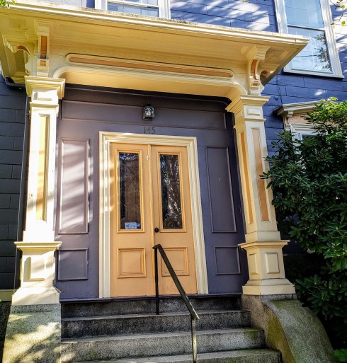
Another reason to praise PEM: the beautiful restoration of the Daniel Bray House on Brown Street: it doesn’t have its new/old door yet as you can see–and I’m not sure if it will be painted this light orange color.

20190912_113844

20190910_140127

20190907_161345

20190907_153717

pixlr

20190907_170036

20190910_134705

20190910_134726

20190907_160454

20190910_140808

20190827_112305Dark Brown/Red is a classic Salem combination.

20190907_170015

20190912_102815

pixlr-1Turquoise is the current it-color, I think.

20190912_110512

20190910_132300

20190907_162959

20190912_114413

20190910_134446

20190910_132834-1T

20190907_170638

20190907_170219

20190907_170103


Considerations on Color

I teach what is commonly known as the “Scientific Revolution” in several of my courses, and I always endeavor to expose my students to the broad range of the “new science” in the seventeenth century as they tend to have a very narrow view of what this revolution entailed. We come to the topic from very different perspectives: for them, it’s all about the heliocentric universe (conception, proof, acceptance? I’m not sure which); for me, it’s about nothing less than a new conception of truth and a new methodology of inquiry. To demonstrate its truly revolutionary impact, I stress the universality of this methodology by exposing them to the range and variety of “ingenious pursuits”, encompassing everything from botany to medicine to chemistry to mechanics to navigation and from the theoretical to the practical. I’m a bit more interested in the latter–and that’s what I’m studying during this sabbatical–but sometimes it’s hard to separate the two approaches: a case in point is Robert Boyle’s Experiments and Considerations Touching Colourswhich was first published in 1664. Boyle is primarily known for his pioneering work in chemistry and physics, but his interests were varied: like his contemporary Isaac Newton, he also experimented with alchemy. As its title indicates, Experiments and Considerations Touching Colours consists of experiments and observations which “enquire seriously into the Nature of Colours, and assist in the investigation of it [them]”, and his empirical data consists of examples of craftsmen creating color, including the English dyers who had perfected the process of transforming a red acid extracted from the American cochineal insect into scarlet and crimson dyes: and voilà, Redcoats! (Well a bit later). It is these intersections of “science”, industry and art that really demonstrate the spirit of inquiry in the seventeenth century.

COnsiderations of Color

Wright, John Michael, 1617-1694; Mary Fairfax, Duchess of BuckinghamFirst edition of the Experiments and Considerations Touching Colour, 1664, Skinner Auctions; The Duchess of Buckingham with her crimson wrap, after 1659, York Museums Trust.

Just two years later, Robert Waller, another fellow of the Royal Society (which we should remember was very interested in technology as well as theoretical science) published a really cool color chart in the Philosophical transactions of the Royal Society of London. As you can read below, Waller had seen a “table of simple colors” some years previous but was resolved to “give a more philosophical and useful one by the addition of some mixt colors”. The vocabulary is similar to that of medicines–simple and compound–and like materia medica, everything was composed from nature but man was starting to amplify the process of production—or creation.

Creating Colors Waller 2

Creating Color Waller

Color Chart 1686Robert Weller, Tabula colorum physiologica (Table of Physiological Colors), Philosophical transactions of the Royal Society of London, 1666.

And then there is the remarkable Dutch manuscript brought to (internet) light by the book historian Erik Kwakkel a few years ago containing a “proto-Pantone” code of colors: the Treatise on Colors for Water Painting (1692) by A. Boogert. A single and singular copy forgotten and full of the most amazing colors and color compositions, this book set the design world on fire back in 2014—understandably so.

color-guide-960x731

Color Chart 1690sA. Boogert, Traité des couleurs servant à la peinture à l’eau, Aix-en-Provence, Bibliothèque municipale/Bibliothèque Méjanes, MS 1389 (1228). Photographs by Erik Kwakkel.


Green(houses) in Salem

So I can show you the beautiful day after our third big snowstorm of March, and also anticipate St. Patrick’s Day coming up this weekend, I am showcasing a portfolio of some of Salem’s green houses today, many cast in snow. It’s a very popular house color in Salem, so this is just a representative sampling. Green is a color that seems to transcend architectural style: you can easily find colonial, Federal, and all variations of Victorian examples. There are no green houses on Chestnut Street (where yellow is an exotic color) so I trudged over to Essex Street, where I found many—and even more on Federal Street.

Green Houses 7

Green Houses 14

Green Houses 9

Green Houses 8

Green Houses 15

Green Houses 5

Green Houses 6

Green Houses 3

Green Houses 4

And then I walked towards downtown and the Common past everyone’s favorite Salem green house: a little gambrel-roofed charmer on North Street, which serves as a constant human-scaled welcome structure along this key entrance corridor, in sharp contradistinction to the over-scaled courthouse nearby. If this house was not here, and maintained in such perfect condition, visitors to Salem would have quite a different first impression: the house softens the street and hints at a more historic Salem.

Green Houses 2

And then I was off, seeing green everywhere I went, all day yesterday and into this morning: you will note that the snow has melted off the trees in some of the pictures below, a sure sign of a late-season snowstorm. I tried to represent all shades of green: a very deep forest variety, emerald, and apple and minty greens that seem a bit more spring-like. Almost unbelievably, it will be Spring in Salem next week.

Greenhouses

Greenhouses4

Greenhouses2

Greenhouses3

Green Houses 13


Pink Portfolio

Certain times of the year are just defined by colors: early May reads pink to me, with touches of white (and green of course) for contrast. It’s all the flowering trees and shrubs and the pink version of one of my very favorite plants, Bleeding Hearts. Spring has been rather chilly here in Salem so far, and this is a really busy time on the academic calendar, but the quest for pink gets me out there on the streets, and in some cases, in (public!) backyards. The sloping garden behind the Peirce-Nichols house, for example, is Bleeding Heart heaven, and while I found no pink (though sometimes lilac can pass) behind another PEM house, the Gardner-Pingree, I did find a rabbit, so I’m including him/her too–along with a photograph of some absolutely beautiful pink borscht from a new bedside book which I bought more for its colors than its recipes: Dinner with Georgia O’Keeffe: Recipes, Art & Landscape (Assouline, 2017).

Pink and White 8

Pink and White 7

Pink and White 5

Pink and White 6

Pink Bleading Heart

“Papplerose” (which looks like Bleeding Hearts to me) drawing by Dagobert Peche (Austrian, 1887-1923); watercolor on paper, Smithsonian/Cooper Hewitt Museum.

Pink and White 4

Pink and White2

Pink and White 3

Pink and White

Pink and White 3

Pink Tulips

Pink and White georgia-o-keeffe-cookbook

Drawing of pink and white tulips by Tommi Parzinger, ca. 1930; graphite on paper, Smithsonian/Cooper Hewitt Collection; borscht from Dinner with Georgia O’Keeffe: Recipes, Art & Landscape by Robyn Lea.


She Wears the Green

I looked back through my posts of St. Patrick’s Days past and found: green cards, green plants, greenbacks, green fairies, and green men. Lots of men, in fact, but very few women, unless they were representing (rather negatively) envy or absinthe! So on this particular St. Patrick’s Day, I’m featuring only women, in more positive (though also rather frivolous) displays. I’ve recently discovered the short-lived and absolutely amazing Gazette du bon ton, a French fashion magazine packed with artistic illustrations which was published from 1912 to 1925. Was there a war in there somewhere? You wouldn’t know it leafing through these whimsical pages. The Gazette features lots of seasonal green, and it was also a favorite color of one of my favorite graphic artists from this same period, Mela Koehler. Perhaps these early twentieth-century representations of lively, festive green are meant to counteract the color’s toxic associations of the previous century? I am opening and closing my portfolio with two more serious real females, both anonymous: a folk art portrait from the mid-nineteenth century (featuring a woman who is hopefully not wearing an arsenic-dyed dress–though I fear for the anonymous artist), and a photograph of a (Salem?) girl taken by a Salem photography studio with which I have taken some liberties: I love her jacket so much I wanted to highlight it by “greening” it up a bit for the holiday.

Green Dress Folk Art MFA 1838

Green dress 19th C MET

Women_19001914_Plate_191

Green Dress Clover Girl Kirchner 1899

Green Dress MK 1910 3 MFA

Green Dress Koehler collage

Green Dress Philip Coles NYPL 1912

Green dress Gazette de BonTon Worth 1912

Green Dress Gazettedubonton00B_0355 1914

Green Dress Gazettedubonton00A_0303 1920 Poiret

Girl in Green

Portrait by unidentified artist, 1838-40, M. and M. Karolik Collection of American Watercolors and Drawings, Museum of Fine Arts, Boston; Dress and Coat, Costume Institute Collection of Fashion Plates, Metropolitan Museum of Art; Raphael Kirchner and Mela Koehler cards, c. 1910, Lauder Collection, Museum of Fine Arts, Boston; Coles Phillips, Woman in green dress sitting beside tulips, 1912, New York Public Library Digital Collections; Illustrations from Gazette du Bon Ton, 1913-1920, Smithsonian Libraries; undated Salem, MA photograph.


Bittersweet November

I don’t really have a theme or subject for today’s post: it is primarily comprised of photos I took here in Salem and up in York Harbor where I spent most of the weekend. But as I was walking along the Harbor cliff walk–a childhood path of mine that was allowed to be taken over by new home owners/builders along the way in past years but now seems to be in the process of being reclaimed by the public–I thought of how appropriate the bittersweet “decoration” that lined the walk was: contrasting and colorful, a last blast of bright before things get darker, so somehow all the more sweet. I’ve always thought November is one of our most beautiful months: the light is so clear, the earth not yet muddy brown or white. Of course since I’ve lived in Salem November has become particularly cherished as it marks Salem’s liberation from its Witch City identity, but I think everywhere that I have lived I have enjoyed November: in Vermont, and Maine, and Maryland, and Britain. I think it must be my second-favorite month, just behind May.

The first week of November in Salem: a blazing tree on Essex Street, the new Little Free Library on the Ropes Mansion Grounds, a house coming back to life, white shows the light, old tracks, a strange seating area at Harmony Grove cemetery (I think it is the pillows that I find somewhat odd), THE WITCH IS DEAD, one last fall photograph of my cat Trinity for a while, I promise!

november-5a

november-13a

november-12a

november-2a

november-3a

november-4a

november-1a

november-6a

In York Harbor, the first weekend of November:  along the Cliff Walk: fortifications (several estates along the walk have castle-esque architectural attributes and CANNONS–who are they guarding against, the New York Yacht Club?), bittersweet, and a secret gate; fall back.

november-10b


november-7a

november-9a

november-8a

november-11a


Green and Purple

At this time of year I crave two colors: green and purple, alone but especially together. This is one of my favorite color combinations, in all shades: lavender and spring green, purple and emerald, violet and chartreuse. I’ve never had a house that could carry off these colors either on its exterior or interior—I suppose I wouldn’t want to live with them–but they always catch my eye. I grew up in the Laura Ashley age, and two of my favorite prints (on a dress and a comforter) bore purple and green rather boldly, and my late spring wedding featured touches of these two colors, anchored by more neutral gray and ivory. The spectrum of green and purple can take you through the year if you’re so inclined: with paler shades for spring and summer and richer tones for fall and winter. So here is my palette, starting with a wonderful picture of the Elizabethan scholar, art and cultural historian, public intellectual, super gardener, and all-around Renaissance Man Sir Roy Strong, standing in the midst of his Laskett Gardens in Herefordshire.

The remaking a garden the Laskett transformed

Green and Purple Historic Palaces WP Cole

Cole and Son Wallpaper Versailles Grand

Green and purple Warner House

Green and Purple House Salem Oliver Street

Green and Purple House Salem

Green and Purple Plaque

Photograph of Sir Roy Strong by Clive Coursnell from Remaking a Garden:  the Laskett Gardens Transformed (2014); “Royal Garden” and “Versailles Grand” wallpapers from Cole & Son; Bedroom at the 1716 Warner House, Portsmouth, New Hampshire (photograph by Geoffrey Gross for Antiques & Fine Art Magazine); two Salem houses on Oliver and Daniel Streets (the first one looks rather blue in this photo, but more purple in real life–love the chartreuse trim–and the plaque on the second house: Historic Salem’s plaques are not usually so informational).


%d bloggers like this: