
I love dining rooms in general and my dining room in particular; I love renderings of dining rooms in general and watercolor renderings of dining rooms in particular: that’s pretty much the post! In the Victorian house I grew up in, the dining room did double duty as a sitting room of sorts, while my first Greek Revival house had an open kitchen/dining area. But my present house has a room that can be nothing other than a dining room and it’s my favorite room in the house. Dining rooms seem to be in danger of disappearing now, and I really hope that trend reverses itself.


My Thanksgiving dining room with and without a watercolor filter—definitely not very artistic!
My regard for dining rooms has artistic rather than social origins: I love all the things associated with dining rather than the act of dining. And when I was relatively young—in high school I think—I came across the paintings of English artist Mary Ellen Best (1809-1891), who painted her interior worlds with such charm and detail that they became imprinted in my mind. Her dining room in York remains one of my favorites: she also painted her family dining at the home of her grandmother and an elderly neighbor in her dining room. Best opened window after window into mid-nineteenth-century interiors in both England and Germany, where she lived after her marriage. We see kitchens, parlors, and drawing rooms in intimate detail: her use of watercolor gives these rooms a dreamy effect so we’re not too overwhelmed.


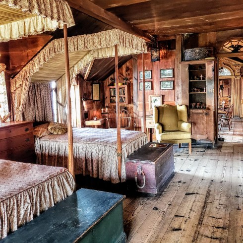
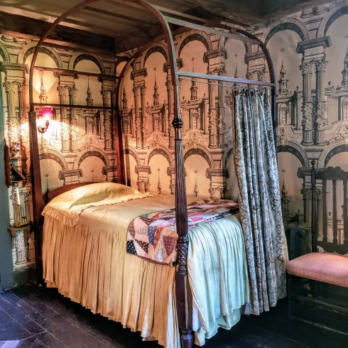
A very different artist, of another time and place, was Edgar W. Jenney, an architect and interior designer who retired to Nantucket in the 1920s. He offers more of a preservation prespective in his interior renderings of old Nantucket houses, large and small, but he was also a commercial artist: I first came across him when I saw his very Colonial Revival “Salem Room” in an old House and Garden. He seems much more focused on the overall ambiance than the details of daily life we see in Best’s paintings, but watercolor softens his scenes.


Two Nantucket dining rooms, 1930s, by Edgar Whitefield Jenney, Rafael Osana Auctions and Nantucket Historical Society.
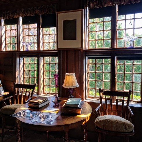
All of the above are artistic compositions, but watercolor was used for professional renderings as well so you can find some lovely paper dining rooms in trade catalogs published by wallpaper, fabric, and furniture companies in particular: there are myriad sources at the Internet Archive’s Building Heritage Technology Library. Architectural and Interior Design archives are another obvious source for these images: I was introduced to the wonderful work of Wisconsin interior decorator Odin J. Oyen here which led me to the first stunning dining room design below here. These kind of searches can go on for days and even weeks so be careful! Work interfered or I would have kept on going.


Two dining room elevation renderings from Historic New England’s Collections from Irving & Casson/A.H. Davenport. A dining room from Mary Brooks Picken’s Sewing for the Home (1941) and a Baltimore dining room from the Metropolitan Museum of Art’s The Homes of Our Ancestors (1925).


 Courtesy, American Antiquarian Society.


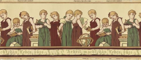 Wallpaper “Froebel” frieze, 1905, E.J. Walenta for Wm. Campbell Wall Paper Company, Machine-printed on paper, Hackensack, New Jersey, USA, Cooper-Hewitt Museum, gift of Paul F. Franco, 1938-50-15.

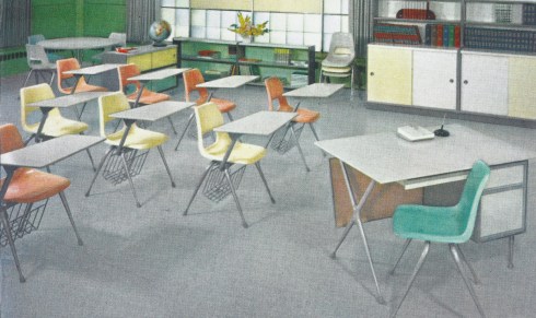 Brunswick chairs c. 1958 from the VS


