
I’ve long admired the prints of Bohemian-born Rudolph Ruzicka (1883–1978), both pictures and fonts—both are characterized by the “optical ease” which he sought for all of his work. Ruzicka migrated to the United States as a child, and received his art training in Chicago and New York City before launching his career as an engraver and designer: he operated his own shop but also worked for the Mergenthaler Linotype Company for his entire professional life, as well as for Merrymount Press in Boston. His body of work includes several portfolios of prints of New York City, Newark and Boston, at least four typefaces (including the classic Fairfield which I use a lot), and a beautiful book of calligraphic fonts titled Studies in Typeface Design (1968). Ruzicka’s pictorial work looks to my untrained eye like the perfect combination of early to mid-twentieth-century central European and American aesthetics (they have that WPA look before the WPA!), and I love that he obviously loved New England: he moved to Massachusetts in 1948 and then to a farm in Brattleboro, Vermont. While he portrays an obvious appreciation for the “pictorial aspects” of New York (and Newark as well) his scenes of greater Boston are beautiful. And as a bonus, the series of greeting cards designed by Ruzicka and produced by the Merrymount Press from 1911-1941 include several prints of notable Salem landmarks, which you can see below.

![]()
![]()


 Ruzicka’s views of Boston (including the old Cornhill and swimming in Frog Pond) above, and of greater Boston (including Peacefields in Quincy, Walden Pond in Concord, McIntire’s Gore Place in Waltham and Derby summer house in Danvers, and the House of the Seven Gables and Old Town Hall in Salem) below.


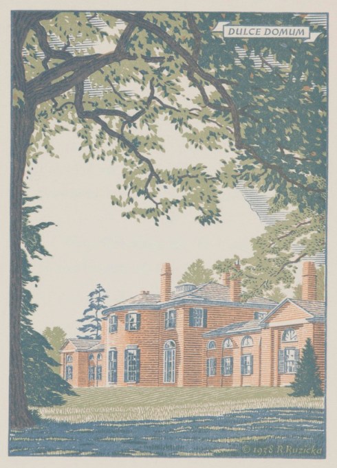


 All images from the collection of the Carnegie Museum of Art; the Harvard Museums also have a large collection of Ruzicka prints.


