Tag Archives: London

Municipal Monsters

In what has become a pattern for me, I was looking for something quite particular, when I came across something that diverted me from my path altogether, this time in the online catalog of the American Antiquarian Society. The item in question was an image–a political cartoon from circa 1845 which depicts a gluttonous Boston consuming the smaller cities of Massachusetts, including Salem–and it immediately commanded my attention, not just because of the Salem reference but also because the “insatiable [urban] monster” depicted reminded me of an underlying perception in early modern Europe, if not before, of the emerging city consuming the countryside. You can easily understand this allegory, given the conspicuous growth of cities in the sixteenth, seventeenth, and eighteenth centuries, paired with an equally conspicuous urban death rate. Apparently this was an issue in America too: though the sentiment seems more economic than demographic on this side of the Atlantic, on both continents it was not only about consumption, but also corruption.

monster-boston-1845 ‘A Nightmare Dream of a Patriotic Politician of the Interior’, c. 1845, American Antiquarian Society

I’ve never been able to find a great image of the emerging “Londonopolis” in the seventeenth century when that term was first used (in the title term of James Howells’ Londinopolis an historicall discourse or perlustration of the city of London, the imperial chamber, and chief emporium of Great Britain, 1657). London more than doubled its population over the seventeenth century, but only later do any “monstrous” depictions appear. Southern England, with London at its center, is the sea monster supporting Great Britain in the late eighteenth-century maps created by Robert Dighton and published under the title “Geography Bewitched”.

municipal-map-london-geography-bewitched-bmRobert Dighton, ‘Geography Bewitched or, a Droll Caricature Map of England and Wales‘, published in London by Bowles & Carver, 1793, British Museum.

It is not overwhelmingly obvious unless you make several connections, but the depiction of a country gentleman apparently escaping that “Sinners Seat”, Whitehall Palace, whose inhabitants ended up in a monstrous hell, captures the moral divide between rural/urban and virtue/vice. The sheer corruption of city hall (the American Whitehall Palace) was never more accentuated than in the anti-Tammany Hall cartoons in wide circulation in the later nineteenth century, in which Tammany is either an octopus or a tiger, preying on the people of New York City and state.

V0047997 A Stuart gentleman is standing before Whitehall, entitled "S

monster-tammany-hall

monster-tammany-tiger-lc‘Sinners Seat’, published: Rob. Walton[London] (At the Globe and Compasses at the west end of St. Paules church & Bon. Church Yard), Wellcome Images; J.S. Pughe, Boss Croker as an octopus consuming City Hall and beyond, Puck Magazine, 1901; S.D. Ehrhart, ‘The Tiger’s Prey’, Puck Magazine, 1913, both Library of Congress.


Conflagration Commemoration

Across the Atlantic, the year-long commemoration of the 350th anniversary of the Great London Fire of 1666 is peaking this weekend, today actually, with a contained conflagration: a 400-foot wooden replica of the seventeenth-century city will go up in flames on the Thames at 8:30 pm tonight. This is only one spectacular event amidst many creative ventures  organized by the arts production company Artichoke, which seeks to”transform people’s lives and change the world through extraordinary art” along with other institutional purveyors. The Artichoke events include illuminations, projections, lectures, interactive performances, pub crawls, a “fire food market” and “fire garden”, all offered under the umbrella of “London’s Burning”, while London’s more traditional institutions are offering a variety of thematic exhibitions and displays. It’s a very complete commemoration, befitting a transformative event in London’s–and Britain’s–history.

Fire of London St Pauls

Fire of London model Flames projected onto the dome of St. Paul’s Cathedral, the symbol of post-Fire London. Photograph: Chris J. Ratcliffe/Getty Images;  the David Best-designed wooden model to be set on fire tonight @artichoketrust.

Fire has played such a huge role in London’s history–not only in the seventeenth century, but also in the nineteenth and twentieth centuries, when another Great Fire of 1834 leveled much of Westminster and the Blitz destroyed much of the central City. The commemoration of tragedy in general, and fires in particular, must necessarily focus on loss and devastation but also on rebuilding–and how the process of rebuilding reflects on the particular society that is engaged in it. I think an incandescent commemoration of 1666 is appropriate because it will illuminate the loss at least as much as the rebuilding–which has always been the focus in remembrance of this particular Great Fire: Wren’s London. We don’t even know how many people died over those three burning days: we have precise knowledge of property damage but a woeful lack of comprehension about the human toll. When the Fire burnt itself out late in the day on September 5 it had consumed 13,200 houses, 87 churches, and St. Paul’s Cathedral and left up to 200,000 people homeless, but how many people?  Who knows: anywhere from hundreds to thousands (doubtless including anonymous souls who had survived the preceding plague year), yet we still seem to repeat the ridiculous number of only six verified deaths. Then as now, it seems that we can only begin to process the enormity of destruction in a visual and structural way.

Griffier I, Jan, c.1645-1718; The Great Fire of London, 1666

Fire of London print BM Griffier

Fire of London print BM after Griffier2 BM

The paintings of Dutch artist Jan Griffier I (c. 1645-1718), who came to London just after the Great Fire, seem to be particularly influential depictions: his view of the burning of Ludgate (Museum of London Collection) was reproduced in scores of prints over the next century and a half (Trustees of the British Museum).


Little British Books

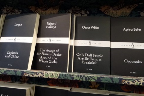
I have a particular predilection for small decorative books published in collectible series, which British publishers are particularly good at producing. I have posted about two of my favorite series before, Britain in Pictures and King Penguins, and on this recent trip I encountered some more! The very traditional and well-stocked Daunt Books, which in addition to selling books has its own imprint, had several series on display in their main store on Marylebone High Street in London, and Waterstones (now managed by James Daunt) had a beautiful display of the new Penguin Monarchs series AND two big bookcases full of classic Penguins. The British love their Penguins, and who can blame them?

Daunt Books London

Daunt Books

Daunt Books Display 2

Candlewick Press Collage

Daunt Books Display

All sorts of books at Daunt including pamphlets: the Candlewick Press “Poetry Pamphlets” are marketed with the pitch phrase “instead of a card”; the “Little Black Classics” were issued in a series of 80 volumes last year to commemorate Penguin’s 80th anniversary.

Penguins Orange

Penguins Blue

Penguin Monarchs

Penguin Monarch Charles II.

Over at Waterstones on Gower Street, there were vintage paperback Penguins in orange and blue, and the new Penguins monarchs series, “ short, fresh, expert accounts of England’s rulers in a collectible format” with commissioned covers. I want all 45 of them (44 kings and queens + Oliver Cromwell, of course).


Ghostly Courtiers

I’ve just got a few more English posts before I get back to the actual streets of Salem: I just took so many great pictures over there if I do say so myself! I’m going back to Hampton Court today–the other side of Hampton Court, which if of course a bilateral palace, with a Tudor side and a Baroque/Georgian one, the cumulative work of Sir Christopher Wren and Sir John Vanbrugh who were commissioned by the last Stuarts and the first Georgians to remodel the entire castle in a more modern (and presumably comfortable) style. If completed, this modernization plan would have resulted in the complete demolition of the Tudor palace but lack of funds and the shifting preferences of monarchs determined that it was (fortunately) not. I far prefer the Tudor palace, inside and out, but I really enjoyed the furnishings, paintings, and overall interpretation of the “Secrets of the Royal Bedchamber” exhibit in the royal apartments on the other side, populated by courtiers all draped in white Tyvek.  Like any old place touched by tragedy, there are rumors of ghosts at Hampton Court Palace, and it as if you are walking among them in these rooms.

20160315_111841_Burst01~2[1]

London 735.jpg

London 724

London 726

London 728

London 727

London 725

London 731

London 730

London 732

Baroque facades–with the Tudor roofline peaking out behind, dining rooms and courtiers; Below, the “Grey Lady” ghost, Sybil Penn, wandering through the palace.

Grey-Lady-low-res


Hooked on Hawksmoor

Well, I am very late to this party but I became absolutely obsessed with the works of British Baroque architect Nicholas Hawksmoor (1661-1736) on my recent trip to London. Hawksmoor’s professional reputation was overshadowed in his own time–and long afterwards–by his association with two more prominent “gentlemen” architects, Christopher Wren and John Vanbrugh, but in the last few decades he seems to have emerged from their shadow. His oeuvre is impressive: under Wren he worked on St. Paul’s Cathedral, the naval buildings at Greenwich, several buildings at Oxford University, Hampton Court and Kensington Palaces and Westminster Abbey, the west towers of which were constructed according to his own design during his tenure as Surveyor General, and he collaborated with Vanbrugh on both Castle Howard and Blenheim Palace. I’ve been to all of these places, but I never associated any of them with Hawksmoor, or thought about Hawksmoor at all, until I saw his Christ Church, Spitalfields, early last week. From that point on the week belonged to Hawksmoor: I scouted out his six surviving London “Queen Anne” churches commissioned by the New Churches in London and Westminster Act of 1710, really looked at the Abbey’s west towers for the first time, and looked on the stately buildings of the Royal Naval College at Greenwich with a new appreciation.

Christ Church Spitalfields

Hawksmoor 1

Christ Church Spitalfields 1950s

Christ Church Spitalfields 1909

21. Christ Church, Spitalfields, London: by Nicholas Hawksmoor 1964 by John Piper 1903-1992

Christ Church, Spitalfields, shining like a beacon at the end of very busy Brushfield Street, afternoon and early evening (after its long restoration, completed in 2004), and in the 1950s and 1909; John Piper, Christ Church, Spitalfields, London: by Nicholas Hawksmoor, 1964, Presented by Curwen Studio through the Institute of Contemporary Prints, Tate Britain.

I just can’t stop looking at Christ Church! And I’m not alone: it has inspired scores of artists and photographers, and authors such as Iain Sinclair, Peter Ackroyd, and Alan Moore. In the poem Lud Heat (1975), which inspired Ackroyd’s (crime? suspense? mystery? not sure how to categorize it) novel Hawksmoor (1985), Sinclair envisions a “psychogeographical” alignment between all of the Hawksmoor churches, and later calls them “eternal” as opposed to the “shimmering trash” of the Docklands (in this great video). Sinclair is absolutely right; these churches do stand out, all of them, not just because of their stature and their distinctive spires but also because they present a rather odd combination of classical austerity and weight.You also have the sense that Hawksmoor was building temples rather than churches: these houses of worship don’t look precisely Christian! One of his six surviving London churches, St. George’s, Bloomsbury, is essentially a classical temple with a steeple on the side rather than the center, at the top of which is not Saint George but King George (I–in Roman dress, presumably he is the Saint), accompanied by a lion and a unicorn. It’s no wonder that our modern secular age admires Hawksmoor, the architect and the Freemason.

Hawksmoor St. Georges

Hawksmoor St. Georges 2.jpg

Hawksmoor St. Georges 3

Hawksmoor’s St. George’s Bloomsbury, completed in 1730; restoration completed in 2006.

Well, I do believe St. George’s was Hawksmoor’s last London church; his earlier ones do appear a bit more traditional/ecclesiastical but still display that distinctive Hawksmoor edge of composition and detail. Here are the rest of his churches, plus two more that he collaborated on with John James: St. Luke’s Old Street in Islington (which features an obelisk steeple!) and St. John’s Horsleydown in Bermondsey, which was demolished after sustaining bomb damage during World War II.

Hawksmoor St Alfrege

Hawksmoor St. Alfrege

Hawksmoor St. Alfrege 3

St. Annes Limehouse

St George in the East

St George in the East rendering BL

Hawksmoor St Mary Woolnoth City

450px-St_Lukes_Islington Hawksmoor

Hawksmoors lost church Bermondsey

St. Alfege Church, Greenwich, 1712-1714 (with window details); St. Anne’s Limehouse, 1714-27 (on the grounds of which there is a pyramid); St. George in the East, Wapping, 1714-1729 (I did not have time to make it out to Wapping, so I have “borrowed” a picture from here and a drawing of the facade from the George III topographical collection at the British Library. Next time!); St. Mary Woolnoth, 1716-27, right in the center of the City of London (very wide and narrow steeple); Two collaborations with John James, 1727-33: St. Luke’s, Old Street and St. John’s Horsleydown, demolished after World War II (from the Collections of the Metropolitan Archives of London). Similar fluted spires, but St. John’s had a comet on top!

So we have all sorts of classical elements, combined with more whimsical ones: columns, pyramids, obelisks, unicorns, comets. Mathematical precision and clocks. I don’t think this adds up to anything particularly pagan, much less sinister (somehow Hawksmoor acquired the moniker “the Devil’s Architect”–I’m not sure if this is a creation of his time or ours): I just think he was a man of his time, which was of course the Enlightenment. Quite a modern man, who ascended to the heights of a gentleman’s profession on his merits alone and worked primarily for institutions rather than patrons. He was impressive and his work remains impressive. I’m not precisely sure what his creative contributions were relative to those of his mentor, Christopher Wren, but I really felt Hawksmoor’s presence at Greenwich, almost as much as Christ Church, Spitalfields: maybe I’m getting a bit “psychogeographical” myself! Unfortunately we don’t seem to have this particular field of inquiry in the States: we’re just not that attached to our built environment to get that introspective about it.

Hawksmoor Greenwich

Hawksmoor Greenwich 2

So now I’m home, with only a few Hawksmoor books to sustain me. I need more: so now I’m going about collecting more texts, and some images that rival, or at least capture, the magnificence of Hawkmoor’s buildings. I really like the work of Andrew Ingamells, who has rendered several of Hawksmoor’s churches in aquatint etchings, and I would almost kill for Pablo Bronstein’s Four Alternate Designs for a Lighthouse in the Style of Nicholas Hawksmoor (Bronstein also designed and commissioned the construction of an actual Hawksmoor beach hut in the form of a lighthouse at  Folkestone, which you can see here).

Ingamells Hawksmoor Collage

Hawksmoor Collage2

Hawksmoor Pablo Bronstein

Hawksmoor books

Trinity and Hawksmoor

Aquatint etchings of Hawksmoor churches by Andrew Ingamells, from a selection here; Pablo Bronstein’s “Four Alternate Designs”, Herald Street Gallery;  Architectural and historical analysis from Owen Hopkins and Mohsen Mostafavi and beautiful black and white photographs by Hélène Binet; just finishing up Ackroyd’s engaging Hawksmoor this morning!


Tudor Texture in London

Besides far superior public transportation systems and many more public smokers, I think the thing that Americans notice the most when they travel to Europe is texture: a built environment that looks comparatively embellished, nuanced with symbolism, and venerable. Despite London’s dynamic growth over the past twenty years or so, there is still a lot of historic fabric in the city–but much of it is deceptively and relatively “modern”, i.e., Victorian. The Houses of Parliament are probably the best example, but scattered around the city are myriad buildings that “look” older than they really are: especially pubs! I was charged with finding Tudor sites in London on this trip: a task that was not as easy as you might think. The successive catastrophes of the Great Fire of London and the Blitz obliterated much of the city’s pre-modern fabric and in between there were those “improving” Victorians! So what remains of Tudor London? Lots of things, primarily to be found in the National Portrait Gallery, Tate Britain, The Victoria & Albert Museum, and the Museum of London. Several places, namely the Henry VII Chapel at Westminster Abbey, St. Margaret’s Church nearby, Lambeth Palace just across the river, and the Tower of London and the sister churches of St. Helen’s Bishopsgate and St. Andrew Undershaft in the City. There is also the Staple Inn of my last post, whose very Tudor appearance probably owes much to an early twentieth-century “restoration”, and St. Bartholomew’s Gatehouse and the oldest residence in London, located on the picturesque City street of Cloth Fair. To the west, Hampton Court Palace, and to the east, Sutton House in Hackney, which was one of the highlights of my recent tour. You can’t quite immerse yourself in the Tudor era in modern London–but you can come close, for an hour or two, if you find the right spot.

Tudor Texture windows

Tudor Texture Queen's

Tudor Texture Sutton Windows

Tudor Texture Sutton Window

Hampton Court 4

Windows into the Tudor era: exterior of the Chapel Royal at Hampton Court (where we attended a service!), featuring the Tudor emblems of the portcullis and rose; looking out from the Tower towards the Queen’s apartments, built c. 1530 for Anne Boleyn; windows at the Sutton House, c. 1535; one of many impressive oriel windows at Hampton Court Palace.

Henry VIII at Hampton Court

NPG 4618; Catherine Parr by Unknown artist

Tudor Texture tomb_margaretcountessof lennox

Tudor Texture Holme Family

Tudor People: Henry VIII at Hampton Court; my favorite of his wives, Katherine Parr at the National Portrait Gallery; the tomb of  his niece (and the grandmother of King James VI and I) Margaret, Countess of Lennox, in the Henry VII Chapel at Westminster Abbey; not quite Tudor-era people but I love this triptych portrait of the Holme family in the Victoria & Albert Museum, c. 1628.

Hampton Court

Hampton Court 2

Hampton Court 5

Sutton House

Sutton House 2

Sutton House 4

Gherkin and St. Andrews

Hampton Court courtyards and Sutton House and its central courtyards in Hackney; St. Andrew Undershaft in the City of London dwarfed by the Gherkin (my photograph didn’t turn out so well as the Gherkin wasn’t so textured; this is one credited to Duncan which I found here. It’s a pretty classic composition now, as you can imagine!)

So now finally for some real interior texture: the Tudors could not bear an unembellished surface and were particular fond of tapestries and wood paneling for their interiors. At Hampton Court, the private Tudor apartments were demolished to make way for the Baroque “restoration” of William and Mary’s reign, but the Great Hall of Henry VIII’s time remains, with its decorated hammer-beam roof and walls lined with The Story of Abraham tapestries. On the day that I was there last week, this room was full of English schoolgirls (in the best uniforms ever) drawing details from the tapestries in close consultation with their teachers, so it was hard for me to get a clear shot of the interior details (plus I was very taken with these uniforms–fortunately there are lots of pictures of the Great Hall online). Later in the week, at Sutton House, I walked around the house in complete isolation and marveled at each and every surface: it was like stepping back in time in some rooms, while in others the National Trust’s conservation/interpretation approach enabled one to look beyond the decorative facade into the bones of the house, which is a must-see for any Tudor fan.

Hampton Court Great Hall

Great Ware Bed.jpg

Sutton House Door

Sutton House doorway

Sutton House Linenfold Paneling

Sutton House plain paneling

Sutton House paneling

Sutton House Details

Sutton House upstairs

Schoolgirls in the Great Hall at Hampton Court; The very famous “Great Ware Bed”, c. 1590, at the Victoria & Albert Museum (this item could have a post of its own); The National Trust’s Sutton House in Hackney: front door, doorway, paneling, details from fireplace surround & hops woodcarving; upstairs drawing room.        


Londonopolis

I have returned from my whirlwind tour of London, which is itself a whirlwind, continuing and even intensifying the dynamic expansion (up and out) that I witnessed the last time I was over there, with no cessation in sight! There’s nothing new about this: the metropolis (Londinopolis, according to the title of James Howell’s 1647 survey Londinopolis an historicall discourse or perlustration of the city of London, the imperial chamber, and chief emporium of Great Britain: whereunto is added another of the city of Westminster, with the courts of justice, antiquities, and new buildings thereunto belonging) emerged in the later sixteenth century and just kept growing all the way up to the twentieth century, when wars stopped and then resuscitated its regular redevelopment. London remains the “chief emporium” of Great Britain, but also of the world. It was difficult to take a picture anywhere in the city without capturing a crane in the background: construction zones abound in every district. And even where there are no cranes there are constant contrasts between old and new–some quite shocking–and some more subtle. But London remains an amalgamation of neighborhoods, and I do wonder what its citizens think of the relentless development pressure. You hear complaints of “blackened” Belgravia, where wealthy foreigners have purchased flats in which they will never live, and “iceberg houses” with hugely built-out basements below ground, but what looks like folly architecture to me seems okay to Londoners. I purchased a book by Rowan Moore, the architecture critic for the Observer, to give some insights into London’s 21st-century building boom during the long flight home, but Slow Burn City was more about anecdotal building than perceptions of planning, for the most part.

I did complete my planned itinerary (including Botticelli Reimagined at the Victoria & Albert, which was ok, but from my perspective presented in backwards order; the Pepys exhibition at the National Maritime Museum, which adhered to its one man’s life and times format without fail, and the AMAZING sixteenth-century Sutton House in Hackney, which will get its own post), and took students to Hampton Court, Westminster, Greenwich, and the Tower of London. The rest of the time I spent in the east end–in Spitalfields and Shoreditch– exploring bustling neighborhoods that I didn’t know very well, inspired by the wonderful blog Spitalfields Life and steadfastly avoiding the Salem-like Jack the Ripper Museum, which was supposed to be about the lives of the female victims (and working-class women in general) but is somehow not. Spitalfields is surrounded by modern buildings but its core is eighteenth-century, and it has been a long-time refuge for immigrants: French Huguenots in the seventeenth and eighteenth centuries, Irish and Jews in the nineteenth, and Bangladeshi today. It is home to the Old Spitalfields Market, which is probably the best market in London, a city of great markets. I fell hard for an architect there, and I don’t mean my husband (who came along): one sight of Nicholas Hawksmoor’s Christ Church, Spitalfields and I was a goner–so he’s going to get his own post too.

Some of my favorite places and photographs: more focused posts to follow all week.

London Staple Inn

London Staple

London Liberty

London Busts

Real Tudor and Faux Tudor: Two of my favorite buildings in London: the Staple Inn in Holborn and Liberty of London; busts from Liberty, the National Maritime Museum in Greenwich, and the Victoria & Albert Museum.

London Trooping

London Tower View

London 483

London Tower

London Graffiti Collage

London V and A courtyard

London Greenwich.jpg

Troops trooping near Buckingham Palace; In the Tower yard; armour in the White Tower; “graffiti” on window frames in the Tower and at Hampton Court Palace; The view from the White Tower–fortress against modernity! In the garden at the Victoria & Albert; the view south across the Thames from the Royal Observatory, Greenwich.

London St Pancras

Pancras todayLondon Marleybone 2

London Marylebone

London Placques

The amazing St Pancras train station and adjoining hotel, saved from demolition by Poet Laureate John Betjeman, whose statue is prominently situated inside; Marylebone streets; a few blue placques.

London 455

London Spitalfields

London bags Spitalfields

IMG_20160313_215701[1]

IMG_20160320_155918[1].jpg

London Fournier

Very Vibrant Spitalfields: Nicholas Hawksmoor’s STUNNING Christ Church, Spitalfields (completed 1729) with which I am OBSESSED; the view from the Church: old and new buildings encasing the market; a few items from the market (thanks Carol!), the beautiful Fournier Street; an effigy of London Mayor Boris Johnson (or Donald Trump)?


Off to London, Leaving Links to Salem Ladies

I’m off to London for Spring Break so will not be posting for a while, but I wanted to leave some links to some of the posts I’ve written on Salem women to fill in for me in my absence. It is Women’s History Month after all, and some of these ladies did not get the love and attention that I feel they deserved! Finding these ladies was an exercise that convinced me that I need to figure out how to develop an index for this compendium when I get back.

I know London is not the typical Spring Break destination, but it is always my favorite destination: for this particular trip (on which I will be accompanied by students!!!!) I have the Botticelli Reimagined exhibition at the Victoria & Albert Museum on my agenda as well as Samuel PepysPlague, Fire and Revolution at the National Maritime Museum, and I really want to visit Sutton House in Hackney, as Tudor structures are relatively rare in London. Then all (or some) of the usual places. I know London pretty well but am open to suggestions (particularly for food–I never know where to eat) so comment away: I am not bringing my laptop but will check in with my phone.

Botticelli London Vand A

Pepysp

Sutton House Hackney

A Botticelli variation, a Pepys poster, and a drawing-room in Sutton House, Hackney.

So here are some links that will lead you to Salem ladies, if you are so inclined. Despite years of blogging, I’ve hardly scratched the surface when it comes to interesting and notable Salem women, as I have sought to expose those whose stories don’t get told again and again and again. I seem to be drawn to artists, but there are lots of entrepreneurs and activists and just interesting women whom I have yet to “cover”–some men too!

Colonial women: A Daring Woman; Ann Putnam; The Pardoning of Ann Pudeator; Four Loves; Minding the Farm.

Authors:  A Scribbling Woman from Salem; The Little Locksmith; Mary Harrod Northend; Mrs. Parker and the Colonial Revival in Salem (could also go under “artists”); Tedious Details.

Artists:  Painting Abigail and Apple Blossoms; Fidelia Rising; Miss Brooks Embellishes; Salems Very Own Wallace Nutting;Paper Mansion.

Uncategorized:  The Mysterious Miss Hodges; A Salem Suffragette; The Woman who Lived in my House;  Ladies of Salem; A Salem Murder Mystery; The Hawthorne Diaries; Factory Girls and Boys; Little Folks and Black Cats; Bicycle Girls.


John Dee, Renaissance Man

The first ten or so years of my teaching career I would bring up John Dee (1527-1609) in one of my classes–he’s relevant to most of them really, whether it’s English history, or Atlantic history, or my courses on the early modern witch trials or the Scientific Revolution–and my students would look perplexed:  who? Once I told them a bit about the “Arch-Conjurer of England” they definitely wanted to know more, but they had no prior knowledge. That all changed about a decade ago when the first book in Michael Scott’s adolescent novel series The Secrets of the Immortal Nicholas Flamel was published, which features John Dee as a central character (Joan of Arc, Machiavelli and Shakespeare also show up as the series unfolds): now I’ve got a generation of students who know all about John Dee, or at least they think they do: in any case, the stage has been set.

(c) Wellcome Library; Supplied by The Public Catalogue Foundation

Anonymous English Artist, John Dee, c. 1594. Wellcome Library; Supplied by The Public Catalogue Foundation

For me, Dee represents one of the last generations of men who could pursue “magic” and “science” at the same time: his life’s work represents just how blurry the line was between these two endeavors in the sixteenth century. He’s also a great example of the multi-faceted Renaissance Man, or at least an English example thereof. It’s really difficult to confine Dee’s interests and activities to a short blog post, but I’ll try: he was first and foremost a mathematician, but this foundational field drew him into so many others: astrology, astronomy, alchemy, geography, cartography, linguistics, cryptography, optics. He started out his professional life, while still in his teens, as an academic, but clearly sought to be a courtier, and enjoyed a close relationship with Elizabeth I, who at one point called him “hyr philosopher”. This connection gave him security, prestige, and influence, which he used to advocate for a stronger imperial policy for England; indeed he is generally credited with coining the term “British Empire”. It must have enriched him too, as he spent considerable money (and time) amassing a huge library which he installed at his primary residence at Mortlake, just outside London. He was an avid manuscript-hunter, pursuing and collecting all written knowledge on “high” (learned) magic, predominately alchemy and cabalism. But written, human knowledge was never enough for Dee: he came to believe that all of his questions could be answered only by beings of a higher order: angels. His pursuit of communion with the angels ultimately drove him down a path that threatened both his livelihood and his reputation, as a Renaissance magus practicing learned, “white” magic had to be very careful not to cross the line into the “black” arts of divination and necromancy in this age of intensive witch-hunting. Dee died a natural death, but lost his fortune, and his complex character was reduced to that of Prospero and Dr. Faustus by his contemporaries Shakespeare and Marlow.

(c) Wellcome Library; Supplied by The Public Catalogue Foundation

The Victorian View of Dee as Conjurer: Henry Gillard Glindoni (1852-1913), John Dee Performing an Experiment before Queen Elizabeth, c. 1880,Wellcome Library; Supplied by The Public Catalogue Foundation. Apparently the skulls in the original painting were painted over at some point!

Modern scholars (as well as authors of adolescent fiction) love Dee and have restored much of his complexity, but it is a difficult task to reconcile the scientist and the spirtualist. And now there is a new exhibition of materials (and instruments) from his own library at the Royal College of Physicians Museum in London: Scholar, courtier, magician: the lost library of John Dee. Perhaps this is an opportunity for Dee to “speak for himself”: the RCP website states that: “Our exhibition explores Dee through his personal library. On display for the first time are Dee’s mathematical, astronomical and alchemical texts, many elaborately annotated and illustrated by Dee’s own hand. Now held in the collections of the Royal College of Physicians, they reveal tantalising glimpses into the ‘conjuror’s mind’.” I’m bringing students in my Tudor-Stuart class over to London during spring break this year, and this is on my itinerary–I think we can build on Nicholas Flamel a bit.

johndeemagic02-768x512

johndeemagic06-768x512

johndeemagic09-768x802

John Dee’s own illustration of a page of the complete works of Cicero. (‘Opera,’ published Paris, 1539–1540) (© Royal College of Physicians / John Chase);  A horoscope chart scribbled in the lower margin of Claudius Ptolemy’s Quadriparti, Venice, 1519 (© Royal College of Physicians / John Chase); another great Dee doodle of three bearded faces in the margin of a treatise on alchemy (Arnaldus de Villanova, ‘Opera,’ published Venice, 1527) (© Royal College of Physicians / Mike Fear). You can see more items from the exhibition here.


Olympic Posters

It was nice to see and hear the traditional ringing of the bells in Britain yesterday, signalling the beginning of the London Summer Olympics. Nearly all of the British institutions that I regularly “visit” have their own take on the Olympics this summer:  the Museum of London has a general exhibit, while the British Museum focuses on medals and the British Library offers up Olympex 2012, an exhibition on collecting the Olympics. My favorite Olympic-themed presentation, thankfully very accessible on-line, is the Victoria & Albert Museum’s presentation, A Century of Olympic Posters . It’s so interesting to see how the posters reflected the times in which they were produced, while at the same time projected national images to the world which were carefully chosen by the host countries.

There was no official Olympics poster until the 1912 Stockholm Olympics, but it seems appropriate to begin with the program(me) cover for the first London Olympics, held in 1908 at the newly-constructed White City Stadium in Shepherd’s Bush.  This Olympiad was originally scheduled to be held in Rome, but the eruption of Mt. Vesuvius diverted it to London. It’s a nice nostalgic image, and you can see the White City in the background.

The first official Olympics poster, printed in 16 different languages and alternative formats, was the work of Swedish artist Olle Hjörtzberg,. The original design, featuring completely naked athletes in a reference to the ancient Olympics, was replaced by this version, with its strategically-placed streamers, but this was a bit controversial too.

After a long break due to World War One, the Olympics resumed in war-devastated Belgium for the 1920 Antwerp games. Maybe it’s just my own national bias, but that looks like a very prominent American flag on the poster:  perhaps an expression of gratitude for the timely entry of the US into the war?  The poster for the 1924 Paris Olympics by Jean Droit has become iconic, and we first see the five Olympic rings representing the continents of the world on the posters for both the 1928 Olympics:  summer (Amsterdam) and winter (St. Moritz).

The poster for the 1932 Los Angeles Olympics, the first to be held outside of Europe, looks a bit odd to me:  apparently the artist Julio Kilenyi sculpted the figure and then photographed it, and I’m not sure how the lettering was produced.  There’s very little sense of place here; it does not read Los Angeles or America to me, but it’s interesting that “California” had to be added.  I suppose that the City of Angels was not yet the international city that it would become.

Few images are as ominous as the official poster for the 1936 Berlin Olympics with its menacing Nazi symbolism and the Four Horsemen, which can only be seen as the Four Horsemen of the Apocalypse in historical perspective.  And then there are two very similar, one might say identical, posters from the canceled 1940 and 1952 Helsinki Olympics.  Clearly Finland–and perhaps the world–decided to pick up where they left off.

There is some semblance of place in the Helsinki posters, but I think that emphasis becomes pronounced in the post-war era, beginning with the image of the second British Olympics, the so-called “Austerity Olympics” of 1948. Jumping forward to the early 1960s, the sense of place seems to overwhelm the sheer athleticism of the earlier posters in the images from the 1960 and 1964 Olympics in Rome and Tokyo.

Of course, the images get more abstract and symbolic in the later 1960s:  the poster for the Mexico games represents the psychedelic age perfectly, as does one of the slightly-cynical images of the 1976 Montreal Olympics.

The posters for the more recent games just don’t seem as textured to me as those from the past, although I really like the official poster #1 from the 2000 Sydney games, “Peace Roo”, designed by David Lancashire. The trend seems to be for whole series of posters to be produced rather than just one, representing individual sports as opposed to the entire event. This was certainly the case for the Barcelona Olympics in 1992, which was represented by over 50 posters, and the organizers of the third London games commissioned posters from 12 eminent British artists. Pictured below is “For the Unknown Runner” by Chris Ofili, who used the vase outline to reference the Greek origins of the games.