Tag Archives: Decorative Arts

Floorcloths

There is one small place in my house where the dreaded fake brick vinyl flooring that once covered an entire hallway still lies: in my mudroom. I kept it there for sentimentality’s sake and because it is a mudroom, so it is mostly covered by sneakers, boots and flip-flops, depending on the season. But now “bricks” are tearing off and I think I’ve had enough: rather than replace with vinyl or tile, neither of which I particularly like, I might go for a custom reproduction floorcloth, based on a sample secreted under one of my china cabinets. I’m thinking this pattern covered the entire dining room, as this part of the house was built at just about the time that new “linoleum” (flax and linseed oil) floorcloths replaced the less durable cloth and canvas varieties following Sir Frederick Walton’s 1860 invention: despite his patent, these new “carpets’ often based on older patterns spread like wildfire on both sides of the Atlantic. My husband says the original flooring was wood, but then what is this little demilune patch of linoleum doing in the cabinet?

Floorcloths 042

Floorcloths 045

I suppose he could be correct: this covering might date from the 1920s, when “linoleum rugs” seemed to be all the rage. Glancing through Frank Alvah Parsons’ Art of Home Furnishing and Decoration, conveniently published by the Armstrong Cork Company in 1919, I spotted “linoleum designs for every room” including several that are similar to my china cabinet sample. Floorcloths seem to evolve from area coverings to wall-to-wall “carpet” over the nineteenth-and early twentieth centuries, following Walton’s invention. And then wooden floors came back into fashion, and my little linoleum went into the closet.

Floorcloth 1811 MET

Floorcloth Crawford House BIG OLD HOUSES

Floorcloth 1919

Floorcloths from c. 1810 to 1920: the Drawing Room of the Craig House in Baltimore, c. 1810, a period room at the Metropolitan Museum of Art; the Captain David Crawford House in Newburgh, New York (from the great blog Big Old Houses); illustration of a living room from Parsons’ Art of Home Furnishing and Decoration (1919)

Whenever it dates from, I do like the pattern (though not the colors), and there are many floorcloth options out there; in fact we seem to be in the midst of a floorcloth Renaissance. One major manufacturer for both museums and individuals (out of her Vermont farmhouse) is Lisa Curry Mair of Canvasworks Floorcloths. There are all sorts of patterns on her site, available in different sizes, and custom options too:  I might request a reproduction of my linoleum patch in a less muddy color for my mudroom and something a bit more 1827ish (the year my house was built) for our entry foyer—now covered rather inconveniently with carpet.

Tumbling Blocks

blockandscrolls

“Tumbling Blocks” and “Blocks and Scrolls” floorcloths from Canvasworks Floorcloths


Boscobel (American)

A few more road-trip posts—then it’s back to Salem and work: I’m prepping for two summer courses and have several scholarly projects on the back burner. Every time I am in the Hudson River Valley visiting my brother, I go to see one or more of the grand estates in the region. On this particular trip, I was looking forward to seeing two Gothic Revival houses in the southern part of the Valley: Washington Irving’s Sunnyside, and nearby Lyndhurst. However, I presumed too much; I happened to be passing through on a dreaded Monday when most museums are closed, these two house museums included. Next time. Proceeding north toward my brother’s house in Rhinebeck I passed by the grounds of another estate which I had not seen–and the gate was open, so to Boscobel I went. I have to admit to a certain snobbiness on my part regarding Boscobel; it’s never been high–or even on–my “must visit” list for several reasons. First of all, it’s a Federal house, built between 1804 and 1808 by Loyalist  States Dyckman (actually he died just after the foundation–his wife Elizabeth oversaw its completion). Now of course I love Federal architecture, but being from Salem I always assume that we have the best Federal houses right here: it’s Samuel McIntire or nothing for me! And as an English historian, the word “Boscobel” means only one thing to me: the English house where Prince Charles/Charles II hid out from Cromwell’s troops following the Battle of Worcester in 1851. So this Boscobel could only be a pale imitation–of either McIntire or the original. I also have a slight prejudice against historic houses that are transplanted, as this American Boscobel was:  it was originally built in the slightly-more southern Hudson hamlet of Montrose, but moved to its present location in Garrison in 1961 (in pieces!) after it was threatened by demolition by a Federal construction project. But all of these “reasons” were stupid: Boscobel is well worth seeing: it has been meticulously reconstituted and its present site is simply stunning, with beautiful grounds and one of the most striking Hudson views I have seen–just across from West Point.

Boscobel 2

Boscobel 3

Boscobel 5

Boscobel 6

Boscobel 7

Boscobel: front, back (entrance from street), views from the house and river’s edge; herb garden and orangerie.

The interpretation of the house was also interesting–how it came to be and how it was reconstituted–particularly in regard to its furnishings. As a Loyalist, Mr. Dyckman had spent the Revolution in England and had bought lots of pieces while there, but Mrs. Dyckman seems to be have been more devoted to American furniture makers–including Duncan Phyfe. As all the furnishings were dispersed when the house went into decline from the late nineteenth-century on, its recreators had to either find original pieces or choose appropriate substitutes. It has been an ongoing process, but the house’s interior certainly gleams in perfect Federal fashion. I couldn’t take any pictures but the website seems to feature all of the rooms. The grounds were adorned with sculptures, the herb garden (though decidedly not in the right place) was in full bloom, and I got some more clues for my evolving research into in the relationship between English Royalists of the seventeenth century and American Loyalists of the eighteenth: altogether a very enlightening visit.

Boscobel

Boscobel 4

Boscobel in pieces, c. 1960; the grounds today.


Fabric for the Fouth

I’ve been rather casually researching how the Fourth of July was commemorated on its Centennial in 1876, and while all the attention is generally focused on the great Philadelphia Centennial Exposition, I have come to appreciate all the special fabrics that were produced that year, material girl that I am. Textiles are key to this celebration: as the United States was in the midst of its industrial revolution, machine-made fabrics were featured prominently in the Exposition’s displays, and it also had a special focus on the “women’s sphere” and the domestic arts. Of course textiles are always a central feature of Independence Day celebrations: even more than fireworks, the Fourth is all about flags, swags, and bunting. As I write, I’m looking at the flag runner on my dining room table, a flag pillow on a nearby chair, and flags flying outside. In 1876, I think they were much more lavish–and much more creative–with patriotic displays of fabric. On the way home from my recent road trip, I passed through the northwest corner of Connecticut and the pretty town of Litchfield, where the Historical Society was featuring an exhibition on the Colonial Revival called “The Lure of the Litchfield Hills”. I enjoyed seeing all the items in the exhibition immensely, but was particularly taken by a child’s drummer costume for the Litchfield Centennial parade. So this would be the first item in my own little collection of Centennial textiles, followed by a banner made for Salem’s 1876 celebrations, a beautiful Centennial coverlet from the amazing inventory of Jeff. R. Bridgman, Antiques, and two Centennial quilts from the collection of the Smithsonian’s National Museum of American History. You can see the centrality of the Philadelphia Exposition; the custom of the time was to incorporate souvenir handkerchiefs into memento quilts, as Mary Stow and Esther Cooley evidently did. To round out my collection I must have one of these very handkerchiefs (from the Metropolitan Museum of Art), and of course, a Centennial Flag (from the New York Historical Society).

Fabric

Fabric Salem Banner

fabric coverlet

Fabric Quilt smithsonian stow

Fabric Centennial Quilt Smithsonian

Fabric handkerchief 1876 MET

Fabric Flag NYHS 1876


Wicker Men

Over the past few days I was exposed, for the first time, to the wild photographs of Charles Fréger’s Wilder Mann series, featuring participants in neo-neo-neo-(many neos-) pagan rituals, as well as the classic 1973 horror film The Wicker Man (I’m not sure horror is the right word, it’s actually quite funny), so now I am thinking about Wicker men, in all their various incarnations. The Wicker Man is a pre-Christian, “barbarian” entity and practice, referred to in Greek and Roman sources ( Julius Caesar, Strabo), and then, like everything classical, rediscovered in the Renaissance. According to the legend, the Celtic practice of human sacrifice involved effigies of great size interwoven with twigs, the limbs of which are filled up with living people which are set on fire from below, and the people are deprived of life surrounded by flames. It is judged that the punishment of those who participated in theft or brigandage or other crimes are more pleasing to the immortal gods; but when the supplies of this kind fail, they even go so low as to inflict punishment on the innocent. (Caesar, De Bello Gallico, 6.16). A century later, Strabo writes that having devised a colossus of straw and wood [the Celts] throw into the colossus cattle and wild animals of all sorts and human beings, and then make a burnt-offering of the whole thing (Strabo,Geographia, 4:5). Of course neither “observer” actually saw these great burning behemoths, but that doesn’t matter: their names were influential enough to establish the Wicker Man as fact even before their texts made it into print (for good discussions of some material evidence, go here and here), and after that, it was all over.

The literary descriptions of the Wicker Man are so graphic that they inspired some great artistic depictions in the early modern era, particularly in the later seventeenth century. Once the religious dissension of the Reformation had cooled, authors (and their illustrators) were once again free to explore the pre-Christian past. A particularly influential image of Julius Caesar’s Wicker Man comes from Aylett Sammes’ Britannia antiqua illustrata (London, 1676): only the hairstyle changes in the succeeding centuries–and the sacrificial lambs get a bit more numerous and detailed.

Wicker Man 1676-001

the-wicker-colossus

Wicker Man 19c-001

Wicker man 1903 Wellcome

Wicker Man Movie Still-001

Wicker Men from Aylett Sammes, Britannia antiqua illustrata (London, 1676); Robert Sanders, The Complete English Traveller (London, 1771); The History of the Nations of Europe (19th century); Charles Wellcome’s Hen Feddegyaeth Kymrie (Ancient Cymric Medicine, 1903), and the 1973 film (©Archive Photos/Getty Images).

I don’t want to be restrained to this particular conception of the Wicker Man; after all it is (nearly) summer, the season of wicker! Certainly the real wicker men (and women) of the past would have been the itinerant street hawkers, carrying their wares in wicker baskets. The ultimate wicker man of this type is certainly the street basket-seller for Carle Vernet’s Cries of Paris series (c. 1820): he is a basket man. A more modern, and much more comfortable, “wicker man” is Robert Louis Stevenson, as depicted by John Singer Sargent in 1887. Commerce and comfort: wicker has been tamed.

Wicker Man Cries of Paris Vernet

Robert_Louis_Stevenson_c

John Singer Sargent, Portrait of Robert Louis Stevenson, 1887, The Taft Museum, Cincinnati 


Willow Ware Redux

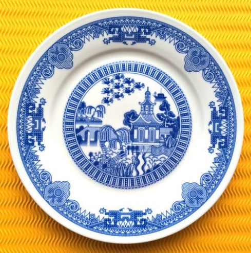
I am not fond of blue-and-white china (or anything blue, to tell you the truth), nor do I particularly like the Willow pattern, one of the most popular and replicated in the western world for several centuries. But I do love both the idea and the act of updating something that is classically familiar—even overly familiar–in a clever and creative way. So when I saw a little story about Calamityware, in which flying monkeys and flying saucers, along with robots and Renaissance sea creatures, are right there on the plate along with the traditional “Chinese” structures, figures, and landscapes, I went right to the source: artist Don Moyer’s site, on which his earlier drawings are coming to life (or pottery) on a Kickstarter-funded production line. So many things about these plates appeal to me (despite their color): they are blatantly anachronistic, purely whimsical, and perfect examples of my favorite fusion of past and present, traditional and modern, new and old. The flying monkeys were first off the line, and we may see kings and oligarchs later, though surely they won’t be as scary.

Calamityware

New Willow Ware Calamity 2

New Willow Ware Calamity 3

Calamityware is not the first variation on the Blue Willow pattern; in fact it was inspirational almost from its inception–and wildly popular. I’ve got a bowl full of Willow shards uncovered in my back yard when I was digging out my herb garden. Willow ware was first produced in the late eighteenth century by Thomas Minton, an English potter who adapted designs featured on Chinese export porcelain for domestic production. There was no patent protection, and his competitors–Wedgwood, Royal Worcester, Spode–began producing their own Blue Willow, and continued to do so for the next two centuries. In an early stroke of advertising genius, a story was composed to sell the dishes: when a powerful Chinese lord discovers that his daughter has fallen in love with his lowly clerk, he locks her up in a secluded pagoda behind a fence and betrothes her to a rich and elderly duke. The young couple flee before the wedding, but are hunted down and killed (there are different versions of their deaths). True love prevails, however, as the gods transform the lovers into a pair of lovebirds which remain together forever, hovering above the willow tree that once shaded their clandestine meetings. The story expanded the reach of Blue Willow–beyond the pottery business and into popular culture: poems, books, textiles, and pictures told the Blue Willow love story over and over again in the Victorian era, and after.

Willow ware Spode V & A-001

New Willow Wares Mercer-001

Spode Blue Willow plate, c. 1800-1820, Victoria & Albert Museum; Joyce Mercer (1896-1965) illustration, 1920s.

And now, Willow ware seems to be having a moment, once again. In fact, this “moment” seems to encompass the past decade or so, or perhaps the pattern, in all of its variations (and colors–I could go for the red), is always having a moment. And that, of course, is the definition of classic. In 2005 ceramicist Robert Dawson digitally-designed a line of “After Willow” dishes for Wedgwood, and more recently we have Pokemon Willow by Olly Moss (note the lovebirds, still flying above!) and there are more calamities to come.

Willow Ware Dawson V and A-001

pokemonwillow


Here be Hedgehogs

Well, it’s actually Hedgehog Awareness Week, so I feel that I need to do my part. I always decorate with animals, and generally it’s a seasonal cycle of snails/foxes/deer/rabbits with a few individual oddities, but just recently I bought a cute ceramic hedgehog so I was thinking about about expanding my menagerie…..and then came Hedgehog Awareness Week! Interesting and historical images of hedgehogs are not difficult to find: medieval illustrators often inserted urcheons/urchins into the margins of their manuscripts and there are also several tales to inspire images: Aesop’s Fox and the Hedgehog ( a title that was adapted by Isaiah Berlin for his classic essay on types of thinkers, inspired by the observation of Archilochus that the fox knows many things, but the hedgehog knows one big thing), the Grimm brothers’ Hans-my-Hedgehog and The Hare and the Hedgehog, and a host of other hedgehog stories penned (and drawn) more recently. There are hedgehogs in Alice’s Adventures in Wonderland and Peter Rabbit: they are a cute and easy addition to any illustrated story. So it was difficult to narrow down my collection of hedgehog images, but here goes.

Medieval Urchins (hence Sea Urchins!):

Hedgehog BL 2-001

Hedgehog Egerton-001

Add. 39636, f. 13.

Hedgehog and Ape-001

British Library MS Harley 3244 f. 49v (13th c.); MS Egerton 1121 f. 44v (15th c.–the hedgehog mocks the goat admiring his reflection in a stream); MS Additional 39636, ff. 13  (15th c.–St. Benedict and a hedgehog); Royal 15 E IV f. 180 (15th c.)

Some early modern hedgehogs: because of his voracious appetite and hibernation habit, the hedgehog often represented gluttony, as on the flag below, and his round silhouette was made for mockery:

Hedgehog vices BM-001

Hedgehog and Hare BM-001

Hedgehog 1777 BM-001

British Museum engraving of the Vices by Heinrich Aldegrever, 1552; engraving after Marcus Gheeraerts’ illustrations of Aesop’s Fables, c. 1630; satirical print of “Miss Hedgehog” published by Matthew Daly, 1777

Whimsical and utilitarian hedgehogs, 19th-21st centuries:

V0049518 A crowned fairy king seated on a hedgehog drawn by a young g Hedgehog Bulb Pot Wedgwood V and A 1820-001

Hedgehog Pincushion-001

Hedgehog May-001

The King of the Fairies rides his hedgehog, 19th c., Wellcome Library Images; Bulb Pot by Josiah Wedgwood, 1820, Victoria & Albert Museum; Hedgehog pincushion (there’s a long tradition of these!), Tatjana Ceramics; Calendar Page for May, Catherine Bradbury,© Catherine Bradbury, Bridgeman Art Library / Private Collection


Emulating Salem

I’ve been trying for quite some time, in several posts, to place Salem squarely in the center of the Colonial Revival design movement of the later nineteenth and twentieth centuries–and not just the artistic and academic movement, but also its more popular expressions. This is a continuing exploration, and as I am trained not as an art historian, or even an American historian, but a plain old English historian, I’m not sure that I’m searching in the right places or looking at the right sources. Right now I’m particularly interested in the broader impact of the period rooms installed in several major American museums after George Sheldon (at Deerfield in the 1880s) and George Francis Dow (at Salem’s Essex Institute in 1907) created the first period-room displays. By the 1920s and 1930s period rooms seem to have been assembled in most of the major American art museums, among them distinct Salem rooms such as that established by architectural historian Fiske Kimball at the Philadelphia Museum of Art in 1923 and the South Bedroom/later “McIntire Room” at Winterthur.

Salem Room Philadelphia MA

Salem Room Winterthur McIntire Room

The Salem and McIntire Rooms at the Philadelphia Museum of Art and Winterthur Museum.

I don’t think that it is a coincidence that you see advertisements for reproductions and adaptations of “Salem” furniture from this very same era, though the inspiration could be traced to many sources. Several major American furniture manufacturers, including Karpen Furniture and the Erskine-Danforth Corporation, produced entire lines of “Early American” reproductions. The latter’s Danersk line, advertised with accompanying Salem ships, seems like the very epitome of the popular Colonial Revival.

Salem Room

Salem Room 1928

The “Salem Room”: 1928 vignette by Edgar W. Jenney, who specialized in the depiction and reproduction of historical interiors and worked to preserved them–most notably on Nantucket.

Salem Room 1926p

Salem bed with border

1926 advertisements for Danersk Early American furniture, Erskine-Danforth Corporation.

It’s not really Salem-specific, but I can’t resist referencing the great 1948 Cary Grant/Myrna Loy film Mr. Blandings Builds his Dream House here, because it both exemplifies and mocks the longstanding influence of the Colonial Revival in America. After an interior decorator (named Bunny Funkhouser!) sketches an over-the-top “Colonial” living-room redesign for the Blandings’ NYC apartment featuring a cobbler’s bench, pie safe, and spinning wheel, they decide to decamp for the real thing in Connecticut. When their authentic colonial is deemed unsound, they level it and build a neo-Colonial, a bit more refined than Funkhouser’s sketch certainly, but most definitely Colonial in inspiration and design. I can’t find a still of the Funkhouser room, but you’ve got to see it to believe it.

Blandings


Ringbearers

As part of their midterm exams last week, I gave my Renaissance students several images to analyze, including one with a very earnest brown-eyed man holding–no, bearing a ring:  was he mourning a deceased wife or fiance, was he himself a lost husband, or more mundanely, was he a goldsmith advertising his wares? These are the usual interpretations, and my students came up with more interesting ones. There are a surprising number of these ringbearing portraits, maybe not enough to classify as a sub-genre, but certainly more than I realized. Most art historians seem to think the portrait below depicts Bolognese goldsmith and painter Francesco Francia.

Francesco del Cossa. Portrait of a Man with a Ring 1472

Francesco del Cossa, Portrait of a Man with a Ring, c. 1472-77, Museo Thyssen-Bornemisza, Madrid.

There is also a theory that this ringbearing young man was a member of the prominent Este family of Ferrara, which means he might be related to this other Francesco below, appearing in this striking portrait by Rogier van der Weyden. Franceso d’Este bears a ring and a hammer, which the curators at the Metropolitan Museum of Art believe might be jousting prizes or symbols of power. I had not thought of jousting prizes before, and while the hammer looks powerful, not sure about the ring.

Ringbearers van der Weyden

Rogier van der Weyden, Francesco d‘Este, c. 1460, Metropolitan Museum of Art, New York.

This has got to be a northern Renaissance device/motif that found is way to Italy, like oil painting in general and portraits in particular. The earliest ringbearing portraits I could find were painting by Jan Van Eyck and one of his “followers”: the first painting is Van Eyck’s incredibly intimate portrait of Bruges goldsmith Jan de Leeuw, and the second is simply titled Young Man Holding a Ring. I have always found the de Leeuw portrait strikingly modern. The curators at the National Gallery of Art in London, whose collection the latter painting belongs to, explain the ring rather conventionally in terms of trade and/or impending marriage, but there is an inscription here (Lord, Let it Pass) so maybe things were a bit more complicated?

Jan_van_Eyck_-_Portrait_of_Jan_de_Leeuw_-_WGA7609

(c) The National Gallery, London; Supplied by The Public Catalogue Foundation

Jan Van Eyck, Jan de Leeuw,c. 1436, Kunsthistorisches Museum, Vienna; Follower of Jan Van Eyck, Portrait of a Young Man Holding a Ring, c. 1450, National Gallery of Art, London.

Don’t get me wrong–I think it’s enough that these goldsmiths are being “captured”: such a great example of the relatively egalitarian and aspirational aspects of Renaissance society and culture. I just wish I knew the whole story behind these interesting portraits. I’m the most curious about the sole woman in this group: the mysterious and beautiful subject of Lorenzo di Credi’s Portrait of a Woman (c. 1490-1500). Most likely the widowed daughter of a goldsmith, or perhaps the widow of the artist’s brother, she is clearly not showcasing her own creation but rather commemorating a relationship.

Ringbearer Lorenzo di Credi

Lorenzo di Credi, Portrait of a Woman, c. 1490-1500, Metropolitan Museum of Art, New York.

Two other images speak to the Renaissance fascination with jewelry and jewellers, which I think might be both literal and symbolic:  one is my absolute favorite painting, Petrus Christus’ St. Eligius as a Goldsmith, variantly titled A Goldsmith in his Shop (1449) in which a couple are pictured in a goldsmith’s shop, presumably about to purchase a ring (with onlookers outside, as well as US). There’s a lot going on here: one of the acts associated with the early medieval St. Eligius was the gift of a gold ring to his contemporary Saint Godeberta before she took her religious vows. Petrus Christus might be portraying Godeberta torn between worldly and holy marriages-and she appears to be reaching towards the latter.

Saint Eligius as a goldsmith by Petrus Christus 1449

Petrus Christus, A Goldsmith in his Shop, 1449, Metropolitan Museum of Art, New York.

And finally there is the symbolic signature (after 1508) of another Northern Renaissance artist. Lucas Cranach the Elder: a crowned black serpent bearing a gold ruby ring. This heraldic device, which also served as Cranach’s coat of arms, appears in many variations (which you can see here) but no one seems to know precisely what it means–perhaps the artist simply thought it looked cool. I’ve always thought that Cranach was the most interesting and enigmatic of northern Renaissance artists, working closely with Luther to advance the cause of the Reformation visually while simultaneously maintaining commissions from the Catholic Church. Throughout his life, he always seemed to be reaching for the brass ring.

signature_of_louis_cranach_the_elder


A Poe Parlor

Last year around this time (of course), the private sales site Joss & Main featured a “Destination Salem” shopping event, comprised of items chosen to conjur up the spirit of my fair city. I was pleased that the selections were not all kitschy witchy, but included some maritime, colonial and Federal (quotations around all terms, please) items as well. This year I’ve been looking out for another Salem collection, but instead the site curators have showcased Design Icon Edgar Allan Poe. Poe is certainly having quite a moment, with his big show at the Morgan Library & Museum! It’s hard to think of him as a “design icon” but he certainly was proficient at setting the scene. The curators of the Joss & Main collection seem to have gone in an exclusively dark and literal direction: all black and gray (think ravens and cats) and no red (think hearts, masques, and blood). I think I can do better.

Macabre Poe NYT Fred R. Conrad credit

Man of the moment Edgar Allan Poe, © Fred R. Conrad, New York Times.

The Salem and Poe collections actually share quite a few items: black-painted tables, windsor chairs, grey upholstery, raven-embellished pillows. There are some nice looking desks, although they’re a bit undersized (why is it that modern desks are so small and coffee tables so big?) I think the items below represent the Joss & Main portfolio quite well.

Bartow+Rug

Macabre Chair Joss and Main

macabre study table

In putting together my Poe-inspired room, I took into consideration two influences. One is Poe himself who, oddly enough, did write an article on interior decoration, “The Philosophy of Furniture”, published in Burton’s Gentlemen’s Magazine in 1840. The other is my more imaginative conception of the Poe ambiance, based on my reading of his works: what I want my Poe room to look like rather than what he would have wanted his room to look like. We obviously have a much clearer vision of the former, and an illustration, as the reading room at the Poe National Historic Site in Philadelphia is decorated according to the preferences laid out in “The Philosophy of Furniture”:  silver-grey walls with lots of crimson and gold accents, landscapes and female portraits, no flowers, minimal window hangings (Poe seems to have had a disdain for swags, like most men I have known), the Empire furniture of his time. Taking all these preferences together, you get a pretty conventional mid-nineteenth century Empire room–I think I need a little bit more texture, a bit more drama, a Gothic air.

Poe Reading Room

Poe doors

Poe Basement

The Reading Room (and spooky basement) at the Edgar Allan Poe National Historic Site in Philadelphia, recreated according to Poe’s “Philosophy of Furniture”.

Poe writes a lot about “arabesque” motifs in his “Philosophy” piece, and the importance of carpets, so I’ve picked the Jaipur “Narratives” carpet below for my Poe parlor, from Joss & Main’s inventory site: this rug has all of his favorite colors, it looks perfect to me. I would keep the Empire sofa that you see above (I already have one), but I am very inspired by the Gothic doors of Poe’s Reading Room, so I would look for some Gothic revival side chairs with a similar silhouette: the perfect one sold in a Doyle’s auction last year, but I need more! In front of the Empire sofa I would put a neo-Gothic table made of metal; there are no “period” coffee tables so you might as well go for something cool.

Jaipur-Rugs-Narratives-Red-Crafts-Rug

Poe Parlor Chair

contemporary-wood-metal-table-65024-1638325

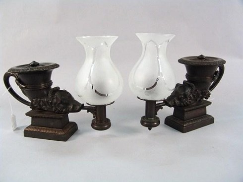
I love this gilded mirror from Christopher Jones Antiques, which is contemporary with Poe: it would go over the mantle of the dark marble fireplace, with two Argand lamps on either side:  the pair below are perfect: they just went for $3500 at a Connecticut auction gallery last weekend.

Mirror

Lamps

Now all we need are some whimsical/literal accessories and finishing touches: footstools and/or drapes in this “Nevermore” fabric, a Poe pillow or two, Raven candles from Target on the mantle, interspersed with these amazing metal sculptures. A great, beating (ticking) clock. I’m not sure about paintings; Poe’s preferred landscapes are boring and (against his wishes) I would definitely have a textured wallpaper rather than plain painted walls. I’m torn between the Pugin wallpapers below, created in 1848 for a client named Lockhart, which might be too much with my rug, and something more silvery and spidery. My Poe parlor is a work in progress.

Poe fabric

Poe Gothic Pillow

Raven Sculptures

PicMonkey Collage


Eastern Carpets on Western Tables

I’m off to New York City tomorrow for a big wedding, and although time is limited, I’ve got to go to at least one exhibition while I am there. I’m torn between the Morgan Library & Museum’s Edgar Allen Poe: The Terror of the Soul  and an equally new exhibition at the Metropolitan Museum of Art:  Interwoven Globe:  the Worldwide Textile Trade, 1500-1800.  I think the latter is going to win out for two reasons: 1) the early modern period is my teaching specialization and; 2) it features textiles–materials, stuff–which is going to win out over literature any and every time. Anybody that has ever studied–or even casually glanced at–European paintings over this long period can see the increasingly liberal display of eastern textiles throughout the era, and most especially in the art of the Renaissance and Dutch Golden Age: this is material evidence of the “interwoven globe”.  The value that was placed on eastern textiles, most prominently carpets, is indicated not only by their appearance but also by their placement; I use a lot of art in my classes, and inevitably my students always ask: why is that oriental rug on the table?

Carpets 1 The Ambassadors

This famous painting, Hans Holbein’s The Ambassadors (1533; National Gallery of Art) is a perfect case in point. I use it to illustrate the ideal of the Renaissance Man: these two young French ambassadors, amidst the symbols of their expertise, with an anamorphic skull lurking in the foreground to warn the viewer against excessive worldliness, create quite the composition. There’s a lot to see and discuss, but inevitably my students ask why is that oriental rug on the table? Before they notice the skull.

Carpets from the Middle East appear in European works of art as far back as the thirteenth century, after the Crusades opened up this exchange, but they become a much more common decorative element several centuries later. Renaissance artists like Carlo Crivelli and Lorenzo Lotto used carpets frequently in their works, so much so that they even have distinct carpet patterns named after them. The presence of the carpet in these paintings immediately conveyed an image of wealth, education and achievement to the onlooker; it was a decorative (but certainly not unsubtle) way of conveying status in this aspirational age.

785px-Lorenzo_Lotto_-_Portrait_of_Giovanni_della_Volta_with_his_Wife_and_Children_-_Google_Art_Project

Carpet 2 Lotto

Lorenzo Lotto, Portrait of Giovanni Della Volta with his Wife and Children, 1547, National Gallery of Art & Husband and Wife, c. 1523, State Hermitage Museum, St. Petersburg, Russia (the carpet is easily understood, but what about the letter and SLEEPING squirrel?)

Jumping  forward to another aspirational era, the Dutch “golden age” in the seventeenth century, and carpets seem to be on every painted table, particularly those of Johannes Vermeer and Gabriel Mëtsu. They appear so often they start to look common, rather than like possessions of the privileged; Vermeer in particular is rather egalitarian with his carpets, which appear in the close proximity of several maids and even a prostitute. Before long, they’ll end up on the floor.

Johannes_Vermeer_-_The_Wine_Glass_(c_1658-1660)

455px-Gabriel_Metsu_-_Man_Writing_a_Letter

Johannes Vermeer, The Glass of Wine, 1658-1660, Staatliche Museen Preußischer Kulturbesitz, Gemäldegalerie, Berlin; Gabriel Mëtsu, Man Writing a Letter, c 1662-1665; National Gallery of Ireland.

PicMonkey Collage

PS. In terms of exhibition souvenirs, I think I prefer the Interwoven Globe tee shirt to the Poe magnet. That clinches it.