I’m not sure when I last posted on trade cards, but it was definitely a while ago. This blog is getting to the point where it needs an index, I fear. I’m always on a rather random hunt for interesting examples of advertising ephemera: I like Salem-related items, but they have to be special in some way. There are just too many stock items out there–plump children, scary clowns, kittens, flowers. So many cards were produced in the last quarter of the nineteenth century (before they gave way to magazine illustrations) that millions survive, preserved as tokens of trade and little windows into the contemporary commercial landscape. Harder to find are cards with interesting shapes, and metamorphic cards, examples of Victorian special effects achieved by holding the card in question to the light, or folding it a certain way. The latter are getting pricey; one (a very rare example of cross-dressers) recently sold on ebay for $150. Here are a few of my recent purchases, and cards which caught my eye: corsets and Frank Cousins, one of my favorite Salem entrepreneurs, are an impossible combination for me to resist, as are horseshoes, Kate Greenaway-esque little girls (an exception to my no children rule) and anything apothecary-related. The amazing die-cut trade cards of a butterfly and what looks like a cracker or biscuit to me but is supposed to be a cake of soap manufactured by Enoch Morgan & Sons, are from Harvard Business School’s Baker Library (which is currently featuring an exhibition entitled The Art of American Advertising, 1865-1910) and the metamorphic card of Uncle Sam drinking coffee is from the Miami University Library’s Victorian Trade Card Collection.
Tag Archives: advertising
Emulating Salem
I’ve been trying for quite some time, in several posts, to place Salem squarely in the center of the Colonial Revival design movement of the later nineteenth and twentieth centuries–and not just the artistic and academic movement, but also its more popular expressions. This is a continuing exploration, and as I am trained not as an art historian, or even an American historian, but a plain old English historian, I’m not sure that I’m searching in the right places or looking at the right sources. Right now I’m particularly interested in the broader impact of the period rooms installed in several major American museums after George Sheldon (at Deerfield in the 1880s) and George Francis Dow (at Salem’s Essex Institute in 1907) created the first period-room displays. By the 1920s and 1930s period rooms seem to have been assembled in most of the major American art museums, among them distinct Salem rooms such as that established by architectural historian Fiske Kimball at the Philadelphia Museum of Art in 1923 and the South Bedroom/later “McIntire Room” at Winterthur.
The Salem and McIntire Rooms at the Philadelphia Museum of Art and Winterthur Museum.
I don’t think that it is a coincidence that you see advertisements for reproductions and adaptations of “Salem” furniture from this very same era, though the inspiration could be traced to many sources. Several major American furniture manufacturers, including Karpen Furniture and the Erskine-Danforth Corporation, produced entire lines of “Early American” reproductions. The latter’s Danersk line, advertised with accompanying Salem ships, seems like the very epitome of the popular Colonial Revival.
The “Salem Room”: 1928 vignette by Edgar W. Jenney, who specialized in the depiction and reproduction of historical interiors and worked to preserved them–most notably on Nantucket.
1926 advertisements for Danersk Early American furniture, Erskine-Danforth Corporation.
It’s not really Salem-specific, but I can’t resist referencing the great 1948 Cary Grant/Myrna Loy film Mr. Blandings Builds his Dream House here, because it both exemplifies and mocks the longstanding influence of the Colonial Revival in America. After an interior decorator (named Bunny Funkhouser!) sketches an over-the-top “Colonial” living-room redesign for the Blandings’ NYC apartment featuring a cobbler’s bench, pie safe, and spinning wheel, they decide to decamp for the real thing in Connecticut. When their authentic colonial is deemed unsound, they level it and build a neo-Colonial, a bit more refined than Funkhouser’s sketch certainly, but most definitely Colonial in inspiration and design. I can’t find a still of the Funkhouser room, but you’ve got to see it to believe it.
The Redcoat Next Door
There is always something interesting going on in Salem. Yesterday my over-the-fence neighbor, a museum interpreter turned screenwriter turned romance novelist, was shooting some six-second Vine videos next door at Hamilton Hall to publicize her forthcoming book, The Rebel Pirate (2nd in the Renegades of the Revolution series). She graciously allowed me to pop over and see the action. As one of the central characters in the novel is a British naval commander, the redcoats are in the picture and it was fun to see one running around the Hall–especially in sneakers (the floor was a little slippery for swordplay). The conceit of the scenes was a romance reader sitting amidst the characters of the novel come to life, and so they were played out, again and again–including a last bit where the characters creep in and turn the pages for her! (Really cute but hard to photograph from afar–look at the Vine). Observing how much effort goes into a six-second film certainly gives one an appreciation for how long it must take to produce a full-length feature! Despite some ongoing window restoration (inside and out), the Hall looked great and provided the perfect romantic setting.
P.S. This was not the only Salem “set” I visited this past year: now that it is beginning to get accolades, I do want to remind everyone that several scenes of American Hustle were filmed in Salem last spring—see my post Filming on Federal.
Electri-city
When I started blogging three (!!!) years ago I really didn’t think I would feature Salem quite so much; I chose the name Streets of Salem because it’s a nice (alliterative) name and I am a very place-oriented person, but I didn’t think the blog would be exclusively or even mostly focused on Salem. I’m not sure it is: history and architecture (of Salem, or not), art, literature, folklore, horticulture, and design certainly have their place here, and even when I do focus on Salem (about half the time? maybe more) I really try for a more universal perspective in terms of both chronology and geography. As much as I love Salem, there’s a certain parochialism here that I often find a bit jarring. Nevertheless–and that said— sometimes I can’t help but feature a Salem story: so much happened/happens here!
I was going to devote this week to various aspects of winter sports when I came across a neat industrial brochure about fluorescent lighting of all things, published by the Hygrade Sylvania Corporation (whose former plant is part of the university where I teach) in 1940: The Dream of Scientists becomes an Accomplished Fact. What a great mid-century title! I opened it up and there was the history of electricity from a Salem perspective.
I was attracted to the artwork (and the sheer confidence of the writing) so I kept on reading, but it got too technical. I knew about Moses Farmer anyway, but have never mentioned him here–too technical, I suppose. Salem’s industrial history is probably just as important as its cultural and commercial heritage but certainly not as heralded, or as visual. Farmer was a New Hampshire-born engineer who experimented with electrical devices, most prominently a “self-exciting dynamo” which he used to illuminate lamps in the parlor of his Pearl Street house in Salem every evening of July, 1859–twenty years before Thomas Edison’s light bulb. This, then, was the first instance of domestic incandescent illumination in the United States, right here in Salem. Of course Farmer’s achievement, like that of Edison, was based on the experiments of a succession of scientists: electrical experimentation, along with the first appearance of the word electricity, commenced in earnest in mid-17th century England.
I wish we had more (or any!!!) reports of Salem citizens observing the illuminated house on Pearl Street in the summer of 1859. I imagine crowds standing outside, night after night. This house is still standing, and its owners have paid tribute to what happened in their home with a sign on its exterior. I applaud their effort and enthusiasm, but I think the date is incorrect: after all, Farmer illuminated this very home in 1859. The MACRIS database identifies the house as the William Knight House, built in 1846.
I am imagining crowds in front of this house in 1859: over a half-century later we have documentation of crowds, and cars, converging before another “electrical” house in Salem. In 1924 the North Shore Real Estate Board commissioned the construction of an attractive colonial revival house on Loring Avenue (just down the road from the Sylvania Plant) equipped with all manner of state-of-the-art electrical appliances and gizmos, a house of and for the future, and another scientific dream fulfilled. It was open to the public for the month of June, and then sold; I drive by it several times a week.
A Clean Bill of Health
There are several things that interest me about this 1787 “Bill of Health” issued by Massachusetts Naval Officer/customs official Joseph Hiller for the (first) Salem ship Grand Turk, an item that comes up for auction next week (in a lot that includes a personal dinner invitation to the ship’s captain, the son and namesake of America’s first millionaire, Elias Hasket Derby, from the Marquis de Lafayette). The first thing that caught my attention is the seal, which is quite faint in this scan so I doctored it a bit (and you can click on the document to examine it in more detail):
I still can’t really make it out, but it’s clearly not the official Massachusetts or US seals, both of which had been adopted by this time. The Commonwealth seal was a Nathan Cushing-designed, Paul Revere-engraved version of the older Massachusetts Bay Colony seal, with a Native American at its center but the unfortunate wording “come over and help us” left out. Instead, what I can barely see here is the faint outline of a pine tree, a symbol which was adopted by the Massachusetts navy after the Battle of Bunker Hill, and later incorporated into the new state’s naval and maritime flags. For naval-officer Hiller, this was obviously the ultimate seal of authority, the seal of his office, rather than his commonwealth or country.
Library of Congress.
The other thing that intrigues me about this document is its dating, or more precisely, the wording of its dating: the sixth day of December in the twelfth year of American Independence, and in the year of our Lord One Thousand Eight Hundred and Eighty-Seven. It is double-dated, in standardized format, with reference not only to conventional western dating but also to the American Revolution. Very interesting: I knew that the French Revolutionaries recognized the importance of the calendar as a nationalistic medium, but I had no idea that the Americans did–I wonder how many other official documents utilized this wording, and for how long?
I haven’t even addressed the content of this document: clearly Derby could not sail his ship to to the Isle de France (Mauritius) until it had received a clean bill of health from the authorities. The Grand Turk, the first of several Salem ships bearing that name, was at this time perhaps the most famous ship in New England, if not the new nation, having returned from a voyage to China and the East Indies earlier in 1787. Mauritius was becoming the gateway to this potentially lucrative trade, and its French governors were clearly aware of its emerging importance. I know of no global plague pandemic at this time (the last one was in the port of Marseilles in 1721) but the document uses the phrase Pestilence or contagious Distemper which is not plague-specific. Smallpox was rampant in New England at this time so that was probably the primary concern.
John Lodge, A Correct Map of the African Islands of Bouron and Mauritius or the Isle of France, The Political Magazine, London, 1781; Norman B. Leventhal Map Center at the Boston Public Library.
Having received his clean bill of health from Naval Officer Hiller, Derby embarked for the east. Shortly after the Grand Turk arrived in port on the Isle de France, its fame (and size) attracted an offer that apparently could not be refused, and the ship was sold to a French merchant. More Salem ships would follow in its pioneering path, and more Grand Turks would be launched, but the exploits of the first one would be remembered not only because of surviving documents like this form, but also through its starring role as the original Old Spice ship.
Hull Pottery Old Spice Shaving Mug, 1930s, and lots of other examples of “Old Spiceiana”, available here.
Father Time
I think I know how the personification of time evolved in western culture: as an amalgamation of the ancient winged Greek god Chronos and the scythe-wielding titan Cronos (either a deliberate mash-up or an alliterative mix-up), with a touch of the Roman god Saturn thrown in there, which explains the timing of Father Time’s appearance. But when I look at the first visual representations of this composite time figure in the sixteenth century, I can’t help but think that there’s a little bit of post-plague grim reaper that was added to the mix as well. He is certainly not the gently-departing figure that we see on early twentieth-century New Year’s cards, but something/someone a bit more menacing, and vengeful. In the first sixteenth-century image below, he is wiping out cities and people, all the glory of the world. But from/at nearly the same time, the second contemporary image shows a “Father Time” that is more recognizable to us, more placid and representing “the past” (with his hourglass) across the table from a young man who personifies the future. I don’t think the placard (all is sufficient) is a message that we understand today, but the visual trope will become universal, as these two Puck covers from 1911 and 1912 illustrate. Like their sixteenth-century predecessor, these Father Times are well-accessorized, and giving way to their futures: airplanes and votes for women.
Crispijn de Passe the Elder, print from Deliciarum Juvenilum Libellus, c. 1590; Giulio Bonasone, print from the Emblems of Achilles Bocchius, c. 1555, both British Museum; Puck Magazine covers from 1911 and 1912, Library of Congress.
Before Father Time’s image became standardized on the magazine covers and postcards of the later nineteenth and early twentieth centuries, he was a regular feature of watch- and clockmaker trade cards from a century earlier. In fact, I’m wondering if these trade cards didn’t play a key role in standardizing his image. These ephemeral Father Times make perfect sense; after all, clockmakers were, almost literally, selling time. Father Time as symbolic “spokesman” for this industry seems to be more prevalent in Britain than on this side of the Atlantic, but the trade card of a prominent Salem and Boston clockmaker and jeweler, Jabez Baldwin (which I featured in this earlier post) features him prominently.
Early Nineteenth-century Trade Cards from the American Antiquarian Society (Baldwin) and the British Museum.
This last trade card, from the 1820s, really harkens back to the sixteenth century and shows both the association and dis-association of time and death: Father Time seems to be breaking away/vanquishing the grim reaper. With this grimness set aside, he is now free to become the benign figure of more recent representations. Most of the New Year’s postcards from a century before depict him as a fairly passive creature, but the wording of the last postcard below (on which he appears only as a presence, not a figure) conveys just a touch of that righteous tone from days gone by.
Rails to Resorts
Even before our university archivist posted a 1914 Boston & Maine Railroad map of the “Summer Resorts of the Coast, Lake and Mountain Regions” along its routes (and despite this past week’s terrible train derailments in Quebec and Paris) I had been planning a vaguely conceived “summer railroads” post. I know all the wealthy people who lived on my street a century ago who summered (or “rusticated”) in Maine took the train, and since we’re going camping (!!!!!!!) in Acadia National Park on Mount Desert Island in a few weeks, I had the romantic notion of throwing all our stuff in the cargo car and making our connection to the Bar Harbor Express. The train does indeed run through Salem, but no place in the U.S. is as connected by rail as it was a century ago, and the Bar Harbor Express no longer runs (we’ll need the car anyway, so I can sleep in it).
Two Railroad Advertising Maps: Boston & Maine “Summer Resorts” 1914 map, Salem State University Archives; an earlier (1882) version for New York’s train tourists, New York Public Library Digital Gallery.
These maps were just part of the railroads’ multi-faceted print advertising campaigns, which must have been extremely effective during hot summers like this one, when people were eager to leave the sweltering cities for cooler spots at the coast and mountains. In conjunction with its maps, the Boston & Maine railroad, which dominated the New England market until the 1960s, issued a series of stunning posters by Charles W. Holmes in the 1920s which focused on the appeal of summer resorts near (there’s even one for Revere Beach) and far. They really capture that air of interwar elegance, and represent the increasing accessibility of New England’s “vacationlands”.
And for later in the year, the Snow Train………………..
Travel posters by Charles W. Holmes for Boston and Maine Railraod, 1920s, Boston Public Library travel poster collection.
Art or Advertising?
I’ve been fixated on this little watercolor painting below ever since I spotted it in the archives of Northeast Auctions a few months ago. Described as a “watercolor trophy with flags and banner with landscapes”, it was painted by C.C. Redmond of Salem in December of 1880. For me, this little image begs the perennial question: is it art or advertising?
I find this question difficult to answer when it concerns bespoke items, produced not for a mass market but for a single customer or client, and the amazing prices that nineteenth-century trade signs fetch at auctions seems to confirm their artistic status. I wish I had found this watercolor “sign” (?) in an auction listing rather than an archive, because I would have snapped it up: I love the combination of lettering and landscapes, and the patriotic symbolism and Salem connection make it even more appealing. Searching around for more information about Redmond, I became even more confused about the art vs. advertising question, as he seems to have presented himself as both artist and “advertiser”, whether out of voluntary inclination or economic necessity I do not know. Charles C. Redmond’s life was short (1850-1889) and busy: he was born in northern Maine, enlisted in the Civil War at age 15 and saw action, and ended up in Salem after the war. He hung his own sign in front of his Essex Street shop in the later 1870s, and the Salem Directory for 1886 includes the following advertisement: Charles C. Redmond, Sign and Ornamental Painter. Particular attention given to all kinds of Portrait and Landscape Painting. Scroll work on wagons, coaches, etc…243 1/2 Essex Street Salem. Redmond was active in the Salem G.A.R. post, and when Lieutenant-General Philip H. Sheridan visited Salem in 1888, his portrait was painted by Redmond, who was described in a souvenir pamphlet from the following year as “a local artist now deceased, who was possessed of rare genius in line of work”. According to the Smithsonian’s Catalog of American Portraits, Redmond painted at least two other portraits before he died, of Salem photographer-entrepreneur Frank Cousins and President Ulysses S. Grant (whose birthday is today!). Both portraits are in the collection of the Peabody Essex Museum here in Salem, but I don’t think they’ve been on view for quite some time.
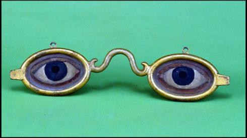
I would love to see these Redmond portraits (especially the Cousins one; I know what Grant looked like), but I would really love to see more Redmond signs. I searched and searched through all my sources, but no luck. I did find some contemporary wooden signs made in Salem by Redmond’s competitors, but I imagine his to be more “artistic”–whatever that means! (Perhaps these beautiful “spectacles” with some fancy scrollwork naming their maker).
Shoemaker’s trade sign made in Salem c. 1880 and signed “Manderbach”, Pollack Antiques; Spectacle sign by E.G. Washburn, New York City, c. 1875-1900, Abby Aldrich Rockefeller Folk Art Museum.
Easter Ambiance
I was writing a post about the computation of the date for Easter in the medieval period and after when it became clear that my technical text was taking the joy out of one of our most joyous holidays. Math: what was I thinking? So I deleted all that dry stuff, and assembled some of my favorite Easter images, which hopefully are easy on both the eyes and the brain. This is a very random assortment: artistic and historical images, Easter advertising, items and scenes that caught my eye. To me, they just conjure up an Easter ambiance, with a bit of religiosity, a bit of whimsy, and a bit of spring.
The Letter A with images of Easter, northern Italian MS. by Nerius, early 14th century, Metropolitan Museum of Art, New York; “Easter Decorations” by the Krebs Lithography Co., 1883, Library of Congress; “Easter Sunday in Harlem”, 1950s, Henri Cartier-Bresson, Metropolitan Museum of Art.
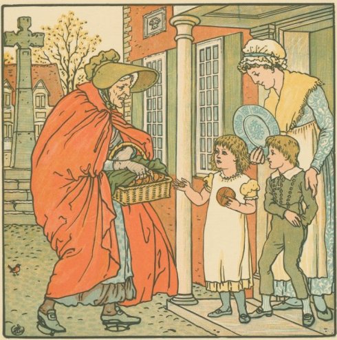
Delivering Hot Cross Buns on Easter Day, Walter Crane illustration, 1890s, New York Public Library Digital Gallery; Dora Batty advertisement for the London underground, 1934, Victoria & Albert Museum, London; Western Union advertisement, 1936, Smithsonian Institution.
Easter-esque accessories from At West End.
Easter in Salem: Bunnies (and heads) in the PEM gift shop and the window of Beautiful Things on Essex Street; the Easter Bunny at the podium at the Hawthorne Hotel a couple of years ago (I loved this picture when I saw it in Northshore Magazine and found it online; could not find a photographer credit, sorry); first flowering, finally!
Colonial Chocolate
Salem can lay claim to at least one candy title–Ye Olde Pepper Candy Companie, established in 1806, claims to be “America’s oldest candy company” and is still manufacturing the gibralters and black jacks that established its reputation. But the other day I came across a trade card in a digital archive which I thought could lead to another title for our fair city: oldest commercial chocolate manufacturer. The card (which gets no bigger, sorry) advertises the business of Gideon Foster, Chocolate Manufacturer, and dates from 1780–the same year that the famous Walter Baker & Co., Ltd. chocolate company was founded in Dorchester Lower Mills. Perhaps Foster beat out Baker by a few months!
Advertising Chocolate, 1780-1829. Baker images courtesy The Dorchester Atheneum.
Alas, I don’t think Salem can claim the chocolate title, for two reasons. The Baker Company can be dated even earlier than 1780, to when Walter Baker, a Boston physician, established a partnership in 1765 with English chocolatier John Hannon. When Hannon departed for Europe in 1780, never to return, Baker continued to run the company under his sole ownership, and it expanded dramatically through the nineteenth century under his heirs and the twentieth century under the successive ownership of General and Kraft Foods (leaving Foster’s little company in the dust!) The other reason is that while Gideon Foster is associating himself with the commercial mecca of Salem,on his trade card, his chocolate mill was actually located in the nearby village of South Danvers, now Peabody; in fact, Foster’s well-preserved Federal house serves as the headquarters of the Peabody Historical Society.
That matter settled, I still have my questions. Why were these two prominent men so focused on the production of chocolate during the Revolutionary War? Wasn’t chocolate a rather trivial pursuit at this particular time? Foster was General Gideon Foster, hero of the Battles of Lexington and Concord, later at Bunker Hill and the siege of Boston, but back in Peabody making chocolate by 1780: was chocolate manufacture a matter of national necessity? Probably not, but it was definitely a substantive commodity in the eighteenth century, viewed as nutritional, medicinal, and sustaining–almost like food. But it was also a beverage (we are generally talking about drinking chocolate at this time; candy bars come later) that some thought had the potential to replace the almighty tea. Thomas Jefferson certainly thought so; in a 1785 letter to John Adams he predicted that “Chocolate. … By getting it good in quality, and cheap in price, the superiority of the article both for health and nourishment will soon give it the same preference over tea and coffee in America…”
Here in Salem, and in the present, my favorite source for chocolate is the decades-old Harbor Sweets, where I started my Christmas shopping today (with less than two weeks to go–classes complete, papers and final exams to grade!) Even if you don’t have chocolate on your list, this is a great place to go for its Santa’s workshop ambiance, as well as the free samples.