Tag Archives: design

Preservation and Post Offices

The fundamental challenges facing the U.S. Postal Service as an agency are beginning to trickle down to our local post office buildingscreating ripple-effect challenges for preservationists across the country. The New York Times ran an article last week highlighting the issue (with great comments), and the National Trust for Historic Preservation placed “Historic Post Office Buildings” on its Most Endangered List last year. Apparently the agency has identified nearly 3,700 buildings as likely candidates for closure, about 200 are soon to go on sale, and eleven are on the market right now. There are several concerns from the preservation perspective:  not only do these buildings serve as community centers, but that they are often the most architecturally significant structure in many towns. And like so many federal buildings, many post offices are also surviving legacies of the New Deal policies designed to put Americans back to work during the Depression. The adaptive reuse of these buildings is the logical answer, but that is always a tricky business, and even if the exteriors of those buildings with landmark status are preserved historic interiors remain threatened:  murals, marble, and metals could be ripped out and sold to the highest bidder.

berkeley_ext

Berkeley PO Jim Wilson NY Times

08POSTOFFICEjp5-popup

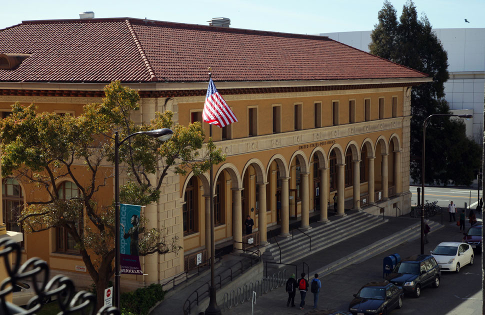
Three photographs of the 1915 Renaissance Revival Berkeley, California Post Office, on the short list for closure:  interior murals of by Suzanne Scheuer, exterior, and protester Josh Kornbluth in character as Benjamin Franklin, the first Postmaster General. Jim Wilson/New York Times.

I checked out several of the post offices that are on the market now (on this great blog) and was immediately drawn to two in particular:  another Renaissance Revival building in Gulfport, Mississippi and the beautiful Greek Revival post office in the Georgetown section of Washington, DC.  The DC building has been sold to a developer who is apparently going to adapt it for office space while retaining the post office on the first floor; this deal seems to have been years in the making and illustrates just how difficult the redevelopment process can be.

Gulfport PO

Gulfport_Post_Office

georgetown_post_office

Georgetown post office by Young

The Gulfport, Mississippi Post Office today and shortly after its construction in 1910,  postcard courtesy of the Mississippi Department of Archives and History; the Georgetown Post Office, built in 1858, and a 1856 rendering by architect Ammi B. Young, Library of Congress.

I must admit that I have never really appreciated Salem’s Post Office, which I walk by nearly every day with little more than a passing glance. It is a classic WPA project, designed by local architect Philip Horton Smith and constructed in 1932-33 in the Colonial Revival style.  It definitely has presence, but I always thought it was a bit boring, until I recently started noticing the details, inside and out:  there certainly is a lot of marble and bronze in there, and the tables and radiator grates–even the mailboxes–are really lovely, as I now can see. To emphasize its centrality–as well as its connection to the outside world–this building was sited right across from Salem’s grand and gothic railroad station, whose destruction in 1954 is lamented to this day.

Post office 2 049

Post Office PC 1940s

Post Office Interior

Post office 2 003

Post office 2 004

The Salem Post Office today and in the 1940s, downstairs interior and mailboxes, the former Post Office in Salem, adapted for reuse as shops in the 1930s and still serving in that capacity.


Trees in the House

I was intent and inspired to have a rather spare Christmas tree this year, but once again we have a huge and furry white pine (I think I incorrectly called last year’s tree a Scotch pine) tree, over nine feet tall, that just eats ornaments.  Oh well, the house probably calls for such a display, in contrast to the more minimalist Scandinavian looks, featuring branches and twigs more so than trees, that I collected in a pile of tear sheets. I particularly like this beautiful Toronto house, owned and decorated by designer Ingrid Oomen, that is featured in this month’s issue of Canadian House and Home.

Tree in the House HH

Tree in the house CHH 3

I don’t know why the second scan came out so grainy–sorry. These minimalist tree branches go so well with this decor, and they could really be maintained all year round, minus the ornaments. I also like this simple display from Country Living, counterposed with the more traditional tree in the adjoining room.

Tree in the House Country Living

I have not managed to go the overly-creative or minimalist route this year.  The Christmas season is always a little frustrating for me, as I have high decorating hopes and not much time, with lots of papers and exams to correct and grades to turn in. I have a few little live trees around the house, like this one on the dining room mantle next to my new deer from Wisteria, and then the big tree in the front parlor (which I am showing you in both undecorated and decorated states so you can see what a monster it is). It doesn’t matter how many ornaments or garlands you put on this tree, it still looks essentially green.

trees Mantle

tree in the house

trees2 007

Two of my favorite historical images of Christmas trees: Eastman Johnson’s Christmas-Time, The Blodgett Family (1864) and a print of President Roosevelt’s children showing him their closeted Christmas tree in 1903:  he was an avid environmentalist and would not have one in the house (or so he proclaimed).

Christmas-Time, The Blodgett Family Eastman Johnson 1864

Tree Roosevelt 1903 WH Hist Assoc

Eastman Johnson, Chistmas-Time, The Blodgett Family (1864), Metropolitan Museum of Art; The Roosevelt children show the President their tree, 1903, White House Historical Association.


Flawed by Design

Several years ago I sold my rather large collection of red transferware, and cleansed the house of most of the odd bits of toile:  it was pretty clear that my husband hated these romantic patterns–particularly in red.  I think most men share his opinion. I miss the dishes more than the textiles, and have been looking for ways to sneak a few transfer pieces back into our home.  Two versions of modern transferware on the market right now might be just creative enough to overcome their toileness:

Target Too by Blu Dot dinnerware and Anthropologie “Dipped Toile” desert plates.

The first set of dishes–the result of a rather stealth collaboration between Target and the modernist manufacturers Blu Dot–are so subtle I think they could make it into my cupboards unnoticed.  Both of these collections are charming, I think, because they are flawed by design, achieving difference (and whimsy) through apparent “defects”.  It occurred to me that only in our modern industrial age could you possibly have such a design concept as deliberately imperfect:  the standards of pre-industrial craftsmanship would simply not allow it. Then I thought (and read) about the traditional Japanese philosophy and aesthetic of wabi-sabi, which embraces the incomplete and imperfect as a way to grasp simple beauty and transience:  yet another cultural distinction between east and west. In the first half of the twentieth century, similar values were embraced by artisans of the Arts & Crafts movement, who were trying not only to revive craftsmanship but also differentiate their products from those that were mass-produced.  Skip forward a century or so, and differentiation through mass production seems to be the aim of some industrial designers.

Porcelain Tray by Bernard Leach, 1931, Victoria & Albert Museum, London.

While exploring the art of imperfection a bit further, I came across this perfectly-matched (at least to me!) pair of objects of flawed beauty, one the result of the passage of time, the other deliberately modern.  Bear in mind that as I am writing this, I am staring at a large crack on my bedroom wall, a flaw that always reappears no matter how many times we reapply plaster.  I’m searching for an empty gilt frame–and trying to have an optimistic outlook!

Highworth Roman milk pot in unrestored state, via The History Blog; crack “painting” via A Lovely Escape.


Calligraphic Cats

I was watching a mash-up rebroadcast of Antiques Roadshow the other night when a pair of Victorian calligraphic drawings suddenly appeared, including one very charming cat. You can see the appraisal–with appraiser Carl Crossman stating that he and his colleagues have seen plenty of calligraphic deer and eagles but few cats–here. Crossman loved the cat (and valued it at around $3500-$4000) and so do I, so of course I had to find one for myself. Calligraphy has always been a more integral feature of Islamic and East Asian art than that of the West, and I found some nice Asian BIG cats, but domestic calligraphic cats from Europe and America were indeed difficult to track down.

Calligraphic Tigers from Japan (18th century) and Pakistan (19th century), Victoria & Albert Museum, London.

In the west, calligraphic drawings seem to emerge first in the general instructional workbooks of eighteenth- and nineteenth-century tutors and their students. The owl and the pussycat below, which come closest to capturing the charm of my beloved Antiques Roadshow cat, were drawn by Dutch instructor Jacob Labotz for his students to copy and thus perfect their hands. So I started my search through the available instructional texts, starting with the later seventeenth century and working my way up to the later 1800s, when “flourishing” offhand calligraphy, combining writing and drawing, flourished. Mr. Crossman was correct: I found lots of birds (more doves than eagles), and no cats.

“Mary Serjant her book scholler to Eliz Bean Mrs. in the art of writing and arithmetick”, 1688, Beineke Rare Book and Manuscript Library, Yale University.

I expanded my search to include museum collections, antique-shop inventories, and auction archives and could only find more calligraphic birds, in addition to a few horses and donkeys, rabbits, the occasional dragon, and this wonderful elephant, produced in Ohio in the mid-to-late nineteenth century. I would have snapped it right up if it was not already sold.

This elusive elephant inspired me to dig deeper and reminded me of an image that I do have:  a calligraphic deer in the form of a John Derian tray:  perhaps the source could lead me to a similarly drawn cat? Fortunately the Real PenWork. Self-Instructor in Penmanship (Pittsfield, MA: Knowles & Maxim, 1881) is available online:  there I found my deer, along with flourished and fanciful birds of all feathers, fish, horses, and a big cat.

I’m going to keep looking for the perfect Spencerian calligraphic cat drawing, but in the mean time I think I’ll settle for yet another John Derian plate (I’m embarrassed to count how many I have), because this one comes very close to my feverishly-sought-after feline.


Great Ghosts

Before I moved to Salem, Halloween was all about ghosts for me, not witches. I’m not sure how I became fixated on them as a little girl, but once I grew up I’m sure I made the connection because of the historical origins of Halloween:  the eve of All Hallows’ or All Saints’ Day (with earlier pre-Christian foundations), an evening when thoughts were on those who had passed.  So when I came to Salem and it was all about witches, I was actually a bit confused; I still don’t really grasp the connection between the 1692 Witch Trials and Halloween (besides commerce), but apparently I am the only person in this city who fails to do so. I have fulfilled my Halloween obligations by buying a bucketful of candy which I will hand out tonight, and in the mean time I can celebrate the holiday in my own way:  by focusing on ghosts.

Some favorite ghosts, starting with my very favorite historical person, Queen Elizabeth I, confronting Napoleon in 1803.  The British always call on Elizabeth when they are in trouble. Here she shows him an image of the burning Spanish Armada and proclaims look at that and tremble!!!  Elizabeth’s ghost is followed by that of another monarch, Louis XVI, protesting Napoleon’s theft of his throne.

Isaac Cruikshank satirical prints,1803-1804, British Museum, London.

In the later nineteenth century there was a spirited effort to catch ghosts on film, leading to the production of many “spirit photographs” as well as to any equally enthusiastic effort to prove that these images were faked with double exposure and other techniques. For some reason, several spirit photographs feature children, as in the one below, entitled Their Guardian Angel. From the same year, a “staged” photograph by Henry Ridgely Evans (who referred to himself consistently as “Dr.”), an amateur magician who investigated spiritualism at the turn of the last century.

Their Guardian Angel, C.H. Graves, publisher, Victoria & Albert Museum, London; spirit photograph by Henry Ridgley Evans, from his book Hours with the Ghosts or Nineteenth Century Witchcraft: Illustrated Investigations into the Phenomena of Spiritualism and Theosophy (1897).

And now for some “ghosts” from the world of art and design.  Philippe Starck’s “Ghost” chair is pretty familiar to me, but a more recent discovery is the even more whimsical Ghost Clock of Wendell Castle.  The possibilities seem unlimited for ghost furniture.

Kartell “Ghost Chair” by Philippe Starck, 2002, Philadelphia Museum of Art; “Ghost Clock” by Wendell Castle, 1985, Smithsonian Museum of American Art.

Looking forward to our next big holiday, a final “Thanksgiving Ghost” from the Victorian illustrator Oliver Herford:

Oliver Herford, A Thanksgiving Ghost, 1885.


Seeing Pink

Black and orange are the predominant colors of the season but I was looking for pink this weekend. Pink houses, large and small, can be found all over Salem but primarily in the outlying neighborhoods away from the center historic districts. While colonial houses can look lovely in pink, this custom seems to apply more to Charleston and Savannah than it does to New England:  pink is just not a Puritan color!  So most of Salem’s pink houses are Victorians, with the exception of a very bright Greek Revival on Winter Street just off the Common, and a little Georgian house in dusty salmon pink right off Derby Street.

And on the other side of Derby Street, overlooking Derby Wharf, the Friendship, and the Custom House, a pink triple-decker, another iconic New England architectural style.

I kept walking east:  downtown was full of tourists and motorcycles, the weather was beautiful, and I knew that I’d find some pink house in the Willows. Salem Willows is a late Victorian park with an adjacent residential neighborhood of structures that were built as seasonal cottages in the later nineteenth and early twentieth centuries. All of these houses have been transformed into year-round residences, and it’s a colorful neighborhood with few preservation encumbrances. There was a full spectrum of pink here, from shocking Schiaparelli to the very pale color of the Gothic Revival cottage overlooking Juniper Point Beach.

Back in town, I turned left and walked down Lafayette Street, which was a grand boulevard of painted ladies before the great Salem Fire of 1914.  Some survived, and Colonial Revival residences replaced those that did not:  one has a conspicuous pink and light gray color scheme that you cannot fail to notice.  On a side street Lafayette, there’s a lovely late 19th century pink house, with an adjacent three-car garage, also in pink.  And way down the road, almost on the Marblehead line, is a “Scooby Doo” eclectic Victorian overlooking Salem Harbor dressed in faded pink.  I was losing the light by this time, as you can see.

These are all great houses, but I must admit that my two favorite pink houses are not in Salem. One is the Justin Morrill homestead in Strafford, Vermont, which I’ve already featured in a post, and the other is the Roseland Cottage in Woodstock, Connecticut, which is owned and operated by Historic New England. Both are assertively Gothic Revival structures–“Gothic” and pink are two descriptive terms which are seldom linked together, but in these two cases we have notable exceptions!

Roseland Cottage, Woodstock, Connecticut, 1846.  Historic New England.


“English” Houses in Salem

Thankfully, I really do believe that Salem is nearly as well-known for its Federal architecture as its witch trials, but Salem is not just a Federal city. There are a vast variety of architectural styles in evidence around town, and some of the later (post 1870) styles get short shrift, I think. Even for a layman such as myself, Colonial, Federal , Greek Revival, and Gothic Revival structures are fairly easy to identify, but once you get into the myriad Victorian styles, it gets a bit more confusing, and then the amorphous Colonial Revival provides even more confusion. What is “Victorian Eclectic” (all Victorian houses seem rather eclectic to me)?  Are Stick and Shingle houses Victorian or Colonial Revival? Do Craftsman and Arts & Crafts houses fall under the umbrella of Colonial Revival or are they completely different styles?  Or are they the same style?  And where does the Cottage style fit in–there seem to be so many different types of cottages!  I could go on and on with the questions, but until I figure out all the later nineteenth and early twentieth-century styles I just go with my own labels and classifications based on impressions.

That said, there are several houses in Salem which I always think of as English. They have a certain detail, or presence, or situation, that just conjures up England for me, even though they are all (for the most part) wooden, American houses.  I’m really not sure precisely when these houses were built, or for whom:  while downtown pre-1850 houses are quite well-documented in Salem, later houses in more outlying neighborhoods (where most of my English houses are located) do not seem to have (written) histories.  I welcome all estimates of dates and proper styles:  to my untrained eye, they look like a little bit Cottage, a bit Tudor Revival (another easily identifiable style), a bit Shingle, and a bit Arts & Crafts.  Hence my confusion!

South Salem, on the side streets off Lafayette:  a really cute English cottage very near Salem State with lots of neat details, a twin-gabled house, a sprawling two-story Tudor Revival, and two houses, wooden and stucco, that were built on land devastated by the great Salem Fire of 1914 that read “English” to me.

Off the Common:  a very English craftsman cottage, and a house that has a very distinguished, English presence.

All of these houses could probably be labelled Shingle, or perhaps Colonial Revival, and none of them rise to the level of the more strident English country houses built in America after the turn of the last century found in the pages of periodicals like The American Architect and Building News, but I still think of them as old “English” houses in New England.

English-American houses in the American Architect and Building News (1917) and The Pageant of America, Volume 13:  The American Spirit of Architecture (1926).


Variations on Blue and White

I’ve never been a blue person; there is no blue in my house except for my turquoise dining room which I think of as green.  When I went through my transferware phase, I collected red (pink) and white rather than the more attainable blue and white, and in the summer time, when it seems like all of my favorite shelter magazines feature blue and white portfolios, I leaf quickly through.  That said, I have been quite taken by the latest installation of the Peabody Essex Museum”s ongoing “FreePort” exhibitions, through which contemporary artists engage with and respond to the museum’s collections, creating completely new works in the process.  FreePort [No.005]:  Michael Lin takes the traditional blue and white of Chinese export ware and runs with it, as Mr. Lin has emblazoned the armorial and heraldic crests of porcelain produced in China for the European market on the staircase walls and floors of the Museum’s Asian Export galleries.  The effect is modern and baroque at the same time.

And then, as  if these vibrant blue-and white walls and floors were not enough to make us look at plates in a completely different way, Lin also produces a mass of “Mr. Nobodys”, the first Chinese representations of Europeans, with their anonymity enhanced by the massing, and their commercial qualities (we are talking about the Chinese export trade here) enhanced by the fact that you can buy one in the PEM Museum Shop.

For comparison’s sake, another Mr. Nobody from the collection of the Victoria & Albert Museum, London.  This one, however, was produced in England in the later seventeenth century.

The motifs and the figurines are interesting examples of cross-cultural exchange, an important dynamic in world history.  I can’t imagine a better way to (literally) illustrate it.  The Lin installation reminds me of another artistic expression, Blue and White by the Silk Road Ensemble, a multimedia performance that traces the migration of blue-and-white porcelain around the world.

This is a big task, because there are a lot of varieties of Asian-influenced blue and white porcelain and pottery:  delftware, fritware, transferware, just to name a few. Blue and white earthenware is everywhere, crafted in very diverse forms, over many centuries.  Here are two particularly disparate examples:  Iranian rasps in the form of shoes from the eighteenth century, and an image of omnipresent “oriental” planters from Victorian England.  Because I was so inspired by Lin, I tried my hand at my own blue and white Salem fabric design via Spoonflower with limited success:  Samuel McIntire’s sheaths of wheat look a bit too tropical in blue!  Obviously Christopher Dresser’s stenciled ceiling (a nice counterpart for Lin’s walls and floors) is much better.

Fritware and late 19th century songsheet, Victoria & Albert Museum, London; design for a stenciled ceiling, Christopher Dresser, Studies in Design, 1876.


Samuel McIntire in Texas

I knew that the charming 1793 summer house designed by Salem’s renown architect and woodcarver Samuel McIntire (1757-1811) had been moved (from its original location 4 miles away on Salem merchant king Elias Hasket Derby’s Peabody farm–successively the property of the Crowninshield and Osborn families), and copied (by Derby’s distant descendant Martha Codman for her Newport mansion Berkeley Villa, which you can read about here), but I had no idea until very recently that it was the inspiration for a Houston McMansion.

Here is a panorama of pictures taken yesterday of McIntire’s beautiful summer house, situated since 1901 on the Glen Magna estate in Danvers, Massachusetts.

And here, via my very favorite pinner on Pinterest, via the Cote de Texas blog, via Luxe magazine, are pictures of a house outside downtown Houston designed by John Ike of Ike Ligerman Barkley Architects of New York.

It is probably wrong of me to call this house a McMansion as it is only two rooms deep, but it does have white marble flours (versus the painted wood of the original).  I’m not sure what to think of this creation:  is imitation the sincerest form of flattery in this case?

Another view:  a Rudolf Ruzicka Christmas card for the Merrymount Press, 1940.


Hats Off to London

The Anglophile in me cannot resist one more post on London, but this one will not be about sports, but rather about hats.  And I will put a little Salem in here, because I am inspired.  As part of the Olympics celebration as well as the Mayor of London’s summer-long schedule of happenings called “Surprises”, twenty of the city’s most conspicuous statues have been topped with hats designed by eminent British milliners. For the next few days, Londoners will be amused (I hope) with very clever juxtapositions of hard and soft, traditional and fanciful.  The event is called “Hatwalk“, and here are some of my favorite pairings:

Queen Victoria wearing what appears to be an Olympic-flame hat, by Justin Smith, Esq.

Another flame: Admiral Nelson in a hat by James Lock & Co., Hatters.

General Sir Henry Havelock in a Philip Treacy “spectator”.

The Poet Robert Burns (A Red, Red Rose) wearing a hat by William Chambers Millinery.

General Sir Charles James Napier wearing a Sophie Beale hat.

King George IV and his horse, resplendent in Brighton pavilion-inspired hats by Stephen Jones.

Sir Arthur Sullivan and The Lady, wearing Gina Foster and Victoria Grant hats.

Franklin Delano Roosevelt and Winston Churchill on Bond Street, wearing hats by John Boyd and Herbert Johnson, respectively.

All photographs by Getty Images.

I love this installation (for lack of a better word–I’ve been struggling with what to call this happening) because it’s creative and historical at the same time–drawing attention to both design and the people, along with their eras and accomplishments, who are “modeling” the hats.  Several of these statues are in very prominent places like Trafalgar Square, but others might have been overlooked and forgotten.  Even before I became aware of Hatwalk, I had been thinking about several statues here in Salem and its environs which I pass by every day and never really look at, much less take the time to stop and read their plaques and inscriptions. If these statues had jaunty hats on their heads, perhaps I would!  One Salem statue in particular which needs more attention (or interpretation) is that of Roger Conant (1592-1679), who settled in Salem in 1626 and became its first governor, after brief stays in the Plymouth and Cape Ann colonies (he really disliked the Pilgrims).  The Conant statue was erected in 1913 after the Conant Family Association commissioned sculptor Henry H. Kitson (who had designed the famous “Minuteman Statue” and whose amazing home, Santarella, I featured in a previous post) for the design.  It is a commanding and majestic statue, but it suffers from its proximity to the dreadful Salem Witch Museum:  too many dim-witted tourists casually assume that Conant has something to do with the Witch Trials because of his seventeenth-century attire.  They never even bother to read the plaque–and the things I have heard them say as they have their pictures taken with poor Roger!  I think that Kitson did a good job with the hat, but perhaps the occasional placement of a slightly more Cavalier-esque one would help?  I hate to call on the Gunpowder Plotters for fashion advice, but I’ve always admired the depiction of their hats in the contemporary broadside below.