Tag Archives: Art

Busy Bees

I know that bees are experiencing some serious challenges at the moment, but it seems to me that there are much more of them out there than in previous summers—at least in our region. I’ve encountered mini-swarms on rural walks in both New Hampshire and Massachusetts over the past month, it seems like individual bees have been buzzing around my garden constantly since July, and just the other day I saw hundreds of bees affixed to the sunflowers in the large patch at Colby Farm up in Newbury: neither bees nor people can resist this flagrant perennial display!

Bee Sunflowers Best

Bee Sunflowers Closeup

I went into my clip file—comprised of very random digital images which I find interesting or attractive and store away for whenever or whatever (other people seem to use Pinterest this way but I just don’t)–and found several bee images there that I had clipped or snipped over the last few months: books, ephemera, creations. So clearly I’ve had bees on the brain: maybe because I decided to forego sugar over the summer and thus became more intensely focused on honey. In any case, this seems like a good time to get these images out there–Thomas Tusser suggests that the ongoing process of “preserving” bees demands a bit more human attention in September in his classic agricultural manual Five Hundred Points of Good Husbandry (1573):  Place hive in good air, set southly and warm, and take in due season wax, honey, and swarm. Set hive on a plank (not too low by the ground) where herbs and flowers may compass it round: and boards to defend it from north and northeast, from showers and rubbish, from vermin and beast. Tusser is one of many British and continental authors writing about bees and beekeeping in the sixteenth century, and over the succeeding centuries this sub-genre continued to flourish, right up to the wildly-popular Beekeeper’s Bible. I’ve written about bee books before, but my favorite recent discovery is Samuel Bagster’s Management of Bees, with a description of the Ladies’ Safety Hive (1834). Bagster has a very entrepreneurial attitude towards bees, and is striving to transform their keeping into a feminine avocation with his promotion of the “Ladies Safety Hive”: they can be built at home or delivered by Bagster, fully-equipped.

bee collage

Bees Bagster

My apian ephemera is focused less on the bees than their hives: which of course serve as an accessible symbol of industry and by extension, achievement. The most prominent uses of beehive symbolism on Salem ephemera that I have found were issued by the Salem Charitable Mechanic Association (which it clearly borrowed from the Massachusetts Charitable Mechanic Association, or vice-versa) and Frank Cousins’ many trade cards advertising his Bee-Hive store but there is also an early trade card for the Salem goldsmith and jeweler Robert Brookhouse which features the very Salemesque combination of hive and ship. I discovered a completely new type of ephemera this summer–watch papers–of which there is an interesting collection at the American Antiquarian Society, including several embellished with beehives.

Bee Certificate

Bee Hive MA Charitable HNE

Trade Card beehive

Bee Brookhouse

Bee Hive Watch Paper AAS

Ephemeral beehives: Phillips Library (printed in EIHC Volume 113); Historic New England; and courtesy American Antiquarian Society.

Another discovery of this fading summer are the amazing textile creations of Mister Finch, which you must see for yourself. His bee is among the more realistic of his species–check out his website for more surrealistic creatures. And then there is Tamworth Distilling, to which I returned several times, which manufactures several varieties of botanical gins, including the Apiary Gin pictured below. To be honest, this was a bit too honey-based for me: gin is my favorite spirit and I tend to be a London Dry traditionalist. But I love the bottle, of course (and their cordials).

bee

Bee Gin

Mister Finch Bee and Tamworth Distilling Apiary Gin.


Posters (and More) @ the PEM

In my recent post on the Phillips Library, I deliberately excluded any commentary on the Peabody Essex Museum, but most of the commenters did not. Any large expansive institution inserting and asserting itself in the midst of a small city like Salem is going to incur a lot of commentary, and the Peabody Essex Museum is not an exception. I wanted my post to focus on Salem’s material heritage, so I excluded its enveloping institution, but in fact my feelings towards the Peabody Essex are mixed. I understand that in order to be successful, the 1992 merger of the former Essex Institute and the Peabody Museum of Salem had to result in a completely new museum, rather than a Frankenstein-esque amalgamation of the two former institutions. That has happened: the Peabody Essex is new, and dynamic, and thriving. I do miss the dusty Essex Institute a bit, just because I like those sorts of institutions, and I think Salem needs a historical society/museum run by professionals for passion and preservation, rather than profit. But I know it is never coming back. However, its archive, the Phillips Museum, must come back. And meanwhile, the Peabody Essex is here, and expanding like a force of nature: one must embrace it. I appreciate many things about the PEM: its collections, its community programming, even its shop. It is a constant resource for me as both a curious individual and a teacher. But just as I want to see more of its historical records, I want to see more of its collections–and it seems to me that the showcase, display, and interpretation of the PEM’s permanent collections are deemed secondary to the mounting of blockbuster exhibitions time and time again: DRESSES, HATS, SHOES. The first great expansion of the relatively new PEM over a decade ago was explained in terms of the need to have more exhibition space to display the Museum’s collections, as is its current project, but in the interim we have seen lots of DRESSES, HATS and SHOES (and several months of McIntire and Gould, to be fair).

At present, the PEM has two blockbuster exhibitions on view coincidentally: the summer-long exhibition Ocean Liners: Glamour, Speed and Style and It’s Alive, a showcase of classic horror and science fiction movie posters from the collection of Kirk Hammett. When I first heard about both, I thought, oh no, posters and posters taking up precious gallery space (away from the permanent collections): ephemera. But I have visited Ocean Liners several times over the summer and I think it comes very close to the “glocal” vision first expressed at the time of the merger of the Essex Institute and Peabody Museum: local history with an enhanced global context. It is maritime history ramped up several notches, encompassing art, history, culture, and style. There are posters, of course, but wow, several of them speak volumes in terms of their impact and message. It’s Alive just seems like a collection of movie posters to me, not really an exhibition, but if I were a curator at the PEM with October hordes passing by my door, I wouldn’t have turned them down either!

PEM ExhibitionsPortholes and eyes at the PEM.

PEM Exhibitions 3

PEM Exhibitions 4

PEM Clyde

PEM Exhibition LinersPEM Exhibitions 7

PEM Exhibitions 5

PEM Murals

PEM Fashion

PEM Luggage

PEM Exhibitions 6

PEM Exhibitions 2

PEM Enlist

PEM Enlist LOCJust a few items from Ocean Liners, which also includes some amazing ship models of which I don’t seem to be able to take a good photograph. Stanley Spencer’s Shipbuilders on the Clyde: Riveters (1941) is amazing! The panel from the Titanic’s sister ship Olympic is displayed in full majesty, altar-style, in the midst of renderings from other pre-World War I ships–this was an era in which the interiors were certainly not streamlined. I never knew there was Titanic “recreation diorama” for tourists just a couple of years after the disaster! This Fred Spear Enlist poster from 1915, showing victims of the Lusitania sinking, really stopped me in my tracks–the last image is from the Library of Congress. 

PEM EX CATS

PEM EX Wallpaper

PEM Exhibitions KarloffMy favorite posters from It’s Alive, on either side of some very atmospheric wallpaper.


Au Courant Classrooms

For my annual back-to-school post, I want to focus on two very distinct phases of school reform, both of which focused on the aesthetics of the classroom. This will not be the case everywhere, obviously, but when I look around Salem and its environs, I see a lot of school buildings built in the later 19th century–World War I era, and an equal number built after World War II. Rather than thinking about demographics, my mind immediately wanders to the design elements of these structures. The exteriors are pretty obvious (solid civic Classical Revival for the former era, International-style boxes for the latter), but what about the interiors? It happens that the celebrated Salem artist Ross Turner was very active and influential in a movement dedicated to embellishing classrooms in the 1890s and after, a movement dedicated to “vitalizing the dormant sense of the artistic” among Americans, “which by false and ugly environment, has been so repressed as to be of little actual value to the community”.  Arts education and the decoration of the classroom went hand in hand for Turner, and he believed that students should be exposed to both as early as possible, in the (relatively-new)) kindergartens and primary schools. He had an effective partner in the Prang Educational Company, which published his works and produced artistic products for the classroom.

Stylish Schools Art for the Eye

Prang Educational Company AAS Courtesy, American Antiquarian Society.

Here are Turner’s design recommendations for classrooms: they should be quiet, harmonious in color and arrangement [with] the color of the walls selected according to the light…the use of dull colors–brown or slate colors–should be usually avoided. The color effect should be responsive and light, never dull, heavy or cold. Remember we have under present conditions to struggle against a hideous dulled surface known as the blackboard, too large and ugly…A comprehensive group or series of art subjects…beginning with primitive work, Egyptian and Assyrian, early Greek and Etruscan, and proceeding up through the Renaissance [not after] is essential, in plaster or pictorial forms. He recommends that statues and “solar prints’ be spread liberally around the classroom, as well as architectural fragments, and decorative designs in plaster. And one last thing: every schoolroom should have a bust or portrait of some eminent American citizen or patriot placed immediately above the desk of the teacher; above and around this the colors of our common country. Here should be the shrine of American patriotism. We should display the flag above patriotic busts, or portraits, inside as well as outside the schoolroom. Art for the Eye was first published in 1895: let’s look at some Salem classrooms from about a decade later to see if it had any impact. These photographs are all from the very accessible digital collections of Salem State University Archives and Special Collections.

Stylish Schools SSU Horace Man

Stylish Classroom SSU Horace Mann3

Stylish Schools SSU HOrace Man 2

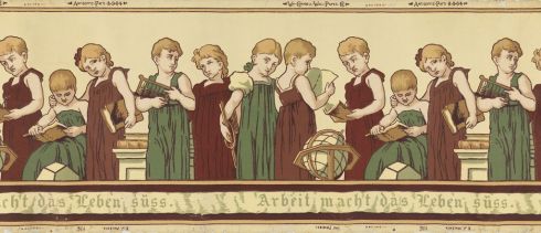
The photographs are from a series taken by Salem photographer E.G. Merrill of the Salem Normal School’s Training School, later known as Horace Mann, for the School’s 50th anniversary in 1904. It looks like the hideous chalkboard is still in the classroom (though utilized for artistic purposes via the elaborate blackboard sketching that was a speciality at Salem Normal School), but there are certainly a lot of other Turner-approved embellishments! It’s so perfect, I envision this wallpaper frieze from 1910, named after the inventor of kindergarten, in all Turner-approved classrooms!

Stylish Schools WallpaperWallpaper “Froebel” frieze, 1905, E.J. Walenta for Wm. Campbell Wall Paper Company, Machine-printed on paper, Hackensack, New Jersey, USA, Cooper-Hewitt Museum, gift of Paul F. Franco, 1938-50-15.

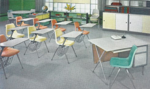
The second wave of educational aesthetic reform followed World War II, and seems largely focused on clearing out all of the elements that Turner advocated for, as well as letting in, or creating, even more light vis-à-vis the new fluorescent lighting. A model classroom was installed at Salem’s Bowditch School (then on Flint Street) by the Salem-based Sylvania factory, and promoted nationally by a serialized newspaper article in alliance with the National Education Association. I can’t get the photographs any clearer, but the description is helpful: blackboards replaced by tackboards (that won’t last), wooden floors replaced by tile, and “posture-improving desks” installed. In the permanent collection of the Museum of Modern Art there is a prototype desk designed for the Bowditch School by the architectural/engineering firm Markus & Nocka in 1946–ostensibly for this remodeling–but I can’t tell if these are the desks in the photograph (if they are, I wonder where they all went when the Bowditch was converted into condominiums!)  More likely something more conventional was chosen, like the colorful Brunswick desks in the advertisement below. These are what I grew up with, and I think there’s still more than a few in the old SSU Sullivan Building where I teach today.

Stylish Schools 1946

Stylish Schools MOMA

Stylish schoolchairs BrunswickBrunswick chairs c. 1958 from the VS Schulmuseum site. 

♣ Heads up: exhibition of Ross Turner’s works at the Kensington-Stobart Gallery at the Hawthorne Hotel opens this Friday September 8!


Late August in Salem

My calendar version of the photographic “golden hour” is late August: everything seems warmer and softer, yet somehow more vivid. It’s not as hot and humid and you can feel a touch of fall in the evening breezes. Cotton-sweater-weather. The days seem precious because they are numbered, not so much by the end of summer (I firmly believe that the end of the summer comes in late September–especially now) but by the beginning of the fall semester, which I have experienced my entire life except for one year. It’s been such a busy summer for me that these last few slow days of August are especially welcome–I’m not doing much with them except for existing really: casual deadheading, aimless walks, leafing through magazines, cocktails. That’s about it. Because I was so busy this summer, fall is going to seem tame by comparison, so maybe the golden hour will be a bit longer than usual.

Late August in Salem:

Late August 6

Late August 2

Late August 7

Late August Trinity

My August garden is basically white at this time of year…Trinity outside and in….the peaking Ropes Garden……………

Late August butterfly

Late August Ropes

Late August Ropes 2

The real Golden Hour, out in Salem Harbor….and off Marblehead….

Late August Harbor 2

Late August 9

Late August Harbor

whimsical posters for the Salem Farmers’ Market by Jesse Ciarmataro of H5P Creative Studio….and one of Marice Prendergast’s Salem paintings, which capture the spirit of this time of year.

Late August Farmers Market 2

Late August Farmers Market

Prendergast Salem Cove

Farmers’ Market posters, Jesse Ciarmataro/ H5P Creative Studio: Maurice Prendergast, Salem Cove, 1916, National Gallery of Art.


Among the Cathedrals

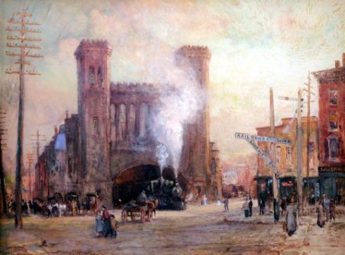
I’m always looking for artistic impressions of Salem’s long-lost train depot (1847-1955), so was thrilled to come across a painting by the Philadelphia-born artist Colin Campbell Cooper the other day. Campbell is universally characterized as an Impressionist, but he seems to have been fascinated by structure, as there are many cathedrals, skyscrapers, and train stations (the cathedrals of their day?) among his works: you can see why he was drawn to the Salem station. Here is his impression, from 1910, along with Walker Evans’ photograph from the 1930s and a street-level stereoview published by Charles Beckford: contrasting views of an imposing edifice.

Cooper Roundhouse

walker-evans-train-station

Salem Stereoview Beckford Cropped

Colin Campbell Cooper, Train Roundhouse, Salem, Massachusetts, c. 1910, Sullivan Goss Gallery; Walker Evans, Boston and Maine Train Station, c. 1931, ©Walker Evans Archive, Metropolitan Museum of Art; Charles A. Beckford, American Views series, n.d.

Cooper had a vibrant and varied artistic life. He was born in Philadelphia in 1856, and after his artistic education at the Philadelphia Academy of Arts (with Thomas Eakins) he was off: to New York, to Europe, to Asia, and eventually to California. While in the Netherlands in 1897, he met and married his first wife, Emma Lambert, who was also a promising and increasingly-prominent artist. They traveled extensively together: one dramatic voyage had them assisting in the rescue of Titanic survivors while aboard the RMS Carpathia en route to Gibraltar in the spring of 1912. Prior to this adventure they came to Salem together–perhaps they were visiting Frank Benson, or Philip Little, or maybe Ross Turner? I can’t discern the details, but three paintings bear witness to their time here in 1910-1911: Colin’s Train Roundhouse and Salem Mansion (alternatively titled A Salem Residence), for which he won the Beal Prize in 1911, and Emma’s Fruit Stand, Salem, Massachusetts.

Cooper Mansion

Cooper Market

Colin Campbell Cooper, A Salem Mansion, 1910, The International Studio, Volume 45; Emma Lampert Cooper, Fruit Stand Salem Massachusetts, Cottone Auctions.

After Emma’s death in 1920, Cooper relocated to California, where he became Dean of the Santa Barbara School for the Arts, and eventually remarried. He kept his studio in New York City, but California terraces began to replace the skyscrapers….and he became a playwright! He died in 1937, just a few years before the foundation of the Santa Barbara Museum of Art, for which he was an energetic advocate. Cooper’s paintings are in many American museums, and Sullivan Goss, the Santa Barbara gallery that represents his estate, is also a great resource for his life and work.

Cooper Glass Train Shed

CCC Grand Central Station MET

CCC Broadway

Cooper Beauvais Cathedral

Charles Campbell Cooper, Glass Train Shed, Philadelphia, and Grand Central Station, New York, both 1910 (the same year as his Salem paintings), Metropolitan Museum, New York; Broadway, c. 1909, Biggs Museum of American Art; Beauvais Cathedral, 1926, Sullivan Goss Gallery.


The Great New England Eclipse of 1932

In my ongoing preoccupation with turning the universal into the parochial, it wasn’t difficult to determine which historical eclipse had the biggest impact on Salem, which was just on the southwest border of the total blackout zone of the eclipse of August 31, 1932. This eclipse cut a diagonal swath through New England from Montreal to Provincetown, and people converged in the White Mountains, Cape Ann and Cape Cod for viewing: there were special eclipse “packages” and special eclipse trains, and more than one observer pointed out that the frenzy was serving as a distraction from the Depression. In Salem, the shops closed at 1:00 in the afternoon on the 31st (which was a Wednesday), as everyone departed for Gloucester–apparently not content to be in the 99% zone! The headlines leading up to the 1932 eclipse were not too different than those today: watch out for your eyes, watch out for your chickens (perhaps there was more emphasis on chickens then), the best viewing places, why the scientists are so excited. I do think there was more “eclipse ephemera” produced then, but it was a period of paper.

Eclipse 1932 NE Map

eclipse collage

Eclipse 1932 Williams

Eclipse 1932 Williams 2

Eclipse glasses 1932

August 1932 headlines from the Boston Daily Globe: eclipse ephemera from the Cole Collection at the Hopkins Observatory at Williams College.

The viewing experience seems to have been uneven across New England on August 31, 1932: clouds and rain prevailed in some places, inspiring my favorite September 1 headlines: Long Awaited Eclipse is Partially Eclipsed (or some variation thereof). I have no doubt that people had fun on the New Haven Railroad’s special Eclipse Train, however, on which they could see night-time when it’s day in New England as you play. Strange things were reported for days afterwards: chickens (very sensitive to eclipses, apparently) laid eggs that bore an imprint of the corona, which appeared on several glass windows around the region as well. In my hometown of York Harbor, Maine, the artist Henry Russell Butler, who had traveled across the country in order to capture the previous three eclipses on canvas, was thrilled to see one appear in his backyard. Photography had long been able to capture eclipses, but paint still worked too.

Eclipse 1932 eclipsed

Eclipse NYT

M25823-28 001

Eclipse 1932 Henry Russell Butler

North Adams Transcript and New York Times headlines, September 1, 1932; New Haven Railroad Eclipse Train poster by John Held Jr., Swann’s Auctions; Henry Russell Butler, Solar Eclipse, 1932, Princeton University Art Museum, gift of David H. McAlpin, Class of 1920.


Give me Mrs. Miniver

My husband, myself, and my stepson can rarely find a movie we all want to see together: the latter is 16 so of course all summer movies are made for him, but I can’t stand the bombastic computer-generated imagery and violence and the predictable scripts. When Christopher Nolan’s Dunkirk came out, we all wanted to see it and so went together last week: a rare occasion. We did not return home together, however, as I had to run out less than halfway through! It wasn’t that it was bad–it was actually riveting–but also just too painful for me to watch all those men on the beach, so exposed and so vulnerable. I knew the Armada was coming but I couldn’t wait for it.

Dunkirk film

Dunkirk real The film and the reality, June 1, 1940 ©Imperial War Museum, London

It’s ridiculous I know, but I think I prefer the Mrs. Miniver version of Dunkirk, in which the gentleman-architect Mr Miniver takes his pleasure craft (conveniently docked in front of his Hollywood-perfect expansive English cottage) out into the Channel and returns only slightly battered (and bearded) a few days later. During his absence, Mrs. Miniver battles a downed Nazi in their kitchen. She wins, of course, but the Director William Wyler gives him a speech intended to bolster the Allied effort (by the time the film was released in 1942, the United States had already entered the war, but during its production Wyler was concerned about American isolationism): We will bomb your cities…Rotterdam we destroy in two hours. Thirty thousand in two hours. And we will do the same here! Combined with all other “inspirational” details in the film, including the bombing of the Miniver house, the heartbreaking death of their new daughter-in-law, and the village vicar’s closing sermon, it’s no wonder that Joseph Goebbels was afraid of it.

Mrs. Miniver 2

Mrs Miniver

It was acceptable to make propaganda films in the 1940s: today things must be as real as (technically) possible and sometimes that is unrelenting, at least for me: I fear my stepson is inured due to a steady diet of video games. I would like to see the Dunkirk miracle play out so I think I’ll have to steel myself to go back and see this film again, but in the meantime I’ll occupy myself with more distant records of this epic event, in paper and a paint. The Imperial War Museum in London has many photographs (including several of the Germans moving in after the evacuation), oral histories, and paintings of Dunkirk among its collections, although after I spent some (digital) time with these memorials I realized they weren’t that distant after all.

Dunkirk collage

Dunkirk 1940 IWM jpeg

Dunkirk painting 1940

Dunkirk Drawing IVW

Dunkirk abstractJune 3 headlines from the Sydney Morning Herald and the Los Angeles Times; a small fraction of the 200,000 British Expeditionary Forces who were evacuated (+140,000 French troops), ©IWM; Charles Ernest Cundall, The Withdrawal from Dunkirk, 1940, © IWM (Art.IWM ART LD 305); “little ships” in Muirhead Bone’s The Return from Dunkirk; Arrival at Dover, 1940, © IWM (Art.IWM ART LD 251); Rudolf A. Haywood, The London Fire-Boat ‘Massey Shaw’ approaching Dunkirk at 11 pm on the 2nd June 1940, © IWM (Art.IWM ART LD 248).


A Grandmother’s Gift

I’m almost done with a long stretch of rather intense work, obligations, and events, and feeling grateful to the friends and family who supported me while I was in the midst of it. I should feel grateful more often I think, and so I was trying to expand my present state this morning as I was considering my various “debts” in my third-floor study: and there, sitting on an old family desk (a gift from my aunt for which I am very grateful), alongside some ribbon embroidered with elephants and a hand-carved elephant head (gifts from a very good friend and a former student, to both of whom I am also grateful) lay the most notable benefit of blogging I have received to date: a hand-written manuscript memoir written by Mary Jane Derby Peabody for her grandchildren in 1880 given to me by a lovely lady from Maine who enjoyed my post on the Salem native and artist. It’s a beautiful book: a precious gift to the grandchildren, and also to me.

Old Times

Old Times for Young Eyes is a charming memoir of a Salem childhood, full of family, houses, furnishings, servants, teachers, teas, flowers, gardens, schoolgirl maps, and the fright we were in when there was alarm at night that the British has landed at Marblehead during the War of 1812! She wants her grandchildren to know all about the Derby family, and includes reproductions of her own painting of her childhood home on Washington Street (formerly on the site of the Masonic Temple) as well as the grand but short-lived Derby Mansion overlooking Salem Harbor. With her teenaged years, the setting moves to Boston, and Mary Jane describes that city in the 1820s in both words and pictures–it looks unrecognizable in the latter. I love everything about this book: the cover, the binding, the writing, the personal perspective and point-of-view, the details and the purpose.

Old Times 3

Old Times 4

Old Times Dedication

Old Times Botany

Old Times 2

Old Times Images

Old Times Images 3

Old Times Text

Old Times Images 2 Cover details and dedication…developing her love of botany…..gathering flowers for pressing on Gallows Hill…..Mary Jane Derby Peabody and the Washington Street House of her childhood….the Derby Mansion, “built by Elias Hasket Derby, your great-great-grandfather, in 1780”, Boston notes and drawings.

I’m not quite sure why I’ve waited so long to post on this book; I’ve certainly been grateful since the moment I received it! I suppose it may be because of a note that Mary Jane included on the memoir’s title page: Privately written for the family only by M.J. Peabody AELXXIV 1881. “Privately” gave me pause, as does only, but the book had already left the family’s possession and was acquired by my benefactress at a yard sale. I intend to pass it on to a Salem archive–not sure which one yet–because both its story and its lessons (this is a grandmother’s memoir after all) should be preserved. I particularly like her assertion that it is important for young people to have beautiful things around them, which her life story illustrates.

Old Times Private Publishing

Old Times precious thingsWise words from Mary Jane Derby Peabody (1807-1892).

Preservation by Pencil

I often get asked if I’m ever going to write a book about Salem—and I always feel like the subtext of the question is or are you just going to keep dabbling on your blog? I always say no, as I’m not really interested in producing any sort of popular history about Salem and I’m not a trained American historian. I have a few academic projects I’m working on now and at the same time I like to indulge my curiosity about the environment in which I live, because, frankly, most of the books that do get published on Salem’s history tend to tell the same story time and time again. First Period architecture is the one topic that tempts me to go deeper: not architectural history per se (again, another field in which I am not trained), but more the social and cultural history of Salem’s seventeenth-century structures—especially those that survived into the nineteenth and twentieth centuries. How do they change over time? Why do some get preserved and others demolished? What was their perceived value, at any given time? Why do some houses get turned into memorials/museums/”monuments” and others disappear, forever forgotten? And (here’s the blogging angle): why are some of these structures preserved for posterity in photographic and artistic form and others not? This is a rather long-winded contextual introduction to my focus today: the wonderful house renderings of the Anglo-American artist Edwin Whitefield (1816-1892). Whitefield was an extremely prolific painter of landscapes and streetscapes, flora and fauna, and I’m mentioned him here several times before, but I recently acquired my own copy of one of his Homes of our Forefathers volumes, and now I need to wax poetic. I just love his pencil-and-paint First Period houses: they are detailed yet impressionistic, simple yet structural, and completely charming. I can’t get enough of them.

HFTitle Page

HF4

HF3

HF 8 Coffin House

HF Gloucester

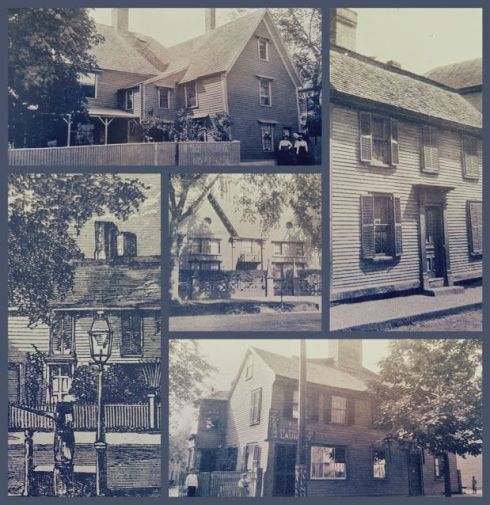
There are five Homes of our Forefathers volumes, published between 1879 and 1889, covering all of New England and a bit of Old England as well: Boston and Massachusetts are intensively covered in several volumes. Whitefield clearly saw himself as a visual recorder of these buildings and was recognized as such at the time (a time when many of these structures were doubtless threatened): An 1889 Boston Journal review of his houses remarked that “We cannot easily exaggerate the service which Mr. Whitefield has rendered in preserving them”. Even though the title pages advertised “original drawings made on the spot”, implying immediate impressions, Whitefield put considerable research and detail in his drawings, intentionally removing modern alterations and additions so that they were indeed the homes of our forefathers. His process and intent are key to understanding why Whitefield includes some structures in his volumes and omits others. He includes only two little-known Salem structures in Homes: the Palmer House, which stood on High Street Court, and the Prince House, which was situated on the Common, near the intersection of Washington Square South, East and Forrester Street. There were so many other First Period houses in Salem that he could have included–Pickering, Shattuck, Ruck, Gedney, Narbonne, Corwin, Turner-Ingersoll–but instead he chose two houses which were much more obscure, thus rescuing them from perpetual obscurity.

Preservation by Pencil Collage

Homes of our FF LC

Already-famous First Period houses in Salem, either because of their Hawthorne, witchcraft, or Revolutionary associations: the Turner-Ingersoll house before it was transformed into the House of the Seven Gables, Hawthorne’s birthplace in its original situation, the Shattuck House on Essex Street, a sketch of the Corwin “Witch House” and the Pickering House. Whitefield’s single postcard of the Witch House in its original incarnation (it was then thought to be the residence of Roger Williams, an association that was later disproven by Sidney Perley).

The Palmer and Prince houses are mentioned in the Pickering Genealogy (Palmer) and Perley’s Essex Antiquarian articles, and apparently there’s a photograph of the former deep in the archives of the Phillips Library, but without Whitefield’s sketches they wouldn’t exist. He was drawn to them, I think, by both their age and their vulnerability: both would be torn down, with little notice, in the same decade that his sketches were published.

HF SALEM 2

HF Salem


In-Vested

Yesterday I was treated to a very special tour of the China Trade gallery and basement of the Peabody Essex Museum by a distinguished and generous curator, and while I was able to snap lots of photographs (exhibition items, packing and conservation materials, amazing things in storage, including a whole subterranean gallery of ship models, some in their original Peabody Museum cases) I came away thinking about just one item, a portrait of Captain William Story by the Chinese artist known in the west as “Spoilum” (Guan Zuolin). The Story portrait stuck with me for two reasons. I had just been reading Nathaniel Hawthorne’s “Custom-House” prelude to The Scarlet Letter, which disses Story as one of the venerable figures, sitting in old–fashioned chairs, which were tipped on their hind legs back against the wall. Oftentimes they were asleep, but occasionally might be heard talking together, ill voices between a speech and a snore, and with that lack of energy that distinguishes the occupants of alms–houses, and all other human beings who depend for subsistence on charity, on monopolized labour, or anything else but their own independent exertions. These old gentlemen—seated, like Matthew at the receipt of custom, but not very liable to be summoned thence, like him, for apostolic errands—were Custom–House officers. By all accounts this is an unfair characterization of Story, who was ending his storied maritime career with a post at the Custom House as Weigher and Gauger, but you can read about his long career here. The other reason I was so taken by Story’s portrait is far less weighty: once again I wondered, why is his hand in his vest? This is a portrait by a Chinese artist who probably knew nothing of that western convention—or perhaps Spoilum was such a popular artist precisely because he did.

Story PEM

Story Spoilum

Importing Splendor gallery wall at the Peabody Essex Museum with portrait of Spoilum’s Portrait of William Story, c. 1804; close-up from MIT’s “Envisioning Cultures” website.

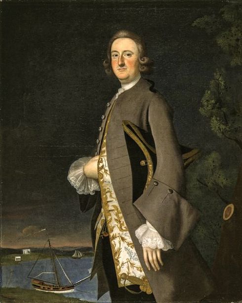
Everyone seems to associate the hand-in-vest/waistcoat pose with Napoleon but many such portraits predate those of the little emperor. Why put the hand in this position in an expression of apparent disablement? Or is it cloaked power? Then there are the rather spurious theories of Masonic hidden hands or attempts by the artists to lessen the challenge of rendering hands by painting just one. Apparently it was simply a dictate of genteel behavior, handed down from the ages of Greece and Rome (which explains the pose’s eighteenth-century origins, in that most neo-classical of centuries). If it was a question of gentility, you can see how the pose would appeal to merchants and sea captains, self-made men who perhaps wanted to appeal a bit more polished for posterity.

Piggot

Young Mariner

George_Washington,_1776

Spoilum Cranstoun

Portrait of a Western Merchant

American Sea Captain Dutch School

Ships Model PEM

Pre-Napoleon in-vested sea captains (+ General Washington): Joseph Blackburn, Portrait of Captain John Pigott, c. 1752, LACMA; John Durand, Portrait of Young Mariner, ca. 1768–1772, collection of John and Judith Herdeg; Charles Willson Peale, General George Washington, 1776, Brooklyn Museum of Art; Chinese-export Reverse Painted Mirror of Captain John Cranstoun, c. 1785, Bonhams; Spoilum, Portrait of Western Merchant, c. 1785, “Envisioning Cultures at MIT; Portrait of an American Ship Captain (Purported to be Captain John Thompson of Philadelphia who engaged in the China trade), c. 1785, Sotheby’s + in the basement of the Peabody Essex: what a treat!