Category Archives: Art

Christmas Covers

I really like the visual aesthetic of early twentieth-century Christmases, as represented by shelter magazines from that era: cozy, warm and stylish–not so commercial. Colorful, but not glittery. People (or their servants) are making Christmas rather than buying it. House & Garden is probably the most stylish, but it was an evolution, as you will see below. I looked through 10+ years of Christmas covers from 1912 through the 1920s and saw the transformation of the Christmas home from somewhat-realistic refuge to a more idealistic showplace, a transition that seems to coincide with the coming of the First World War and is exemplified in the illustrations of Ethel Franklin Betts. The post-war Christmas spirit is a little bit more romantic and curatorial: the house is presented to us through a series of vignettes. It’s all a bit less accessible, except through all those beautifully-draped windows that allow us to peep inside, drawn by the light.

housegarden22greeuoft_0359-1912

housegarden24greeuoft_0363-1913

housegarden26greeuoft_0353-1914

housegarden28greeuoft_0321-1915

housegarden30greeuoft_0299-1916

housegarden33greeuoft_0351-1917

housegarden34greeuoft_0279-1918

housegarden36greeuoft_0369-1919

housegarden38greeuoft_0373-1920

housegarden39greeuoft_0729-1921-november

housegarden42greeuoft_0453-1922

House & Garden Christmas covers from 1912-1922 (except the canopy bed, which is a November 1921 issue–I just loved it) accessed via the Online Books page at the University of Pennsylvania. Below is my very favorite cover, from 1925, and the inspiration for this post–a special “storybook” house in Salem, all lit up for Christmas.

christmas-1925

christmas-house-salem


Christmas in Salem 2016

stellar Christmas in Salem tour around Salem Common this past weekend, featuring all the things that I love about Salem houses and Salem people. The combination of generous and creative homeowners, perfect clear and crisp December weather, and myriad magical details made for a very special experience. Here’s just a short list of attractions (I really could go on and on): a McIntire spiral staircase, beautiful views of the Common (as seen through very clean windows–the first thing I noticed when I got home was how dirty mine are), an artist’s atelier/bedroom, an alpine-decorated deck, kitchens extraordinaire, an architectural dollhouse, exceptional artwork and collections. To be honest, I barely noticed the Christmas decorations as I was so focused on the architecture and interior design. I was a bit pressed for time, so I skipped the three institutional stops on the tour–the PEM’s Andrew Safford House, the Bertram House, and St. Peter’s Church–and went right for the private homes, all along the Common and a few adjacent side streets. It seemed to me that the tour was curated for contrast: of scale (larger institutional or single-family homes contrasted with smaller structures and condominiums), of architectural style (everything was built in the nineteenth century but what a difference between the Federal, Greek Revival, Victorian and Colonial Revival!), of design (very modern and more traditional), of embellishment (very decorated and more minimalistic), and above all, of expression: the homeowners expressed themselves in various ways: through their own art or design, or through their collections, or both!

I was fortunate to obtain a press pass so I could take photographs of the houses, but 1) I am not a professional photographer and 2) I got completely overwhelmed by all I had to see/ “capture”, so please go on over to Creative Salem  or to Historic Salem for more polished and comprehensive portfolios: it was really all too much for me, in the best possible way!

Let’s start with a sampling of beautiful rooms, and then I’ll try to present some of the details that caught my eye–just some, because there was so much to see.

christmas-in-salem-tree

christmas-in-salem-room-2

christmas-in-salem-room

christmas-in-salem-tree-3s

christmas-in-salem-kitchens

christmas-in-salem-detail-8

Let there be light! This  was a very enlightened tour, in more ways than one:

christmas-in-salem-window-2

christmas-in-salem-window-3

christmas-in-salem-foyer1

christmas-in-salem-staircase

Myriad Mantles……..

christmas-in-salem-mantle-2

christmas-in-salem-mantle-4

christmas-in-salem-mantle-5

christmas-in-salem-mantle

Dazzling Details…….of collections, an amazing restoration, and all sorts of embellishment, including an historic Salem gallery wall, an exterior Christmas tablescape (set up by the homeowner of a beautiful condo, who felt that she need to offer a “bit more”), and the ultimate dollhouse.

cis-details-collage

cis-details-collage-restoration

cis-collage

christmas-in-salem-detail-5

christmas-in-salem-deck1s

christmas-in-salem-dollhouses

It was impossible for me to capture the complete creativity of Salem artist Thomas Darsney’s stunning home/gallery: his canvases were luminous but the entire home was in fact a canvas, with no surface or detail unconsidered. 

christmas-in-salem-detail-6

christmas-in-salem-detail-7

christmas-in-salem-detail-10

christmas-in-salem-detail-11

Just a few exterior shots because again, the light was so beautiful on Sunday……

christmas-in-salem-exterior-3

christmas-in-salem-exterior-2

christmas-in-salem-exteriors

Why not tie everything up with a big red bow?

cis-bow


Cabinets on Canvas

After stuffing ourselves with Thanksgiving dinner the day before, and Thanksgiving breakfast pie yesterday morning, we walked downtown to the Peabody Essex Museum to see their latest blockbuster exhibition, Shoes: Pleasure and PainIt is a fine visual feast for sure, but not exactly thought-provoking for me (and I’m not really a shoe girl–but I did get some great pictures for another post), so I wandered next door to another current exhibition, Samuel F.B. Morses Gallery at the Louvreand the Art of InventionThis traveling exhibition focuses on Morse the artist and “copyist” rather than Morse the inventor: his 1831-33 painting of an imagined exhibition of 40 artworks at the Musée du Louvre in Paris, combined with his role as the “father of American photography” based on his early experimentation with the daguerreotype process, is the inspiration for a complementary display of over 65 photographs from the PEM’s extensive collection. I must admit I didn’t quite grasp the connection between the painting and the photographs—“the spirit of curation, storytelling, and cross-cultural affinities”—but I was happy to see both, and I spent some time trying to find my own connections, which is the very best impact any exhibition can have.

cabinets-1

cabinets-2

cabinets-5

1992-51-morse-8-center-figureslowres

Samuel F.B. Morse’s Gallery at the Louvre (Terra Foundation for American Art) in the PEM show, along with his copy of Titian’s portrait of François I and a crop of the artist/inventor instructing his daughter in the center of the painting from a blog post by Shoshana Resnikoff on the PEM blog Connected.

After a bit of thought and browsing around, ultimately I think I made one of the connections the curators of this exhibition wanted me to make by comparing Morse’s “gallery painting” with the original examples of this genre from the seventeenth century. The whole idea of collecting and creating a “cabinet” of curiosities, wonders, or magnificent works of art is so very early modern, and best expressed by Francis Bacon who prescribed that every Renaissance Man should have a goodly huge cabinet, wherein whatsoever the hand of man by exquisite art or engine hath made rare in stuff, form or motion; whatsoever singularity chance and the shuffle of things hath produced; whatsoever Nature hath wrought in things that want life and may be kept; shall be sorted and included. In idealized ways, these cabinets were depicted by a succession of artists, and most ardently by Flemish and Dutch Golden Age painters such as members of the multi-generational Francken dynasty and David Teniers the Younger. There are notable differences between gallery paintings of the seventeenth century and Morse’s painting (besides the fact that the earlier paintings are obviously much better): the people depicted in the former are engaged with the art on the walls and tables through collection and admiration, not replication. As (old) Europeans living in an age of confidence–they probably thought they would always be surrounded by art: the gallery of Archduke Wilhelm, in the Teniers painting below, was newly-assembled following a bout of Swedish looting during the Thirty Years’ War (and many of these same painting came from the estates of English Royalists confiscated by Oliver Cromwell!). Morse’s painting seems more about capturing and transmitting art and culture–by whatever means possible– from the Old World to the New, which seems very appropriate for the inventor of his namesake code.

cabinet-of-an-art-collector

cabinet-of-art-and-curiosities-f-francken

david_teniers_el_joven_-_el_archiduque_leopoldo_guillermo_en_su_galeria_de_bruselas_kunsthistorisches_museum_de_viena_1650-52-_oleo_sobre_lienzo_123_x_163_cmHieronymus Francken II, The Cabinet of an Art Collector, 1621, Royal Museum of Fine Arts, Brussels; Frans Francken II, Chamber of Art and Curiosities, 1636, Kunsthistorisches Museum, Vienna; David Teniers the Younger, The Archduke Leopold Wilhelm in His Gallery at Brussels, c. 1650, Kunsthistorisches Museum, Vienna.


Imag(in)ing Authors

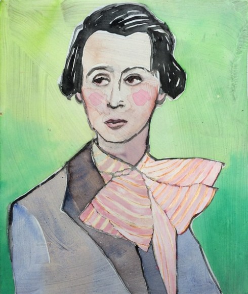
I don’t think that there is any doubt that we used to glorify authors much more in the past than in the present: while the written word is still alive and well (for now) its producers are not the focal points of our popular culture that Nathaniel Hawthorne, Mark Twain, and F. Scott Fitzgerald once were, except for those long-dead but seemingly eternal celebrity scribes like Will and Jane. There is so much material evidence of author adoration from a century and more ago : portraits, pilgrimages to literary “shrines”, biographies, the various Victorian “Authors” games–first produced right here in Salem— designed to develop literary familiarity and appreciation from an early age.But that is not the literary or the material culture that we live in now, so I was kind of surprised to encounter two “Odes to Authors” prints while I was browsing around the website of Anthropologie, of all places. These are the work of artist Valerie Suter, who is apparently a voracious reader of twentieth-century fiction.

authors

authors-2

Odes to Authors Virginia Woolf and Djuna Barnes by Valerie Suter, available here.

I went over to Suter’s website and found lots more authors: clearly they are her primary inspiration at this point in her life/career. She works in various mediums (including animation and clothing) and portrays her literary subjects in accessible and whimsical ways, occasionally doing something or in each other’s company, like the familiar subjects of A Moveable Feast  and Mark Twain playing pool, below. Lots of color, patterned backgrounds, interesting scale, and an almost complete absence of any formality or pretense bring these authors to life. I really want Josephine Tey, author of one of my very favorite books, The Daughter of Time (1951).

amoveablefeast

authors-john-steinbeck

authors-twain-and-paine

fullsizerender2

authors-joan-didion

authors-tey

daughter-of-time-penguin-classic

Paintings by Valerie Suter: Ernest Hemingway, Gertrude Stein, James Joyce and F. Scott Fitzgerald in A Moveable Feast; John Steinbeck among chrysanthemums, Mark Twain playing pool, E.B. White, Joan Didion & Josephine Tey; Penguin Classic cover of The Daughter of Time. 


You are what you do/like

I was in an antique shop several weeks ago when I spotted some framed prints published by J.N. Toy and W.R.Lucas in Baltimore in the early 1830s. They were that odd kind of anthropomorphic mixture of human, creature, plant and/or materials that always appeals to me, so they instantly captured my attention. I wasn’t quite sure I wanted to purchase them, so I snapped some pictures, but the combination of glass and lighting did not capture them very well–later I searched for some better images and fortunately found them, or most of them (The Botanist below is under glass). These lithographs are the products of a short-lived partnership between two Massachusetts-born printers, George Endicott and Moses Swett, both of whom had worked at the Pendleton Firm in Boston. I’ve admired Pendleton prints  for a while, so that’s probably another reason why these odd little prints appealed to me. Apparently these are political caricatures, illustrating an increasing (threatening) feminine presence in these endeavors, but I think this is lost in the translation of time. To me, they just look like ladies who are enthusiastic about their various pursuits (except for maybe the fish lady).

endicott-swett-circulating-librarya

endicott-swett-crockerya

endicott-swett-fish

endicott-swett-fish-color

endicott-swett-botanist-print

Lithographs by George Endicott & Moses Swett, published by J.N. Toy and W.R. Lucas, Baltimore, 1831-33, Collections of Winterthur Library and the Library of Conress.


A Rare Emblematic Eagle

It is interesting to trace the adoption of the eternal eagle as a national symbol for the United States in the first fifty years of its existence, and its adaptation in Europe and Asia by entities eager to take advantage of the new American market. The eagle has been used in heraldry since time immemorial, so it took more than baldness to make it American (remember, Benjamin Franklin preferred the turkey for the national symbol, in part (I think!) because eagles were so universal). There’s a very informative essay on “Eagles after the American Revolution” at the Metropolitan Museum’s Heilbrunn Timeline of Art History (a resource I use often) which commences its analysis with Edward Savage’s Liberty, reproduced on reverse-pained glass in China for the American market around 1800. The image shows the former American emblem, a native goddess representing Liberty, passing her torch to the new not-very-bald American eagle.

eagle-savage

Chinese reverse-painted glass depiction of Edward Savage’s 1796 print “Liberty”, c. 1800, Metropolitan Museum of Art.

And after that, a veritable explosion of American eagles, appearing in all sorts of poses and forms before standardization occurs. There is a relatively rare eagle emblem from this era that seems so Salem to me: a triumphant seafaring bald eagle rides into a harbor on a shell boat, with shield and flag brazenly displayed. The harbor looks more romantic than federal, but still, the image seems to represent the commercial and maritime foundations of the American enterprise. This past weekend, I almost purchased a saucer bearing one of these “Eagle riding on/in a shell” images, but ultimately decided it was too dear. Manufactured by only one Staffordshire pottery firm, R. Hall & Son, in the 1820s and 1830s, it seems to be one of the few transferware patterns that has held its value over the past decade.

eagle-saucer-winterthur


eagle-riding-on-a-shell-saucer

eagle-riding-on-a-shell-skinner-auctions

eagle-riding-shell-blue-collage

eagle-riding-shell-rose-collage

eagle-and-shell-black

“Eagle Riding on a Shell” transfer-printed pottery in green, blue, rose and black made by the Ralph Hall Factory, Tunstall, Staffordshire, England, 1822-40, from the Collections of the Winterthur Museum, Skinner and Northeast Auctions–interspersed with some centennial textiles made by the American Print Works in Fall River, Massachusetts in the 1870s (another era of eagle creativity), collection of the Cooper Hewitt Museum


Face-based History

I am a longtime admirer of Simon Schama, as both historian and art historian, presenter and public intellectual. For me, his study of the Dutch Golden Age, The Embarrassment of Riches: An interpretation of Dutch culture in the Golden Age (1987) is a classic of cultural history, illustrating a masterful engagement of textual and material sources, almost Burckhardtian in its scope. I always have it close at hand. Even though Schama is not principally an English historian, I show bits and pieces of his History of Britain series in class, just because he is such a good communicator–and teacher. As any reader of this blog (or former student) knows, I’m always utilizing (I think of it as playing with, actually, as I am not trained) art in class, in large part due to Schama, even though I am far less knowledgeable and adept than he. Schama’s latest project focuses on British portraits in the National Portrait Gallery, probably my very favorite museum in the world: The Face of Britain is a multi-media history of Britain through its portraits, rather than a history of British portraits. Through an exhibition last year at the NPG, and an accompanying book and television series, Schama examines Britain’s relatively modern history (after all, the portrait is a Renaissance creation) through portraits of individuals which represent both precise historical moments and dynamic trends. A very representative, and compelling, vignette relates the creation of a famous (or infamous) portrait of Winston Churchill, commissioned for the Prime Minister’s 80th birthday by Parliament. There was quite a bit of push-and-pull between Churchill and the commissioned artist, Graham Sunderland, resulting in a portrait that is described by Schama as a “beautiful ruin” detested by the subject, the humiliation of the artist at its public unveiling in 1954, and its eventual  destruction by Lady Churchill or one of her delegates. All we have are studies and photographs of the painting that captured this particular historical moment.

NPG 5332; Winston Churchill by Graham Vivian Sutherland

Preparatory Study for Winston Churchill’s 1954 portrait by Graham Vivian Sunderland, National Portrait Gallery.

The making of Churchill’s portrait is a study in power dynamics, and Schama explores other kinds of relationships in his exhibition/presentation/narrative: “The Face of Power” is accompanied by “Faces of the People”, “The Face of Fame”, “The Look of Love”, and “The Face of the Mirror”. The essential relationship in all of these categories, however, is between the artist and the subject, and consequently it is a bit difficult to string along an entire collective history. I didn’t see the exhibition, but I heard from friends that it was confusing because of its conceptual-rather-than-chronological structure. I do have the book and I’ve seen several episodes of the series, and (once again) Schama’s superior communication skills do seem to carry us along, especially as we move among variant genres: “portable portraits”, miniatures, statues, engravings, photographs. I didn’t learn too much from his analysis of the Tudor and Stuart portraits–I’ve heard all that virgin and martyr stuff before–though I do appreciate the inclusion of Oliver Cromwell’s “warts and all” portrait and the “mourning portraits” Kenelm Digby commissioned of his beloved Venetia. I got a little lost in the later seventeenth century, but thought he made effective arguments for the representational value of portraits from the eighteenth century up through much of the twentieth, and I LOVED his “faces of the mirror”: I always though of self-portraits as being exclusively individualistic and not particularly dependent on context, but no longer! As is often the case with Schama, his transitions were subtle and his connections convincing, so in the end I found myself agreeing with his assertion that”portraits bring you into their company”.

Historical faces from Schama’s Face of Britain: Sir Francis Drake, whom Schama calls “the first genuine heroic famous Englishman”, principally because he is a “man of action”; Two very different portraits by William Hogarth: David Garrick as Richard III and the convicted murderess Sarah Malcolm in prison; Two earnest expressions of love by Thomas Gainsborough (for his daughters) and Dante Gabriel Rossetti (for Jane Morris, the wife of his William), and some amazing artists’ self-portraits, for which Schama provides plenty of context: Gerlach Flicke (cropped), an imprisoned sixteenth-century artist who painted the first English self-portrait so that his “dear friends….might have something by which to remember him after his death.”, Sir Joshua Reynolds, and William Orpen, “Ready to Start” fighing (?) in the Great War. Apparently Orpen later regretted his trivializing accouterments.

NPG 4032; Sir Francis Drake by Unknown artistSir Francis Drake by an unknown artist, c. 1580, ©National Portrait Gallery

british-faces-800_hogarth_davidgarrick_as_richardiii David Garrick as Richard III, William Hogarth, © Walker Art Gallery

british-faces-hogarth-sarah-malcolm-in-prison Sarah Malcolm by William Hogarth, Sarah Malcolm © Scottish National Gallery

british-faces-gainsborough-daughters-npgThe Painter’s Daughters chasing a Butterfly, Thomas Gainsborough ©National Gallery

Rossetti, Dante Gabriel, 1828-1882; Blue Silk Dress (Jane Morris)Blue Silk Dress (Jane Morris) by Dante Gabriel Rossetti, ©Society of Antiquaries of London

british-faces-gerlach_flicke_by_gerlach_flicke_crop Gerlach Flicke, ©National Portrait Gallery

British Faces Self-portrait_c.1747-9_by_Joshua_Reynolds_(2).jpgSir Joshua Reynolds, ©National Portrait Gallery

british-faces-498px-william_orpen-ready_to_start-1917 William Orpen, Ready to Start, ©Imperial War Museum


Drawing down the Moon

One artist whose work I have admired for quite a while but never really knew how to contextualize in a topical or thematic way is Samuel Palmer (1805-1881). He seems to be one of those people who was not of his time. I guess you would call him a Victorian artist, but he reacted against his dynamic age by creating rather romanticized, even primitivized (if that is a word) landscapes and pastoral scenes, in several mediums. I find much of his work–particularly his early work– very appealing yet hard to pin down: some of his paintings look and feel as if they could date from either the early seventeenth century or the late nineteenth. The monochromatic drawings which he called “blacks” (the first two images below) look strikingly modern to me, and deliberately designed to illustrate the effects of moonlight. I was looking and thinking about the Harvest Moon over the past few nights and suddenly one of these popped into my mind. So I looked up his works at the Tate, the Victoria and Albert Museum, and the Metropolitan Museum of Art, and a few other places, and found that my memory was correct: this was a man who could really draw (down) the full moon–and its crescent counterparts as well. The then-nineteen-year-old’s biblical inscription on the last drawing below is both timeless and timely: The / moon / also to / rule by night / for his mercy / endureth / for ever. Thou crownest / the year / with thy / goodness.

The Harvest Moon: Drawing for 'A Pastoral Scene' c.1831-2 by Samuel Palmer 1805-1881

Samuel Palmer, The Harvest Moon: Drawing for ‘A Pastoral Scene’ c.1831. Tate Britain

palmer-evening-v-and-a

Samuel Palmer, Nocturnal Landscape with Full Moon and Deer, c. 1829-30. Victoria & Albert Museum


Coming from Evening Church 1830 by Samuel Palmer 1805-1881

Samuel Palmer, Coming from Evening Church,  1830. Tate Britain

palmer-cornfield

Samuel Palmer, A Cornfield by Moonlight with the Evening Star,1830.  British Museum

B1977.14.65

Samuel Palmer, Harvest Moon, 1833. Yale Center for British Art

17.55.2

Samuel Palmer,Christmas, or Folding the Last Sheep, 1850( Etching; second state of five). Metropolitan Museum of Art

palmer-harvest-moon-drawing-1824-v-and-a

Samuel Palmer, Harvest Celebration, c. 1824 (Leaf 20, ink drawing from a sketchbook). Victoria & Albert Museum


The Shots heard round the World

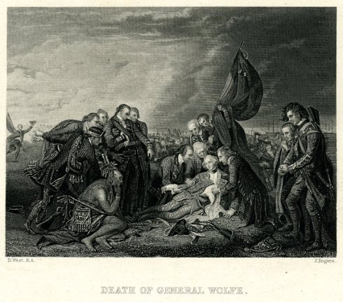
No, not that one, the (three) ones that came years before, which killed Major-General James Wolfe on this day at the decisive Seven Years’ War Battle of Quebec in 1759, a death that was disseminated around the world through the iconic 1770 painting by Benjamin West. The painting and its reproductions, in oil, print, tole, pottery and caricature, became a powerful symbol of the emerging British Empire, even though it was rather ironically the creation of an American-born artist. West broke with tradition by depicting the fallen hero in contemporary uniform rather than classical dress, thus intensifying the identification of his contemporaries, yet still portrayed an eternal, Christ-like figure. The painting was a sensation when it was first exhibited, and for quite a few years thereafter.

west-death-of-general-wolfe-1770

Benjamin West, Death of General West, 1770National Gallery of Canada.

I’m hardly the first historian to pontificate on the importance of this painting: I’m leaning pretty heavily on the analysis of Simon Schama (albeit in “historical novella” form in Dead Certainties:  Unwarranted Speculations, 1991) and Linda Colley, more straightforwardly in her magisterial Britons. Forging the Nation, 1707-1837 (1992). Colley calls the painting a “splendid fraud” in that none of the onlookers were even there, most particularly the pensive Native American, who was of course fighting on the other side in what is referred to as the “French and Indian War” over here. Still, Colley observes that “The Death of Wolfe started a vogue for paintings of members of the British officer class defying the world, or directing it, or dying in battle at the moment of victory.”  I think this “vogue” was probably due as much to the prints of the painting as the painting itself (most after William Woollett’s engraving), because they were everywhere, in constant circulation  up until at least 1820 as far as I can tell: through the American and Napoleonic wars, when Britain needed its heroes. I suppose it was only the cult of Nelson that diminished that of Wolfe, somewhat.

death-of-general-wolfe-1776

death-of-general-wolfe-1820

death-of-general-wolfe-john-rogers-1830

west-tray-northeast-auctions

west-pitchers-christies

wolfe-gillray

Print made by William Woollett, 1776; Etching for John Young’s  ‘A Catalogue of Pictures at Grosvenor House’, 1820; Print by John Rogers , 1830, all Collection of the British Museum; Tole Tray, Northeast Auctions; Creamware Jugs, Christies Auctions; and The Death of the Great Wolf, a satire on the passing of the Treason and Sedition Bills, in 1795, James Gillray, British Museum.


Conflagration Commemoration

Across the Atlantic, the year-long commemoration of the 350th anniversary of the Great London Fire of 1666 is peaking this weekend, today actually, with a contained conflagration: a 400-foot wooden replica of the seventeenth-century city will go up in flames on the Thames at 8:30 pm tonight. This is only one spectacular event amidst many creative ventures  organized by the arts production company Artichoke, which seeks to”transform people’s lives and change the world through extraordinary art” along with other institutional purveyors. The Artichoke events include illuminations, projections, lectures, interactive performances, pub crawls, a “fire food market” and “fire garden”, all offered under the umbrella of “London’s Burning”, while London’s more traditional institutions are offering a variety of thematic exhibitions and displays. It’s a very complete commemoration, befitting a transformative event in London’s–and Britain’s–history.

Fire of London St Pauls

Fire of London model Flames projected onto the dome of St. Paul’s Cathedral, the symbol of post-Fire London. Photograph: Chris J. Ratcliffe/Getty Images;  the David Best-designed wooden model to be set on fire tonight @artichoketrust.

Fire has played such a huge role in London’s history–not only in the seventeenth century, but also in the nineteenth and twentieth centuries, when another Great Fire of 1834 leveled much of Westminster and the Blitz destroyed much of the central City. The commemoration of tragedy in general, and fires in particular, must necessarily focus on loss and devastation but also on rebuilding–and how the process of rebuilding reflects on the particular society that is engaged in it. I think an incandescent commemoration of 1666 is appropriate because it will illuminate the loss at least as much as the rebuilding–which has always been the focus in remembrance of this particular Great Fire: Wren’s London. We don’t even know how many people died over those three burning days: we have precise knowledge of property damage but a woeful lack of comprehension about the human toll. When the Fire burnt itself out late in the day on September 5 it had consumed 13,200 houses, 87 churches, and St. Paul’s Cathedral and left up to 200,000 people homeless, but how many people?  Who knows: anywhere from hundreds to thousands (doubtless including anonymous souls who had survived the preceding plague year), yet we still seem to repeat the ridiculous number of only six verified deaths. Then as now, it seems that we can only begin to process the enormity of destruction in a visual and structural way.

Griffier I, Jan, c.1645-1718; The Great Fire of London, 1666

Fire of London print BM Griffier

Fire of London print BM after Griffier2 BM

The paintings of Dutch artist Jan Griffier I (c. 1645-1718), who came to London just after the Great Fire, seem to be particularly influential depictions: his view of the burning of Ludgate (Museum of London Collection) was reproduced in scores of prints over the next century and a half (Trustees of the British Museum).