Monthly Archives: March 2012

Urban Landscapes

I wish we had city maps like the “bird’s eye” views produced in abundance in the second half of the nineteenth century today, but I suppose Google maps have taken their place.  Digital maps are not substitutes for the first generation of these maps, however, which give us a unique perspective on urban landscapes of the era, a block-by-block, house-by-house, humanistic view that not even photography provides.  I suppose I like them so much because they remind me of the city maps of the sixteenth century, my period:  the civic pride, the belief in progress through construction, the people are so conspicuous in maps of both eras.  To illustrate my point, let’s look at two maps, produced centuries apart:  a map of the German city of Nuremberg from Georg Braun & Franz Hogenberg’s multi-volume Civitas Orbis Terrarum dated 1575, and a map of Salem that I happen to own, John Bachelder’s southern perspective of the city,  published by Endicott & Company of New York City  in 1856.

There are several differences in these perspectives (color, water, iconography, dress) but there are also, I think, some striking similarities, the most important of which is the central placement of the citizens of these cities.  The message seems to be:  the people are the city, not just the magnificent buildings or the busy harbor. Very democratic, in both the sixteenth century and the nineteenth century.  Google maps don’t place people front and center; people aren’t even in Google maps.

John Bachelder, a New England native and an artist, lithographer, and photographer as well as a cartographer,  published several other views of Salem, as well as many other cities, before he went on to distinguish himself as a “battlefield cartographer” and more:  documenting in minute detail some of the major battles of the Civil War, most notably Gettysburg.  But I think that his eye for detail is present in is antebellum city maps as well, many of which are at the Library of Congress.  Below is his western perspective of Salem, also published by Endicott & Company–a bit further back, more of a traditional panoramic view featuring more landscape than people, yet the people are still present.

As impressive an artist as Bachelder was, my very favorite Salem city map, also from this era, was produced by John William Hill in 1854.  Here is a map that defies categorization:  it’s part panorama, part rendering.  The detail, perhaps a bit idealized, is amazing, especially if you view it with a zoom feature.  Yet the people are stick figures; it’s all about buildings and streets.

Map of Salem, Mass., 1854 by John William Hill for Endicott & Co., and the Smith Brothers, New York, 1854

Another artist and lithographer who was producing “low-level” (I’m referring to perspective rather than quality) vista maps of American cities  in the middle of the nineteenth century was Edwin Whitefield, who emigrated to America from England in 1838 and almost immediately began to earn his living by making on-the-spot sketches of his new country.  Like Bachelder, it was the built landscape that caught his eye rather than the natural one, and no doubt both he and Bachelder knew that city fathers would be far more likely to pay for their work than farmers. Later in his life, Whitefield moved to the Boston area and became a real booster of the New England heritage, publishing several volumes of renderings of first period homes under the title Homes of our Forefathers.  Perhaps he wanted to capture them before the urban landscape swallowed them up.

Whitefield’s Views of Salem, Lynn, Beverly and Danvers, Massachusetts, 1850 (New York Public Library Digital Gallery), and two Salem houses in Homes of our Forefathers (1880).


The Folly Cove Designers

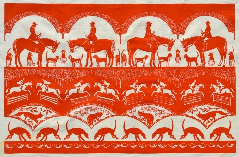
This past weekend I made a major score when I encountered a long-sought item:  a placemat depicting Chestnut Street  in Salem made by Louise Kenyon of the Folly Cove Designers in the 1950s or early 1960s.  Though it is in rather shabby condition, I snapped it right up, as I have long wanted a piece of Folly Cove and now I have one depicting my own street!

The Folly Cove Designers were a collective of textile artisans working in the Lanesville section of Gloucester, Massachusetts from the 1940s through the 1960s.  Inspired by the Arts & Crafts movement and founded by illustrator Virginia Burton Demetrios, the designers carved their own linoleum blocks and produced linens, clothing, and upholstery fabric for their own houses and also for sale.  There was a strong educational mission connected to what essentially became a guild:  aspiring Folly Cove Designers completed coursework (designed by Demetrios, apparently as innovative an educator as she was an illustrator and designer) as well as a “masterpiece” (a term that originated in the medieval craft guilds), which, if it met with the approval of a jury made up of revolving members of Folly Cove, was produced and offered for sale under the trademark of the Designers.

After Virginia Burton Demetrios’s death in 1969, the guild dissolved, but one of the earliest Folly Cove designers, Sara Elizabeth (Halloran) continued the block printing tradition in Lanesville until her death in 2009.  The Sara Elizabeth Shop is still open for business, selling old and new Folly Cove designs on fabric and paper at both their shop and their website, which is also a good source for Folly Cove history and the block printing process.

The printing process:  as demonstrated in a 1945 Life article (“Yankee printers get National Recognition”), as well as by the still-working Acorn press at the Sara Elizabeth Shop.  Below, Virginia Burton Demetrios and her students/designers from the Life article.  The piece in the center (by Demetrios) is called Diploma, because it was given to a new designer, framed, after they had sold their first block print. Note the footstomping (or stamping) phase of the production process.

My Chestnut Street print is not really representative of a Folly Cove design, though the guild was indeed made up of individual designers with individual visions.  Still, there are a lot of floral and naturalistic themes, and some very whimsical images, particularly of animals.  The concentrated Finnish population in mid-twentieth century Lanesville might have asserted a Scandinavian influence on the prints (though they are far from Marimekko!), as several members of this community became Folly Cove designers.  On the other hand, some of the patterns look positively Elizabethan to me.  The Cape Ann Museum in Gloucester has a very strong Folly Cove collection, including sample books and archival materials as well as textiles (in fact, the Museum recently purchased the block which produced my print).  You do run across Folly Cove products in antique shops and at auctions in our area as well:  Blackwood/March Auctioneers in Essex always seem to have lots.  Essex antiques dealer Andrew Spindler currently has several Folly Cove patterns available in his 1stdibs shop, including one of my favorites, Gossips, and some pillows covered in a perennial favorite, Lazy Daisies.

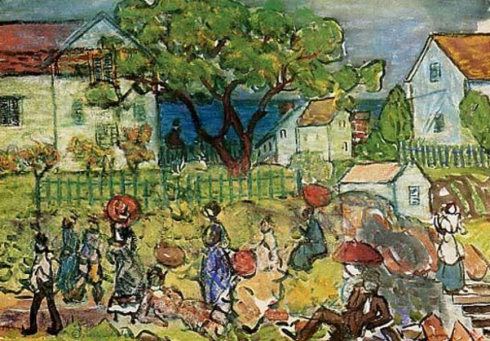
A few more of my favorite Folly Cove prints:  two designs by Zoe Eleftherio and Elizabeth Jarrabind’s Turtles, and (to set the scene) a Maurice Prendergast painting of Folly Cove from 1910-15.


Utopia, not Dystopia

Last week was a bit unnerving, unsettling, disconcerting.  Not only because of the unseasonably warm weather, but also because of a word (or two):  dystopia or dystopian.  The opposite of utopia, not a perfect, elusive place, often in the future, but rather a repressive and hostile place, definitely in the future, where individual freedoms are subjected to some all-powerful system. Whenever I was near a radio or a television,  I kept hearing that word, at least 20 times, more than I have ever heard that word in my life.  The primary contexts for the word were reviews of the Hunger Games film, set in a decidedly dystopian future, and related stories about the popularity of dystopian themes in young adult fiction, which is itself disconcerting.

As is always the case when things are not just quite right for me, I retreat to the past.  What better way to counter dystopia in the present than with some utopias of the past?  I really don’t know that much about ancient history, so I skipped the Garden of Eden, the Isles of the Blessed and Elysian Fields and went back to the Renaissance Utopia, Thomas More’s 1516 book, and then moved forward, more happily, toward the present.

Early Modern Utopias:  More’s Utopia, Tommaso Campanella’s City of the Sun (1602), Bartolomea del Bene’s City of Truth (1609), and Francis Bacon’s New Atlantis (1624).

As you can see (you’ll have to take my word on the cropped Bacon image), all of these utopias are self-contained islands or cities, apart from the corrupt world, and their very existence is a commentary on that world.  It’s also very interesting to me that in these four works, two written by Englishmen and two by Italians, a distinct nationalistic vision of utopia has emerged:  More and Bacon have located their utopias on islands and Campanella’s and del Bene’s utopias are walled cities.  The Italians seem to think they can find utopia through urban planning, which was both an artistic and a logistical enterprise. Not only did the Italian Renaissance inspire and create paintings like Piero della Francesca’s Ideal City (c. 1470) but also the Venetian “development” of Palmanova in 1593, a real “ideal city”.

With the coming of industrialization in the modern era, cities could not possibly be utopian.  The ideal life/world could now only be found in a long-lost Arcadian past or a pastoral enclave in the present.  American utopianism in the nineteenth-century seems to be best represented by the romantic landscapes of the Hudson River Valley school, like Thomas Cole’s Dream of Arcadia below, and social experiments like Brook Farm here in Massachusetts, where Nathaniel Hawthorne spent a few (apparently miserable) months in 1841.  A young and struggling writer at the time, Nathaniel clearly did not find his utopia at Brook Farm:  too much manure.

Thomas Cole, Dream of Arcadia, 1838. Denver Art Museum.

Joseph Wolcott, Brook Farm with Rainbow, 1845. Massachusetts Historical Society.

I’m not sure how the quest for utopia has fared in the twentieth century, and into the twenty-first.  Have we given up on it?  Are utopian ideas and ideals so personal that we don’t have a collective cultural vision?  Is is all about dystopia?  At least in the first part of the century, and despite the dreadful First World War, the Bauhaus movement was definitely driven by utopian ideals as well as the passion for modernism and the desire to integrate art, design and technology.  All of these goals are exemplified by the title and the typography of their publications from the early twenties:  the volumes of  Utopia:  Dokumente der Wirklichkeit (Utopia: Documents of Reality) were designed by Oskar Schlemmer in a style that still looks modern today.

An etching by the American artist Peter Larsen from just about the same time as the beginning of the Bauhaus School shows a decidedly more inaccessible Utopia, like that of Thomas More.  So we’re right back where we began, with those who believe that Utopia is within reach, or at least worth striving for, and those that believe it’s just a fantasy.

Peter Larsen, Utopia,1919. Smithsonian American Art Museum.


Globally-warmed Gardens

Unlike my students and nearly every one I run into, I’m not relishing this rare warm March weather.  I like warm (not hot) weather as much as the next person, but in season.  If there’s going to be a bright sun out there, I would prefer that there are leaves on the trees for shelter and shade.  Yesterday the temperature rose into the mid 80s which is just wrong for March in Massachusetts.  Last year was an amazing year for my garden, well-protected and -watered by a blanket of snow all winter long, but this year I am worried.  Looking around the web for some advice and reassurance, I instead became more alarmed when I came across the website for a campaign by the National Trust in Great Britain from 2010: A Plant in Time sought to raise environmental awareness by examining how climate change could end gardening as we know it.

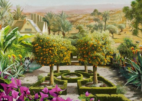
The point, and the cause, is well-illustrated, literally, by three paintings by artist Rob Collins showing the effects of rising temperatures on the classic English garden—essentially it evolves into a Mediterranean one.

The end of the English garden is a dismal prospect indeed!  I look at my own (New) English garden, where blooms abound, and wonder if I’m going to see the same transformation:  the disappearance of the lawn, the roses, the delphiniums (actually, my delphiniums never come back anyway).  The National Wildlife Foundation’s Gardener’s Guide to Global Warming informs me that I’m still in my old 6B Plant Hardiness Zone, but also that at least one iconic Massachusetts plant, the mayflower, will disappear in the next few decades due to climate change.


Camellia Craze

One associates the camellia more with the South than the North (at least I always have), but in the early and middle part of the nineteenth century there was such intense interest in the flower among the elites of Boston, New York, and Philadelphia that the term craze seems apt. Camellias are far from hardy up here, so the camellia craze coincided with a flurry of greenhouse building.  All around Boston greenhouses popped up in the 1820s and 1830s, each one producing a profusion of hothouse flowers for Yankee homes.  At an exhibition sponsored by the fledgling Massachusetts Horticultural Society in 1836, Charles Mason Hovey, a local nurseryman and later a prominent horticultural publisher, showed 12 varieties of Camellia Japonica, one of which was named after him.

Herman Bourne, Flores Poetici, The Florist’s Manual (Boston, 1833); J.J. Grandville, Les fleurs animées (1847).

Another prominent Camellia enthusiast was Boston merchant Theodore Lyman, who commissioned Salem’s own Samuel McIntire to design a country house  for his property west of the city in 1793.  The Lyman Estate or “The Vale”, as it was called then and now, included not only the McIntire mansion (later considerably altered and expanded; you can see a great post on its later history and interiors here), surrounding grounds, and a beautiful carriage house, but also a chain of greenhouses.  The Vale remained the country seat of the Lyman family for over 150 years, and was conveyed to the Society for the Preservation of New England Antiquities (now Historic New England) in 1951.  Both the house and the carriage house are undergoing significant repairs at present but the greenhouses are open all year long, and I visited them last week, near the end of the annual “Camellia Days”.

The Vale in halcyon days, before its Victorian and Colonial Revival alterations (courtesy Historic New England) and last week, in the midst of roofing work.

There are four greenhouses at the Lyman Estate, the oldest one dating from 1804.  The “Camellia House” was built in 1820, right in the middle of the camellia craze in Boston.  I visit the greenhouses several times a year just to see the very established specimens within or for plant sales.  Even apart from the plants, the infrastructure is also very appealing, as is the juxtaposition of soft russet brick, Victorian steam fittings, and glass.  I have made it for the height of camellia season in the past, which is generally in February, but I was late in this busy year:  some of the camellias you see below are still blooming, but the general ambiance was one of faded glory.

The Camellia House is the last of the chain of greenhouses, so you go through glass rooms of tropical plants, fruit trees, succulents (!!!!), orchids, and then you’re there….


A List and Links

Having been nominated for a Versatile Blogger award last week by the gracious author of Moving in Time, to whom I extend my gratitude, I want to follow the rules of the award by: 1) revealing 7 things about myself and; 2) recommending 15 blogs which I admire.

The first task:

1. I am the very last person in the world who does not have a cell phone.

2. I’m a terrible clotheshound who can’t seem to break the habit.

3. Doris Day movies make me happy.

4. Contrary is one of my favorite words.

5. I detest eggs:  I have to run from the room if anyone is breaking one or cooking one.

6. Also succulent plants:  they really give me the creeps.

7. I dislike the color blue (except turquoise).

And the second.  It should go without saying that I admire all the blogs on my blogroll and check in with them regularly.  So for this task, I’m choosing blogs that I have not linked or referenced before, including several that are relatively new to the web.  This seems to be in keeping with the spirit of the award.  All of the blogs below are either very creative, very well-researched, or very fresh, original and earnest–another one of my favorite words–in some way. So, here is my rather random list of links:

Secret Gardener.  Beautiful images here–and words.

Blanket and Bone.  A lovely eye; my idea of a design blog.

Absinthefiend. A new blog about absinthe–need I say more?

Restaurant-ing through History.  Looking at history through the perspective of restaurants;  a nice window into the recent past.

Got Medieval. This is a very well-established, popular blog, but I haven’t shared it before so I am now.

 The Quack Doctor. Again, a blog  that has been around for a while, but as the popular history of medicine is a bit obscure, well worth sharing.

Joie de VivreA strong sense of place, in this case Ireland.

Spitalfields Life:  A strong sense of place, in this case East London.

Desideratum:  The blog as a work of art.

Animalarium:  The best animal images anywhere.

The Passion of Former Days: a great site for old photographs.

Tattered and Lostone of several great ephemera sites.

The Bygone Object:  we’ve been on a big public history push at SSU, and this academic blog has helped me to focus my thinking about the field and its endeavors.

Lostpastrememberedmuch, much more than a food blog; all sorts of context, and great images.

Piewacket: a nice photography and design blog (and I love the movie which is I assume is the source of its name:  Bell, Book and Candle).


Green Men

A succession of green men for St. Patrick’s Day, beginning with several of the most celebrated medieval “foliate heads” in Britain from the parish churches of Sutton Benger, Wiltshire and Winchelsea, East Sussex.  As you can see, these grotesques are not green in color but they are definitely green in spirit:  representing nature, fertility, the life cycle, and memory.  A very common motif of medieval architecture across Europe, I have always felt that the presence of the Green Man in sacred spaces also represents the assimilation of Christianity and pre-Christian cultures.

Green Men from Wiltshire and Sussex, from a comprehensive gallery of images at “The Enigma of the Green Man” site.

The omnipresent Green Man has a few cousins in medieval culture, including the “wild man” or “wild woodman”, sometimes referred to as the “wodewose” as in this great scene from Jean Froissart’s Chroniques d’Angleterre, titled the “Dance of the Wodewoses”.  In the seventeenth century, the wild/green man appears playing with fireworks in John Bate’s Mysteries of Art and Nature (1635), which is a bit menacing, given that this is the century of the Gunpowder Plot.  And after that, he evolves into “Jack in the Green”, the central focus of May Day festivities across Britain. Below are some May Day, or Jack-in-the-Green Day celebrants in Bristol and from one of my very favorite blogs, terrain.  I wish we had this custom in the United States.

British Library MS Harley 4380, folio 1, 15th Century


There has to be a connection between the Green Man and the other famous green man of medieval English heritage, Robin Hood, but I’m not sure what it is (besides the pub sign below).  There are both outside of civilization, in the woods, but still moral guides.  And then of course there is the green knight of Sir Gawain fame:  how does he relate?  This is not my field; I can only speculate.  He’s beyond the realm of outlawry and in the realm of otherworldly–like the Green Man.

Robin Hood illustrations from the Robert Copland edition of 1550 and the Louis Rhead edition of 1912; the headless Green Knight in F.J.H. Darton’s Wonder Book of Old Romances (1912) and a Ken Orvidas illustration in the New York Times.

I am well into this post and I haven’t even mentioned the man whose day it is:  St. Patrick.  This is defensible because St. Patrick is not really a “green man”; he’s the antithesis of the green man really.  Before the early modern era, he is never depicted in green because that would make him too wild, I think.  He is a conqueror of the wild (the non-Christian) rather than a wearer of the green.  Green might be nearby (in the form of shamrocks or the snakes he supposedly drove out) but he is not green.

P. Gally print of St. Patrick the Apostle of the Irish, 1806, British Museum.


The only exception that I could find is this much earlier image of Patrick below, from John Mandeville’s Voyage d’outre mer (1451):  he is standing on a patch of green surrounded by devils and souls in purgatory, and underneath his bishop’s robe he is clearly wearing a green tunic.  Green has become Christian, it seems, and perhaps a little bit of early Irish nationalism.

British Library Royal MS 17B XLIII, folio 132v, Fifteenth Century.

Once you get into the modern era, there are a lot of directions in which to follow the green man.  The medieval motif gets revived in late nineteenth-century urban architecture, so that occasionally you will see him among the surface embellishment of neo-Romanesque multistory buildings:  modern skyscrapers.  There’s a whole book about The Green Man in New York City by Asher Derman. I tried to find some green men in Salem, but there are none:  perhaps in Boston where the Richardson Romanesque is more prevalent.  And then you can go into the popular culture fantasy direction, where there are the little green men of science fiction and the super-heroic Green Hornet and Green Lantern. Green men are everywhere, even telling us when to cross the street.

I think I’ll finish up close to where I began, with the woodsy green man. The work below, Hidden Green Men by Bryony Drew, is one of the entries in this year’s Victoria & Albert Illustration Awards.  There are supposedly eight green men in this picture (a mix of illustration, photography and photoshop), but I have yet to find them all. Green men are ever-elusive.


Double Parlors

We’re repainting our double parlor, finally.  For years friends have been telling me to go darker, to highlight the serious moldings in these rooms. It’s painted a very subtle blush pink now, but it just looks like a rather shabby off-white in the pictures below. And it looks cold. Clearly it’s time to paint: I’ve taken down all the pictures and removed all the moveable stuff, now out with the rugs, the couches and the mirrors–Moneypenny will stay on the radiator for as long as she possibly can. We haven’t quite decided on the exact color yet:  I really like Rundlett Peach from California Paints Historic Colors of America, while my husband is leaning toward something a bit more something with a bit more orange, or perhaps a warm grey (is there such a thing?) or something “buffy”. We tried a rather vibrant persimmon last year and realized we could not live with quite that much color in these rooms. Any suggestions would be welcome; there’s a lot of prep work to do so we have a few days to decide. The double parlor is really one large room separated by pocket doors which we rarely close; while it is a large area it is always rather dark, as our house is north-facing.  The matching grey marble mantles are the other consideration; obviously we want a color that complements them. Here’s a few pictures of the space now.

There are “fake doors” in both the front and rear parlors for symmetry, which is very Greek Revival.

After painting, lighting.  I’ve never really liked the fixture in the rear parlor, and what you are seeing above is a cap where a gas fixture once was so we need some wiring in the front parlor.

It’s fun to turn your house (and your cat) into a pencil sketch!

While looking around for some inspiration and colors for my double parlor, I kept coming across images of the Greek Revival house in Brooklyn Heights where Truman Capote lived when he wrote In Cold Blood and Breakfast at Tiffany’s. No doubt Google was directing me there because I was searching for “Greek Revival Double Parlors” and this house is a Greek Revival with several parlors (I don’t think they are contiguous) but also because this house has recently been in the news for setting the sales record for a single-family home in Brooklyn: $12 million (though the asking price was $18 million–sign of the times). The house looks stunning even though it has a bit of an ’80s ambiance (1980s not 1880s, though neither is good); it has a lovely enclosed garden in back and the colors of its parlors are close to what I want for mine, although I think I need a warmer, slightly rosier color than that pictured below. I must admit that I like my softer grey mantles better.

I think both Federal and Greek Revival houses are quite adaptable to a range of furnishings. You can go very period if you like, or in a more contemporary direction, or mix it up (my preference), and it all seems to work in these spare, classical spaces. I love looking in my Richard Jenrette books, but that kind of grandeur is unattainable. House museums like the Merchants House in New York City are fun to visit, but I wouldn’t want to live there. On the other hand, the parlor in cosmetics scion Aerin Lauder’s Greek Revival country house in the Hamptons is a bit too modern for me (although that orange might be just what my husband wants).

Richard Jenrette’s great book, followed up by More Adventures with Old Houses, which focuses on Edgewater, his amazing Greek Revival estate on the Hudson River, the front parlor of the Merchant’s House Museum in NYC, and Aerin Lauder’s Hamptons living room photographed for Elle Decor.

I think the warmer, traditional yet updated look that appeals to me the most is well represented by the double parlor of an 1838 Nantucket house designed by Thomas Jayne Design Studio for clients “who were committed to adapting to the historic architecture of their home rather than altering it to fit contemporary tastes”.  A lovely attitude and a lovely room.


The Bulfinch Bank

In terms of architectural turf, I like to think of Salem’s own master woodcarver/architect Samuel McIntire as being so eminent and prolific that no other architect of his day could compete for commissions within the bounds of the then-bustling port. I like to think that, but I am wrong, as an even more eminent architect, Charles Bulfinch (1763-1844), designed several buildings in Salem, including one that is still standing: the Essex Bank Building.

Charles Bulfinch built Federal-era Boston in much the same way that Samuel McIntire built Federal-era Salem but the former architect had more of the background and inclinations of a “gentleman” (Harvard, the Grand Tour) than a craftsman, and seems to have been far more politically ambitious as well, serving on the Boston Board of Selectmen and as the Commissioner of Public Building in Washington. In addition to the residences he designed for wealthy Bostonians (including the Harrison Gray Otis house, the present-day headquarters of Historic New England), his New England commissions included buildings for Harvard and the Massachusetts General Hospital, the state houses of Massachusetts, Connecticut and Maine, and the majestic “Bulfinch Church” (Unitarian First Church of Christ/Fifth Meeting House) in Lancaster, Massachusetts. In Washington, Bulfinch was responsible for restoring the Capitol building after its burning by British troops occupying Washington during the War of 1812:  he rebuilt the wings, laid out grounds, and designed the center domed building that was later replaced by the much larger dome of today.

Bulfinch's Capitol Dome in 1846, Architect of the Capitol.

In Salem, Bulfinch designed at least three buildings that I know of:  The Salem Almshouse on Salem Neck (1816), Ezekiel Hersey Derby’s grand house on Essex Street (1800), and the Essex Bank.  There seems to be conflicting information about the Old Town House, which is sometimes attributed to Bulfinch and sometimes not, so I’m leaving that out.  The Almshouse, often called the “Poor Farm” survived until the 1950s when it was razed to make way for condominiums, and the Derby House survived until the 1970s, albeit in unrecognizable form as it was increasingly swallowed up by the commercial storefronts of busy Essex Street.

The Salem Almshouse and the Ezekiel Derby house in photographs from the early 20th century, after the latter had been transformed into the “All America Shoe Shop” adjacent to the Salem Five Cents Savings Bank. I couldn’t find a photograph of this Bulfinch house in its heyday, but you can see a similar house in Portsmouth in this post by the Downeast Dilletante. In her 1919 book A Loiterer in New England, Helen Weston Henderson attributes the Derby house to McIntire rather than Bulfinch and includes the elevation drawing above–she also bemoans the house’s “desecrated front”. The bottom photograph shows the Ezekiel Hersey Derby room at the Philadelphia Museum of Art.

These Bulfinch buildings in Salem are gone, but the Essex Bank Building survives, due in large part no doubt to the preservation efforts of Historic Salem, Inc. and the Salem Redevelopment Authority.  It was the first bank building in Essex County, and remained a bank for a good part of that century until it became the headquarters of the Salem Fraternity for Boys (the forerunner of the Boys & Girls Club of Greater Salem) in 1869.  Frank Cousins’ photograph below indicates that it had reverted back to a bank in the early twentieth century. At the end of that century it became an antiques store (with a stunning second-floor apartment) and now it houses an antiquarian bookstore.

Frank Cousins photograph from the Urban Landscape Digital Collection at Duke University; the Essex Bank Building yesterday.


March Hares

The “frisky” behavior exhibited by European hares in March, the beginning of their mating season, has determined that the allusions “mad as a March hare” and “harebrained” have been with us for a while, far longer than Alice in Wonderland. In the sixteenth century, there are so many references to this seasonal disorder among rabbits, including John Skelton’s “as merry as a March hare”  in Magnyfycence (1520) and John Heywood’s “as mad as a March hare” in the first edition of his Proverbs (1546) that it seems well-established in the English language and culture.  So now it’s March, almost mid-March, and it’s definitely time for some March hares.

My search for some real long-legged European hares brought me to a beautiful book by Christine Gregory, Brown Hares in the Derbyshire Dales (2010), which contains some stunning photographs of hares in their element, in every season. Gregory seems to pursue her subjects with a singular intensity, with riveting results.

A Hare in March by Christine Gregory, from Brown Hares in the Derbyshire Dales.

In the past, visual depictions of hares came in a variety of forms: different types of cards issued over the centuries, fables and stories, the decorative arts. They also seem to be among the most anthropomorphic of animals (especially March Hares). There are of course many images of hares in hunting scenes in the medieval and early modern eras, but almost as many in “turning the tables”/ world-turned-upside-down scenes in which hares are the hunters rather than the prey.  I could focus an entire post on just this sub-genre, but I’ll just include one such scene today: The Hunter Caught by the Hares, a Georg Penz print from a Hans Sachs broadside (circa 1534-35) in the collection of the Museum of Fine Arts, Boston.

Cartophilic hares appear in both the early modern and modern eras, beginning with this “nine of hares” card, from a deck of 72 round cards engraved by the “Master PW’ of Cologne around 1500.  Rather than hearts and spades, the deck is organized into suites of roses, columbines, carnations, parrots and hares. A more dandified hare appears on a cigarette card from many centuries later.

The Nine of Hares, Master PW of Cologne, circa 1500, Collection of the Victoria & Albert Museum, London. Cigarette card, 1920s, New York Public Library Digital Gallery.

Nineteenth- and early twentieth-century hares take all forms: both straightforward and anthropomorphic representations, political caricatures, decorative motifs, and from the second half of the nineteenth century onwards, a steady succession of illustrations from children’s’ books. The most acclaimed graphic designers and illustrators all have their hares, including Christopher Dresser, Hugh M. Eaton, and Walter Crane.

A European hare from Samuel Griswold’s Pictorial Geography of the World (1849), A “grotesque dado-rail, being formed of the hare, which is especially suited to a dining room” by Christopher Dresser (1876),NYPL Digital Gallery, a Chelsea tile by William Frend De Morgan, c. 1873-76, Victoria & Albert Museum, London, and the March cover of Frank Leslie’s Popular-Monthly.

Crane’s March Hare, who first appeared in the 1865 edition of Alice’s Adventures in Wonderland, is my favorite, and more natural (and Arts & Craftsish) hares appear in his 1887 edition of Aesops Fables. Jessie Wilcox Smith’s March Hare and Mat Hatter appear in a domestic scene in her 1915 edition.

Illustrations from Walter Crane (1865 & 1887) and Jessie Wilcox Smith (1915), NYPL Digital Gallery.

There is a large trace (or drove, there seem to be quite a few applicable collective nouns) of contemporary hares from which to choose, but I finally settled on the two below:  Bruce Gernand’s 2004 etching, Hare in Transit, an updated version of the Tortoise and the Hare, and Julia Cassels’  very vertical Mad March Hare.


%d