Monthly Archives: February 2012

Leaping Ladies

I don’t know about the supposedly “medieval” custom of ladies proposing to their fellows on Leap Days; it sounds like another example of what cultural historians call the invention of tradition to me.  As stated again and again (especially on the internet), the “Ladies’ Privilege” dates from either the future St. Patrick’s dialogue with the future St. Bridget in the fifth century, or a Scottish Act of Parliament in the thirteenth century.  In the Tudor-Stuart period that I study, I have found a few references to this odd day out, a day that doesn’t quite fit on the calendar, and one on which unusual things may occur, notably in the 1600 play The Maydes Metamorphosis, which contains the couplet Master be contented, this is leape year, Women wear breetches, petticoats are deare.

Actually there’s a long tradition of turning-the-tables in western culture:  lords of misrule, charivari, the “world turned upside down”, festivals.  Probably in other cultures too.  So I think the irregularity of leap day became equated with a day when women wore the pants, obviously an equally unnatural occurrence.  Not only do we have the Mayd’s Metamorphosis rhyme, but two images from several centuries later, both of which clearly express not-so-subtle political (King George IV wearing a dress) and social (bloomers!) sentiments.

George Cruikshank, A Leap Year Drawing Room, or the Pleasures of Petticoat Government, 1820. British Cartoon Prints Collection, Library of Congress.

Bloomers for Leap Year, Harper's New Monthly Magazine, 1852. New York Public Library Digital Gallery.

The cartoons above are critical caricatures, but women acting like men could also be entertainment, as very literally illustrated by this 1896 poster for the Forepaugh & Sells Brothers Combined Circus (from the Library of Congress), featuring “”the leap year ladies of laughter” and  “the only clown women who wear the comic crown”.

As far as I can tell, it is not until after the turn of the century, when we enter into a “golden age” for postcards, that we see the almost-exclusive association of Leap Year and the Ladies’ Privilege.  Rather than “new women” pushing the boundaries, we see desperate women chasing men pictured on penny postcards.  So many of these ephemeral items survived that they must have been manufactured by the ton, particularly in the leap years 1908 and 1912. After World War I, it was a different story.  There are some lovely, wistful women, but also a lot of unattractive and old maids, doing anything to catch a man on that special leap day.  Here is just a small selection of some random but (I think) representative samples, starting with some relatively mild examples from 1904 and then proceeding t0 the heady year of 1908 (popping ladies, man in a mousetrap).

And one postcard from 1912, another leap year that produced a mountain of cards portraying women in pursuit of men, and this one, which brings us back to who wears the pants.


Scarlet Letters

A is for…adultery, or Athenaeum?  I was at a meeting of the trustees of the Salem Athenaeum the other night at which we were discussing a new logo for this venerable library.  The design which we were considering featured a very prominent red capital letter A, and all I could think of was The Scarlet Letter.  My concern was that we were tying ourselves too exclusively to Hawthorne, but our discussion quickly revealed that my fellow trustees just didn’t connect the A to the book (or adultery); it was a literary Rorschach test, and all they saw was a letter, not a Scarlet Letter.

Scarlet letters were etched in my mind, so I went in search of some more; I thought it would be interesting to see how an assortment of book illustrators took this simple letter and ran with it.  Surely the illustrations for The Scarlet Letter—most especially the cover—would be a lot more interesting than those for The House of the Seven Gables or any other Hawthorne title.  I was not disappointed, and it was a red letter afternoon.

My very favorite Scarlet Letter cover is that of the Vintage Classics edition published by Random House UK in 2008; it is simple, clever and textured.  Below that cover is the Ruben Toledo illustration for a Penguin edition from the following year.  I like the relatively recent (1994) Dover Thrift Edition as well; this one got me wondering about a field of A’s so I made my own “fabric” via Spoonflower with a cropped image of a seventeenth-century commonplace book.

Earlier editions of The Scarlet Letter are a bit less overt with their A’s.  The first edition was published in 1850, and an illustrated edition was not published until a generation later, with a discreet A on the title pages.  Rather than a badge of shame, the A of the 1878 James R. Osgood edition looks rather heraldic, while those of the editions of 1905 (Grosset & Dunlap), 1920 (Methuen Press, London), 1931 (Cheshire House), and 1941 (my spoonflowered version of the Limited Editions Club cover) look a bit more creative, and also reflect their eras.

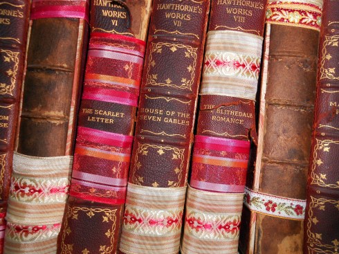
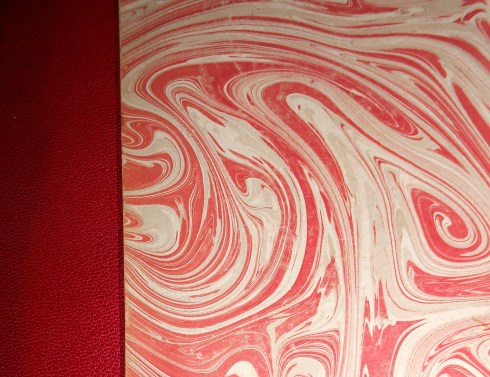
I’m afraid to even look for the A in my version of The Scarlet Letter, one of the 22 volumes in the Houghton Mifflin/Riverside Press Complete Writings of Nathaniel Hawthorne (1900), because I fear it might fall apart if I do so!  I found the complete set in a box in a Maine antique shop several years ago and bought it very cheaply because of the books’ deteriorated condition; they had been in a basement for many years, and their leather bindings were (and still are) cracked and their pages mildewed.  I’d like to restore them, but that goal is pretty low on my priority list for now, so I’ve tied them up with ribbons and put them on the bookshelf.  The cloth covers and endpapers are still very beautiful, as you can see.

Hester Prynne bears badges of various designs in the various editions of The Scarlet Letter, but let’s face it, the A has to be pretty prominent.  One of the earliest and most illustrious illustrators, George Henry Boughton, gives the demure Hester a large A patch in 1881, but it is not scarlet. Hugh Thomson’s more romantic Hester, from 1920, wears her scarlet A with nurse-like calm, as does Lillian Gish in the film version from a few years later.

There’s a lot of places that I could go from here because The Scarlet Letter has become so allegorical and the striking scarlet A so…….adaptable, for lack of a better word:  political cartoons (anti-American!), the Atheists‘ Speak Out campaign, Emma Stone in Easy A.  But I think I’ll stick to the scarlet letter, and end with another textual image, from the New Orleans artist Scott Campbell.


Patriotic Publishing: Britain in Pictures

I had very little time last weekend but still found myself rearranging bookshelves, a typical procrastination tactic.  Yet more time disappeared when I started opening up the slim volumes of the Britain in Pictures series, published by Collins (the forerunner of HarperCollins) in the 1940s when Great Britain was facing the imminent threat of German invasion.  Over 100 volumes were issued from 1941, each one covering a basic and essential aspect of British civilization, ostensibly in case it disappeared.  The volumes feature a colorful cover with standardized type, lots of illustrations to record the institutions, places and customs that were threatened with annihilation, and equally illustrious authors:  Cecil Beaton on English Photographers, Edith Sitwell on English Women, John Betjeman on English Cities & Small Towns, and (the most amazing pairing of all), George Orwell on The English People.


Much to my shame, I have to admit that I first bought a few of these books when I was looking for PINK and RED books to decorate the bookcases in my double parlor:  you will notice the preponderance of pink below.  This is a mortifying admission, as an English historian, as an Anglophile, as a reader.  I just loved the way these books looked, never mind the content.  But after they went on the shelf, I started (occasionally) pulling them off and reading them, and then I wanted more, never mind the cover color.  They are written in the most accessible way, almost blog-like, and definitely with the mission of capturing the essence of every single topic, whether it is British fashion, clubs or trade unions.  So now I have quite a few titles, most of which I bought from a used book store in Concord, Massachusetts owned by a woman who always seemed to be able to get more.  No longer; I notice they are fetching higher and higher prices on Ebay and AbeBooks, and there is even a book on collecting them:  Michael Carney’s Britain in Pictures:  A History and Bibliography (1995).

The categories of the series are on the back of each volume, encouraging collection in the 1940s and today:  Art and Craftsmanship, including both the visual and performing arts, History and Achievement (lots of military topics, like the book above, but also books on mountaineering and polar exploration), Social Life and Character (including my three favorite books, British Rebels and Reformers by Harry Roberts, Life among the English by Rose Macaulay, and The English at Table by John Hampson), Natural History, Education and Religion, Literature and Belles LettresTopographical History, Science, Medicine and Engineering, and Country Life and Sport (lots of lords and ladies made contributions here).  The back cover of one of the first books to be published also describes the rationale for the entire series:  The English have never been good at describing themselves or their ways, either for their own benefit or for the benefit of others.  It is, therefore, not surprising that no comprehensive series of books, at a popular price, illustrating, in print and picture, the life, art, institutions and achievements of the British people has ever been issued, either for British or for foreign readers.  At this time, when it has become essential for citizens throughout the Empire to take stock of themselves and their ideas and to express them to others, it is desirable to fill this gap.

A few observations about the series title:  Britain in Pictures.  You can tell from the quote above that while the goal was to capture British civilization, an English bias would emerge.  The majority of the titles focus on English life, although there are volumes on Wales, Scotland, Ireland and Commonwealth countries.  All of these books are illustrated histories in every sense of the word:  images were culled from libraries and museums but also commissioned from contemporary artists. The past and the present come together in these little British books, just in time.

Random illustrations from British Historians by E.L. Woodward, The English at Table by John Hampson, British Clubs by Bernard Darwin, and British Garden Flowers by George M. Taylor.


George Washington Slept Here

Last summer, I wrote about George Washington’s visit to Salem in a post on the Assembly House where he dined; today I’m featuring the house where he spent the night (October 29, 1789) after he was feted by the city’s notables:  the Joshua Ward house, built between 1784 and 1788 on what was then waterfront and what is now busy Washington Street.  Like my post on Lincoln last week, I’m trying to recognize and remember American statesmen on the days they were actually born (February 12 and 22) rather than on the generic “Presidents’ Day”.

Teddy tries to take over:  Puck Magazine, February 1909.

President Washington came to Salem as part of a New England tour in the Fall of 1789.  His diary entries indicate that he was impressed with the commerce of the town, but he has little to say about its architecture.  Washington was no Jefferson; he was clearly more interested in the quality of the land and the roads along his route than he was in culture, material or otherwise.  The Joshua Ward house was a brand new mansion when he arrived, ostensibly the finest residence in town, but he refers to it only as his “lodgings”.  He spent the night in the second-floor northeast bedchamber, on the right in the pictures below.

A bust of Washington appears to peer out at Salem from a window over the entrance of the Joshua Ward House.

The house is now home to the Higginson Book Company and appears well-maintained and seemingly-secure, despite being wedged in between a Dunkin Donuts (one of 57,000 in Salem), modern condominiums, and an office building.  Its location has determined that the Ward House has had an interesting history, to say the least.  At this point in time, it is far better known as a haunted house than a historic one, due to the fact that it was built on the former site of the house of  George Corwin, the High Sheriff of Essex County who issued the warrants for those arrested in the Witch Trials of 1692 and infamously placed the sequential stones on Giles Corey’s body which crushed him to death for failing to enter a plea.  Sheriff Corwin dropped dead of a heart attack 4 years after the trials at age 30, and the combination of a series of shady stories involving a curse and his corpse, along with an equally shady “spirit photograph” ostensibly taken in the early 1980s, have created a ghostly reputation for the Joshua Ward House.

Its location has threatened not only its reputation but also its preservation.  The Ward house was originally built on a bluff overlooking the South River, but as Salem developed the river was filled in to create the major commercial thoroughfare of Washington Street, and Salem’s massive Boston and Maine Railroad Station was built virtually in its front yard.  Eventually it became the “Washington Hotel”, indicating that its association with Washington was well-known, and commercial storefronts were built in front of it and a “New Washington House” adjacent.

The view looking south on Washington Street in the later nineteenth century and the Boston & Maine terminal in 1910, Detroit Publishing Company. The Ward house is located just beyond and behind the “Boston” building on the right:  quite a change from the river view of a century before!  A postcard from the late 1920s.  Below, a northwestern orientation, FACING but still obscuring the Ward House:  the New Washington House  (Dionne Collection, via Salem Patch), Washington Street in the 1930s, and today.  The posts in the lower left-hand corner of the modern picture are those of the Joshua Ward House fence.

The house is obscured in all of these pictures of its streetscape, but fortunately it is revealed in the photographs of Arthur C. Haskell, taken for the Historic American Buildings Survey in 1937 and accessible at the Library of Congress. These pictures show a house (labelled the Joshua Ward “Washington” House) that looks like it has fallen upon hard times on the outside, but relatively well-preserved on the inside.  The first two exterior views show appendages growing out of both front and back, and a missing balustrade, but the interior views show an empty but still elegant interior, with woodwork which is often attributed to Samuel McIntire.  I think that the second-floor landing between the front and rear stairs is particularly impressive.

A sketch of the house; you can see all the stuff that has been built in front of it.

HABS photographs by Arthur C. Haskell, 1937:  Ward House front and back exterior, first-floor parlor mantle, second-story landing, and the room that George Washington slept in on the second floor.

It’s so interesting to see a city–the world–grow and change from the perspective of one house, bearing silent witness.  Things will get worse for the Joshua Ward house before they get better. In that horrible time of urban renewal, the 1960s and early 1970s, a developer approached the Salem Redevelopment Authority (which has planning jurisdiction over downtown) to tear down the  “junk” in back of the Washington Street storefronts at no. 148, meaning the Ward House!  In the ensuing uproar the way was cleared for an extensive restoration supervised by Salem preservation architect Staley B. McDermet, revealing the elegant mansion of Washington’s time–and ours.


Before Photoshop

A retrospective exhibit of Jerry Uelsmann’s “non-literal” photography opened last weekend at the Peabody Essex Museum here in Salem and continues through May 13.  The Mind’s Eye: 50 Years of Photography by Jerry Uelsmann  includes over 90 works by the photographer, dating from the 1950s to the present.  I was too busy and sick (with the dreadful, everlasting cold that everyone seems to have this winter) to make it for the opening festivities last weekend, featuring a presentation by Mr. Uelsmann as well as a screening of the documentary on his work by Daniel Reeves entitled Outside In:  The Transformative Vision of Jerry Uelsmann, but yesterday I spent an hour or so wandering around the gallery and plan to go back soon.  The museum itself was quite crowded, given that it was a Saturday and there were lots of family activities in the Atrium relating to the other major exhibition that recently opened, Shapeshifting:  Transformations in Native American Art, so I didn’t stay long.  One of the major benefits of living (and working)  in Salem is being able to pop into the world-class museum that the Peabody Essex has become between classes or appointments on a quiet Tuesday afternoon.

Uelsmann’s  photographs were all amazing, but I particularly liked those with architectural details, very predictable given my predilection for the built environment.  Apparently I’m in good company, because the works below are among his most popular.  The last one reminds me of the “feral houses” of Detroit, first showcased on the great blog Sweet Juniper.  I also liked the animal-themed photographs, including one of Uelsmann’s first wife Marilyn with some out-of-scale sheep in their bedroom and another in which a black dog surveys a block of houses (architecture and animals, perfect).

Untitled, 1964.

Untitled, 1976 (Sometimes referred to as "The Philosopher's Desk" but not by Mr. Uelsmann).

Untitled, 1982.

Uelsmann’s photographs made me curious about the history of photomontage, defined by David Evans in the Grove Dictionary of Art as a “technique by which a composite photographic image is formed by combining images from separate photographic sources”.  I knew that the Surrealists played around with photography at the turn of the last century, but I had no idea that the very first generation of photographers did so as well.  So even though Uelsmann is obviously a master of photomontage, he is not a pioneer; an entire century earlier photographers like Oscar Gustave Rejlander and Henry Peach Robinson, both working in Britain from the early 1850s, were experimenting with what was then called “double printing” or “combination printing”.  It’s only natural that people would want to manipulate the new medium almost as soon as it appeared, although “artistic photography” bothered those who wanted photography only to document reality.  A very focused website, nureal:  a timeline of fantastic photomontage and its possible influences, 1857-2007 features a very substantive history of the technique and the artist-technicians, and the website of the George Eastman House, International Museum of Photography and Film can also provide context and images, including that of Robinson’s famous combination print Fading Away (1858), made from five different negatives.  Robinson had trained as a painter and seems to have been more motivated by artistic principle in his photographic compositions than a desire to capture reality, as illustrated by his 1880 print Two Figures in a Landscape in which the models were photographed in his studio and then “placed” outdoors in the final image.

Two photographs by Henry Peach Robinson:  Fading Away (1858, George Eastman House) and Two Figures in a Landscape (1880).

Robinson wrote about his cut-and-paste technique, so not long after this second photograph anyone could have themselves pictured before Niagara Falls, without ever traveling there.  Things get a little bit more fantastic in the last decades of the nineteenth century, with “spirit photography” and photographic collages and all sorts of surrealistic images appearing on both postcards and larger prints.  Another good online source to explore the history of photography in general and photomontage in particular is the American Museum of Photography, which maintains several digital exhibitions, including a charming one on the work of trick photographer and publisher William H. “Dad” Martin, whose images of “homespun surrealism”/ fantastic farming were incredibly popular just before World War One.


Corset Culture

From my vantage point here in Salem, it appears that we’re in the midst of a corset comeback:  not only do we have our own corsetmaker who sells her creations online, but also a new bricks-and-mortar corset shop in Derby Square, right across from Old Town Hall.  A Beautiful Corset (10 Derby Street, Salem) offers made-to-order corsets by the British corset manufacturer Vollers, for which it is one of the few distributors in the United States. The owner explained to me that she has operated an online business for several years, but opening a real shop was a necessity, because with corsets, it’s all about the fit (and the fitting!)  Her expansive store is filled with “models” named after years, as Vollers still cuts their corsets from patterns made in 1899, and 1903, and so on, as well as a gift shop-within-a-shop called J’adore. 

The shop window at A Beautiful Corset/J’Adore, fabric choices for the corsets, a finished product in Chinese silk–with Salem’s Old Town Hall as backdrop.

My interest in corsets doesn’t come from a love of constraint, but rather of craftsmanship, and I always like to see a new shop open up in Salem, particularly one that doesn’t offer the same old (kitschy, witchy) things.  Corsets are both very old and very new, given that they morphed into girdles several generations ago, coincidentally with the invention of all sorts of synthetic and stretchable textiles, and essentially disappeared.  The reappearance of the hand-made corset is something to celebrate, just like letterpress printing.

The commercial revival of corsetry seems to be coincidental with a cultural one.  Several exhibitions featuring the corset have been mounted in the last few years, including the Victoria & Albert Museum’s touring exhibition Undressed:  350 Years of Underwear in Fashion and the Worcester Art Museum’s Bound by Fashionthe Corset in European Art.  It seems absolutely fitting that Worcester should have a big corset exhibition, as that city was the absolute center of corset manufacturing here in Massachusetts (with claims of being the largest corset manufacturer in the world) in the later nineteenth and twentieth centuries, when the Royal Worcester Corset Company (1861-1950) employed over 2000 workers (mostly women) at its state-of-the-art factory.

Pink silk corset, circa 1885-95, from the Collection of the Victoria & Albert Museum, London; Portrait of a Woman, 1556, by an anonymous painter of the Flemish school, Worcester Art Museum, Worcester, Massachusetts, and interior view of the Royal Worcester Corset Factory main stitching room, from Digital Treasures:  a Central and Western Massachusetts Library Project.

Worcester might have had claims to worldwide corset domination, but in terms of advertising claims, the company that seems to have led the industry in innovations was Warner Brothers, the founding corporation of the present-day Warnaco.  The company was founded by a pair of physician brothers, Lucien and Ira Van Der Warner, who founded their “reformed” corset company in Bridgeport , Connecticut in 1874 after several years of lecturing on the considerable dangers of whalebone- and steel-boned corsets.  Their new “healthy” corset was boned with more flexible coraline, an organic product made from the agave americana plant, and they must have spent a fortune on colorful chromolithographic advertising to showcase its natural benefits.  Two decades later, they had both retired as millionaires.

Warner Brothers Coraline Corset advertisement and trade cards, from Duke University Digital Collections and the Library of Congress.

The history of the corset is really essentially the history of women–women’s fashions, women’s health, women’s work–so obviously a short blog post can only scratch the surface.  Another major reason why corsets have been having a “moment” in the past few years is an amazing book:  Valerie Steel’s The Corset:  A Cultural History (2001), a work of intensive scholarship and immediate accessibility.  If you want the whole story of the corset, pick it up.

A 15-year-old corset worker in 1917:  Library of Congress.


Maps of the Human Heart

Heart-shaped maps are one thing, but maps of the human heart are quite another, and I’ve got both on this Valentine’s Day.  The charting of emotional territory, as opposed to physical space, has resulted in the production of several interesting maps from the seventeenth century to the near-present.  Below are the companion Map of the Open Country of a Woman’s Heart and Map of the Fortified Country of a Man’s Heart, ostensibly and anonymously drawn “by a lady” and published by the Kellogg Brothers of Hartford, Connecticut in the 1830s.  These heart maps, along with lots of other examples of the Kellogg’s impressive lithography, can be viewed at the online gallery of the Connecticut Historical Society and Museum.

I’ve brightened and cropped both maps so that you can better see the different regions that make up these human hearts. It’s very interesting that the woman’s heart is an “open” country while the man’s is a walled fort.  Money seems to take up a lot of territory in the man’s heart while outward appearances dominate the woman’s; romance and sentiment take up space but love is referenced only with power, ease, eating, dress and admiration!  Matrimony is very clearly outside of the man’s heart (whereas the “citadel of self-love” is inside).

These heart maps seem to be fusing together two cartographical trends from the early modern era:  the cordiform map, in which actual places are displayed in a heart-shaped map, and allegorical maps, which use map formats but dispense with the places altogether in order to put forth the message, often in caricature.  The most famous world map with a cordiform projection, the Nova, et Universi Orbis Descriptio of Oronce Fine, was published in a succession of early modern atlases after its initial appearance in 1531.

As for the allegorical, two very sentimental maps were published in the sixteenth and seventeenth centuries:  the carte de tendre, a road map to and through the country of “tenderness” first published in Madeleine de Scudery’s novel Clelie in 1654, and the “Empire of Love” map published by German typographer Johann Gottlob Immanuel Breitkopf in 1777.

The Carte de Tendre: beware of the “Lake of Indifference” and “Dangerous Sea”!

The Empire of Love:  proceeding from the “land of youth” at the bottom, northward to the “land of lust”, and then easterly to the “land of happy love” (hopefully).

Even after the turn of the twentieth century, emotional maps continued to be published in various formats.  I found a Brazilian postcard from 1904 in a collector’s forum along with a locally-made map of “Loveland”  in the collection of the Leventhal Map Center at the Boston Public Library (part of their ongoing exhibition of “unconventional maps”), and two heart maps that are clearly based on the Kellogg prints which were first published in McCall’s Magazine in 1960 and reprinted in the fascinating book by Katherine Harmon, You are Here:  Personal Geographies and Other Maps of the Imagination (Princeton Architectural Press, 2004).

A map of “Loveland” by Ernest Dudley Chase dating from 1943; it doesn’t scan very well, but a zoom feature is available at the BPL map site.  Lots of very 1940s-ish cartoon characters.

Geographical Guide to a Woman's Heart Emphasizing Points of Interest to the Romantic Traveler: illustration by Jo Lowrey for McCall' s Magazine, 1960

Geographical Guide to a Man's Heart with Obstacles and Entrances: illustration by Jo Lowrey for McCall's Magazine, 1960

Times and sentiments change; I think we’re about due for an updated map of the human heart.


Little Bits of Lincolniana

I hate Presidents’ Day; it obscures the achievements of those individual presidents which it claims to recognize.  We should celebrate, or at least remember, the birthdays of Abraham Lincoln and George Washington even if we do not have the day off from work. Today is Lincoln’s birthday, and for the occasion I’ve assembled some scraps of paper which bear witness to his personal life more than his presidential one (but ultimately they become inseparable).  There is a vast sea of Lincolniana, and this was just my way of navigating through it.

The clever little “business card” of young lawyer Lincoln, and the Cotillion Party for which he is listed as a “manager” (I suppose this is the equivalent of today’s “sponsor”), along with a certain Mr. Todd.  As that is his future wife’s maiden name, I like to think that he met Mary Todd at this party, though I could be wrong.  These items, as well as the four images below, come from the William E. Barton Lincoln Collection at the University of Chicago. Because they are quite charming, I’ve included some digitized exhibition labels from the Lincoln Centennial as well as the records.

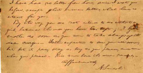
The Marriage License of Abraham Lincoln and Mary Todd, the last bit of a letter from Abraham to Mary written while he was serving in Congress in Washington:  the majority of it is about money, indicating that Mary’s reputation as a spendthrift is well-deserved, and he closes with “kiss and love the dear rascals” referring to their boys.  A check for $5 to Tad, one of the rascals.

The items above are all from the Alfred Whital Stern Collection of Lincolniana at the Library of Congress:  a dance card from Lincoln’s first inaugural ball, a Union envelope from the Civil War, a Massachusetts Republican ticket for the election of 1864, and a mourning ribbon for Lincoln from later 1865.  All manner of ribbons survive, as everyone must have worn one; this is a particularly fancy one, I think.


Letterpress Love

The revival of traditional letterpress printing in this past digital decade is a very interesting trend to me; or perhaps my impression is incorrect and letterpress never went away.  It does seem like small letterpress printers are popping up everywhere, hopeful signs that craftsmanship is still valued–even pursued–in an age of mass and massive production. I wanted to feature some local letterpress printers for this pre-Valentine’s Day post and I found quite a few, but very few of them were really offering valentines, which makes perfect sense:  their business is a bespoke one, and custom-ordered Valentine’s Day Cards are probably pretty unusual (and unprofitable).  I did find a few, and I broadened my search a bit to include letterpress offerings on the neat (and new-to-me) site Felt & Wire Shop and Etsy.

I’m looking for rather streamlined Valentine’s Day cards this year:  no cutesy animals, only minimalist hearts, typographical motifs, and beautiful printing, although a quirky card always catches my eye.  The cards below particularly appealed to me, beginning with one from a local printer: B.IMPRESSED.  Just click on the image to get to the source.

I had to put one animal-themed card in here, plus this is beautifully printed.

A bit overtly romantic for me but again, beautifully printed.  The bleeding hearts look like BLEEDING HEARTS.

Not a valentine, but a great photograph (by Maggie Holzberg) of an example of some very nice printing and the “bite” of type into paper, from the Massachusetts Cultural Council’s Folk Art & Heritage Apprenticeship Program.


Up, Up and Away

Today is Jules Verne’s birthday, and as I’ve been engaged in putting together a steampunk-themed exhibition and event at the Salem Athenaeum and have hot air balloons on the brain, I thought I’d share some of my favorite images of the balloon craze of the later nineteenth century.  Even though hot air balloons were invented in the later eighteenth century, they really picked up steam a century later due in large part to the enormous popularity of Verne’s “Voyages Extraordinaires”,  beginning with the publication of Cinq Semaines en Ballon (Five Weeks in a Balloon) in 1863.  The Balloon became the most accessible and emblematic of Verne’s fantastic wayfaring machines, and started to show up in all sorts of places.


Frontpieces to early Hetzel editions of Jules Verne’s collected Voyages Extraordinaires.

In addition to Verne’s texts, one of the very best places to look for early balloon images of all types is in the Tissandier collection at the Library of Congress.  Gaston and Albert Tissandier were balloon enthusiasts, collectors, and contemporaries of Jules Verne’s, and the Library of Congress purchased their 400+ item collection in the 1930s.  Here are the two balloonist brothers in the 1880s: as you can see, shortly after balloons captured the public’s imagination, airships of all kinds began to appear.  Anything was possible in the air.

A rather arbitrary sampling of the Tissandier collection is below:  Gaston and some journalist companions passed out due to lack of oxygen after their balloon Zénith reached a record height of 28,000 feet over Paris in April of 1875, an advertisement for balloon rides over Paris from the 1880s, and a photograph of several balloons within the newly-built Eiffel Tower at the Paris Exhibition of 1889.

In France, ballooning clearly became an art form, both the activity itself and its graphic depictions, as well as an expression of patriotism.  I love the print by Camille Grávis below, with a clockface balloon flying over the Eiffel Tower; it dates from the 1890s and exemplifies the time and place so well. Then we have a tricolor balloon and a fleet of balloons, all bearing the tricolor.

The next step was to remove the basket altogether and attach the balloon, or balloons, directly to a person, or to a horse, or to a person on a horse, or perhaps to a bicycle on its way to the moon.  Nothing was impossible; no place was unreachable–in the worlds of Jules Verne.

Throughout the western world, the motif of the hot air balloon infiltrates nearly every manifestation of popular culture  in the later nineteenth century:  advertising, entertainment, political satire, housewares, clothing, and ultimately moving pictures as well as still ones. I could post about balloon shows, women balloonists, politicians depicted as balloons (not a stretch for late nineteenth-century cartoonists), balloon wallpaper and fabric, balloon-view maps, and all the different types of balloon ephemera. Certainly the actual balloonists–the Montgolfiers in the eighteenth century, the Tissandiers in the nineteenth, and all of their followers–are responsible for this infiltration, but so too was Verne. It’s no accident that the pioneering 1902 Georges Méliès film Voyage dans la lune (of Hugo fame) was inspired by Verne’s earlier story From the Earth to the Moon.  At that point in time, Verne was nearing the end of his long and prolific life, and already recognized as a “prophet” of the new century.


%d bloggers like this: