Tag Archives: Massachusetts

Out and About in Concord

Yesterday was Patriot’s Day here in Massachusetts, commemorating the Battle of Lexington and Concord (even though it actually happened on the 19th; it’s a convenient long weekend for state employees such as myself).  My own Patriot’s Day tradition is to walk the Battle Road through Lexington, Lincoln and Concord, sometimes with a crowd, sometimes with just my immediate family, sometimes by myself.  This year I was all by myself, so I thought I might run the route rather than walk it, but I completely wimped out because of the heat:  it was in the high 80s, making it a very uncomfortable day for Boston marathoners (the other big event of the day).  I did walk most of the route, then I bailed and had lunch and went shopping in Concord Center.  Not very patriotic!

Concord is a stunning town, full of beautiful houses and lovely landscapes.  Nathaniel Hawthorne definitely preferred his beloved Wayside to any of his Salem dwellings, I must admit.  Salem was a little busy for him in the middle of the nineteenth century, and he always felt the burden of his family’s witch-hunting past there.  Concord was bucolic, but not so isolated that he couldn’t find interesting people to talk to like the Alcotts (from whom he bought his house) and Ralph Waldo Emerson.

I’m always impressed by the variety of historic houses in Concord.  There are lovely colonial houses, but also houses in the full spectrum of nineteenth-century styles:  vernacular farmhouses, Greek and Gothic Revivals, Victorians,  and lots of center-gabled houses that I associate more  with New York than New England.  It is a wealthy town, so it has its share of Mcmansions too.  Here are a few photographs of some of my favorites, but I could have snapped many more.

Flags and banners all around Concord for Patriot’s Day; with the heat, it seemed more like July 4th than April 16th.  The tower on the last house above mirrors Hawthorne’s “writing tower” at the Wayside, below in 1910 Detroit Publishing and 1941 HABS photographs.

I have long admired the stone Gothic Revival house below:  look at the windows, the trim, the fence!  It’s spectacular.  Behind it is Concord’s hillside cemetery, with flags for Revolutionary War veterans.

More Concord houses:  a very random sampling.

A colonial house with a stone-like facade, the Old Manse, Hawthorne’s other Concord address, where he and his bride Sophia stayed after their marriage, an amazing house across from the Old Manse–its additions go on and on, a pristine colonial which is just over the line, in Lincoln, and my newest Concord house.

There’s a lot more to do in Concord than just walk around and take pictures of houses.  There is great shopping in its center, including one of my very favorite shops called Nesting on Main and a really neat kitchen shop, among others.  There are the Wayside and Orchard House museums and the great little Concord Museum, of which I am completely jealous for Salem, which deserves a dedicated history museum just as nice.  The Concord Museum gives you a great chronological timeline with period rooms and furnishings, and also has revolving exhibitions:  currently they are featuring 70+ treasures from the Massachusetts Historical Society’s collection arranged in an exhibition entitled The Object of History.

Tabletop items at Nesting on Main, Ralph Waldo Emerson’s study in the Concord Museum, along with the portrait of Dorothy Quincy, circa 1720 by an anonymous artist, part of “The Object of History:  Colonial Treasures from the Massachusetts Historical Society”, on view until June 17.

And then there is Walden Pond, which was very crowded this particular hot APRIL afternoon.


A Bicycle Tour of the North Shore

Now that it is Spring, I’m looking forward to getting back on my bicycle more often, and taking longer trips rather than just darting from here to there on a mission.  A couple of weeks ago, I purchased a lovely little book written and illustrated by Edmund H. Garrett, a prominent and prolific Boston-based commercial artist of the later nineteenth century:  Romance and Reality of the Puritan Coast (1897).  The whole premise of the book is a tour of Boston’s North Shore, “from the seat of a bicycle”, one of my own long-term goals.  Garrett’s route from Nahant to Gloucester was certainly a lot more bucolic than mine would be today, but routes 127 and 133 are still pretty bike-worthy, so I’m going to follow his path sometime this summer.

Even though Garrett deliberately avoided any sites associated with the “witchcraft hysteria” in Salem, his publisher had no problem selling the witch image in the above publicity poster.

Garrett bikes, stops, and tells little historical stories which are illustrated by his sketches.  He is clearly more interested in the romance of the North Shore than its present-day reality, and both the “puritan” past and the rocky coastline seem equally romantic to him. He blows through Lynn and Swampscott pretty quickly, is clearly enhanced with old town Marblehead, and once he gets to Salem he is primarily focused on Nathaniel Hawthorne and his haunts:  where the great author lived, worked and walked.

Past Salem, towards Gloucester, on what was then beginning to be called the “Gold Coast” because of the gilded-age mansions that were lining its shores, Garrett is more entranced by shady little lanes off the beaten track and old crooked houses–and the sea, about which he waxes poetically on nearly every page. After he reaches the end of his tour, the quaint village of Annisquam, Garrett pedals back to Gloucester–slowly, so he can enjoy the view—for dinner, with mention of what would naturally be a more laborious trip back to Boston.


The Folly Cove Designers

This past weekend I made a major score when I encountered a long-sought item:  a placemat depicting Chestnut Street  in Salem made by Louise Kenyon of the Folly Cove Designers in the 1950s or early 1960s.  Though it is in rather shabby condition, I snapped it right up, as I have long wanted a piece of Folly Cove and now I have one depicting my own street!

The Folly Cove Designers were a collective of textile artisans working in the Lanesville section of Gloucester, Massachusetts from the 1940s through the 1960s.  Inspired by the Arts & Crafts movement and founded by illustrator Virginia Burton Demetrios, the designers carved their own linoleum blocks and produced linens, clothing, and upholstery fabric for their own houses and also for sale.  There was a strong educational mission connected to what essentially became a guild:  aspiring Folly Cove Designers completed coursework (designed by Demetrios, apparently as innovative an educator as she was an illustrator and designer) as well as a “masterpiece” (a term that originated in the medieval craft guilds), which, if it met with the approval of a jury made up of revolving members of Folly Cove, was produced and offered for sale under the trademark of the Designers.

After Virginia Burton Demetrios’s death in 1969, the guild dissolved, but one of the earliest Folly Cove designers, Sara Elizabeth (Halloran) continued the block printing tradition in Lanesville until her death in 2009.  The Sara Elizabeth Shop is still open for business, selling old and new Folly Cove designs on fabric and paper at both their shop and their website, which is also a good source for Folly Cove history and the block printing process.

The printing process:  as demonstrated in a 1945 Life article (“Yankee printers get National Recognition”), as well as by the still-working Acorn press at the Sara Elizabeth Shop.  Below, Virginia Burton Demetrios and her students/designers from the Life article.  The piece in the center (by Demetrios) is called Diploma, because it was given to a new designer, framed, after they had sold their first block print. Note the foot–stomping (or stamping) phase of the production process.

My Chestnut Street print is not really representative of a Folly Cove design, though the guild was indeed made up of individual designers with individual visions.  Still, there are a lot of floral and naturalistic themes, and some very whimsical images, particularly of animals.  The concentrated Finnish population in mid-twentieth century Lanesville might have asserted a Scandinavian influence on the prints (though they are far from Marimekko!), as several members of this community became Folly Cove designers.  On the other hand, some of the patterns look positively Elizabethan to me.  The Cape Ann Museum in Gloucester has a very strong Folly Cove collection, including sample books and archival materials as well as textiles (in fact, the Museum recently purchased the block which produced my print).  You do run across Folly Cove products in antique shops and at auctions in our area as well:  Blackwood/March Auctioneers in Essex always seem to have lots.  Essex antiques dealer Andrew Spindler currently has several Folly Cove patterns available in his 1stdibs shop, including one of my favorites, Gossips, and some pillows covered in a perennial favorite, Lazy Daisies.

A few more of my favorite Folly Cove prints:  two designs by Zoe Eleftherio and Elizabeth Jarrabind’s Turtles, and (to set the scene) a Maurice Prendergast painting of Folly Cove from 1910-15.


Globally-warmed Gardens

Unlike my students and nearly every one I run into, I’m not relishing this rare warm March weather.  I like warm (not hot) weather as much as the next person, but in season.  If there’s going to be a bright sun out there, I would prefer that there are leaves on the trees for shelter and shade.  Yesterday the temperature rose into the mid 80s which is just wrong for March in Massachusetts.  Last year was an amazing year for my garden, well-protected and -watered by a blanket of snow all winter long, but this year I am worried.  Looking around the web for some advice and reassurance, I instead became more alarmed when I came across the website for a campaign by the National Trust in Great Britain from 2010: A Plant in Time sought to raise environmental awareness by examining how climate change could end gardening as we know it.

The point, and the cause, is well-illustrated, literally, by three paintings by artist Rob Collins showing the effects of rising temperatures on the classic English garden—essentially it evolves into a Mediterranean one.

The end of the English garden is a dismal prospect indeed!  I look at my own (New) English garden, where blooms abound, and wonder if I’m going to see the same transformation:  the disappearance of the lawn, the roses, the delphiniums (actually, my delphiniums never come back anyway).  The National Wildlife Foundation’s Gardener’s Guide to Global Warming informs me that I’m still in my old 6B Plant Hardiness Zone, but also that at least one iconic Massachusetts plant, the mayflower, will disappear in the next few decades due to climate change.


Camellia Craze

One associates the camellia more with the South than the North (at least I always have), but in the early and middle part of the nineteenth century there was such intense interest in the flower among the elites of Boston, New York, and Philadelphia that the term craze seems apt. Camellias are far from hardy up here, so the camellia craze coincided with a flurry of greenhouse building.  All around Boston greenhouses popped up in the 1820s and 1830s, each one producing a profusion of hothouse flowers for Yankee homes.  At an exhibition sponsored by the fledgling Massachusetts Horticultural Society in 1836, Charles Mason Hovey, a local nurseryman and later a prominent horticultural publisher, showed 12 varieties of Camellia Japonica, one of which was named after him.

Herman Bourne, Flores Poetici, The Florist’s Manual (Boston, 1833); J.J. Grandville, Les fleurs animées (1847).

Another prominent Camellia enthusiast was Boston merchant Theodore Lyman, who commissioned Salem’s own Samuel McIntire to design a country house  for his property west of the city in 1793.  The Lyman Estate or “The Vale”, as it was called then and now, included not only the McIntire mansion (later considerably altered and expanded; you can see a great post on its later history and interiors here), surrounding grounds, and a beautiful carriage house, but also a chain of greenhouses.  The Vale remained the country seat of the Lyman family for over 150 years, and was conveyed to the Society for the Preservation of New England Antiquities (now Historic New England) in 1951.  Both the house and the carriage house are undergoing significant repairs at present but the greenhouses are open all year long, and I visited them last week, near the end of the annual “Camellia Days”.

The Vale in halcyon days, before its Victorian and Colonial Revival alterations (courtesy Historic New England) and last week, in the midst of roofing work.

There are four greenhouses at the Lyman Estate, the oldest one dating from 1804.  The “Camellia House” was built in 1820, right in the middle of the camellia craze in Boston.  I visit the greenhouses several times a year just to see the very established specimens within or for plant sales.  Even apart from the plants, the infrastructure is also very appealing, as is the juxtaposition of soft russet brick, Victorian steam fittings, and glass.  I have made it for the height of camellia season in the past, which is generally in February, but I was late in this busy year:  some of the camellias you see below are still blooming, but the general ambiance was one of faded glory.

The Camellia House is the last of the chain of greenhouses, so you go through glass rooms of tropical plants, fruit trees, succulents (!!!!), orchids, and then you’re there….


Double Parlors

We’re repainting our double parlor, finally.  For years friends have been telling me to go darker, to highlight the serious moldings in these rooms. It’s painted a very subtle blush pink now, but it just looks like a rather shabby off-white in the pictures below. And it looks cold. Clearly it’s time to paint: I’ve taken down all the pictures and removed all the moveable stuff, now out with the rugs, the couches and the mirrors–Moneypenny will stay on the radiator for as long as she possibly can. We haven’t quite decided on the exact color yet:  I really like Rundlett Peach from California Paints Historic Colors of America, while my husband is leaning toward something a bit more something with a bit more orange, or perhaps a warm grey (is there such a thing?) or something “buffy”. We tried a rather vibrant persimmon last year and realized we could not live with quite that much color in these rooms. Any suggestions would be welcome; there’s a lot of prep work to do so we have a few days to decide. The double parlor is really one large room separated by pocket doors which we rarely close; while it is a large area it is always rather dark, as our house is north-facing.  The matching grey marble mantles are the other consideration; obviously we want a color that complements them. Here’s a few pictures of the space now.

There are “fake doors” in both the front and rear parlors for symmetry, which is very Greek Revival.

After painting, lighting.  I’ve never really liked the fixture in the rear parlor, and what you are seeing above is a cap where a gas fixture once was so we need some wiring in the front parlor.

It’s fun to turn your house (and your cat) into a pencil sketch!

While looking around for some inspiration and colors for my double parlor, I kept coming across images of the Greek Revival house in Brooklyn Heights where Truman Capote lived when he wrote In Cold Blood and Breakfast at Tiffany’s. No doubt Google was directing me there because I was searching for “Greek Revival Double Parlors” and this house is a Greek Revival with several parlors (I don’t think they are contiguous) but also because this house has recently been in the news for setting the sales record for a single-family home in Brooklyn: $12 million (though the asking price was $18 million–sign of the times). The house looks stunning even though it has a bit of an ’80s ambiance (1980s not 1880s, though neither is good); it has a lovely enclosed garden in back and the colors of its parlors are close to what I want for mine, although I think I need a warmer, slightly rosier color than that pictured below. I must admit that I like my softer grey mantles better.

I think both Federal and Greek Revival houses are quite adaptable to a range of furnishings. You can go very period if you like, or in a more contemporary direction, or mix it up (my preference), and it all seems to work in these spare, classical spaces. I love looking in my Richard Jenrette books, but that kind of grandeur is unattainable. House museums like the Merchant‘s House in New York City are fun to visit, but I wouldn’t want to live there. On the other hand, the parlor in cosmetics scion Aerin Lauder’s Greek Revival country house in the Hamptons is a bit too modern for me (although that orange might be just what my husband wants).

Richard Jenrette’s great book, followed up by More Adventures with Old Houses, which focuses on Edgewater, his amazing Greek Revival estate on the Hudson River, the front parlor of the Merchant’s House Museum in NYC, and Aerin Lauder’s Hamptons living room photographed for Elle Decor.

I think the warmer, traditional yet updated look that appeals to me the most is well represented by the double parlor of an 1838 Nantucket house designed by Thomas Jayne Design Studio for clients “who were committed to adapting to the historic architecture of their home rather than altering it to fit contemporary tastes”.  A lovely attitude and a lovely room.


The World of Work Boxes

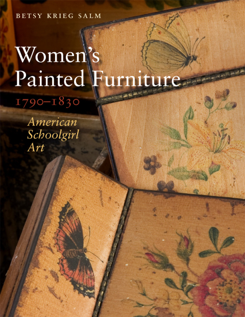
I was researching a post on painted “fancy chairs” from the Federal era and after when I got distracted by a great book and its subject matter: Betsy Krieg Salm’s Women’s Painted Furniture, 1790-1830 (University Press of New England, 2010) caught my eye in the library for numerous reasons (it’s a beautiful book, I love painted furniture, the era coincides with Salem’s golden age, so I knew I’d find some good stuff in it), but once I opened it I could not put it down. The result of three decades of research by the author (who is an ornamental artist herself), the book is art history, social history, education history, cultural history, world history all at the same time.

The subtitle, American Schoolgirl Art, is particularly appropriate as this book is about training, expectations, and influences as well as the motifs which decorate the furniture. I had never really considered the distinct genre of “schoolgirl art” and now I’m curious about its place in other eras and cultures. Lots of painted pieces are examined in Salm’s book, but my favorite by far are the work boxes produced by young women from relatively wealthy families, like Salem’s own Mary Derby Prince, the daughter of a Salem ship captain, with connections by blood and marriage to two of Salem’s most commercially aristocratic families, the Derbys and the Ropes. Another Salem box from the same era (and milieu) is that of Hannah Crowninshield, from the collection of the Peabody Essex Museum. Have I ever seen this before?  I don’t think so, but I could have walked right by it. I am familiar with samplers, of course, and the various types of wooden, decorated boxes produced for documents and other materials, but somehow I have never put the two together in the form of a work box, produced by young women as both an example of their work and for their work. Here are some of my favorites from the book:

Work Box by Ann Trask, Rowson Academy, Boston, circa 1810-20. Collection of Old Sturbridge Village.

Lid of Work Box by Hannah Bland, Massachusetts, circa 1810-30. Private Collection.

Detail of Lobstermen from Work Box of Fanny Barber, Gloucester, Massachusetts, 1821. Private Collection.

These boxes are so charming and so reflective of the environments in which these girls lived and worked, as well as the more general cultural influences to which they were exposed.  A little bit more context, for both American schoolgirl art and (transatlantic) work boxes in the first half of the nineteenth century:  a concise yet substantive article about the curriculum and culture at the Misses’ Martin’s School in Portland, Maine, and a few images of professionally-made work boxes from the British Empire. The first box is a particularly expensive example, with leather covering, silk lining, brass fittings, and custom-made sewing and needlework accessories, from the collection of the Victoria & Albert Museum in London.

Work Box, England, circa 1815. Collection of the Victoria & Albert Museum, London.

These last two “cottage” work boxes are both examples of Tunbridge ware, even though they were made in places thousands of miles apart:  southeast England and India. Tunbridge ware is the very intricate type of inlaid woodwork that emerged in the vicinity of Tunbridge Wells, Kent in the eighteenth century, characterized by the creation of mosaic patterns with different colored woods, and sometimes other materials. Tunbridge ware designs influenced American decoration and obviously Asian as well, as the second work box, made of wood veneered with ivory, was made in India around 1790-1800.

Tunbridge ware painted sewing box, early 19th century, Bleasdales Ltd.

Ivory-veneered Work Box, Vishakhapatnam, India, circa 1790-1800. Collection of the Victoria & Albert Museum, London.


The Boston Massacre in Black, White & Color

Today, or rather tonight, marks the anniversary of the Boston Massacre of 1770, the most dramatic manifestation of the rising tensions in Boston accompanying the occupation of the city by British troops sent from London to enforce the Townshend Acts and make the colonists pay for their Seven Years’/French and Indian War. Well, there you are: the conflicted sentiments of an English historian who is also a native New Englander are readily apparent!  What became known as the Boston Massacre affords an excellent opportunity to examine the shadings of perspective in history, and we have the perfect image to work with:  Paul Revere’s iconic Bloody Massacre perpetuated in King Street Boston on March 5th 1770 by a Party of the 29th Regt., published less than three weeks after the event.

Revere was such a clever entrepreneur and propagandist; it’s too bad his midnight ride obscures his other talents and contributions. The engraving that produced these viral prints was very closely based on that of Henry Pelham, whose own massacre image “The Fruits of Arbitrary Power”, did not go on the market until several weeks after Revere had essentially flooded the market and sparked a revolution. The most “inspirational” detail of the print, in terms of igniting revolutionary fervor up and down the eastern seaboard, was no doubt the portrayal of the British troops in a firing squad format, shooting on the unarmed, passive, victimized colonists, but one other detail, or missing detail, is equally important: all of the victims of Revere’s massacre are white; the fledgling revolution’s first victim, a man of mixed race named Crispus Attucks, is not present.  The colorists of Revere’s engraving added to its appeal (and inspiration) by adding a lot of bright red blood to the print, illustrating and emphasizing his original title:  Bloody Massacre.

A print from a little later in 1770, and accounts of the five victims of March 5 from the Boston Gazette, and Country Journal, March 12, 1770, all from the Library of Congress.

Only a year later, when the first event of the massacre was commemorated, it was already being referred to as the Boston Massacre, largely due to the efforts of another brilliant propagandist, Samuel Adams. All narrative (as opposed to visual) accounts depict more of a confused melee, in which British soldiers fired into a threatening crowd under cover of darkness. But that was beside the point for the entire nineteenth century–and well after. The active abolitionist movement in New England will resurrect Crispus Attucks as an active participant, victim, and martyr of the Boston Massacre in the 1850s,but the Redcoats retain a relatively rigid line.

Putting Crispus Attucks in the picture:  the frontspiece of William Cooper Nell’s Colored Patriots of the American Revolution (1855), chromolithograph by John H. Bufford based on a drawing by William L. Champney (1856), and Howard Pyle’s illustration for Harper’s Magazine (1883).

Despite Attucks’ prominent placement in the prints above, he goes missing again in several popular prints from the later nineteenth and earlier twentieth centuries. The Alonzo Chappel image below, produced for Heppenheimer and Maurer’s popular Centennial Album in 1873, appears to be loosely based on the Bufford chromolithograph above, but a white man has replaced Attucks in the central position.  The 1901 image by Francis Luis Mora beneath it, published in Harper’s Magazine, retains Revere’s menacing Redcoats (made more menacing by the perspective) and even the dog which he placed in the middle of the event.

Prints by Chappel and Mora, New York Public Library Digital Gallery.

A half-century later, Crispus Attucks returns in two modern depictions of the Massacre:  a mural at the Recorder of Deeds Building in Washington, DC by Herschel Levit, and William H. Johnson’s Crispus Attucks. The events of March 5, 1770 fade into the background, or are substantively altered, as Attucks assumes center stage. Another figure who is associated with the Boston Massacre, John Adams, has become the central focus of the event in recent years, following the publication of David McCullough’s popular and Pulitzer Prize-winning John Adams in 2001 and the ensuing HBO miniseries based on the book. As Adams served as defense counsel for the accused British soldiers, this seems to have shifted the historical perspective a bit, from event to aftermath, while at the same time revealing a little bit of British sentiment.

Herschel Levit, Crispus Attucks (1943) and Philip H. Johnson, Crispus Attucks (1945), Smithsonian Archives of American Art; Alonzo Chappel, John Adams, Library of Congress.


Corset Culture

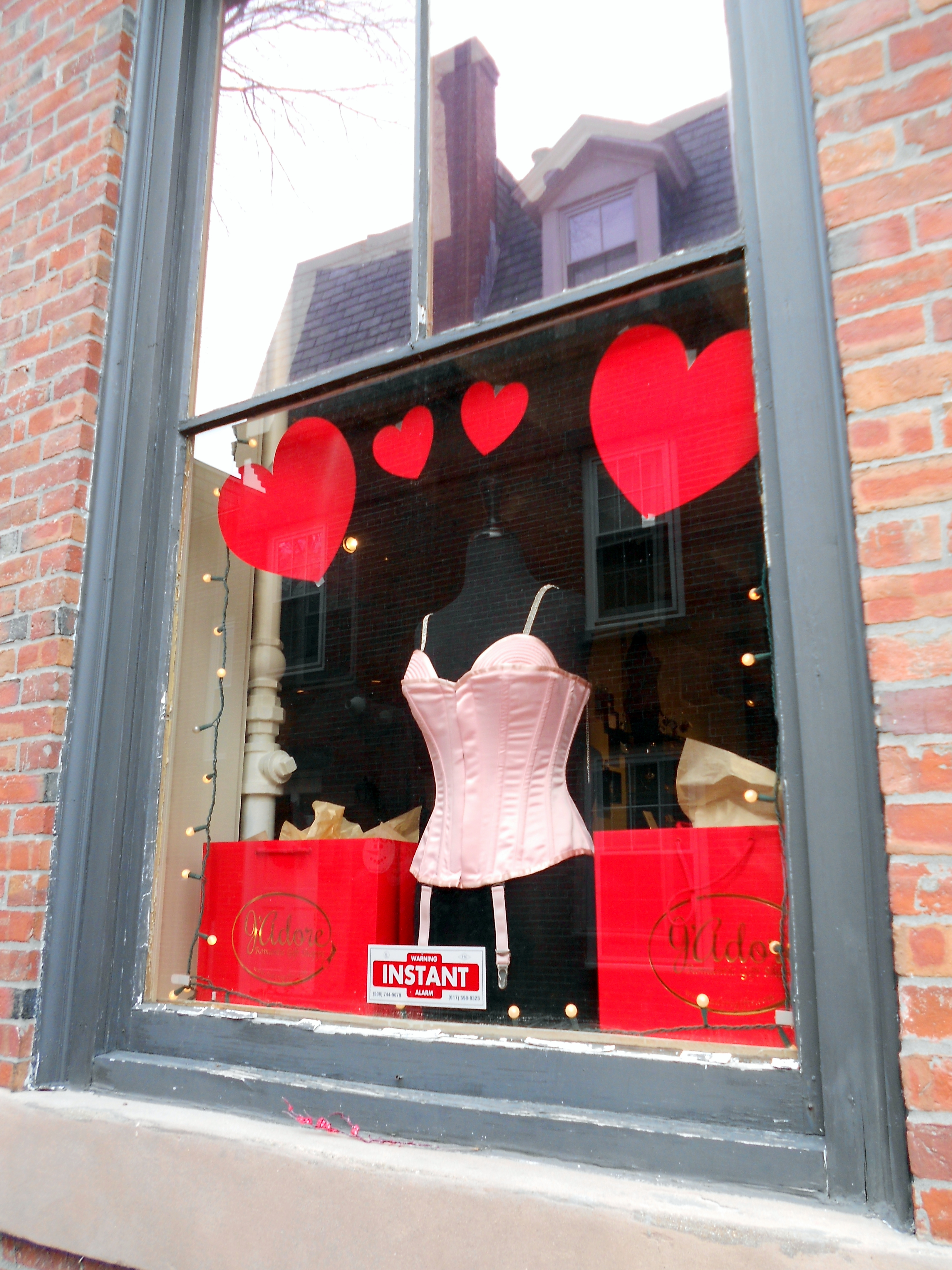
From my vantage point here in Salem, it appears that we’re in the midst of a corset comeback:  not only do we have our own corsetmaker who sells her creations online, but also a new bricks-and-mortar corset shop in Derby Square, right across from Old Town Hall.  A Beautiful Corset (10 Derby Street, Salem) offers made-to-order corsets by the British corset manufacturer Vollers, for which it is one of the few distributors in the United States. The owner explained to me that she has operated an online business for several years, but opening a real shop was a necessity, because with corsets, it’s all about the fit (and the fitting!)  Her expansive store is filled with “models” named after years, as Vollers still cuts their corsets from patterns made in 1899, and 1903, and so on, as well as a gift shop-within-a-shop called J’adore. 

The shop window at A Beautiful Corset/J’Adore, fabric choices for the corsets, a finished product in Chinese silk–with Salem’s Old Town Hall as backdrop.

My interest in corsets doesn’t come from a love of constraint, but rather of craftsmanship, and I always like to see a new shop open up in Salem, particularly one that doesn’t offer the same old (kitschy, witchy) things.  Corsets are both very old and very new, given that they morphed into girdles several generations ago, coincidentally with the invention of all sorts of synthetic and stretchable textiles, and essentially disappeared.  The reappearance of the hand-made corset is something to celebrate, just like letterpress printing.

The commercial revival of corsetry seems to be coincidental with a cultural one.  Several exhibitions featuring the corset have been mounted in the last few years, including the Victoria & Albert Museum’s touring exhibition Undressed:  350 Years of Underwear in Fashion and the Worcester Art Museum’s Bound by Fashion:  the Corset in European Art.  It seems absolutely fitting that Worcester should have a big corset exhibition, as that city was the absolute center of corset manufacturing here in Massachusetts (with claims of being the largest corset manufacturer in the world) in the later nineteenth and twentieth centuries, when the Royal Worcester Corset Company (1861-1950) employed over 2000 workers (mostly women) at its state-of-the-art factory.

Pink silk corset, circa 1885-95, from the Collection of the Victoria & Albert Museum, London; Portrait of a Woman, 1556, by an anonymous painter of the Flemish school, Worcester Art Museum, Worcester, Massachusetts, and interior view of the Royal Worcester Corset Factory main stitching room, from Digital Treasures:  a Central and Western Massachusetts Library Project.

Worcester might have had claims to worldwide corset domination, but in terms of advertising claims, the company that seems to have led the industry in innovations was Warner Brothers, the founding corporation of the present-day Warnaco.  The company was founded by a pair of physician brothers, Lucien and Ira Van Der Warner, who founded their “reformed” corset company in Bridgeport , Connecticut in 1874 after several years of lecturing on the considerable dangers of whalebone- and steel-boned corsets.  Their new “healthy” corset was boned with more flexible coraline, an organic product made from the agave americana plant, and they must have spent a fortune on colorful chromolithographic advertising to showcase its natural benefits.  Two decades later, they had both retired as millionaires.

Warner Brothers Coraline Corset advertisement and trade cards, from Duke University Digital Collections and the Library of Congress.

The history of the corset is really essentially the history of women–women’s fashions, women’s health, women’s work–so obviously a short blog post can only scratch the surface.  Another major reason why corsets have been having a “moment” in the past few years is an amazing book:  Valerie Steel’s The Corset:  A Cultural History (2001), a work of intensive scholarship and immediate accessibility.  If you want the whole story of the corset, pick it up.

A 15-year-old corset worker in 1917:  Library of Congress.