Tag Archives: Interior design

Clockwork and Cocktails

We had our big fundraiser for the Salem Athenaeum this weekend:  Clockwork and Cocktails:  A Steampunk Affair.  The event was the result of several months of planning and preparations and a last-minute frenzy of decorating.  And then it was over and it all came down, in about an hour: so much energy and effort, so ephemeral.  I have no pictures of the actual party because for the hour or so that I was there I was in a fog caused by a combination of cold medicine and gin, having come down with a bad cold the day before, but I trust that my friends and fellow committee members will send me some. Everyone was snapping away, as it was a very visual party.  I do remember:  quite a large crowd of 150 people, give or take 10 or 20, a broad spectrum of ages, 20s through 70s, almost all dressed in some steampunk fashion (which I did not expect; everyone seemed to take our theme very seriously), great musicians, a magnificent living statue who never blinked, and giant pink octopus tentacles descending upon the third-floor trustees’ room.  Salem has quite an active steampunk scene, and we were fortunate to find (actually they found us) MHS Hysteria, a merry band of actors/crafters who really made the party.

Fortunately I took pictures of our decorating session the day before the party so all the embellishments are documented:  they can live on in the digital world!  We had a great committee comprised of the most creative women in Salem, and their individual and collective efforts created a magical environment.  All the key steampunk details were there– clocks, gears, keys, hot-air balloons, Victoriana—elegantly executed and assembled.

Clocks:

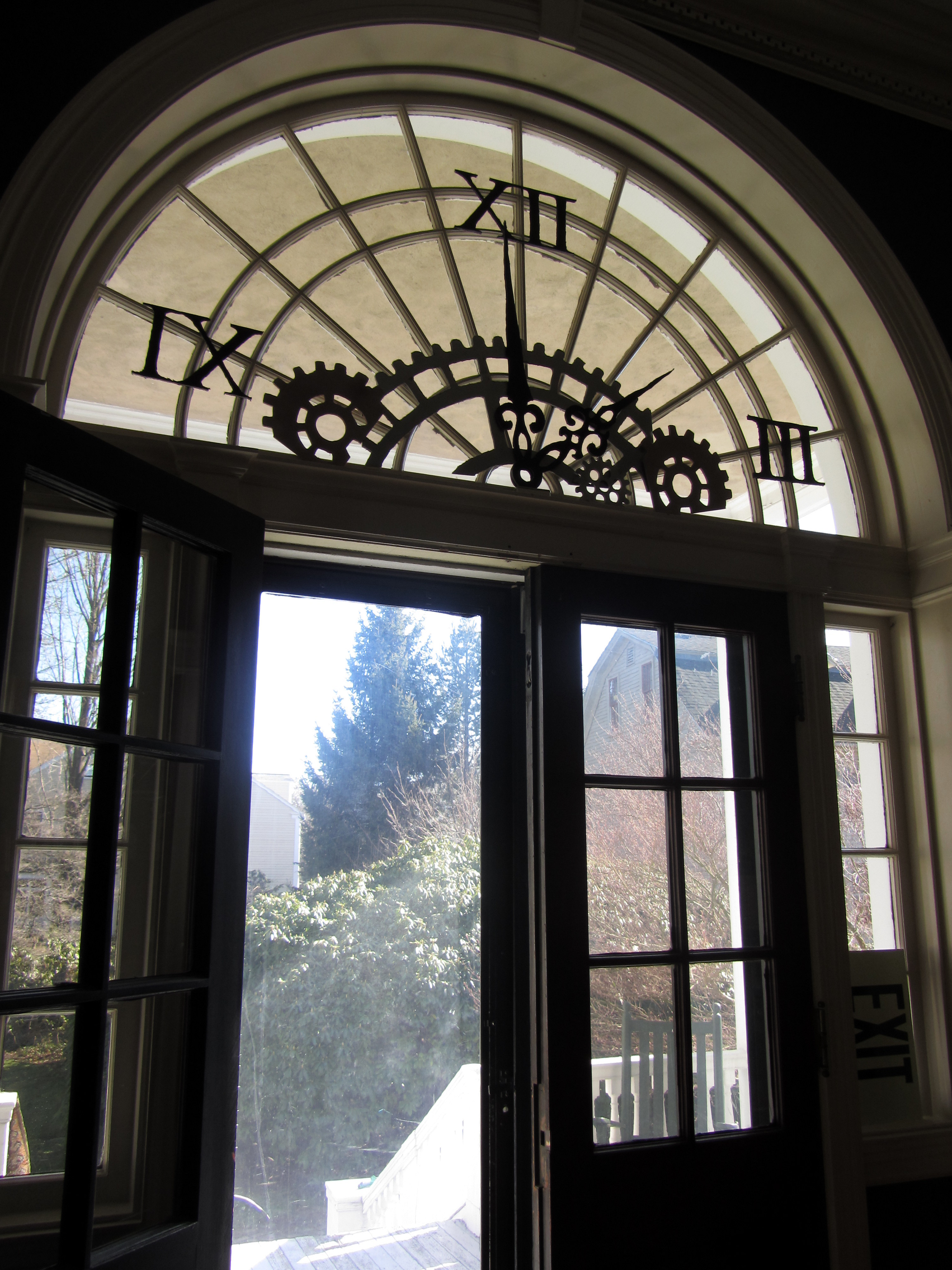
Adam from MHS Hysteria had the genius idea of transforming the Athenaeum’s demilune windows into Hugo-esque clocks, an amazing illustration of our theme as well as the Athenaeum’s architecture.  More clocks, just a few of many, including several sourced by Jane and a beautiful assemblage under glass by Suzie:

Balloons:

Part of the event included an exhibition of the literary sources of steampunk, which featured a lot of Jules Verne and other late nineteenth-century ballooning tales, so we wanted to carry that motif over into the party.  Katy made little balloon baskets (as well as mustaches- and goggles-on-sticks) and a late-afternoon balloon brigade put them all together.

Keys:

There were quite a few keys in the exhibition, which featured industrial ephemera as well as early science fiction.  Salem’s own Locke Regulator Company was one of the largest manufacturers of steam fittings in the country at the turn of the last century, so we had to include some of their materials, and where there is a lock there must be a key!  This motif was carried over into the party rooms, and even into the bathroom by Carol.  After I took the above picture, a pop-up Sherlock Holmes (complete with magnifying glass) somehow made his way in here; apparently he was the talk of the party.

Goggles, goggles everywhere:

There were goggles everywhere, both made and acquired.  Nathaniel Hawthorne wore his goggles-by-Carolyn (who also made the giant pink Octopus tentacles which I somehow failed to get a picture of) very well, I thought, as did this very dignified bust.

Miscellaneous objects of interest and beauty:

A very eclectic tableau on top of the card catalog (yes, the Athenaeum still has one), an automaton-esque old dress form (on which even the duct-tape shoulders look beautiful to me), and jewelry-insects under glass, just a sampling of the amazing decorative displays on view, and the energy and creativity of the event committee.  In addition to the aforementioned ladies, I’d also like to thank the rest of the committee:  my co-chair Sarah, master of logistics and the budget, Julie, Mary, Kristine, Penny, Stacia & Patti.  Cheers to you all!


Double Parlors

We’re repainting our double parlor, finally.  For years friends have been telling me to go darker, to highlight the serious moldings in these rooms. It’s painted a very subtle blush pink now, but it just looks like a rather shabby off-white in the pictures below. And it looks cold. Clearly it’s time to paint: I’ve taken down all the pictures and removed all the moveable stuff, now out with the rugs, the couches and the mirrors–Moneypenny will stay on the radiator for as long as she possibly can. We haven’t quite decided on the exact color yet:  I really like Rundlett Peach from California Paints Historic Colors of America, while my husband is leaning toward something a bit more something with a bit more orange, or perhaps a warm grey (is there such a thing?) or something “buffy”. We tried a rather vibrant persimmon last year and realized we could not live with quite that much color in these rooms. Any suggestions would be welcome; there’s a lot of prep work to do so we have a few days to decide. The double parlor is really one large room separated by pocket doors which we rarely close; while it is a large area it is always rather dark, as our house is north-facing.  The matching grey marble mantles are the other consideration; obviously we want a color that complements them. Here’s a few pictures of the space now.

There are “fake doors” in both the front and rear parlors for symmetry, which is very Greek Revival.

After painting, lighting.  I’ve never really liked the fixture in the rear parlor, and what you are seeing above is a cap where a gas fixture once was so we need some wiring in the front parlor.

It’s fun to turn your house (and your cat) into a pencil sketch!

While looking around for some inspiration and colors for my double parlor, I kept coming across images of the Greek Revival house in Brooklyn Heights where Truman Capote lived when he wrote In Cold Blood and Breakfast at Tiffany’s. No doubt Google was directing me there because I was searching for “Greek Revival Double Parlors” and this house is a Greek Revival with several parlors (I don’t think they are contiguous) but also because this house has recently been in the news for setting the sales record for a single-family home in Brooklyn: $12 million (though the asking price was $18 million–sign of the times). The house looks stunning even though it has a bit of an ’80s ambiance (1980s not 1880s, though neither is good); it has a lovely enclosed garden in back and the colors of its parlors are close to what I want for mine, although I think I need a warmer, slightly rosier color than that pictured below. I must admit that I like my softer grey mantles better.

I think both Federal and Greek Revival houses are quite adaptable to a range of furnishings. You can go very period if you like, or in a more contemporary direction, or mix it up (my preference), and it all seems to work in these spare, classical spaces. I love looking in my Richard Jenrette books, but that kind of grandeur is unattainable. House museums like the Merchant‘s House in New York City are fun to visit, but I wouldn’t want to live there. On the other hand, the parlor in cosmetics scion Aerin Lauder’s Greek Revival country house in the Hamptons is a bit too modern for me (although that orange might be just what my husband wants).

Richard Jenrette’s great book, followed up by More Adventures with Old Houses, which focuses on Edgewater, his amazing Greek Revival estate on the Hudson River, the front parlor of the Merchant’s House Museum in NYC, and Aerin Lauder’s Hamptons living room photographed for Elle Decor.

I think the warmer, traditional yet updated look that appeals to me the most is well represented by the double parlor of an 1838 Nantucket house designed by Thomas Jayne Design Studio for clients “who were committed to adapting to the historic architecture of their home rather than altering it to fit contemporary tastes”.  A lovely attitude and a lovely room.


The World of Work Boxes

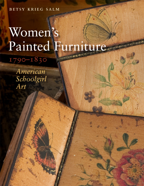
I was researching a post on painted “fancy chairs” from the Federal era and after when I got distracted by a great book and its subject matter: Betsy Krieg Salm’s Women’s Painted Furniture, 1790-1830 (University Press of New England, 2010) caught my eye in the library for numerous reasons (it’s a beautiful book, I love painted furniture, the era coincides with Salem’s golden age, so I knew I’d find some good stuff in it), but once I opened it I could not put it down. The result of three decades of research by the author (who is an ornamental artist herself), the book is art history, social history, education history, cultural history, world history all at the same time.

The subtitle, American Schoolgirl Art, is particularly appropriate as this book is about training, expectations, and influences as well as the motifs which decorate the furniture. I had never really considered the distinct genre of “schoolgirl art” and now I’m curious about its place in other eras and cultures. Lots of painted pieces are examined in Salm’s book, but my favorite by far are the work boxes produced by young women from relatively wealthy families, like Salem’s own Mary Derby Prince, the daughter of a Salem ship captain, with connections by blood and marriage to two of Salem’s most commercially aristocratic families, the Derbys and the Ropes. Another Salem box from the same era (and milieu) is that of Hannah Crowninshield, from the collection of the Peabody Essex Museum. Have I ever seen this before?  I don’t think so, but I could have walked right by it. I am familiar with samplers, of course, and the various types of wooden, decorated boxes produced for documents and other materials, but somehow I have never put the two together in the form of a work box, produced by young women as both an example of their work and for their work. Here are some of my favorites from the book:

Work Box by Ann Trask, Rowson Academy, Boston, circa 1810-20. Collection of Old Sturbridge Village.

Lid of Work Box by Hannah Bland, Massachusetts, circa 1810-30. Private Collection.

Detail of Lobstermen from Work Box of Fanny Barber, Gloucester, Massachusetts, 1821. Private Collection.

These boxes are so charming and so reflective of the environments in which these girls lived and worked, as well as the more general cultural influences to which they were exposed.  A little bit more context, for both American schoolgirl art and (transatlantic) work boxes in the first half of the nineteenth century:  a concise yet substantive article about the curriculum and culture at the Misses’ Martin’s School in Portland, Maine, and a few images of professionally-made work boxes from the British Empire. The first box is a particularly expensive example, with leather covering, silk lining, brass fittings, and custom-made sewing and needlework accessories, from the collection of the Victoria & Albert Museum in London.

Work Box, England, circa 1815. Collection of the Victoria & Albert Museum, London.

These last two “cottage” work boxes are both examples of Tunbridge ware, even though they were made in places thousands of miles apart:  southeast England and India. Tunbridge ware is the very intricate type of inlaid woodwork that emerged in the vicinity of Tunbridge Wells, Kent in the eighteenth century, characterized by the creation of mosaic patterns with different colored woods, and sometimes other materials. Tunbridge ware designs influenced American decoration and obviously Asian as well, as the second work box, made of wood veneered with ivory, was made in India around 1790-1800.

Tunbridge ware painted sewing box, early 19th century, Bleasdales Ltd.

Ivory-veneered Work Box, Vishakhapatnam, India, circa 1790-1800. Collection of the Victoria & Albert Museum, London.


Corporate Interiors

I like reading contemporary shelter magazines, but they seldom offer any advice for one of my central decorating dilemmas:  how to integrate the front Federal part of my home with the rear Victorian addition (never mind the kitchen from the 1920s and other architectural details from that “renovation” scattered around the house).  So I thought I’d browse (digitally) through some “house beautiful” books from the later nineteenth century, to see if they could offer any tips or inspiration.  There are lots available on the Internet Archive, but (apart from Edith Wharton’s writing style) I didn’t find them very inspiring, or nearly as interesting as the trade catalogs of the same era.  It seems like much of the Winterthur Library’s collection of these publications is now available in digital formal.  These catalogs range from mere brochures to actual decorating books, published by wallpaper, fabric, paint, carpet, and furniture companies for both wholesale and retail customers, I suppose.  I’m sure that I’m far from the first to recognize that they must be an extremely valuable resource for charting changing styles.

Below are a couple of plates from Suggestions for Modern Interior Decoration, published by the Henry Bosch wallpaper company of Chicago and New York in 1906.  The entire book consists of plates of interior vignettes, followed by appropriate wallpaper samples; here’s a very Arts & Crafts sitting room with entrance hall in the background.

Next, the cover and “Boston Room” of the 1917 Home Decorations Book published by the Star Peerless Wallpaper Mills, manufacturers of “Black Cat Wallpapers” for the home.  The Boston Room is of course in an understated “colonial” style.  For a stark contrast, I’ve jumped forward several decades, to the eve of World War II, and a very dynamic bedroom in the 1939 catalog of the Celotex Corporation, Interiors with Beauty, Comfort and Quiet. Quite an interesting combination of colors there; not very quiet.

Paint companies, including Sherwin-Williams and Glidden,  really ran with the “decorating catalog” concept before and after World War One.  A 1910 billiard room demonstrated “handicrafted effects” from Sherwin-Williams Your Home and its Decoration, and (again for contrast) two decades later a very bright (and much less crafty) living room appears in The Home of To-Day (1930).  For a post-war view, I’ve also included a colorful bathroom from Glidden’s 1946 catalog, The Key to Color Harmony in Your Home.  This book really recommends the color combination of aqua, pink and brown, and not only for bathrooms.

Back to a browner age. My last two images don’t really fit in with those above–rather than interior vignettes offering decorating advice as well as goods they are examples of more standard advertising–but the lithography is so striking I wanted to include them.  Below are two pages from the undated Album of Maine’s Atkinson House Furnishing Company, established in 1884 and “the only in the US doing business under a special contract system and Installment Plan”:  the exterior of its main Portland store and the interior sales floor, an actual corporate interior.


Stag Party

In addition to my chair duties, I am teaching one course this semester, a survey of English history from the Roman era through the Tudors.  This is a long period, and in order to add more depth to a course that is more characterized by breadth I’m going to bring quite a few illuminated manuscripts (digitally) into the classroom for my students to view and analyze.  While I was reacquainting myself with some of my favorites this past weekend (via the extraordinary resource that is the British Library’s digital catalog of illuminated manuscripts), I seemed to be seeing lots of deer in the margins, and stags in particular:  stags alone, stags as prey, stags with satyrs, stags with serpents (which they can apparently drive out of the ground) and stags parading with other animals. Stags appear not only in medieval bestiaries (encyclopedias of animals) but also in herbals (encyclopedias of plants) because the hardened cartilage of their hearts–os de cor de cervi–was used in medical preparations.

A selection of stags from the British Library Department of Manuscripts:  Arundel, Egerton, and Royal Mss., circa 1280-1490.

The image of the stag persists into the modern era in visual and material culture more as a symbol of majesty and the (receding) forest than a feature of everyday life.  There is the statuesque, noble stag, the leaping stag, and of course, the stag head–a hunting motif that has gained a more general popularity in the last decade or so.  I prefer my deer with their bodies attached, so here are a few favorite images from the collection of the Victoria & Albert Museum:  leaping deer on a  Meissen plate from the late 18th century, and Foxton furnishing fabric and a Susie Cooper figurine, both from the 1930s.  Cooper (1902-1995), the dominant ceramics designer of the twentieth century, loved the leaping deer motif so much that she used it as her company logo and trademark.

I use a lot of deer for my Christmas decorating, and as I’ve had neither the time or the inclination to do my typical January purge, there’s still quite a few stags around the house.  And I’ve had my eye on the Nico Masemula stag at Anthropologie for the last couple of months, now fortunately (for my wallet) sold out.


The Social History of Wallpaper

Nearly every man I know hates wallpaper while most of my female friends love it; I wonder if this gender division existed in the past?  I hear from the paper-hating men that wallpaper is too “busy”, “distracting”, and “floral” (even if flowers are far from the central motif).  They seem predisposed to dislike a wall-full of images and more inclined to focus on just one (or maybe two).  We have some really ghastly wallpaper in our front  hall which I’m sure my husband hates but I find strangely comforting in a grandmotherly sort of way.  Neither of us are inclined to do anything about it as it covers two stories’ worth of wall, but he must have to shield his eyes everyday.

Wallpaper can reveal more than gender preferences; it can also reveal the cultural values of society at large (if you are prepared to engage in gross generalizations, which I obviously am).  Relying heavily on my favorite historical design books (primarily Judith  & Martin Miller’s Period Details and Period Design & Furnishing), and a few other sources, I’m going to attempt a social history of wallpaper, beginning with Tudor Age.

The fragment of  sixteenth-century block-printed wallpaper above was preserved as the lining of a deed box and is part of the collection of the British National Archives.  It is typical dark and dense decoration; the Tudors loved embellishment of all kinds, but particularly natural motifs.  Here you see royal insignia, the emblem of St. George (the patron saint of England) and the ever-present Tudor rose.  The grotesques look a little medieval to me; I’m not sure what they’re doing there.  On to the seventeenth century.

This is a fragment of later seventeenth- century scenic wallpaper in the collection of the Victoria & Albert Museum.  In the middle part of the seventeenth century, the Puritan-dominated Parliament prohibited the production of things as frivolous as wallpaper (and theater!),  but after the monarchy was restored in 1660, people demanded entertainment and embellishment.  Restoration wallpaper seems to have developed as a middle-class form of decoration, as it was a relatively cheap way to mimic more expense tapestries, embroidery, and plasterwork, which were featured in more aristocratic homes.

Things get lighter in the eighteenth century, due to the influences of the “Chinese style” (the example above is from the vast collection of the Victoria & Albert Museum) and the new textile, cotton.  Production became more  complicated, due to the increasing popularity of flocked papers with raised textures, and scenic (even panoramic) papers.  Great Britain was of course an empire, and one of the best examples of later eighteenth-century wallpaper (still on the walls, and recently restored)  is right here in this former colony, in the 1768 Jeremiah Lee Mansion in Marblehead, Massachusetts.  The Lee Mansion has both rare hand-painted murals and block-printed papers still in place, and the former have been reproduced in decoupage form by Neptune Studios, also based in Marblehead.  Of course, I snapped them right up and here they are on one of my mantles:

Thanks to Salem’s own photographer-entrepreneur Frank Cousins (who I referred to in an earlier post), we have a photograph of another local example of early mural wallpaper, in the dining room of the Samuel McIntire’s Cook-Oliver House (1802-3).  The French-made wallpaper depicts the world’s four climate regions, and is still hanging.

The Cook-Oliver House, Federal Street, Salem. Photograph by Arthur Haskell, Historic American Building Survey, 1938. Library of Congress

Frank Cousins' photographs from his "Pageant of America" series, New York Public Library Digital Gallery

So shortly after the American Revolution, Captain Samuel Cook (or his wife) probably preferred to install French wallpaper in his home rather than English, as a native industry had yet to develop.  But French designs and designers dominated the industry everywhere in the early nineteenth century.  French emigres to the United States, most prominently the Philadelphia wallpaper printer Henri Virchaux, produced scenic and neoclassical papers for the homes of America’s new elites.  Below are two examples of papers produced for Messrs. Virchaux & Co. in 1815, from the collections of the Library of Congress.  Adelphi Paper Hangings produces licensed reproduction papers of Virchaux designs (as well as those of other nineteenth-century manufacturers) and has lots of period patterns on their website.

Even though French designs were preferred by upper-class consumers on both sides of the Atlantic, the British wallpaper industry was still extremely profitable, due to both new industrial techniques and marketing strategies.  The wallpaper industry was showcased in the Great Exhibition of 1851, featuring over 100,000 objects on display and attracting 6 million visitors, both by the officially licensed wallpaper featuring the Exhibition’s symbol, the Crystal Palace, and this prominently placed advertisement by one of Britain’s largest manufacturers, Townsend, Parker & Townsend:

National Archives, United Kingdom

New York Public Library Digital Gallery

After 1850, machine printing replaced the hand block-printing process and wallpaper became a more egalitarian form of embellishment.  Lots of large floral patterns, produced for mass consumption; perhaps this is when wallpaper became a dirty word for men!  I’ve taken my share of Victorian wallpaper off walls, but when looking for mid-nineteenth-century wallpaper to put back on the walls of my house I turned to Waterhouse Wallhangings.  Dorothy Waterhouse became an advocate for early American papers after she discovered subtly colored prints underneath  “ugly” 1890s papers in the process of restoring her 1799 house on Cape Cod in the 1930s.  She wrote and spoke about her love for hand-printed papers, people sent her samples from up and down the east coast, and she started a reproduction historic wallpaper company which is still in business.  Historic New England possesses and licenses wallpapers from the Waterhouse archival collection, and you can see the collection in its entirety (along with thousands of other samples) at their website; below is the Waterhouse wallpaper that I have in my library and dining room.  It’s actually two variations and colorways of the same 1850s background pattern, and of course my husband dislikes it.

Because the Victorian era is so long, it encompasses many different, often contradictory, design styles:  naturalistic and mechanistic, traditional and modern, simple and complex. Two men with divergent styles but  an equally influential impact on wallpaper design were Christopher Dresser and William Morris, both working in the later nineteenth century.  Dresser is among the first “industrial designers”, who sought to take advantage of the mechanized production process by incorporating repetition and standardization into his designs, while Morris was a steadfast naturalist whose (more expensive) papers were still block-printed by hand.

Christopher Dresser Wallpaper (1876), New York Public Library Digital Gallery

William Morris woodblock print wallpaper, Victoria & Albert Museum Collections

The dialogue between machine-made and man-made, combined with increasing globalization, created a golden era for design in general (and wallpaper in particular). So we see the aesthetic movement, the arts and crafts movement, the art nouveau movement, and the art deco movement, before the transition to full-scale modernism, in the early decades of the twentieth century.  I’m not sure how any of these styles affected the average consumer; when you look at the material evidence for the twentieth century what you see are such a variety of papers produced, with traditional (though more cheerful!) florals, and a new emphasis on the pictorial, and the novelty:  popular culture on the walls.  If you search through the online collections catalogue of the largest repository of historic wallpaper in the United States, the Cooper-Hewitt, National Design Museum (over 10,000 samples!) you will see an amazing variety of twentieth-century papers:  Gibson girls, all sorts of literary characters, cowboys, love letters, college memorabilia, all forms of transportation, anything to do with children, Andy Warhol cows. 

Some of the most popular twentieth-century patterns have been reproduced by Bradbury & Bradbury Art Wallpapers, including an art deco “aeroplane” paper, pictured here in blue, and the mid-century “gee gee” paper in sage. Finally, back to the future:  two modern takes on a classic French toile:  Harlem Toile  (in two colorways) and  London Toile.  Today there’s a toile for everyone and everywhere.