Tag Archives: Graphic Design

Christmas Play

The invention of Christmas as not only a religious and social holiday but also as family time over the course of the nineteenth century meant that people had to find things to do while at home for stretches of time. Imagine what we now call “the Holidays” spent in the company of our extended families with no telephones, televisions, or computers and you can can quickly grasp the need for some form of distraction, occupation, or Christmas “merriment”: songs, tales, but above all, games. The Victorians were great entertainers and also avid consumers of board games, first for educational and later for entertainment purposes, so it only makes sense that they would develop parlor games which were specifically focused on their favorite holiday. The first Christmas game I found actually pre-dated Victoria herself:  Christmas circles : or amusement for the new year. A new game designed to entertain a numerous party, featuring a board of concentric circles consisting of Christmas objects and characters, dates from about 1825. There are tokens but no apparent rules, and in the center of the board said objects and characters are “staged”, suggesting a pantomime at home. This is a London-made game, and given the British propensity for pantomines at holiday time, a domestic version makes sense. Just a few decades later, Alfred Crowquil’s Pantomime (As it was, is, and will be…to be played at home) brought pantomimes into the parlor, though accessible illustrations of stock characters.

Christmas Circles VandA

Christmas Pantomines 1849

Pantomimes Harvard

Christmas pantomimes never really caught on on this side of the Atlantic, and I don’t think a Christmas dinner party game called The Feast of Reason. A Christmas Dinner Party Puzzle did either, as I have been able to locate only two copies, one in the collection of the Boston Athenaeum and one which sold to a private buyer at auction a few years ago. Both were published by the Salem firm C. M Whipple and A.A. Smith in 1865, after a charming drawing by the artist William Emmerton (featuring marginalia that looks like a medieval manuscript) and lithography by the J.H. Bufford firm. There are multiple riddles for each course, and I have yet to figure out even one. Later in the century, another Salem producer, Parker Brothers, manufactured several games for Christmas time, including The Santa Claus Game and The Night before Christmas.

Feast of Reason BA

Feast of Reason 2p

Christmas Games Santa Claus Parker Brothers

Christmas Games Parker Brothers 1896 BGG

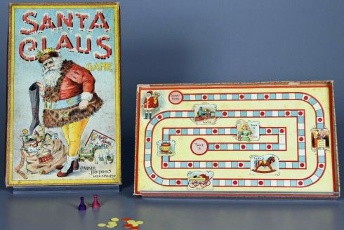
As the Parker Brothers’ games illustrate, by the twentieth century Christmas games seem to have evolved into children’s games primarily, rather than family or parlor games. There are a few exceptions, but there seems to be a holiday segregation of sorts, with the children preoccupied with gaming and gifts and the adults occupied elsewhere (purchasing, preparing, drinking?). At least everyone comes back together for the feast, followed by a little Crackers merriment, always over in Britain and increasingly over here.

Christmas Game 12 Days

Christmas Crackers V and A

Christmas games:  Christmas Circles, c. 1825, The Twelve Days of Christmas, c. 1950, and Batger’s Crackers, 1920s-30s, Victoria & Albert Museum Collection; Alfred Crowquil’s Pantomime, Harvard University; The Feast of Reason, c. 1865, Boston Athenaeum, Parker Brothers’ Santa Claus games, 1890s, National Museum of Play, ©The Strong.


What I Want Now: King Penguins

Today I have an entry in my very occasional series of What I Want Now: things I am craving at this very minute. Generally these things fall into two categories: items that I have just discovered and want instantly and items that I have known about for a while but suddenly must have. Today I am thinking about collectible “King Penguin” books, an illustrated hardcover series that Penguin published between 1939 and 1959, including 76 titles. I have four and now want more. These are slim volumes with striking covers: like another series which I admire and collect, Britain in Pictures, it was the aesthetic quality of these books that first captured my attention rather than their content. They look great on a shelf, and in multiples, so I really need more, now. I bought my four volumes in a brick-and-mortar store that is no more, so I think I’ll have to expand my collection from online sources but I’m a bit hesitant as condition is everything with these books: not only do they have beautiful covers, they have lovely spines, and this is the part of the book that gets the most wear and tear. Yet despite my trepidation, I will press on, and if anyone out there reading this wants to help, I have Crown Jewels, Elizabethan Miniatures, Some British Moths, and Flowers of Marsh and Stream in my possession and really want Animals in Staffordshire Pottery, the two (edible and poisonous) mushroom books, both of which have amazing covers, A Book of Toys (with toy penguins on the cover), Spiders, The Bayeux Tapestry, The English Tradition in Design, A Book of Scripts, Tulipomania, and just for the season, Compliments of the Season.

King Penguin Elizabeth Miniatures

King Penguin Flowers Marsh and Stream

King Penguin Mushrooms Covers

King Penguin Toys Cover

King Penguin Spiders Cover

King Penguin Scripts Cover

King Penguin Ballet Illustration

King Penguin Military Uniforms Illustration

King Penguin Tulipomania Cover

King Penguin Compliments Cover

King Penguin titles I have and want, and illustrations from Janet Leeper’s English Ballet and James Laver’s British Military Uniforms. The best source for learning all about collectible Penguin titles is here. Oh, and this one too, please: for $92, I assume its spine its perfect.

King Penguin Life Cover


Fabricating the Feast

Can there be any other holiday more closely associated with women than Thanksgiving? Forget the quasi-mythical “First Thanksgiving”, for which we only have references to men fowling and feasting–after that it’s all about women. What emerged as a New England tradition in the early nineteenth century was transformed into a national holiday through the intense efforts of author and editor Sarah Josepha Hale, eventually resulting in Abraham Lincoln’s Thanksgiving Proclamation of 1863. Several other New England ladies contributed to this effort, including Lydia Maria Child, whose “Over the River and through the Wood” we traditionally associate with Christmas but was first published in 1844 as “The New England Boy’s Song about Thanksgiving”. Successive presidents followed Lincoln’s precedent until 1941, when Congress established the fourth Thursday of November as a permanent Thanksgiving holiday. In the interim, a major medium for the adoption of a national harvest holiday seems to have been women’s magazines, chief among them Hale’s own Godey’s Ladies Book and later Good Housekeeping, The Ladies’ Home Journal (and Practical Housekeeper), (The) House Beautiful, and even Harper’s Bazaar. There was definitely a bit of culinary imperialism at work here: the ideal Thanksgiving menu published in Hale’s first novel, Northwood, was Yankee fare (cranberries!), but as turkey assumed the center stage (pushing out the very popular chicken pot pie and assorted other fowl) regional dishes could be assimilated as “sides”. And need I even say it? Women were making all those Thanksgiving feasts.

Thanksgiving HP 1894

Thanksgiving 1895 Bradley

Thanksgiving LHJ 1897-98

Thanksgiving 1904 Puck

Thanksgiving Pictorial Review 1906 Cover

Bearing Thanksgiving HP 1914

Thanksgiving gh 1937

Fabricating a very FEMININE Thanksgiving in the popular print media, 1894-1937: 1894-95 covers by Louis John Rhead and William H. Bradley, Metropolitan Museum of Art and Museum of Fine Arts, Boston; Ladies’ Home Journal Thanksgiving covers for 1897 and 1898; 1904 Puck Magazine cover, Library of Congress;  Pictorial Review and Ullman Manufacturing calendar page for November 1906; Harpers Bazaar and Good Housekeeping covers, 1914 and 1937, Library of Congress and Good Housekeeping archive.


Salem Spirits

After the various map posts, which go viral immediately and retain a steady following thereafter, the most popular posts on my blog have been those focused on spirits, in particular an examination of a peculiar Salem drink from colonial days named Whistle Belly Vengeance and the story of a libelous temperance pamphlet directed at the wealthy rum distiller who happened to build my house. I can understand why: there’s just something very alluring about alcohol! The process of distillation, in particular, has always had a rather mysterious and even diabolical reputation, from the days of alchemy to that of Nathaniel Hawthorne, when a certain ambitious temperance minister named George Cheever targeted the largest rum distiller in town, John Stone (who built my house and styled himself Deacon for his role at the First Church of Salem) in an allegorical pamphlet entitled  The Dream, or, The True History of Deacon Giles’ Distillery (1835). In the thinly-veiled Deacon Giles, who concocted barrels of cholera, murder, fever and delirium with the aid of his demon workers, Deacon Stone saw the inverse of his pious self: both men were (hypocritical) bible-society members, both lost relatives in the diabolical vats of their distilleries, both had alcoholic sons, both made demon rum. Stone sued for libel and won, but Cheever became a cause celebre and temperance hero during the trial. His little story was reprinted for a national audience, and within the next decade Stone’s largest distillery was converted into a sawmill.

Deacon Giles Frontspiece 1835

Domestic and Demonic Distillation: Rebecca Tallamy’s Book of Receipts. Written in the margins and blank spaces of a copy of John French’s Art of Distillation, 1651, Wellcome Library, London; the frontspiece to George Cheever’s True History of Deacon Giles’ Distillery, 1835, New York Public Library Digital Gallery.

But now Deacon Giles, and rum distillation, has returned to Salem in the form of a new (and real) craft distillery named after the fictional distiller. Deacon Giles Distillery, located just off Canal Street, not only reflects the current appetite for crafted spirits, but also Salem’s rich rum-selling past. Rum is as “Salem” as the Witch Trials of 1692, Samuel McIntire, Hawthorne, and (unfortunately) Halloween: with eight distilleries in operation in 1821 and a reputation for the best “New England” rum around, the city logically became the target of the evangelical temperance movement in the next decade. It wasn’t just all about Deacon John Stone! And as the distillers were walking me around their beautiful “still house” this afternoon while talking about their triple-distillation process and pursuit of “purification”, I couldn’t help but think back to the days of the medieval alchemists, who also pursued the ultimate quintessence, or “elixir of life”, through a multi-step process in which distillation, the next-to-less step, effects the ultimate purification.

Spirits 121

Spirits 106

Spirits 112

Spirits 117

Spirits 103

Deacon Giles Distillery, 75 Canal Street, Salem: Tasting Room mural, the distillers at work, the products–Liquid Damnation Rum and Original Gin.

Deacon Giles was aided by the path which Salem’s craft hard cider brewery, Far From the Tree, paved and the amendment of the Salem zoning ordinance to allow Massachusetts Farmers Series licenses allowing them to produce, pour, and sell. Both businesses have great tasting rooms and really knowledgeable people eager to tell you all about their products while you sip them. I was really tempted today, but I didn’t think having a swallow of rum (or more) was a good idea when I had class in an hour!

Spirits 085

Spirits 091

The Far From the Tree Tasting Room on Jackson Street in Salem and two Far from the Tree ciders: they also have Rind (my favorite–but I think it is a seasonal variety), Spice, and several others. These ciders are great because they are really dry, as advertised. Next up: Notch Brewing on Derby Street!


The Cartography of Entanglement

Today’s post is a perfect example of how my mind works and why looming deadlines force me out of my home office and into my university one, or to the library, or anywhere but home. I was very quietly reading a great book about English migration in the seventeenth century, in preparation for my upcoming graduate class, when my mind started to wander to maps: first to maps of the Atlantic world, then to maps of the early modern world, then to nineteenth-century imperial maps, then to allegorical maps, then to propaganda maps, then to maps which had spider motifs. This wandering started with the title of the book, The Web of Empire, but it was definitely prolonged by my materialistic instincts, as I have finally ejected my husband’s saltwater aquarium from the lovely little room that I used to call my “map room”, and will again. This room was very damaged by leaks from ice dams this past winter, and has been recently been re-papered and -plastered, so I’m in redecoration mode. I had several old maps and globes in there, but even before our fierce February they were threatened by the vapors emanating from that old aquarium, so now that it is out of there the maps are going back in–and I want more. I’m a huge fan of allegorical and pictorial maps (see here and here and here), so I thought, why not spiders? They’re not quite as obvious a metaphor for world domination as the octopus, but a close second.

Web of Empire Games

I started my search for arachnophobic maps with the early nineteenth century and Napoleon: Thomas Rowlandson had very famously portrayed the little general as “the Corsican Spider” and I figured some contemporary cartographer would be inspired to create a vision of Europe caught in his web. No luck, and nothing from the Victorians either, although one of Lillian Lancaster Tennant’s whimsical maps depicts the old legend of Robert the Bruce and his inspiring spider. This is hardly the arachnophobia I was expecting, or looking for: it will take the ferocious World War I–and the polarizing imperial strategies of the rest of the twentieth century–to produce those kind of images.

Napoleon as Spider

Web Map Scotland Barrons

Thomas Rowlandson’s The Corsican Spider. In his Web. (1808), Royal Collection Trust; Bonaparte with a spider web as a medal, having devoured Russia (1814), Jonathan Potter, Ltd.; Map of Scotland from Stories of Old (1912) by Lillian Lancaster Tennant, Barron Maps.

And so that brings us to probably the most famous spider map:  “L’Entente Cordiale, 1915”. This propaganda map represents the German perspective on World War I, with Britain portrayed as a giant spider literally eating France while the US is entangled in its web in the background and an unfettered German eagle overlooks the scene. This is a mockery of the alliance made between France and Britain  in the previous year, which clearly did not aid/save France. I found several other British spiders in various collections of German propaganda from the Great War, including the map below from (of all places) neutral Sweden, and the “Europa 1915-1916” map which depicts the insect extending its legs across the Channel while Germany is (quite literally) steamrolling the Russian bear: this view conforms to the German rationalization that it was Britain that had woven a web of empire, spanning the globe.

Lentente Cordiale LOC Bordered

Swedish Propaganda Poster 1918 CUL

Europa 19151916 IWM

l’Entente Cordiale, 1915, Library of Congress; England Världens lyckliggörare, 1918, War Reserve Collection, Cambridge University Library. (I’m not entirely certain that this Swedish poster is not depicting an English octopus: there is no web, but it does look quite furry); Europa 1915-1916, Imperial War Museum.

The spider allegory is unleashed in the 1930s and 1940s: Nazi Germany produced many anti-Semitic and anti-Communist pamphlets and posters (and combinations thereof) employing the spider, and then we see all the participants portraying the enemy in arachnidian ways once the war began. The U.S.S.R. is portrayed as a menacing spider by both the Germans and the Americans in the space of five years, and then of course Hitler/Germany becomes the most menacing spider of all. I’m including a well-shared image of “The American Spider” which is dated 1943 because it’s a perfect fit for this post, but I’m not sure of the source: tumblr-and reddit-land never credits! I’ve searched all the usual repositories and come up with nothing, but I would love to know about more about this particular spider map.

Bolshevik Spider 1935 Hoover Institute

Spider Russia Cold War

Nazi Spider Map 1943

Spider Map US WWII

Germany struggles to keep Europe free from Bolshevism, 1935, Hoover Institute, Stanford University; The Russian Spider Sits atop the World and Watches for more Victims, Los Angeles Times, January 7, 1940 (during the brief German-Russian alliance), Barry Ruderman Antique Maps, Inc.; One by One his Legs will be Broken, 1941, Imperial War Museum; The American Spider, 1943, source–Vichy France?

The spider need not be so malevolent. Another map from this era, published by Ernest Dudley Chase, one of the most prolific and creative pictorial cartographers of the mid-twentieth century based right here in Massachusetts, features a spider web as a sort of overcast underworld. Following in the wake of “A New Yorker’s Idea of the United States of America” and “A Bostonian’s Idea of the United States of America”, Chase’s “The United States as viewed by California (Very Unofficial) Distorted and Drawn by Ernest Dudley Chase”, contrasts a distorted two-thirds of interwoven America with a very sunny, happy California. I’ve included a quote from another of Chase’s maps for parity’s sake. And because our own twenty-first century view of the web is quite different from that of the previous century, I’m ending with this great “Age of Internet Empires” map from the Oxford Internet Institute. I could go on–rail transportation maps are often called “spider maps”–but I think I’ve been entangled enough!

Ernest Dudley Chase

Ernest Dudley Chase Map NE

Age_of_Internet_Empires_final

Ernest Dudley Chase maps, Boston Public Library Leventhal Map Center; “Age of Internet Empires Map”, Oxford Internet Institute.


Flagg-Waving

The prolific illustrator James Montgomery Flagg (1877-1960) is responsible for some of our most iconic patriotic images, crafted to bolster support for World Wars I and II on both the home and battle fronts. These images are only a small part of his vast body of work–and a career that was well on its way by age 15 when he was appointed staff artist at Life and Judge magazines–but are nonetheless illustrative of his creativity and his tendency to focus the visual message on people rather than objects or events: he personified patriotism. Even though it is clearly based on the equally-iconic Lord Kitchener poster by Alfred Leete, his Uncle Sam (literally–he served as his own model) will forever be our Uncle Sam and though Miss Columbia looks a bit more ephemeral she certainly served her time in the first decades of the twentieth century. My favorites are the more whimsical, pre-war “Flagg girls” dressed up in red, white and blue, but all make for a patriotic display as we head into this July 4th weekend.

Flagg Judge July 1915

Flagg Girls 3 Cheers for the Red White and Blue 1918

Flagg I LC

Flagg 1941 LC

Flagg Columbia Collage

Flagg Marines

Flagg Forest Photograph 37

Flagg’s cover for the July 3, 1915 edition of Judge magazine; original Uncle Sam “I Want You” poster from 1917 and its reissue in 1941 (see a short article here); a collage of Columbias, 1917-1918; “Tell that to the Marines!”, 1917-1918; and Flagg (left) & FDR with his anti-Forest Fire poster, 1937, Museum of Fine Arts, Boston and Library of Congress. Just a few years ago, the owner of Flagg’s 1910 summer house in Biddeford Pool, Maine, received permission to demolish it, but somehow save the land- and seascape murals he had painted on its interior walls. I think it’s gone now.


Ephemera-esque

At the end of last semester, one of my students gave me a beautiful card with what looked like a vintage (1920s-1940s) lithograph of the House of the Seven Gables. I just loved it–not just the sentiment inside, but also the image outside, which looked vaguely familiar, but I couldn’t quite place it. So I went right to the producer, Lantern Press, and found a treasure trove of images in all forms (cards, posters, souvenirs of all sorts), some actual reproductions of vintage lithographs, some “vintage-esque”: travel posters, crate labels, old postcards, lots of maps, both regional and global in content and perspective. Very accessible ephemera with no need to get your hands dirty hunting through flea market boxes: you can even get one of the oldest Salem Witch postcards in the form of a refrigerator magnet (if you must).

Some old, some new: a few examples from Lantern Press’s inventory of images:

Lantern Press Gables Card Cover

Lantern Press Golf

Lantern Press Umbrella Card

Lantern Press Blue Ridge Parkway

Lantern Press Capes


The Knight’s Tale

Every single day this week Geoffrey Chaucer came up in discussion, and only once in class! So it seemed like no coincidence when an old textbook I was consulting for something else entirely reported that on this very day in 1397 he first read the Canterbury Tales at Richard II’s court. I’m not sure this is true, but as Chaucer was already on my mind I indulged myself a bit more. I use many of the Tales in my courses to illustrate various aspects of late medieval culture and society, but I read them for pleasure as well–and a few translated lines from The Knight’s Tale even made their way into my wedding ceremony. This is the tale that my students favor–even as I push the Pardoner and the Franklin on them, but of course their “veray parfit gentil knight” is Heath Ledger! I can’t blame them: I like that movie too, as its egalitarian spirit seems vaguely late medieval (and I prefer blatant anachronism to what passes for “accurate” historical dramas). But The Knight’s Tale and its companion stories were not rediscovered only in the 21st century: every generation seems to have their Chaucer, from the 80+ manuscript versions produced shortly after his death, to William Caxton’s printed versions, seventeenth-century theatrical productions, or the beautiful texts and images of William Blake and William Morris, for as Blake noted in 1809, Chaucer’s characters live age after age. Every age is a Canterbury Pilgrimage; we all pass on, each sustaining one of the characters; nor can a child be born who is not one or other of these characters of Chaucer.”

Knight's Tale Ellesmere

Knight's Tale Caxton BL

Knights Tale Kyngston

Two_Noble_Kinsmen_by_John_Fletcher_William_Shakespeare_1634

William_Blake_-_Chaucer's_Canterbury_Pilgrims 1810

Knight's Tale Kelmscot

Knights Tale 19th

Canterbury Tales 1968

Canterbury Tales 2013 Penguin

Cropped leaf from the  “Ellesmere Chaucer” MS., c. 1400-1405, Huntington Library; page from William Caxton’s 1483 edition, British Library; 1561 edition printed by John Kingston for John Wight; a 1634 theatrical adaptation of the Knight’s Tale by John Fletcher and William Shakespeare; “Chaucer’s Canterbury Pilgrims”, engraved and published by William Blake, 1810; Illustration by Edward Burne-Jones for the “Kelmscott Chaucer”: The Works of Geoffrey Chaucer, now newly imprinted. Kelmscott Press, 1896; Illustration by William Clark Appleton from Percy Mackaye’s The Canterbury Tales of Geoffrey Chaucer. A Modern Rendering in Prose, of the Prologue and Ten Tales, New York, 1904; Poster for the “bawdy” musical, 1968, Victoria & Albert Museum; Penguin Clothbound Classic cover by Coralie Bickford-Smith, 2013.


Hatching Hostilities

Well this is not really a post that speaks to the spirit of Easter, but it does involve eggs…..I think I’ve written about all of the usual Easter topics over the years, including rabbits, the White House Easter Egg Roll, and Swedish Easter witches, but never war, until today. The minute I saw some egg-themed postcards from the Russo-Japanese War (1904-1905), I knew I had to write about them, and this seems like an (oddly) appropriate time. Even though it was a relatively short war, this cross-cultural conflict was nevertheless a major turning-point in Russian history, Japanese history, and world history, and it anticipated the truly global nature and coverage that would characterize World War I in the next decade. A good part of this coverage was pictorial: photographs, editorial images, and postcards–the latter was new media at the turn of the last century, and producers and artists in the west and the east embraced them as a multi-national form of war reportage. Cards produced for domestic audiences tend to be more propagandistic and jingoistic, obviously (you can see a sampling at MIT’s “Asia Rising” online exhibit), but those oriented towards an international market tend to be more symbolic, allegorical, and (above-all) humorous. Because of the universal symbolism of the egg and its all-too-apparent nature, these egg-themed cards, all from the vast Leonard A. Lauder Collection at the Museum of Fine Arts, Boston, are not too difficult to understand: an “Easter Egg of the War” is about to hatch hostilities in Manchuria, a Russian soldier cracks opens a “boiled egg” filled with his enemy, and the theater of war is played out in two postcards from the “Easter Eggs of the Mikado” series.

Japan Easter Egg of the War

Boiled Egg

Japan PC 1 MFA

Japanese PC 2 MFA

A.F. Delamarre, “The Easter Egg of War”, 1904-1905; Fernet, “Boiled Egg”, 1904-1905; and unidentified artist, “The Easter Eggs of the Mikado” series, 1904-1905, all from the Leonard A. Lauder Collection of Japanese Postcards, Museum of Fine Arts, Boston.

The meaning behind these next four postcards is even easier to grasp: an egg fight, in which eggs are broken, and scrambled (leaving behind a big mess!):

Egg Battle 1 Fact to Face

Egg Battle 2 Start the Fire

Egg Battle 3 Fire at Will

Egg Battle 4 Body to body

Egg Battle 5 After

Unidentified (Japanese?) artist, The Egg Battle series: face to face, start the fire, fire at will, body to body, after the battle, 1904-1905, Leonard A. Lauder Collection of Japanese Postcards, Museum of Fine Arts, Boston.


Hardcovers

I had been wanting to write a post on Black Beauty, the first “real” book I ever read and one that shaped my childhood in several ways, for some time, and as today marks the birthday of its author, Anna Sewall, this seemed like the perfect time. So this weekend I brought out my old copy for inspiration but almost as soon as I opened it up I realized I could not read this book again, much less write about it. Don’t get me wrong: it’s still a wonderful book:  I just don’t want to go through the horse’s painful journey again. Of course everything turns out all right for Black Beauty in the end, but Sewall gives him such a strong voice, and fills his story with so many harrowing, realistic details, that the moment I opened up the book (after decades) it all came rushing back. I can’t imagine how I had the courage to read this tome in the first place at age seven or eight: the fearfulness of youth, I suppose! But I’m not going back: the protective material side of me has surfaced, fortunately, and I’m going to focus on the decorative aspects of books today instead of their content.

Black Beauty 1st ed.

Black Beauty 1897

Black Beauty 2011

Covers of Black Beauty:  1877 first edition, 1897, and 2011 Penguin Threads edition–with design by Jillian Tamaki.

Enough of suffering, compassion and sanctuary! Like anything that seems likely to go away, books have becoming more precious as objects for some time, both in their original form and in variations and adaptions. One company that seems to be bridging the gap between literature and art is Juniper Books, which offers ready-made and custom collections of books gathered around a particular author or theme with covers and spines designed to decorate the bookshelf. When they can’t find an appropriate set of books to house their designs–they just cover up odd volumes–and so we have an Ernest Hemingway set of elephant-embellished books and an anonymous set of elephant-embellished books, all ready for a pachyderm-themed study (like mine).

Hardovers Juniper Books Hemingway Set

Hardcovers Elephant Book Set

And if you’re just looking for book forms, there are a variety of options: ceramic books are my particular preference of this genre –book-shaped vases and flasks go way back, at least to the eighteenth century. A couple of years ago I bought up as many of the book candles below as I could obtain at Anthropologie (a store that will put candles in anything and everything): I didn’t particularly care for the candles (still intact); I just liked the “books”. They are long gone from the store now, but these more colorful book vases are still very much in stock. A bit more sophisticated examples from Seletti and Kim Marsh are available here and here, and I suspect I could gather much more.

Hardcovers 030

Anthropologie ceramic book vases

Book Vases

Hardcovers Kim Marsh