Category Archives: History

Why are there no WPA Murals in Salem?

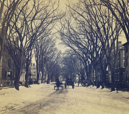
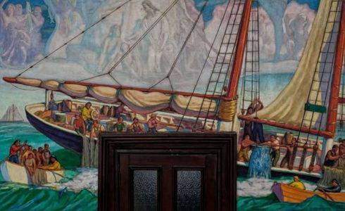
The various initiatives of the Works Progress Administration made their mark on Salem during the Depression: substantive work on Greenlawn Cemetery and the Salem Armory was completed, wharves and docks were built or rebuilt all around Salem Harbor, and the Salem Maritime National Historic Site was created along Derby Street. Many historic structures in Salem were measured and photographed under the aegis of the Historic American Building Survey, for which I am grateful nearly every day. I’m sure there were more infrastructural improvements implemented with federal funds in Salem in the 1930s, but I don’t have the time or the inclination to lose myself in the massive archives of the New Deal!  There is a conspicuous absence of federally-funded art in Salem however: no murals in the Post Office or City Hall illustrating the city’s dynamic and dramatic history. This absence is conspicuous because Massachusetts in general, and the North Shore in particular, is home to some notable New Deal murals, commissioned by various Federal cultural agencies to embellish public spaces with uplifting, patriotic, accessible American scenes while simultaneously providing unemployement for artists. There are amazing murals in Boston, Worcester and Springfield, and in Natick, Lexington, and Arlington, and here in Essex County, in Gloucester City Hall, Abbot Hall in Marblehead, the Topsfield Public Library, and the Ipswich Post Office. Moreover, there were several Salem artists who painted murals for the WPA elsewhere–but not in the city of their birth or residence. Why?

wpa-mural9-large

wpa-eliot-natick

wpa-lexington-ma-po-mural-1024x512

wpa-mural-gloucester

gloucester-wpa-mural-3

Umberto Romano, “Mr. Pynchon and the Settling of Springfield”, Commonwealth of Massachusetts State Office Building, formerly the US Post Office, Springfield, Massachusetts, photograph by David Stansbury, and Hollis Holbrook,” John Eliot Speaks to the Natick Indians”, US Post Office, Natick, photograph by Thomas Cortue, both part of the joint Smithsonian National Postal Museum and National Museum of the American Indian exhibition, “Indians at the Post Office: New Deal-Era Murals”; Aiden Lassell Ripley, “Paul Revere’s Ride”, US Post Office, Lexington; and Charles Allen Winter’s “Protection of the Fisheries”,  and “Education” , two of 6 murals in Gloucester City Hall that have been recently restored.

I’ve been wondering about this for a while, but this weekend I was engaging in my semi-regular weekend fantasy-shopping-on-1stdibs session and I came across a study painting by Dunbar Beck for a mural entitled The Return of Timothy Pickering which eventually embellished the interior of the Danvers Post Office, where it remains to this day. And I thought to myself: why the hell was the mural commissioned for DANVERSWhy didn’t it come to Salem? Timothy Pickering is one of the most famous native sons of Salem, his house is here, and his mural should be here too. Danvers is the former Salem Village, and was long part of Salem, but still this mural clearly portrays Salem Town and harbor.

pickerings-return

wpa-mural-crop-pickering

Dunbar Beck, Study Painting for the Danvers Post Office mural “The Return of Timothy Pickering”, currently available from Renaissance Man Antiques on 1stdibs.

So, why no murals of Salem’s earliest settlements, famous vessels, lively port, sea captains’ mansions, or Witch Trials on the walls of public building downtown?  Well there would have had to be some visual reference to 1692, and that was hardly an uplifting American episode that could be used to raise spirits during the Depression. That’s the curse of 1692, which manifests itself time and time again. Or maybe there was no place for one in Salem’s relatively new Post Office or venerable City Hall. But I for one would like to see a simplistic scene of North America’s first elephant stepping on Salem soil somewhere around town.


Royal Recommendations

As we move into a new era (“reign”?) here in the United States I am quite determined to keep my blog as apolitical as possible but some events and occurrences will no doubt be provocative and/or inspirational. At those times I’ll probably have to delve in, but I will strive for a relatively detached perspective by placing these events and occurrences in as wide an historical and/or cultural context as possible. Here is a first attempt. The other day, our President-elect tweeted his endorsement of L.L. Bean based on a significant contribution on the part of one its family owners, the granddaughter of L.L. Bean himself. I immediately felt and heard the indignation and desire for retribution of seemingly-everyone in my adopted state of Massachusetts focused on one of the largest businesses in my home state of Maine. The employees of this venerable company are probably trembling in their boots: did they ask for this? And are we now entering an era of presidential commercial endorsements akin to the “Royal Warrant of Approval” system in Britain and other European countries which still have monarchies? Imagine the presidential seal of approval where the Royal Arms are below (along with very different entities) provoking an equal measure of purchases and boycotts across the nation.

Royal Warrants of Appointment granted to some of my favorite purveyors: Penhaligon’s (represented by my “Juniper Sling” perfume–which smells a lot like a gin & tonic!), Barbour, and Hatchards Bookshop in London. I’m sure there are a lot more royally-approved goods around the house, including the Twinings tea and Carr’s crackers in my cupboard and the Hunter boots in my closet. Apparently there are approximately 800 Royal Warrant Holders in Great Britain, representing myriad goods and services, everything from movers to jewelers.

royal-warrant-perfume

royal-warrant-barbour

royal-warrant-hatchards

Royal Warrant Holders past and present: Eighteenth-century trade card for Maydwell and Windles, glass manufacturers, British Museum; Carter’s garden seeds, 1897; Pears soap advertisements from 1902 and 1911;  a Daimler ad from the 1930s, and a Colman’s Mustard label from 1887: this company is a particularly proud bearer of the royal arms; Sanderson Fabrics, a warrant holder since 1923, pays homage to Queen Elizabeth II during her Diamond Jubilee in 2012.

royal-warrant-cartouche

royal-warrant-seeds-bm

royal-warrant-collage

royal-warrant-car-2

royal-warrant-colmans-mustard-1887

sanderson-blog-fit-for-a-queen1


Pope and Pagan; or Nativist Fun

Salem holds almost as prominent a place in the history of board games as it does in the origins of American maritime commerce and Federal architecture, due in overwhelming part to Monopoly, but before the Parker Brothers there were the Ives Brothers, the true pioneers of card-and board-game production. The publishing firm of W. and S.B. Ives was founded in 1823 by William and Stephen Ives, and operated through the mid-1850s, producing the Mansion of Happiness, generally acknowledged as the first American board game, as well as the widely-popular Improved and Illustrated Game of Dr. Busby. The success of the Ives Brothers, (or really William Ives as Stephen seems to have left the partnership relatively early) in effect created an industry by sparking imitation and competition from their fellow Massachusetts manufacturer, Milton Bradley, the McLoughlin Brothers in New York, and ultimately Parker Brothers. The American Antiquarian Society has a large collection of nineteenth-century board games, including many produced by the Ives firm, and while I was browsing around its digital collections the other day (looking for something altogether different) I encountered a rather provocative Ives board game called The Game of Pope and Pagan, or Siege of the stronghold of Satan, by the Christian army which was published in 1844. It’s a simple game, a variant of the perennial Fox and Geese, in which players constituting the “Christian” army lay siege to the “stronghold of Satan” which is occupied by the Pope and pagans: in the words of the game, “this simple amusement exhibits a band of devoted missionaries, attacking the strong-hold of Satan, defended by papal and pagan Antichrist”. I spend a lot of time in seventeenth-century England (I’m assuming the game’s title is derived from Bunyan’s Pilgrim’s Progress) so I’m pretty familiar with strident anti-Catholicism but the more “modern” American offshoot in the nineteenth century shocks me every time I encounter it: what a cauldron Salem must have been at this time with its heady mixture of abolitionists and nativists (with a dash of temperance thrown in)! Apparently there were intersections among these groups but you wouldn’t know it from this game, in which “the white figures represent the missionaries, as white is they symbol of innocence, temperance, and hope…..as heraldic sable denotes grief after a loss, Pope and Pagan are in black, both denote gloom of error, and their grief at the daily loss of empire”.


pope-and-pagan-4

pope-and-pagan-5

pope-and-pagan2

W. and S.B. Ives, The Game of Pope and Pagan, or Siege of the stronghold of Satan by the Christian army, Salem, Massachusetts, 1844, © American Antiquarian Society. 


Nuts-and-Bolts Bankers

I love everything about this little pamphlet I picked up the other day commemorating the 100th anniversary of the Merchant’s National Bank of Salem in 1911: In the Year 1811. The graphics, the format, the paper, the fonts. The whole point of the pamphlet is to show how much changed from 1811 to 1911, and how integral the Merchants National Bank was to that change. Everything is so much better in the latter year, everything is so modern, and to illustrate this modernization, in both words and pictures, the pamphlet privileges the practical side of life over the big political events that shaped the century: transportation, heating, cooking, lighting, clothing, and commerce, of course. There is one sentence referencing the wars of the century, and presidents are referenced only by their age at the time of the incorporation of the bank. 

bankers-5

bankers-3

bankers-11

bankers-12

bankers-14

bankers-heat

bankers-22

There are several references to Salem’s notable architecture, but again, it’s really all about the bank, which showcases its new headquarters on Essex Street, “colonial in architecture and absolutely fire-proof in construction. The walls are of brick; roof and floors of concrete. There is nothing to burn; the city might be swept by a conflagration, and the building of the Merchants Bank would still stand”. Of course this strikes one as a very prescient statement, as Salem would  be “swept by a conflagration” in only three short years: the Great Salem Fire of 1914. The new bank building stood tall, but primarily because the fire did not reach downtown. Samuel McIntire is not mentioned in the pamphlet, despite the fact that 1811 was the year of his death.

banking-collage

The new bank building on Essex Street, the Old Witch House, and a representative Salem porch.

I think the illustrator of most (certainly not all) of the charming sketches in the pamphlet are the work of Salem-born artist George Elmer Browne, based on the illustration of Salem’s first Eastern Railroad depot, which is attributed to Browne elsewhere. Everyone is familiar with the great Gothic Revival structure that was built in the 1840s and unceremoniously demolished in the 1950s, but this was its less imposing predecessor. Now that was a big change!

bankers-20

first_salem_station_by_george_elmer_browne

train-station-pikes

Browne’s illustrations of the First E.R. Depot in Salem, in Francis B.C. Bradlee’s The Eastern Railroad: A Historical Account of Early Railroading in Eastern New England (1917) and the second depot in 1911-12 Report of the Salem Plans Commission.


Trudging Along

Yesterday was a beautiful winter day with everyone out and about cleaning up after the Saturday snowstorm, which was not as bad north of Boston as it was to the south.The streets of Salem were clear by mid-morning, if not before (I was sleeping in), and people were engaged in their regular Sunday activities. There were Sunday street-hockey players out my front windows, and hungry birds out back.

snowy-chestnut-street-hockey-game

snowy-garden

I suddenly became curious about snow removal in the past–mostly because I didn’t want to go out and engage in my own snow removal in the present. I have–and have seen–quite a few historic photographs of winter scenes in Salem in the later nineteenth and early twentieth centuries, but none of them feature snow carts, snow plows, or snow removal. Salem has always been quite urban, and people needed to get around, how did they manage? What was the system then that so preoccupies us now? Both the New York Public Library and the Boston Public Library have quite a few photographs of various methods of snow removal in their collections, from simple shovel brigades to “snow rollers”–I’ve never seen anything like that for Salem: anyone out there have anything?

chestnut-street-in-winter

lafayette-street-in-winter

Chestnut and Lafayette Streets in the 1870s in stereoviews by Charles G. Fogg. Carriages on the snow—not even sleighs! But it’s not too deep here.

snow-chesnut-st-2-harvard

snow-chestnut-street-1899-harvard

Chestnut Street in the 1890s, deeper snow, no signs of plowing–but these carriages do look like they are on blades. I’ve shown these before; they are from a family archive in the Schlesinger Library at Harvard.

My problem is that I don’t have any winter scenes of Washington or Essex Streets with tracks that needed to be cleared: Chestnut was and remains strictly residential. I still think people trudged around a lot more than we do now, however. Look at these two wonderful photographs of students from the Horace Mann “Training School” associated with the Salem State Normal School (now Salem State University, where I teach) and their teacher, visiting historic sites downtown in the snow.Look at her skirt: she’s not troubled by a little snow.

snow-and-students-collage

E.G. Merrill photographs of Horace Mann students, 1904, Salem State University Archives and Special Collections

Like everything else, our toleration for snow in the streets changed with the automobile: we won’t settle for anything less than black the day after a snowstorm now. The wonderful book by Marblehead artist, photographer, and author Samuel ChamberlainSalem in Four Seasons (1938) shows winter streets cleared for cars and pedestrians. And he agrees with me: some of Salem’s most beautiful moments are in winter, when few visitors see it (though a lot more now, fortunately).

chamberlain-four-seasons

Plowing Chestnut Street in the 1930s, from Samuel Chamberlain’s Salem in Four Seasons (1938).


Perennial Patterns

There were several Christmas gifts that I gave to people that I wanted for myself–all books. It was very frustrating to me that two of these particular books were shrink-wrapped, so I couldn’t even leaf through them before I wrapped them up! One was even in its own impenetrable (without leaving a trace of attempts at opening) box. On Christmas Day, as soon as I saw my brother-in-law open up a beautiful book by Peter Koepke entitled Patterns. Inside the Design Library I knew I had to have one for myself–and now I do.

patterns-cover-phaidon

patterns-book-2

This stunning book is an exploration of a small fraction of the vast collection of The Design Library, a collection which includes seven million samples and fragments of pattern design embellishing fabrics, embroideries, yarns and wallpaper, all stored (appropriately) in a converted fabric mill in Wappingers Falls, New York. The book features a representative sampling of patterns and a very interesting concluding section on how design professionals, including designers at such diverse companies as Calvin Klein, Colefax and Fowler,and Pottery Barn, have used the library for inspiration. This is probably just a coffee-table book for my brother-in-law, who has long worked with textiles, but for me, it’s almost like a beautiful textbook, as each pattern is classified according to four main families of design–Floral, Geometric, Ethnic, and Conversational–and myriad subcategories under these categories. I quickly learned that I’m not crazy about abstract, chaos, exotica, jazzy, jungle, kaleidoscope, or modernist patterns (much less “x-rated” or “yummy”), but I LOVE distressed, gothic, and quotidian ones, and REALLY love feathers and insects. This was not a surprise to me, but I love finding classifications for my preferences.

patterns-7

patterns-3

patterns-5

patterns-4

From Patterns: Inside the Design Library: French hand-painted feather paper, mid- to late-20th century; French hand-painted insect paper, early 20th century; French distressed woodblock-printed wallpaper, 1770 & “gothic” printed fabric, also from France, late 19th century (these look like the characters in a 17th-century witch trial!).

I also like the patterns labelled “Oberkampf”, after the eighteenth-century textile manufacturing company Oberkampt & Cie, which produced fabrics with a revolutionary “rolling block press”. They seem timeless, somehow, as did several of the samples in the book–patterns that looked old, but were in fact quite modern, and that looked modern, but were in fact rather old. Those old sayings that “nothing is every really new” and “everything comes back again” are not always true, but they often are, a point that was really driven home in the last section of the book, “The Creatives”, in which designers reworked Design Library-sourced patterns for products as diverse as Lulemon leggings, Clinique packaging, and the chartreuse velvet coat which Mrs. Obama wore to accompany the President to Norway to receive his Nobel Peace Prize in 2009.

patterns-8

patterns-9

patterns-10-calvin-klein

Eighteenth-century Oberkampf designs from Patterns; the development of  Mrs. Obama’s coat by Francisco Costa, then creative director for Calvin Klein, based on velvets he found in the Design Library. 


Luther, the Great Disruptor

Was it just me or was the word disruption used intensively in the closing months of 2016? It seems like every time I turned on the radio or picked up the newspaper I was confronted with that word. Now that the year has turned to 2017, my attention has definitely turned to the ultimate change agent, Martin Luther, who sparked a religious/political/social/cultural disruption that divided western Christendom with the “publication” of his Ninety-five Theses in October of 1517. I’m trying to work my way through a stack of recent Luther publications so that I can update the content of both the undergraduate and graduate courses on the Reformation that I’m teaching this semester, and taking breaks to check out (digitally, because I don’t think I’m going to make it in reality) the several American exhibitions that are ending this month: Word and Image: Martin Luther’s Reformation at the Morgan Library & Museum, Martin Luther: Art and the Reformation at the Minneapolis Institute of Arts, and Law and Grace 2016Martin Luther, Lucas Cranach, and the Promise of Salvation at the Pitts Theology Library at Emory University in Atlanta.These three concurrent exhibitions are connected through German sponsorship and the Here I Stand: Luther Exhibitions USA 2016 project website and catalogs, which will be useful resources for both myself and my students, though the former is oriented more towards the secondary-school level I think (and oddly fails to acknowledge or even reference Luther’s anti-semitism). There have already been some notable Luther exhibitions in German institutions as we are in the midst of a Luther anniversary decade, but everything shifts back to the homeland for this anniversary year under the aegis of the In the Beginning was the Word: Luther 2017 project.

luther-collage

Luther on the cover of Time for his last big anniversary, in 1967, and this year’s anniversary logos.

I haven’t made it through all of these materials yet, but there seems to be a strong emphasis on the dissemination of Luther’s critique of church teachings and practice, through the means of both words, particularly printed words, and images.The connection between the new medium of printing and the success of the Reformation has long been acknowledged by historians, but the focus on Reformation art is a more recent development. I’m using two books in my courses that represent both approaches well: Andrew Pettegree’s Brand Luther and Steven Ozment’s Serpent and the Lamb, which explores the creative and mutually-beneficial relationship of Luther and Philip Cranach the Elder. The latter furthered the Reformation cause with both painted and printed images, while still, remarkably, maintaining his Catholic patrons! The Morgan exhibition features two beautiful contrasting Cranach paintings of the Virgin and Child/ Jesus and Mary: one very traditional the other strikingly humanistic in which we encounter Christ in a completely unmediated way, a reformed perspective that was also the product of the Renaissance.

luther-pettegree

ozment-serpent-and-lamb

cranach-collage

Lucas Cranach the Elder, Virgin and Child with St. John as a Boy, about 1514. Oil and tempera on panel. Federal Republic of Germany (on permanent loan to Veste Coburg Kunstsammlungen) & Christ and Mary, ca. 1516–1520. Oil on parchment on panel. Foundation Schloss Friedenstein, Gotha.

One review of the Morgan exhibit asked if Luther was history’s first “tweeter”, sending out cheap flugschriften (“flying pamphlets) to the masses. If we want to push the social media comparison farther, then Cranach ran the Lutheran Instagram account, by providing his friend with a steady supply of anti-papal illustrations for these pamphlets. When you gaze upon Cranach’s famous “papal-ass”, which went viral, you can appreciate the disruption that Luther made.

cranach-1523

luther-print

cranach-print

Lutheran disruption via Cranach’s cartoons: the “papal-ass” and clerical wolves, devouring their prey (the sheep=Christian believers), Heimatmuseum Osterwieck, British Museum and Universitätsbibliothek Bern, Zentralbibliothek , Switzerland, Call No. ZB AD 357.


The Golden Age of Gift-Giving

Before the Victorians and the twentieth century transformed Christmas into the extravaganza that it is today, New Year’s Day–in the midst of an extended Christmastide– was the occasion for offering and receiving gifts. We know a lot about the meaning and materiality of gifts in Tudor England because of some extraordinary records, and several recent works which have transcribed and interpreted them for all of us, most notably Jane Lawson’s momentous transcription of 24 surviving Gift Rolls from Elizabeth’s reign, The Elizabethan New Year’s Gift Exchanges (2013) and Felicity Heal’s The Power of Gifts: Gift-Exchange in Early Modern England (2015). These two complementary volumes are really interesting and useful (though expensive–fortunately I received one as a gift!). I’m sure you can imagine how valuable and variable these sources are–as Elizabeth received a lot of stuff from her courtiers: pounds of gold coins in little bags made of luxurious fabrics and embroidered, beaded and embellished, books, jewels, articles of clothing, as well as more unique items. Let’s just look at one year’s haul, recorded in the roll from 1578-79 entitled New Yer’s Guiftes giuen to the QUENE’S MAIESTIE at her Highnes Manor of Richmond, by these Persons whose Names hereafter do ensue, the First of January, the Yere abouesaid, which has been digitized by the Folger Shakespeare Library.

gift-collage

elizabethan-gift-roll-folger

gift-roll-in-situ

Our sources: the gift rolls are quite literally ROLLS.

It’s a long roll, organized by the titles of the gift-bearers, from Earls to Gentlemen, and the value of their gifts, a perfect illustration of currying favor. Elizabeth’s long-time favorite, the Earl of Leicester, offered up a very fair jewel of gold, being a clock fully furnished with small diamonds pointed, and a pendant of gold, diamonds, and rubies, very small; and upon each a lozenge diamond, and an apple of green and russet enamel. From the Earl of Ormond, a very fair jewel of gold, wherein are three large emeralds set in which and red roses, one bigger than the other two, all the rest of the same jewel garnished with enameled roses and flowers, furnished with very small diamonds and rubies; about the edge very small pearls; and in the bottom is part of a flower-de-luce garnished with small diamonds, rubies, and one sapphire, with three mean pendant pearls, two of them small; the backside a green-enameled flower-de-luce. More jewels, lots of gold coin, and embellished apparel, including girdles and kirtles, mantles, “forepartes”,”scarfs”, petticoats, caps, mufflers, gloves and handkerchiefs  in cloth of gold, satin and velvet. Very detailed descriptions: you can easily see why these rolls are so valuable to historians of clothing and accessories, as well as to those attempting to piece together the intricate and dynamic relationships that formed the Elizabethan Court.

elizabeth-in-gloves

elizabethan-blackwork

swete-bag

A crop of Elizabeth and the Three Goddesses by Hans Eworth (1569), ©Royal Collection Trust: a rare image of the Elizabeth wearing gloves, a common New Year’s Day gift. A fragment of Elizabethan blackwork, often referred to in the Gift Rolls, ©National Trust; Elizabeth received at least one “swete bag” to fill with sweet-smelling herbs to guard her from the plague in 1579–this embroidered example is from the collection of the Metropolitan Museum of Art. 

Rather than additions to Elizabeth’s vast and well-studied wardrobe, I tend to look for more unusual items in these records, especially household furnishings.The Earl of Hertford gifted the queen with a small pair of writing tables enameled with a grasshopper, all of gold, enameled green on the backside, and a pin of gold having a small pearl at the end thereof.  From Lady Thockmorton, a large bag to put a pillow in or moire satin, allover embroidered with gold, silver, and silk of sundry colors, with 4 tassels of green silk and gold; and a cushion cloth of network, flourished over with flowers of gold, silver and silk of sundry colors, lined with white satin. Elizabeth also received  contemporary examples of things we might receive today (on Christmas Day): books, stationery, sweets, flora and fauna, including eighteen larks in a cage from one Morris Watkins, on New Year’s Day of 1579.

elizabethan-cushion-cover

Elizabethan Cushion Cover, Metropolitan Museum of Art.


Toasts and Toadstools

There are myriad good luck charms associated with the New Year, and I’ve featured many of them already, including the Scottish “First Footing” ritual and the pig and chimney sweep traditions of continental Europe. I really can’t speak to the southern traditions of eating Hoppin’ John and collard greens, and horseshoes and clover seem to be universally lucky at all times of the year, so I think I’m going to go with toadstools this particular New Year. Very prominently featured on the New Year’s postcards produced and disseminated in large quantities a century or so ago are red-and-white-capped toadstools scattered about—these are “red fly” mushrooms called Fliegenpilze in Germany (which produced most of these same postcards) and they are very lucky indeed. If you’ve ever seen one of these (the proper Latin name is amanita muscaria) out in the wild, you would understand why it is such a storied plant: it looks not quite real, wondrous, and is said to have both insecticide and hallucinogenic qualities. Despite the fact that one of my favorite King Penguin books classifies this mushroom as poisonous, it was apparently a stroke of luck to encounter one: in doing so you becomes a Glückspilz (literally a lucky mushroom; metaphorically a lucky person).  It is no wonder these ‘shrooms ended up in both Alice and Wonderland and on all those New Years’ postcards, and on this particular year, on the mantle in my front parlor: I am taking no chances with 2017!

toadstool-nypl

toadstools-german

mushroom-new-year-card

new-years-collage

mushrooms-mela-koehler-mfa

toadstool-collage

An assortment of New Year’s postcards from my own collection and the Digital Collections of the New York Public Library; the holly and the……..mushrooms on a Mela Koehler Christmas card from the Lauder Collection at the Museum of Fine Arts, Boston; Amanita muscaria in John Ramsbottom’s Poisonous Fungi (1945).

I was just down in Rhinebeck, New York for Christmas at my brother’s house, and I had about twenty minutes in one of my favorite stores anywhere: Paper Trail. There were mushrooms in the window, and the most beautiful toadstool/mushroom (I must admit that I don’t know the difference) ornaments. So inspired, I switched up my own mushrooms (+ some hourglasses–very subtle) for the deer on the front mantle almost as soon as I got home. I think I have a pig somewhere in the basement so I might pop him on there too. And a horseshoe.

mushrooms-paper-trail

mushroom-mantle

Mushroom mantle 3.jpg


The House with Nine Lives

One of the projects that my husband’s architectural firm has been working on is coming to a close, so I took advantage of a holiday open house to go in and see how the much-altered former Home for Aged Men/Sons of Poland/ Emmerton Hall of the House of the Seven Gables was being transformed into six condominiums. I like my title, so I’m keeping it–but it is incorrect: 114 Derby Street is actually a building on the cusp of leading ten lives (if you count all the new units individually). It was built in 1806 for Salem sea Captain Joseph Waters, and remained a single-family residence until 1877 when the great philanthropist John Bertram purchased it for his newly-established Home for Aged Men. After the Bertram Home moved to the Common (where it remains), the Sons of Poland transformed 114 Derby Street into a fraternal headquarters and social club, and it continued to serve in the latter function, essentially, when the House of the Seven Gables Settlement Association purchased it in 1966 and renamed it after its founder, Caroline O. Emmerton. As envisioned by Emmerton, the Gables was an institution that was founded to realize the joint goals of preservation and settlement, and its social activities had outgrown the constraints main campus across the street. Everyone in Salem consequently refers to this building as the “Settlement House”, though that identity was relatively short-lived in the context of its entire history. The Frank Cousins photograph below, taken in the early twentieth century when the house was the Bertram Home for Aged Men, shows some semblance of its original Federal appearance.

settlement-2

settlement-1

duke0030-waters-house

The Waters House c. 1912 (Urban Landscape Collection, Duke University Library) and today. Third-floor ghost windows on both the main house and the 1983 addition of 114 Derby Street are reminiscent of the house’s Federal past.

Every “life” brought major architectural changes to the old Waters House, but it appears that the twentieth-century alterations were particularly extensive: the building’s exterior and interior were completely transformed by the Sons of Poland in the 1930s, and the Gables added the present addition to the back and side in 1983 (which everyone I know disdains but now looks pretty cool). The mission of the Gables has evolved over the last decade or so, and consequently its trustees made the decision to sell the building last year.This last (maybe!) evolution of 114 Derby Street has been pretty speedy, and the six (sold-out) residences should be ready for occupancy this spring.

settlement-collage

settlement-9

The addition s) and all those institutional uses mean that the new condominiums all (I think all!) have their own entrances.

waters-stairwell

settlement-stairway

settlement-4

settlement-7

settlement-11

settlement-12

settlement-13

settlement-14

Old stairwells and New spaces being carved out of the Waters/Settlement House: as you can see, the units are quite large (1-3 bedrooms with expansive living/dining spaces) and include parking out back.