Category Archives: Design

Reverence for Ruzicka

I’ve long admired the prints of Bohemian-born Rudolph Ruzicka (1883–1978), both pictures and fonts—both are characterized by the “optical ease” which he sought for all of his work. Ruzicka migrated to the United States as a child, and received his art training in Chicago and New York City before launching his career as an engraver and designer: he operated his own shop but also worked for the Mergenthaler Linotype Company for his entire professional life, as well as for Merrymount Press in Boston. His body of work includes several portfolios of prints of New York City, Newark and Boston, at least four typefaces (including the classic Fairfield which I use a lot), and a beautiful book of calligraphic fonts titled Studies in Typeface Design (1968). Ruzicka’s pictorial work looks to my untrained eye like the perfect combination of early to mid-twentieth-century central European and American aesthetics (they have that WPA look before the WPA!), and I love that he obviously loved New England: he moved to Massachusetts in 1948 and then to a farm in Brattleboro, Vermont. While he portrays an obvious appreciation for the “pictorial aspects” of New York (and Newark as well) his scenes of greater Boston are beautiful. And as a bonus, the series of greeting cards designed by Ruzicka and produced by the Merrymount Press from 1911-1941 include several prints of notable Salem landmarks, which you can see below.

ruzicka louisberg square carnegie

ruzicka beacon hill gardens carnegie

ruzicka beacon hill view

ruzicka charles street church

ruzicka cornhill boston

ruzicka granary burying ground

ruzicka washington monument

ruzicka frog pond carnegieRuzicka’s views of Boston (including the old Cornhill and swimming in Frog Pond) above, and of greater Boston (including Peacefields in Quincy, Walden Pond in Concord, McIntire’s Gore Place in Waltham and Derby summer house in Danvers, and the House of the Seven Gables and Old Town Hall in Salem) below.

ruzicka carnegie 3

ruzicka quincy

ruzicka walden pond

ruzicka gore place

ruzicka glen magna carnegie

ruzicka gables carnegie

ruzicka market house carnegieAll images from the collection of the Carnegie Museum of Art; the Harvard Museums also have a large collection of Ruzicka prints.


Fadeaway Women

Since I discovered the earlier version (1883-1936) of Life magazine this fall, I’ve been browsing through its content and covers: this Life 1.0 was a very different medium than its successor! I put together a portfolio of Christmas covers for a post, and then I realized that the work of one particular illustrator was more interesting, whatever the seasonal expression. These covers are the work of Clarence Coles Phillips (1880-1927), known first as C. Coles Phillips and for most of his career as Coles Phillips: an innovative illustrator who utilized the technique of negative space (and imagination) to portray a series of stylish and independent women on the covers of Life (and other periodicals) from 1908 to the end of his short life. The Christmas cover from 1909 caught my attention first, but it is not my favorite: I just love the ladies playing with boy toys in 1911—-a far cry from the Gibson Girls who preceded them!

Life xmas

December 22, 1909

Life 1909-10-14

Life 1910-03-03 C. Coles Phillips

Life C. Coles Phillips

Life 1911-07-27 C. Coles Phillips

Life mghl_phillips-5 Aug 24 1911

Life 1911-08-31 C. Coles Phillips

Life 1911-09-28 C. Coles Phillips Fade Away Women

Life 1911-11-30 C. Coles Phillips Fadeaway

Life 1912-06-13 C. Coles Phillips Fadeway

Life1912-12-26 C. Coles Phillips

Life phillips_l7apr21

Life mghl_phillips-9

October 14, 1909/ March 3, 1910/ May 12, 2010/ July 27, 1911/ August 24, 1911/ August 31, 1911/ September 28, 1911/ November 30, 1911/ June 13, 1912/ December 26, 1912/ April 7, 1921/ May 13, 1926. All covers from MagazineArt.org.


It started in Salem for John Derian

I’ve been a fan of decoupage artist and entrepreneur John Derian forever or what seems like it: since I bought my first piece at a little Marblehead shop named C’est la Vie, which is still very much up and running. And then I bought more glass trays: most from this same shop but I also took pilgrimages to his stores in New York City and Provincetown. Thanks to his collaborations with Target, I was able to obtain even more of Derian’s rediscovered prints, covering utilitarian objects like storage crates, coffee cups, and jewelry boxes. Beautiful stationery that I can’t even bring myself to use. So now there’s probably something Derian in every room in the house (except for those inhabited exclusively by my husband and stepson) but despite his omnipresence in my life I somehow never knew that it all began in Salem for John Derian! I knew he was from Massachusetts, Watertown in particular, but not until I read the forward to an engagement diary which my parents gave me for my birthday last week did I realize that a few colorful prints found at the Canal Street Flea Market in Salem in 1983 inspired his whole brilliant career!

Derian

Derian Collage

Colorful nineteenth-century floral prints found in a box of broken-up antique books and loose papers at a flea market in Salem, Massachusetts. I’m pretty sure this was the Canal Street Flea Market, which was before my time: I checked with Salem’s chronicler of record, Jim McAllister, to see if he had an image but no luck. This was a rather famous flea market though—I can remember hearing about it when I started poking around in markets a bit later than this—so I can understand how it might have drawn Derian up from Watertown. His description of how he was struck by the “power” of these particular images resonates with me completely—I’ve felt that power time and time again on my hunts. How impressive to be able to turn that reaction and appreciation into a decorative arts empire—and how neat that I can add this empire to the increasingly-long list of things that started in Salem.

John Derian around the house–not an exhaustive portfolio!

Derian 10

Darien 7

Darien 6

Darien 5

Darien 3

Darien 11

Darien 12

Darien 9

Darien Sheep


Dark Flora

I picked up this beautiful coffee table book the other day: Foraged Flora by Louesa Roebuck and Sarah Lonsdale, floral designer and writer/editor respectively. The photographs were so beautiful, I had to have it, but I hesitated, as apart from those on architecture, I tend to leaf through coffee table books only once or twice so they are extravagant purchases. But this one seemed different: it’s like a farm-to-table book for floral arranging. Think local and seasonal; forage and embellish every day. And it is so beautiful…..so I bought it, and I’ve been looking at it quite a bit. I have a small urban garden which I tend to ignore as soon as September comes around, but there are lots of fluffy white spent flowers out there now, and berries come later, so hopefully this book will help me to take advantage of my natural resources.

Foraged Flora Book

The other reason I keep turning the pages is this book reminds me of some of my favorite Dutch Golden Age still lifes, particularly those by two women: Clara Peeters (c. 1594-1657–who was actually Flemish) and Rachel Ruysch (1664-1750). Ruysch was much more well-known in her day than Peeters’ in hers, but there was a big exhibition of the latter’s works at the Prado a couple of years ago so at least she is getting some recognition hundreds of years after her death. The work of both women is amazing, and you’ll see why I was reminded of it as I glanced at the photographs of Laurie Frankel in Foraged Flora. The first images below are Frankel’s photographs; the next two paintings by Peeters and Ruysch.

Foraged Flora Laurie Frankel

Photograph by Laurie Frankel for Foraged Flora

Foraged Flora Laurie Frankel 2

Photograph by Laurie Frankel for Foraged Flora

Foraged Flowers Clara Peters Prado

Clara Peeters, , Museo del Prado

Ruysch, Rachel, 1664-1750; A Spray of Flowers

Rachel Ruysch, A Spray of Flowers with Insects and Butterflies on a Marble Slab, The Fitzwilliam Museum

I just love the combination of flowers against a dark background—I had to pick up a pillow along with the book! The Dutch paintings generally show special flowers in full bloom; Foraged Fauna follows suit, but its hunter-gatherer-renderers are a bit more adventurous with their materials, which is inspiring.

Foraged Flora garden

Garden October 2018The last rose of 2018 (?) and more plant material in my garden + my new pillow and what remains.


My Salem Museum

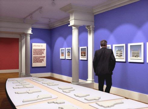
The Peabody Essex Museum has made an additional concession in the mitigation dialogue following their admission to the relocation of Salem’s historical archives to a “Collection Center” in Rowley: a presentation/exhibition on the “Salem (Historical?) Experience” to be permanently installed in Plummer Hall. This could be good news—-like everything else the devil will be in the details—but it in no way compensates for the removal of historical materials left in good faith to the care of the PEM’s predecessors by scores of Salem families. Still, Salem has always needed a proper Salem Museum, with texts, objects, and interpretations of key events and themes in its history presented in an installation that is both contextual and chronological. This could be an opportunity to have some semblance of that, as the PEM has wonderful curators and resources, but the institutional reluctance to actually showcase authentic Salem items—combined with the word “experience”—leaves me a bit worried that all we’re going to get is some sort of virtual presentation. Nevertheless I was inspired to put together my own Salem Museum, and here are its key components.

Salem Worlds: I would prefer a thematic presentation to a chronological one, but after teaching history for 20+ years I know that chronology is important—-people want to get the facts straight and in order. So I think I would use a “worlds” approach in which Salem expands from a tiny little settlement into one which is an important part of the entire world, and then create various other worlds which represent different aspects of Salem’s history. Worlds are a way to combine themes and chronology: we need to know about Salem’s experience as a colonial outpost of the expanding British Empire, its role in a world of Revolution, and its preeminence in a world of global exchange, but also about the worlds of ideas, work, and association which flourished within its borders. I’d like to flesh out the isolated world of seventeenth-century Salem and its environs that served as the setting for the witchcraft accusations of 1692 as much as possible, but also trace the legacy of the Trials through the evolution of the “world(s) of Witch City” from its first expressions until today. We need to peer into the worlds of Salem’s many activists—whether they were working for abolition, temperance, social reforms, or suffrage in the nineteenth century, or striking for more job security at Pequot Mills in 1933. I’d like to recreate Nathaniel Hawthorne’s Salem world with texts and images, and also that of one (or more) of the lesser-known diarists whose memorials are locked in the Phillips Library. Different worlds could be explored in keeping with the PEM’s programming (I guess I have to make that concession).

Virtual is fine, but we need objects and texts too: I’ve been to quite a few city history museums (but unfortunately none on this list) and it seems to me that the mix is best. There’s always some sort of “orienting” video, so that might be the best way to deal with the chronology: I love the Museum of the City of New York’s Timescapes in particular. The only way we can create some semblance of seventeenth-century Salem is through cgi, and I cannot watch Pudding lane Productions’ deep dive into seventeenth-century London enough (and my students love it).

My Museum Timescapes

In this era of immersive make-believe, people crave authenticity, so we need to see real stuff too: personally, I’d love to see the 1623 Sheffield Patent, which granted rights to Cape Ann to several members of the Plymouth Colony and was contested by a representative of the Dorchester Company. This is a connecting link between Plymouth and the North Shore, and between Plymouth and Salem: as Cape Ann didn’t quite work out at that time the old planters migrated down the shore. Later in the seventeenth century, let’s widen the circle of persecution a bit by showing items that illustrate the struggles of Thomas Maule and Philip English—what an Atlantic world the latter represents! The widening world of eighteenth-century Salem could be explored through periodicals, ephemera, and any and all expressions of “trade port culture”, which the PEM loves (as long as the port in question is not Salem). Craftsmanship (or simply work), consumption, and activism are themes and worlds that can take us (or Salem) from the eighteenth century through the nineteenth century and all the way up to today.

SHeffield Patent

My Museum Maule

My Museum Handkerchief PEMThe Sheffield Patent, 1623, Phillips Library, Peabody Essex Museum; Title page of Thomas Maule’s New England Pesecutors Mauld, 1697; The Poor Slave (Dedicated to the Friends of Humanity), ca. 1834, copperplate-printed cotton, Boston Chemical Printing Company, The Joseph Downs Collection of Manuscripts and Printed Ephemera, Henry Francis DuPont Winterthur Museum (Also in the Phillips Library). 

Art+History=Culture+Connections: The past five months—this entire semester!—has been like a Museum Studies course for me as I have been reading and exploring museums and historical societies around the world to see if I could come up with some compensation for the cultural deficit we have here in Salem, where the institution with most of the historical collections has withdrawn, leaving behind an infrastructure of largely commodified historical interpretation. There are many historical museums doing amazing things, but I’ve been particularly impressed by what I’ve seen (only online) at the Santa Cruz Museum of Art and History. I spent a summer in Santa Cruz years ago on an NEH grant, so I have a fondness for that place anyway, but I love how this particular museum merges art, history, and community engagement into a mission that stresses relevance and region. It is an institution that is governed by the same “connections” mission that PEM references all the time, but their much stronger emphasis on place (in part through history) must make the pursuit of those connections more attainable and meaningful. As I haven’t been there, I’m not sure exactly how SCMAH presents the past, but my Salem History Museum would not recognize divisions between art and history, or material and textual culture. I’d have both, together, and a very particular emphasis on architecture. Lots of McIntire drawings, a whole gallery wall of Frank Cousins photographs, and some modern representations of Salem buildings to illustrate their (ever-) lasting impact. I would certainly have some of John Willand’s houses on a wall of my museum as I already have one on a wall of my house: each one is amazing, and I know he prefers a collective display. I would also feature some of the wonderful photographs of Salem captured by Salem instagrammers: more posts than #pem, just count the hashtags.

My Museum Little collage

My Museum collage

My Museum 30 Chestnut

Willand Gallery

Two sides of Salem artist Philip Little (1857-1942) from the PEM’s own collection: “Submarine Baseball” and A Relic of History, Old Derby Wharf, Salem, c. 1915; A Frank Cousins (18501927) portfolio; John Willand’s 30 Chestnut Street and Chestnut Street “Gallery”.
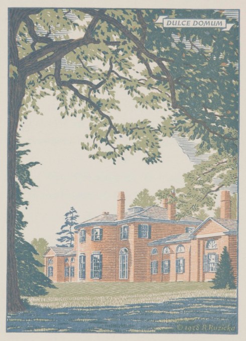

Porcelain Propaganda

I’m thinking about Russia this week for two reasons. In a year of big historical anniversaries, we have now arrived at the centenary of the Russian Revolution–which I must say is not getting much play here, or even in Russia apparently! Regardless of how it turned out in the end, this was an extremely consequential event, almost right up there with Luther’s revolutionary Reformation, which has received some serious commemoration across the globe. It is always interesting to me what we choose to remember and what we choose to forget. I’m also thinking about Russia now, because of an event this week sponsored by the Pickering House featuring Ambassador Emeritus Thomas R. Pickering, former US Ambassador to the United Nations (under President George H.W. Bush) and Russia (under President Clinton). The title of Ambassador Pickering’s Thursday night talk is Russia and the United States: Marriage, Separation, Divorce? , which sounds very timely indeed. I have to admit that I’m thinking about Russia for a third, much more materialistic reason too: I recently came upon a trove of porcelain propaganda plates from the first decade of the Soviet Union, and I’m obsessed with both the images and the idea of these “vessels”. The idea is so contradictory: porcelain and propaganda? Porcelain is for the elite, propaganda for the masses: why should these two things ever come together? Apparently there is a utilitarian reason: in the years after the Revolution and Civil War, shortages were great and opportunities for projection were few, but when the new government took over the famous Imperial Porcelain Factory it found a ready supply of blank porcelain plates. Russian artists were mobilized to adorn these “canvases” with revolutionary symbols and slogans, a dramatic departure from the Factory’s previous designs: hammers and sickles rather than gilded flowers. The designs are all so striking: some are symbolic, some folkloric, some futuristic, all vivid. Here are a few examples from the Hermitage, which is opening an exhibition next month titled The Voice of the Time. Soviet Porcelain: Art and Propaganda.

PP Red Man Hermitage

PP Red Genius “Red Man” with “All Power to the Soviets” banner, Mikhail Adamovich and Maria Kirillova, 1921; “Red Genius” with the slogan “We will Emblazon the World with the Third International”, Alisa Golenkina, 1920.

PP Star

PP Large Star with a Shief

PP Eat“The Star”, Mikhail Adamovich, 1921; “Large Star with Sheaf “, Nina Zander, Sergey Chekhonin and L.Vychegzhanin, 1921; “Who Does Not Work, Neither Will He Eat”, Maria Lebedeva, 1920.

PP Stir

PP Cup and Saucer
“Stir” Cup & Saucer, Alexandra Shchekotikhina-Pototskaya, 1920;  “A Hammer, Sickle, and Gear Wheel” Cup & Saucer, Victor Rilde, 1921-22.

Continue reading


Female Fancy-Dress, 1609-1980

I am so looking forward to Halloween night next Tuesday, not only because our long municipal nightmare will be over here in Salem for another year, but also because I actually do enjoy creative Halloween costumes, and they do appear on this night, glittering like stars in a sky of more generic garb. If an entire family is going to make the trek to Salem to trick-or-treat on Chestnut Street, they will often go all out, and in years past I’ve seen the Swiss Family Robinson, The Jacksons, the Addams Family (actually I think these three were all just last year), the Coneheads, the Jetsons, and a variety of historical characters, en masse and individually. I wish there were more conceptual costumes and less inspired by popular culture but that’s probably asking for too much for a holiday that is supposed to be for and about children. The most creative (and conceptual) costumes I have ever seen were made (or proposed) for masquerades or fancy-dress parties prior to 1920 or so, after which Halloween began to emerge as a major American holiday and the witches and the pumpkin-heads pushed out the nymphs and the sprites and the various ethereal forest creatures. Costumes begin with Queens, who were entitled to prance about in court masques long before actresses were, so I’m going to begin my portfolio with the Queen of the Amazons, one of many costumes designed by Inigo Jones for Ben Jonson’s Jacobean masques, which were commissioned by King James I’s (and VI’s) Queen Anne, my vote for bestdressed Queen of all time. Jonson’s The Masque of the Queens was presented at Whitehall Palace in February of 1609, the third masque written for Anne and the first to include an “anti-masque” featuring witches, of course, the opposite of the virtuous ladies played by the Queen and her ladies. Penthesilea, the Amazonian Queen, enters first (after the witches).

Costume Masques

Costume rowlandson500

Costume collage 3Inigo Jones’ Penthesilea costume for the Masque of Queens, 1609, British Library; Thomas Rowland’s Dressing for a Masquerade, British Museum;  Léon Sault’s designs for the House of Worth, 1860s: Eve with a snake and a Sorceress, Victoria & Albert Museum. 


A bit less custom, and a bit more commercialized, costuming commences in the later nineteenth century: more for fancy-dress parties than for Halloween. All sort of costumes can be found in pattern books from this era, such as Jennie Taylor Wandle’s Masquerade and Carnival. Their Customs and Costumes, published by the Butterick Publishing Company in 1892. As you can see, the Halloween archetypes (devil, witch, sorceress, little and big bat) are already popular. Women’s magazine also offer up lots of fancy-dress inspiration: below are some very……naturalistic costumes from the Ladies Home Journal in 1914 and a few more conventional examples from 1920.

Costume collage

Costume masqueradecarniv00wand_0053

Costume masqueradecarniv00wand_0114

Fancy Party Costumes LHJ Nov 1914

Costume collage 2

The transition from fancy-dress to Halloween costumes comes just around this time, 1920: I am marking it with an aptly-titled commercial publication,  Dennison’s Bogie Book, issued by the Dennison Manufacturing Company of Framingham, Massachusetts in 1920. This “book of suggestions for decorating and entertaining at Hallowe’en, Harvest Time, and Thanksgiving” contains lots of instructions, indicating that we’re at a moment where traditions are being invented. Of course all you need to have the perfect Halloween are Dennison products, which all seem to be made of orange and black crepe paper. It seems like full-blown commercial Halloween is right around the corner, but yet when I look at the photograph of Batgirl, St. Ann (wow, she’s the outlier here!), and Wonder Woman from New York city photographer Larry Racciopo’s Halloween (1980), it doesn’t seem like we’ve come that far at all.

Costumes 1920

Halloween Costumes 1980 Bat Girl, St. Ann, and Wonder Woman photographed by Larry Racioppo, New York Public Library Digital Gallery.


The Hanged Man

Is it just me (here in Salem) or is Tarot experiencing a major resurgence? If so, I would point to our own anxieties and its flexibility, which encourages and drives myriad interpretations and paths: the Economist kicked off the year with its annual predictions issue featuring a spread of Tarot cards suggesting a dystopian future for “Planet Trump”. Regardless of their meaning, I love visual metaphors that are enduring and flexible, or so flexible that they are enduring: reflective of a particular era’s beliefs and values time and time again. One Tarot card that seems to represent this genre well is trump XII, The Hanged Man, which can represent a state of suspension, punishment, suffering, self-sacrifice, and also a critical crossroads at which one has the opportunity to change course. In the first Tarot decks, produced in fifteenth-century Italy and France, he was simply the traitor, perhaps reflecting contemporary “shame paintings” of conspirators and criminals, who were hanged by one leg for all to see.

Hanged Man collage

Shame Paintings collageHanged Men from the Visconti-Sforza deck, c. 1428-50, Cary Collection of Playing Cards, Beinecke Rare Book and Manuscript Library, Yale University and Morgan Library & Museum ; Samuel Y. Edgerton’s CLASSIC book on pittura infamante, with one of  Andrea del Sarto’s drawings (Galleria degli Uffizi, Florence) on the cover and inside.

The hanged man crosses the alps and is presented as Le Pendu in Tarot decks produced in early modern France and Flanders in the characteristic hanging-by-one-leg pose, (sometimes with bags of coins weighing him down in reference to the ultimate traitor, Judas). It’s important to note that before the end of the eighteenth century and the publication of French occultist Antoine Court de Gébelin’s The Primitive World Analyzed and Compared with the Modern World (1773-1782), Tarot cards were merely for play. The Primitive World asserted an ancient Egyptian lineage and ascribed much more power to all of the cards, and replaced the Hanged Man dangling from a rope to Prudence in the presence of a snake. A few years after the publication of de Gébelin’s tome, Jean-Baptiste Alliette reinforced and popularized his claims and offered up a more practical approach to Tarot practice in How to Entertain Yourself with the Deck of Cards called Tarot (1785), completing its transition to an occult art. The Hanged Man reappears in the nineteenth century, looking much the same as his pre-modern form but with enhanced powers and meaning.

Tarot Pack BM

Tarot Worth BMThe Hanged Man in a Flemish Tarot deck from the eighteenth century, and Oscar Wirth’s 1889 deck, British Museum.

The troubled twentieth century was a golden age for Tarot, beginning with the deck that popularized and standardized its “divinatory meanings”: the Rider-Waite Deck, with illustrations by Pamela Coleman Smith, which was first published in 1909 and reissued in a major way in 1970. In A.E. Waite’s accompanying Pictorial Key to the Tarot, the Hanged Man is described as “a card of profound significance, but all the significance is veiled…..the face expresses deep entrancement (represented by the saintly halo), not suffering…the figure, as a whole, suggests life in suspension, but life and not death”. While Tarot meanings were widely disseminated and standardized by Rider-Waite, the archetypal images were subjected to a range of modern interpretations over the next century. Perhaps the second most influential deck of the twentieth century was the “Thoth Tarot”, a collaboration between Aleister Crowley and Lady Frieda Harris which was published in 1969, well after both artists’ deaths. Much more multidisciplinary, the Thoth Deck broke the mold and inspired decades of creative interpretations–“traditional” (whatever that means when referencing Tarot), commercial, allegorical and abstract. Several Crowley-Harris paintings, the Hanged Men among them, were exhibited at the Venice Biennale in 2013, which I think began this current preoccupation with Tarot. There have been several Tarot exhibitions over the past few years, encompassing everything from emblematic installations to hooked rugs, as the Tarot cards are “reimagined” over and over again. Right here in Salem, photographs from Jim Bostick’s  “Salem Arcanum” Tarot series, featuring a Hanged Man who seems both traditional and modern and definitely illustrates “life in suspension”, are currently on view in the October exhibition at the Mercy Tavern.

Hanged Man 1909

Hanged Man Crowley-Harris

Hanged Men collage2

HWT collage

Hanged Man Woodcut

Minimalist Tarot

SONY DSC

A century of Hanged Men: Pamela Coleman Smith, from the Rider-Waite deck, 1909; Aleister Crowley and Lady Frieda Harris, 1969; Dürer & Bruegel Hanged Men by Giocinto Gaudenzi, 1989, and Pietro Alligo & Guido Zibordi Marchesi, 2003 accessed from this amazing site which showcases Tarot through the ages; the Housewives Tarot by Jude Buffum and Paul Kepple for Quirk Books, 2003; Woodcut @ HorseAndHair, 2013; photographs by Ayla El-Moussa for 25th Century, 2016; and Jim Bostick of Salem, 2017.


New Condos in Old Ipswich

Shameless promotion of husband’s work follows. Ipswich is my second-favorite Essex County town, so I was thrilled when my husband got the contract to convert its former town hall into condominiums. The project was long and complicated but is now completed: I accompanied him to the open house last week to take some photographs, but in all honesty I’ll seize any opportunity to go to Ipswich, whose inventory of First Period and later antique homes is without parallel. The District Condominiums provide quite a contrast to this material heritage in terms of interiors, but the exterior restoration of the building is faithful to its second incarnation. It began its life as a (one-story) Unitarian Church in 1833, was considerably enlarged in 1876 when it was transformed into the town hall, and underwent a series of additional alterations during its service as administrative offices and a district court before it was sold by the town in 2004. There were hopes for a theater conversion, but eventually condominiums emerged as the only option for its preservation (visit the wonderful blog Historic Ipswich for a far more detailed history and lots of photographs). While the building has long presented a dignified silhouette along South Main Street, it has been vacant for a decade, so I hope residents are happy with the new residences. The building is on the National Register and the local historical commission holds a preservation restriction, so there were considerable constraints governing the construction process, most notably windows. As you can see, there were two windows added to the front facade, and smaller ones in the back and sides, but all the other windows had to be incorporated into the interior design, in one way or another.

Ipswich

Ipswich town hall 1930s

Ipswich 4

Ipswich 8

Ipswich 9

Ipswich 29

Ipswich 5

Ipswich2

Ipswich 16

Ipswich 3

Ipswich 11

Ipswich Museum

Ipswich 15

The former Ipswich Town Hall/District Court (today and in the early 20th century) transformed into condominiums–across the green, the Ipswich Museum @ the Heard House, c. 1800; and just a few steps away, the Ipswich River. 


Flame-Stitch

For antiques aficionados, August is all about Americana auctions (couldn’t resist all the alliteration!) and there are always Salem pieces to discover. Among the lots of Skinner’s upcoming Americana auction, a late eighteenth-century pole fire screen captured my attention immediately, not just because it was made in Salem, but also because of its flame-stitch embroidery. Flame-stitch is one of my favorite perennial patterns, characterized by its durability and adaptability: it spans the ages (from at least the Renaissance) and can be easily adapted by time and place. It’s somewhat obscure origins–according to the curators at the Victoria & Albert Museum, it is a technique also sometimes known as Irish stitch, Hungarian stitch, Florentine stitch and bargello stitch, the variety of names indicating the uncertainty of its origins–perhaps explains its mutability. It is one of those patterns that can appear both “antique” and “modern”: flame-stitch cushions, in particular, seem timeless.

Flame-stitch Pole Screen Skinner

flamestitch collage

Flamestitch garden pillow

Mahogany pole screen, late 18th century, Skinner Auctions/ Flame-stitch pincushion, late 17th century, Victoria and Albert Museum/ Flame-stitch “Jasper” pillow, Jayson Home/ 18th century flame-stitched pillow, 1stdibs/ a faux flame-stitch pillow in my backyard.

In its modern incarnations, flame-stitch doesn’t necessarily need to be a stitch: the zig-zag, chevron pattern seems to be sufficient for the more general identification. No needle required, pattern without technique. The vibrant contrasting colors of flame-stitch fabrics past have also given way to more tone-on-tone variations of the present. I’ve always wanted to upholstery one of my couches in a flame-stitch fabric, and I must admit that both the Federal-era embroidered version (on the left) and the more contemporary variation (on the right) both appeal to me (although I really love the 18th-century embroidery fabric from a Newport-made slip seat–which might have originated as a pocketbook–AND the early 19th-century French and Lee Jofa chartreuse fabrics below).

flamestitch collage2

Flame-stitch Winterthur

a-woven-flamestitch-panel

Flamestitch Lee Jofa

American Country Federal Sofa, Northeast Auctions/ Southwood Mahogany Flame-Stitch Sofa, Chairish/ 18th-century slip seat upholstery, Winterthur Museum Collections/ Woven early 19th century French flame-stitch panel, 1stdibs/ Lee Jofa watersedge fabric.

Two historic flame-stitch items that often pop up at auctions are men’s pocketbooks or “wallets” and stools. An extraordinary example of the former is included in the upcoming Skinner auction: a later eighteenth-century Massachusetts wallet featuring African-American servants, or slaves, well-dressed but definitely in service. This was featured on Antiques Roadshow a while ago, and so I was not surprised to see it come up for auction (with an estimate of $10,000-$15,000). There are so many (somewhat less singular) examples in museum collections and auction archives that I imagine every late eighteenth-century man walking around with a flame-stitch wallet! For women, there were flame-stitch embroidered shoes, from earlier in the century. Obviously there are endless variations of both the historic technique and the modern pattern, but I think the form that captures the cherished quality of flame-stitch best are bible and book covers, which were also produced in great quantity in the eighteenth century.

Flamestitch wallet collage

Flame-stitch pocketbook bonhams

Flame-stitch purse CH

28.102.17a-b 0002

FS stool collage

Flamestitch Book Cover PMA

Rare flame-stitch Massachusetts wallet featuring African-American figures, Skinner Auctions/ American silver-mounted pocketbook inscribed “Thomas Stubbs”, 1798, Bonhams Auctions/ Flame-stitch pocketbook, late 18th century, Cooper Hewitt Museum, Gift of Mrs. Rollin Stickle/ Flame-stitch Latchet Shoes, c. 1700-1729, Metropolitan Museum of Art/ Early 18th century French fruitwood stool, Bonhams Auctions/ Folk art painted stool with flame-stitch seat, Northeast Auctions/ Pair of mid-century modern flame-stitch benches, 1stdibs/ Bible cover, 18th century, Philadelphia Museum of Art.