It’s the end of the semester, a transitional time in which I traditionally don’t quite know what to do with myself. Instead of finishing up all of my little annoying tasks, I am persusing random pieces of print here and there. My stepmother has observed that my father can be sidetracked very easily from any task by “printed matter,” generally a newspaper or magazine, something that can be read quickly but is not (by him). I have observed this many times. It runs in the family: I too can be diverted by printed matter, but for me, it’s not the text but rather the type. I don’t really care what the words (or images) are, it’s how they have been printed, their design and composition. This goes back decades with me, since I wrote my dissertation on English printers in the sixteenth and seventeenth centuries. I did so much research on their world, their shops, their type, that I became a typography fan for life. If I happen to spot a striking typeface, a new-to-me specimen pamphlet, or an interesting title page, I will chase these impressions down to the ends of research database-earth. That happened this past weekend: hours went by, but I did discover a new Salem printer. One glance at the bookplate of Irving Kinsman Annable in the large collection of bookplates amassed by Daniel Fearing at Harvard’s Houghton Library, and I was lost.


Annabale (1867-1949) was a Salem resident who established and ran the Berkeley Press of Boston for over 50 years, eventually passing the business down to his son Walter. When I read some of the advertisements for the Press, I assumed they were job printers, producing forms and flyers, envelopes and enclosures. These very practical (and emphemeral) products were the basis of the Berkeley business, but clearly the Annabales had an artistic and skilled devotion to their craft and were not just pumping pieces out. Inland Printer, the long-running printing industrial periodical, has many reviews of the Berkeley Press, and also features the full range of its advertising: again and again the claim is “a specialty of out-of-the-ordinary printing.” Besides these orders, the Berkeley Press produced or contributed to lots of specialty publications for regional institutions and trade organizations, as well as a succession of patriotic pamphlets, including the Declaration of Independence and Gettysburg Address. Houghton Mifflin even commissioned Berkeley to produce one of the earliest (and most popular) pictorial maps, the black-and-white version Melanie Elisabeth Leonard’s view of Cape Cod, in 1926. Catalogs, portfolios, all sorts of enclosures: the press printed anything and everything, except for larger books. (I think, but I don’t have access to any business records, though there are papers in the Phillips Library collection that I want to check out if my curiosity continues). Of course, Berkeley’s own advertising materials, like the pamphlet on decoration below in the collection of Historic New England, are the most beautiful.


The first half of the twentieth century was such an exciting time for the craft of printing as its practicioners were earnest advocates for its skills and exemplars in the face of increasing mechanization. These men (mostly) were all inspired by William Morris and his Kelmscott Press, but they went on to acquire distinct skills and attributes through their own practice, societies, and appreciation of printing history. They kept their businesses small and identified as artisans first. In Boston, the leader of the printing craft movement was clearly Daniel Berkley Updike (1860-1941) and his Merrymount Press, which produced lots of ephemera as well, but many more books than Berkeley, each one a work of art. I don’t think the contemporaries Updike and Annabale were competitors; I think they were colleagues, and both were active in the Boston Society of Printers. Annabale was definitely more interested in advertising as an art, writing quite clearly about the power of “word images.” The Berkeley Press did produce several small books, especially if there was a local connection as in the case of Joseph Ashton’s History of the Salem Athenaeum, 1810-1910, but they are nothing to get excited about. On the other hand, Annable seems extremely excited about the power of perfectly printed slogans and symbols. In the press prospectus Houseflags & Trademarks (1924—the author is not credited but this reads like all of Annable’s other copy) he compares the flags flown by New England ships a century before, when they “were such frequent travellers across the waters of the world….[that] their flags were familiar spots of color in the harbors of six continents” with the trademarks of his day: if the design was right the same “familiarity” would emerge. Though he did some printing in Salem for friends and organizations which which he was associated, and even produced some picture and postcards which he sold himself (enough that I’m wondering if there was a press at home—a really cute mansard roof cottage still standing on Willow Avenue), I think Annabale saw his professional life as existing in Boston, for over fifty years.


Houseflags & Trademarks courtesy of Bailgate Books, Ltd.
Like this:
Like Loading...


 Travel Posters by John Held Jr. from Artsy and Swann Auction Galleries Archives.


 Cape Cod poster, 1931, David Pollack Vintage Posters; Ships by John Held, Syracuse University Museum; Ship Bonetta of Salem Departing from Leghorn, William Bunch Auctions & Apraisals.


 See what I mean about the weather? But Kappel’s Ropes Mansion and Witch House hint at brighter and warmer days, even with no color!


 The Custom House (which is celebrating its 200th anniversary this year) Derby Wharf Lighthouse, The Little Studio (just above the compass star)–where both Philip Little and Philip Kappel worked, in different seasons—and the House of the Seven Gables.
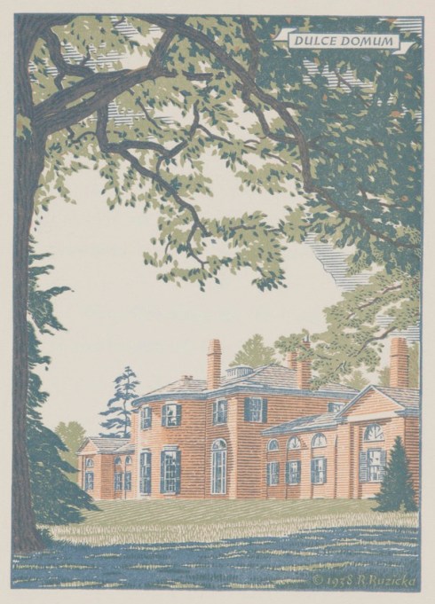
 Chestnut Street