Tag Archives: Graphic Arts

Summerlands

I am just back from a very festive wedding in Mexico, blitzed and therefore completely incapable of presenting a proper post. But I have been saving up some images by Jazz Age commercial artist John Held, Jr. (1889-1958) for a while, and today seems like the perfect time to put them out there. Held’s popular flapper images, appearing as magazine cover and content illustrations throughout the 1920s, are a perfect representation of their age, but it was his pictorial maps which first caught my eye. I also like the posters he created for the New York, New Haven & Hartford Railroad, enticing travelers to locations all around New England and beyond, northward, the same direction my travels will take me this summer. No more south, except for Rhode Island and maybe Connecticut! Held used the term “Vacationland” several times in his New Haven posters, but I never liked that term while growing up in Maine so I streamlined his alternative “Summer Play Land” for a more timeless title.

Travel Posters by John Held Jr. from Artsy and Swann Auction Galleries Archives.

Held was a wonderful illustrator but his work cannot be confined to that genre; even though he published over 100 cartoons in the New Yorker in the 1920s and 1930s he can’t be identified exclusively as a cartoonist either. He worked in many mediums: watercolor, ink drawings, engraving, woodblock prints, even sculpture. On several of his fanciful maps, he refers to himself as a cartographer, and he wrote as well as illustrated. In his commercial heyday in the 1920s he was reportedly the highest-paid graphic artist in America but his commissions declined and fortunes failed with the Depression. So he seems to define (some critics even say document) an era even as a moved on to less popular (flapper-less) artistic expressions. Many of his engravings and prints have an intentional primitivism that makes them almost timeless in my view, among them several Salem ships.

Cape Cod poster, 1931, David Pollack Vintage Posters; Ships by John Held, Syracuse University Museum; Ship Bonetta of Salem Departing from Leghorn, William Bunch Auctions & Apraisals.


A Salem Printer & Procrastination

It’s the end of the semester, a transitional time in which I traditionally don’t quite know what to do with myself. Instead of finishing up all of my little annoying tasks, I am persusing random pieces of print here and there. My stepmother has observed that my father can be sidetracked very easily from any task by “printed matter,” generally a newspaper or magazine, something that can be read quickly but is not (by him). I have observed this many times. It runs in the family: I too can be diverted by printed matter, but for me, it’s not the text but rather the type. I don’t really care what the words (or images) are, it’s how they have been printed, their design and composition. This goes back decades with me, since I wrote my dissertation on English printers in the sixteenth and seventeenth centuries. I did so much research on their world, their shops, their type, that I became a typography fan for life. If I happen to spot a striking typeface, a new-to-me specimen pamphlet, or an interesting title page, I will chase these impressions down to the ends of research database-earth. That happened this past weekend: hours went by, but I did discover a new Salem printer. One glance at the bookplate of Irving Kinsman Annable in the large collection of bookplates amassed by Daniel Fearing at Harvard’s Houghton Library, and I was lost.

Annabale (1867-1949) was a Salem resident who established and ran the Berkeley Press of Boston for over 50 years, eventually passing the business down to his son Walter. When I read some of the advertisements for the Press, I assumed they were job printers, producing forms and flyers, envelopes and enclosures. These very practical (and emphemeral) products were the basis of the Berkeley business, but clearly the Annabales had an artistic and skilled devotion to their craft and were not just pumping pieces out. Inland Printer, the long-running printing industrial periodical, has many reviews of the Berkeley Press, and also features the full range of its advertising: again and again the claim is “a specialty of out-of-the-ordinary printing.” Besides these orders, the Berkeley Press produced or contributed to lots of specialty publications for regional institutions and trade organizations, as well as a succession of patriotic pamphlets, including the Declaration of Independence and Gettysburg Address. Houghton Mifflin even commissioned Berkeley to produce one of the earliest (and most popular) pictorial maps, the black-and-white version Melanie Elisabeth Leonard’s view of Cape Cod, in 1926. Catalogs, portfolios, all sorts of enclosures: the press printed anything and everything, except for larger books. (I think, but I don’t have access to any business records, though there are papers in the Phillips Library collection that I want to check out if my curiosity continues). Of course, Berkeley’s own advertising materials, like the pamphlet on decoration below in the collection of Historic New England, are the most beautiful.

The first half of the twentieth century was such an exciting time for the craft of printing as its practicioners were earnest advocates for its skills and exemplars in the face of increasing mechanization. These men (mostly) were all inspired by William Morris and his Kelmscott Press, but they went on to acquire distinct skills and attributes through their own practice, societies, and appreciation of printing history. They kept their businesses small and identified as artisans first. In Boston, the leader of the printing craft movement was clearly Daniel Berkley Updike (1860-1941) and his Merrymount Press, which produced lots of ephemera as well, but many more books than Berkeley, each one a work of art. I don’t think the contemporaries Updike and Annabale were competitors; I think they were colleagues, and both were active in the Boston Society of Printers. Annabale was definitely more interested in advertising as an art, writing quite clearly about the power of “word images.” The Berkeley Press did produce several small books, especially if there was a local connection as in the case of Joseph Ashton’s History of the Salem Athenaeum, 1810-1910, but they are nothing to get excited about. On the other hand, Annable seems extremely excited about the power of perfectly printed slogans and symbols. In the press prospectus Houseflags & Trademarks (1924—the author is not credited but this reads like all of Annable’s other copy) he compares the flags flown by New England ships a century before, when they “were such frequent travellers across the waters of the world….[that] their flags were familiar spots of color in the harbors of six continents” with the trademarks of his day: if the design was right the same “familiarity” would emerge. Though he did some printing in Salem for friends and organizations which which he was associated, and even produced some picture and postcards which he sold himself (enough that I’m wondering if there was a press at home—a really cute mansard roof cottage still standing on Willow Avenue), I think Annabale saw his professional life as existing in Boston, for over fifty years.

Houseflags & Trademarks courtesy of Bailgate Books, Ltd.


An Enigmatic Etcher

I wanted to share some examples of the work of the Salem artist George F. White, Jr., better known as George Merwanjee White (1849-1915), but I wish I could also share more details about his life. He’s a bit mysterious, particularly his chosen middle name, Merwanjee, a notable Parsi name. He was the proverbial “son of a Salem ship captain” whose most well-known works are quite local in focus, yet there is evidence that he also traveled widely, in both Europe and India. White’s father, George F. White Sr., made many voyages to the Indian Ocean for shipowners from Salem, Boston, and even New York, so perhaps his son might have accompanied him and was thus exposed to Indian influences, but this is complete conjecture on my part. In any case, by the time White Jr. married at the age of 27 he had shed the “F.” and acquired the “Merwanjee” and that is how he was known throughout his life. George M. White is recognized as part of an “Etching Revival” in Boston and Salem,, a movement which began in the last two decades of the nineteenth century in the latter city, exemplified by the little-known artists Harriet Frances Osborne and White and the more well-known Frank Benson. In addition to his etchings, White produced oil and watercolor paintings and was also recognized as a gifted producer of bookplates, but architectural etchings and drawings seem to be his preferred genre. There is a beautiful portfolio of his images of old Salem houses published by subsciption in 1886 entitled Etchings of Old Houses and Places of Interest in and about Salem which has been digitized for the “Peabody Essex Museum Publications” at the Internet Archive, and below are some of my favorite views. First, the process of production, followed by what was then generally known as the “Roger Williams House” and now the “Witch House,” the Philip English Mansion, the “Old Bakery” on St. Peter Street, later to be moved and renamed the John Ward House at the Essex Institute, the seventeenth-century survivor Narbonne and Pickering Houses, the lost Lewis Hunt and Richard Prince Houses, and Nathaniel Hawthorne’s birthplace in its original location on Union Street.


White’s images are of both old Salem houses—emerging landmarks—which had survived the dynamic nineteenth century (or most of it) as well as fabled houses which had not, thus expressing the beginnings of a preservation conciousness which is also evident in the similar sketches of Edwin Whitefield’s Homes of our Forefathers series, which was published just about the same time. Whitefield is a bit more romantic; White a bit more realistic. White wants to show and tell us what was special about the English, Hunt, and Prince Houses, and he’s wistful about the “picturesque” past: this is a word he applies to both the lost Prince House and the “living” Pickering House, the exterior of which was “fashioned” in the picturesque style of a bygone age in the 1840s. You can’t help but feel that modernity is encroaching.

Heliotype prints from George Merwanjee White’s Etchings of Old Houses and Places of Interest in and about Salem, Limited Edition, 1886.


Voting Matters

I am very, very anxious about the election and can think of little else. I have enough of a historian’s sensibility, of a human’s sensibility, to know that this is the most momentous election of my life. Of course there is little that I can do–other than donate and vote–so I have been appeasing my anxieties in my usual way: by reading about elections past. It has also helped me to read and listen to Boston College history professor Heather Cox Richardson, who has been putting the current situation in a comprehensive historical context for months now: talk about commitment! I have learned a lot about American history during this whole blogging experience, but I think I’ve learned more in the last 6 months than the past ten years: the problem is, I’ve been looking for the comfort of we’ve been here before but I seem to be surmising that many aspects of our current situation are truly aberrant! Apart from the search for context, there is just something very interesting about the logistics and detritus of elections past: in this digital age, we don’t have enough electoral texture. So here are just a few items that caught by eye.

Early Election Ballots: I love browsing through the early election ballots at the American Antiquarian Society: if you don’t understand the Electoral College—they are rather clear illustrations: also of the evolving concept of the ticket. Plus it’s interesting to see the emergence and disappearance of various political parties.

Mass Appeal: I love this flyer for Nathaniel Prentice Banks (also from the American Antiquarian Society), who was running for a Massachusetts congressional seat in the election of 1852. I don’t know if you can read it all, but he is appealing to all different sorts of men—mechanics, young men, middle-aged men and veterans! Plus he courts the ladies, and exhorts them to “stir up” their men!


Voting by Mail: since 1864. Very American. Poll Book from the Smithsonian Institution.


Poll Taxes! Who knew? I associated poll taxes with the segregated South, but in fact, people had to pay them right here in Massachusetts, and in other states as well, right up to the ratification of the 24th amendment in 1964! Imagine paying to vote. Imagine being an active suffragist, working your whole life for the voting rights of women, all women, and even after enfranchisement this barrier is still there! There were a few snarky articles published in the Boston papers right after the ratification of the 19th amendment in which the theory was put out there that perhaps women wouldn’t want to vote as they would have to tell the poll tax assessor their true ages! Unbelievable!


A Salem Parade Flag. Just because it must have been fun to see election parades, which I assume must have brought people together, but perhaps not. 13-star flag used in 1896 Salem parade, Cowan’s Auctions.

Pinback Buttons! Never can get enough of these: most are Roosevelt and McKinley, 1900 & 1904, from the Smithsonian; the Citizen pin is from 1915-20 and the Ann Lewis Suffrage Collection. I love the sentiment of Vote as you please but please vote.


A flyer from Margaret Chase Smith’s presidential campaign, 1964 (Smithsonian Collection). Because Margaret Chase Smith. And that’s as close as I am getting to our present time.


Shelter Signalling

I love twentieth-century magazine art, especially early twentieth-century cover illustrations, for various reasons: the accessible aesthetics, the creativity and artistry, the cultural representation. Then as now, magazine publishers and editors wanted to represent their time and place with their covers, and also send messages, or signals, to their readership as well as the people who might glance at them as they walked by a street (or airport) stand. The difference between then and now, though, is that more artists were called upon to create these covers in the first half of the twentieth century than photographers. So we have have less realism and more ambiance, color, symbols and impressions. I was looking at a succession of covers of one of my favorite shelter magazines (which had several reincarnations and which I wish would be reincarnated yet again), House and Garden, and it was obvious that its editors deliberately veered away from the realistic renderings featured on covers in the first decade of the twentieth century towards more artistic and impressionistic images in the second and third. Here’s a succession of October covers with the messages that I am receiving, all from the Condé Nast Library, which I’m fortunate to be able to access via Artstor: the alternative themes of “fall planting” and “furnishing for the fall bride” predominate for these “numbers”, but I think there are other messages too.

The Aughts:  we are so Sturdy! (and such good builders, 1908-11).

October aughts collage

The Teens:  we’re so Whimsical! (1916-1920).

October HG 1916

October Teens HG Collage

The Twenties: we are so industrious (and America is truly the land of plenty; 1921-29).

October 1920s Collage

The Thirties: we’re so confused! We are so very 1) Sleek (1936); 2) Acquisitive (1937-38: House & Garden certainly seems a bit out of touch with the DEPRESSION; 3) Rococo (1938-41).

October HG 36

October 1930s collage

Late 30s

1949: We’re Going Places (and we can have it all).

October HG 49


Victory New Year, 1919

All New Years are special as they are embedded with thoughts of hopefulness and fresh starts, but I think the dawn of 1919 might have been particularly so: the themes of victory and peace following the Great War ring out in all the accounts of its celebration, which might also have been particularly joyous as it marked the last “liquid” New Year with the onset of Prohibition approaching. The New York Times proclaimed 1919 the “Victory New Year” and the Boston Globe bid adieu to a battle-scarred pirate-gladiator representing 1918. Probably the best image expressing contemporary hopes for the coming year was a seemingly-ubiquitous poster equating world peace, (lady) liberty and (American) prosperity produced by the United Cigar Stores Company: this theme is manifest in all of the accounts of New Year celebrations and forecasts which I sampled, and most mentions of Prohibition were below the fold!

Victory New Year 1919 NYT

New Year 1919 Boston Globe

New Year's collage

I think I must have posted on all of the New Year’s traditions and symbols over the past eight (!!!) years, and horseshoes, pigs, toadstools, shamrocks, and chimney-sweeps are still in evidence on New Year’s postcards in 1919, but change was also inevitable, as the dominant German postcard industry collapsed with the onset of the war, and domestic producers gradually altered the style and substance of holiday cards. During and right after the war, there are a profusion of babies and comforting hearth scenes on holiday postcards, but also more patriotic and elevated expressions. The French influence seems strong, but American illustrators also shaped the image of seasons’ greetings—with emphasis on both domestic prosperity and universal peace: a major cultural consequence of World War I is the emergence of peace on earth as a popular holiday sentiment.

New Year 1918

New Year silk

New Year 1919 Card

Santa Snowman Delcampe (1)

_Peace._Your_Gift_To_The_Nation._A_Merry_Christmas.__-_NARA_-_512601

New Year RuzickaFrench silk New Years’ postcards for 1918 and 1919 featuring the Allied flags, Europeana; Xavier Sager and Santa planting the American flag on the North Pole postcards, 1919, Delcampe.net; Santa’s gift of peace poster by the U.S. Food Administration, Library of Congress; Rudolph Ruzicka holiday card for 1918-1919, Harvard.

But all was not completely calm in the United States on January 1, 1919. Deaths from the Spanish Flu epidemic of the fall had dwindled, but they were still being reported. As President Wilson made his way to the Paris Peace Conference, there was both evident pride and anxiety about America’s evolving role in world affairs. As always, everyone was concerned about the economy. The front page of the Boston Herald shows a cartoon in which all of Paris’s landmarks have been renamed “Wilson” (Place de la Wilson, La Tour Wilson, etc.), but also features an interview with Massachusetts Governor-elect Calvin Coolidge who prescribes “thrift and industry” and expresses what seems to be a very real concern that now that Europe is peaceful, all Americans of European descent will return there! This is Calvin Coolidge in a new light for me (remember, I am not an American historian), expressing concerns over the labor market as well as the loss of “so many men who during their stay with us have given us so many models of good citizenship” and suggesting cash payments as enticements for these men to stay put!

New Year Boston Herald

New Year Coolidge Collage

The Suffragist leader Alice Paul also identified 1919 as the “Victory New Year” as she was determined to bring the long struggle for votes for women to a triumphant close in that year. President Wilson’s commitment to freedom and democracy overseas was recognized as a wonderful opportunity to expose his hypocrisy at home (as this was an age when people recognized hypocrisy) and so the Suffragists burned “watchfires” in front of the White House, “to consume every outburst of the President on freedom until his advocacy of freedom has been translated into support of political freedom for American women”. From New Year’s Day into February, the watchfires burned, despite the cold, the harassment, and the arrests, igniting the final push towards the passage of the 19th Amendment in the Congress in May and June of 1919, and its eventual ratification in August of 1920. And so it seems that victories were both in hand and at hand on New Year’s Day, 1919.

Watchfires LC

The+Suffragist,+June+14,+1919_NMAH-AHB2013q013138Library of Congress & National Museum of American History.


Hang the King and Queen in the Dining Room

Back to the seventeenth century, where I am working my way through a series of instructional books produced to meet the apparent and universal demand for better health, more wealth, and an enhanced quality of life. For most of yesterday I was in the company of William Salmon, Doctor of Physick, who wrote an comprehensive and detailed compendium titled Polygraphice: or The Arts of Drawing, Engraving, Etching, Limning, Painting, Washing, Varnishing, Gilding, Colouring, Dyeing, Beautifying and Perfuming, which was published in eight expanding editions from 1671 to 1701. Here we have the third edition, from the University of Heidelberg, which includes an additional “Discourse on Perspective and Chiromancy”. In some ways, this is your typical early modern mishmash of arts, “sciences”, and a bit of magic, but in other ways it is very precise and technical, the instructions for perspective and shading particularly so. Salmon is always referred to as an “empiric” in terms of his medical practice, but his publications are so diverse one assumes they are primarily derivative—yet there seems to be some strong opinions among the instructions.

Salmon Pyro

salmon1675_0068

salmon1675_0036

salmon1675_0079

And the long seventeenth-century title does not mislead us: Salmon offers up instructions on all aspects of drawing, engraving, and etching, he tells us how to mix up paint colours, of both water and oil, and how to gild, varnish and dye, and then he makes the remarkable transition from painting canvases to rooms to faces! This is the rationalization: some may wonder that we should meddle with such a subject as this, in this place, but let such know; the Painting of a deformed Face, and the licking over of old, withered, wrinkled, and weather-beaten skin are as proper appendices to a painter, as the rectification of his Errors in a piece of Canvas. Well. Since he’s in the realm of cosmetics, he tells us how to make a variety of waters, and touches on alchemy for a bit—more in forthcoming editions. I was delighted to see a very early reference to “Popinjay Green”, which I think must be my favorite color (no–apparently not that early a reference: the Oxford English Dictionary tells me that the word first appeared in English in 1322, and the reference to the color began appearing in the sixteenth century).

Popinjay Green Collage

Popinjay Susan Sandford

Adding an anachronistic image here: this “Popinjay” collage of a turn-of-the-century dandy by artist Susan Sanford just seemed to fit in this post + I like it.

There is very little creativity in this text about art, but the time, place, author, and genre dictate didacticism. Salmon instructs us not only how to make paints, but also which colors to apply to which subjects, whether it’s the sky or the clouds or the grass in a “landskip” or the skin of the subject of a portrait. Once the paintings are complete, he tells his readers where they should be “disposed of” (hung) in their houses: royalty in the dining room, forbear all “obscene pictures” in the banqueting rooms, and family pictures in the bedchamber. Art is essentially skilled imitation of nature, in an ideal sense: the work of the Painter is to express the exact imitation of natural things; wherein you are to observe the excellencies and beauties of the piece, but to refuse its vices.

Salmon CollageThe dining room at the royal palace of Holyroodhouse in Edinburgh, over which King George IV reigns.


A Souvenir of Salem

Salem has been a tourist city for a very long time, and that identity has inspired the production of countless souvenirs made from every material imaginable: ceramic, metal, cloth, wood, plastic, and a veritable forest of paper. I’ve been a rather casual collector of Salem souvenirs since I moved here many years ago, although I do have my periods of intensity if I come across something I haven’t seen before. I’m a paper girl, and I thought I had seen every bit of ephemera in this genre, but last week a little souvenir book with an embossed red cover popped up on ebay and I pounced. It arrived yesterday, and I was not disappointed: this little souvenir pamphlet contains some of the most beautiful prints of Salem structures I have ever seen. Even with its obvious damage, it is still a gem. There is no title page or publisher–although an advertisement for the Salem stationers Merrill & Mackintire is at the end, so I assume it is their offering. It is also undated, though I can come up with an approximate date just looking at some of the captions, which reflect the work of the tireless historian and “antiquarian” Sidney Perley to get dates and identifications just right at the turn of the last century—and after.

SS 1

SS2

SS3

ss6

ss10

Some historical “facts” are mutable. The site at which the accused and convicted “witches” of Salem were presumed to have been executed was commonly known as “Witch Hill” in the later nineteenth century but evolved into “Gallows Hill” at its end. This is still a Salem neighborhood and park, but from the 1890s Perley identified Proctor’s Ledge below as the site of the executions, and just last year this site was marked with a memorial by the City of Salem. Likewise, Perley confronted the long-held assertion that the small structure on the grounds of the Essex Institute was in fact the seventeenth-century First Church of Salem, and asserted that it was a Quaker Meeting House from later in the century. As you can see, the owner of our little souvenir book, whom I presume is the Charles Heald who signed the back of one of its prints, simply scratched out “First Meeting House” and wrote in “Quaker M.H.” And then Perley took on the “Roger Williams House” and asserted that Roger Williams never actually lived there: it then became the Witch House assertively, though in this first decade of the twentieth century it’s still either/or.

Antiquarian in Arms 1901

Witch House 1903Two Boston Post articles from 1901 and 1903 showing Perley in the midst of two big Salem historical “disputes”:  “Antiquarians are all up in arms again” is one of my favorite headlines ever.

The “Old Turner House” has yet to become the House of the Seven Gables, so I think I can date this souvenir booklet to sometime between 1903 and 1909 pretty comfortably. Yet there is not a car or trolley in sight: the cumulative vision is one of  “Olde Salem” with the exception of a few “modern” municipal buildings. Seaside Salem endures, and the Pickering House remains ever the Pickering House, unchanged from the seventeenth century except for the acquisition of its Gothic trim in the midst of the nineteenth.

SS7

SS8

SS4

SS5


Rewards of Merit

This is graduation week, when we celebrate achievement and completion with pieces of paper, as we have for hundreds of years. No one wants a digital diploma! Even that avatar of online higher education, Southern New Hampshire University, has a television commercial showing university representatives traveling across the country presenting diplomas to graduates: their educational experience can be impersonal but not its culmination, apparently. Despite a lifetime spent in education, as a student and teacher, I am a late bloomer when it comes to commencements: I skipped both my undergraduate and graduate ceremonies, much to my regret, and once I became a professor I continued to avoid what I perceived as a long, boring, and formulaic ritual. But when I became chair of my department five years ago, I decided that it was my responsibility to attend, and so I dusted off the unused (and very expensive) gown I had purchased years ago and marched out there. I thought I was going for my colleagues—to be with those that went, to be an example to those that didn’t—but it was all about the students. As soon as the (yes, long and boring) ceremony was over, we ran out into the fresh air, and our students ran to us, sometimes even before their parents. Together, we had reached a destination–a place–after completing a long journey. And you really have to show up to realize that you’ve arrived.

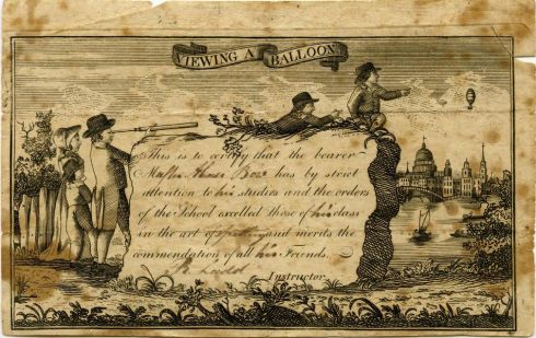
I like nineteenth-century American “rewards of merit”, given by teachers to their students in recognition of certain qualities (diligence and deportment above all) as historical expressions of both the personal and the professional relationships that exist in any educational environment. They look formulaic, like a diploma, but they also represent an individual relationship—and achievement. As an ephemeral genre, they can testify to the evolution of printing and production techniques as well as educational objectives. Rewards of merit were produced in Great Britain too, but they really flourished in the United States, especially in the second half of the nineteenth century. I prefer the earlier forms from the first part of the century: written or sparsely printed, just a few images, some “colored in” with watercolors by teachers who wanted to add a more personal touch. Once you get into the later era of polychromatic cards, you lose a lot of the personal connection, and it seems as if they did too.

Reward of Merit 18th century A very early American Reward of Merit, or “conferment of honor” from William Arms to his student Amos Hamilton in Deerfield, Massachusetts, 1795 © Pocumtuck Valley Memorial Association, Deerfield MA. In the larger towns and cities of Massachusetts, printed reward of merit forms were used right from the beginning of the nineteenth-century, but hand-written citations continued in the country: below, Tirza Lampson’s “diligence and virtue” is rewarded in Charlton, Massachusetts, and Azubah Clark is “presented with this honorary emblem, for her being a good scholar and hereby is recommended for her studious attention laudable improvements, and admirable behavior in school, for which, she merits the sincere thanks of her instructress Rebecca Walton Temple”, both in 1811. 

Reward of Merit 1811 Charlton

Reward of Merit 1811 2And then there were the forms, which were personalized by notes and watercoloring by the instructors and “instructresses”.

Reward of Merit ABA3 1815

Reward of Merit Salem 1818

Reward of Merit ABA4 1819

Reward of Merit ABE 6 1828

Reward of Merit collage

Reward of Merit 1842

Reward of Merit East Bridgewater 1851

Reward of Merit 1868 Methuen

Reward of Merit 1876 2

Reward of Merit 1878Rewards of merit for Philip Harman in Boston (1815); Martha Page in Danvers (1818); Martha Barker in Boston (1819); Marietta Bailey in Newburyport (1828); the Misses Fairbanks and Prebble in Taunton (1934); Nancy Fairbanks in Boston (1842); Grace Cobb in East Bridgewater (1851); Leuella Mills in Methuen (1868), and two certificates received by Master Abner Bow in 1876.  All from the American Broadsides and Ephemera database of collections of the American Antiquarian Society.

These last two rewards are charming but they’re getting a bit busy for me (what is that “sea horse”?): the imagery is overwhelming the student-instructor relationship. From this point on, these little slips of paper become more colorful, flowery, sentimental and generic, with one notable–and striking exception, the monotonal, monographic MERIT “badge” of the later nineteenth century. What other sentiment do you need? Well, maybe ONWARD and UPWARD.

Merit Orange

Reward of Merit HNERewards of Merit cards 1880-1993, Historic New England.


Time Travellers

Generally there are several films on my Salem Film Fest “itinerary”, but this year (the Festival’s 10th) I seem to be focused exclusively on one documentary: Jay Cheel’s How to Build a Time Machine. I don’t think I’m quite as fixated on time travel as the two subjects of the film, animator Rob Niosi and theoretical physicist Ron Mallet, but I’m a Time Machine aficionado too: of the book and both (major) movies. I think there are personal motivations behind their mutual quest, but I haven’t seen the film yet. Beyond Wells’ storytelling abilities, the attraction for me is the steampunky notion of playing with time: I certainly don’t want to conquer or even control it! Like most historians, I don’t have a romantic attachment to the past either: I know it was dirtier, smellier and dark, but not, perhaps, as dark as the future, so I would still prefer to go back, if only for a spell, in my dependable machine.

time-machine-poster

time-machine-collage A century of time machines, from Enrique Gaspar’s “time ship” (1887) to the 1960 Wells machine, to TARDIS.

I’m just a casual delver into science fiction, but it seems me that The Time Machine is seldom discussed in the context of its lighter predecessor, Mark Twain’s A Connecticut Yankee in King Arthur’s Court (1889), probably because the latter is so light and not as concerned with the logistics of time travel. It is interesting to me that at this time, the tail end of the nineteenth century, so many people were interested in going back or forward or to anywhere but where they actually were! These two works initiated a time travel genre that will no doubt be with us forever, encompassing everything from Time Bandits, to Back to the Future to Midnight in Paris and everything in between, including my personal favorite, The Navigator: A Medieval Odyssey.

time-trave-aconnecticutyankeeillustratedepub

time-travel-connecticut_yankee4_new

time-traveling-navigato3_

pickering-house-and-knight

chestnut-street-pc-with-knight Knights descend on Salem!