Category Archives: Design

Limning the Local

I’ve engaged in lots of different history here: a lot of public, some world, American and European, but above all, local. I’m always looking for new ways to delve into and present local history. I follow the sources, I chase down new perspectives and approaches whenever I catch a trail, and because I’m operating in a digital world, I always look for striking visuals. All of these avenues have somehow brought me to a somewhat obscure graphic artist who centered much of his life on living in, working in, and  illuminating the backwoods Maine lumber town of Weld, Maine, a man named Seaverns W. Hilton who often signed his work S.W. Hilton. Hilton was born in Rhode Island and worked as a graphic artist (he is generally referred to as a poster artist) in New York City, but by the 1930s and his 30s he was in Weld, a Franklin County town whose population had shrunk precipitously as it lost its lumber trail. He diversified his artistic training into wood carving as a means of reviving and perhaps becoming part of his chosen community, but continued to illustrate on paper as well—mostly local history texts, and this is how I found him. I became a bit preoccupied by Benedict Arnold’s disastrous Quebec Expedition of 1775 after attending some commemorative events in Newburyport a few weeks ago, and found a little treatise with that perfect mod/mid-century aesthetic by none other than S.W. Hilton. And then I caught his trail.

It’s just great! I mean, this was quite the adventure (disaster) and you need the pictures. I tried reading some academic texts, but I think I learned more from Mr. Hilton. He illustrated books about the neighboring towns of Livermore and Rumford, as well as the famous Mount Zircon Moon Tide Spring in the latter. The Bethel Historical Society has an online exhibition on this venerable mineral spring, comparable to Poland Spring, featuring Hilton’s illustrations fromThe Mount Zircon Moon Tide Spring: An Illustrated History by Randall H. Bennett. These inland Maine cities and towns have interesting histories, as highlighted by Hilton and the authors for whom he illustrated, but they are not as well known as the Downeast ports on the coast with their more dramatic maritime narratives, so I appreciate Hilton’s creative spin. The title page of Josiah Volunteered, featuring the Civil War diary of a Maine soldier, also illustrates the Hilton treatment: it was published in the year he died, 1977. Looking at Hilton in a somewhat wider frame, he seems to have had success working in advertising in New York City (his copy work is  scarce but has fetched high prices in recent auctions), and became increasingly entangled in Maine from the later 1930s, primarily through the woodworking shop he founded, Woodworkers of Weld, which produced toys and figurines into the 1950s. Some of his creations garnered a national spotlight when an adjoining restaurant adorned with them, The Farmer’s Wife, was featured in Life magazine in 1937, and postcards followed. In this and all of his work, there’s an obvious whimsy in his depictions of past and present, and I think that’s what I appreciate the most, especially now.

Opening Day of the Mount Zircon Spring, from The Mount Zircon Moon Tide Spring: An Illustrated History by Randall H. Bennett.

Hilton posters for the Northern Pacific from the 1920s: Swann Auction Galleries and David Pollack Vintage Posters.

A wonderful 3 part series about Weld and Hilton starts here: https://luannyetter.wordpress.com/2021/04/09/the-shop-land-part-i/


Words or Pictures or Numbers?

This post is about the work of a venerable but new-to-me graphic designer, Seymour Chwast, but before I get to him I have to explain how I got to him. If you have been reading the blog over the past year or so, you might have perceived that I have become mildly obsessed with two images associated with Salem: the official Salem City Seal with its Sumatran trader, now likely on its way out after 180 years or so, and more recently a cartoon cat mascot chosen by the Mayor of Salem and the Salem 400+ Committee to represent our city’s “unique identity” for our upcoming Quadricentennial. The discussion, and in the latter case lack thereof, over both images has been perplexing. I’ve written quite a bit about the seal, and was going to write more about the mascot, but I now realize that such efforts are a waste of time. These images, deemed rascist or representative or not, will stand or fall according to the whims of five or six or maybe 20 people at best. That’s how Salem works: the average person has very little power over matters of civic identity or branding (or anything else for that matter.) Nevertheless, it’s been so interesting exploring the power of images over the past year or so in various ways. As a Renaissance historian, I’ve always been aware of the complexity of images, but if you want to consider their power in the present, that brings you into the realm of graphic design, and so that brought me to Seymour Chwast, briefly. And then he popped into my consciousness again just last week when I was searching for an image of the Battle of Sluys for a powerpoint lecture on the Hundred Years War. The search led to a compelling image of a medieval naval battle which was not Sluys but rather Chwast’s depiction of the Battle of Zonchio in 1499, fought between Venice and the Ottoman Empire. This is just one of nine hand-colored linocut battle scenes, paired with literary quotes on the opposing page, included in Chwast’s 1957 folio A Book of Battles. 

Chwast is in his 90s and still working, I think: his career is too prolific and illustrious to summarize here but I will take a stab. Over six decades he has published all sorts of images and illustrations, individually and on behalf of the Push Pin Studios (now Group) the graphic design firm he co-founded in the 1954. From magazine covers to posters to corporate advertising to packaging to theatrical backdrops to his own publications: he has done it all. Chwast is the author of 30 childrens’s books and four graphic novels, and he is also a typeface designer! Chwast’s career is marked by his intent and ability to utilize design as a political force on many occasions, and one theme seems to run through much of his editorial work from the beginning: pacifism. This was certainly the inspiration for his Book of Battles, as the juxtapositions of images and words make clear.

And then, in 2017, a capstone (or maybe not yet) anti-war book, At War with War: 5000 Years of Conquests, Invasions, and Terrorist Attacks. An Illustrated Timeline. More striking graphics and literary excerpts, but a timeline too, which means numbers. The (red) numbers somehow make the illustrations all the more menacing, especially as we proceed into the (modern?) information age in which casualties can be marked along with dates. It all packs a powerful punch.


Summerlands

I am just back from a very festive wedding in Mexico, blitzed and therefore completely incapable of presenting a proper post. But I have been saving up some images by Jazz Age commercial artist John Held, Jr. (1889-1958) for a while, and today seems like the perfect time to put them out there. Held’s popular flapper images, appearing as magazine cover and content illustrations throughout the 1920s, are a perfect representation of their age, but it was his pictorial maps which first caught my eye. I also like the posters he created for the New York, New Haven & Hartford Railroad, enticing travelers to locations all around New England and beyond, northward, the same direction my travels will take me this summer. No more south, except for Rhode Island and maybe Connecticut! Held used the term “Vacationland” several times in his New Haven posters, but I never liked that term while growing up in Maine so I streamlined his alternative “Summer Play Land” for a more timeless title.

Travel Posters by John Held Jr. from Artsy and Swann Auction Galleries Archives.

Held was a wonderful illustrator but his work cannot be confined to that genre; even though he published over 100 cartoons in the New Yorker in the 1920s and 1930s he can’t be identified exclusively as a cartoonist either. He worked in many mediums: watercolor, ink drawings, engraving, woodblock prints, even sculpture. On several of his fanciful maps, he refers to himself as a cartographer, and he wrote as well as illustrated. In his commercial heyday in the 1920s he was reportedly the highest-paid graphic artist in America but his commissions declined and fortunes failed with the Depression. So he seems to define (some critics even say document) an era even as a moved on to less popular (flapper-less) artistic expressions. Many of his engravings and prints have an intentional primitivism that makes them almost timeless in my view, among them several Salem ships.

Cape Cod poster, 1931, David Pollack Vintage Posters; Ships by John Held, Syracuse University Museum; Ship Bonetta of Salem Departing from Leghorn, William Bunch Auctions & Apraisals.


Salem’s Uber-Inglenook

A month or so ago, I was very fortunate to be able to tour Salem’s former Superior Court, a grand Victorian castle, complete with turret, built in 1861 and expanded in the 1880s. It’s been mothballed for quite some time, and is now part of big development/redevelopment project, in which it and its adjoining Greek Revival courthouse will be restored and a new multi-story residential building built alongside Salem’s train station. My husband’s firm, Seger Architects, is working on this project, and so after a big of nagging, I got to tag along on one of their site visits. I recall being in this building before, but I was not really present in the way I was on my recent visit: there were only a few people milling about and I had time to focus on every little detail. And there were so many: iron staircases with intricate designs, all manner of rounded and squared and arched windows, crafted courtrooms, with carved benches and siding and vaulted ceilings, small spaces for conferences delineated by smooth panelled doors and frosted windows, wooden phone booths, tiled floors with mosaic embellishments. But above and beyond all, there is the Essex County Law Library, with its magnificient “walk-in” fireplace. It’s impossible to describe the baronial beauty and presence of this particular room and feature, so I might as well just show you some photographs, of present and past.

My photos of the former Essex County Law Library and the Superior Court exterior from last month; Frank Cousins’ photographs from c. 1891, Cousins Collection, Phillips Library via Digital Commonwealth.

I posted a few photos on facebook, and one of my friends referred to this fireplace as an “inglenook,” which surprised me, as I think of inglenooks as small cozy places in pubs, where one gathers around the fire. This spacious enclosure does not strike me as particularly “nook-like”.  But the definition (according to Curl’s Dictionary of Architecture and Landscape Architecture) is more general: “corner of a large fireplace where the opening of the chimney was far larger than needed, and there was space where persons could sit” and “area off a room containing the fireplace, often with a small window, fitted with seats behind the chimney-breast and the wall.” So maybe it is an inglenook–it certainly could be fitted with myriad seats, though it was more purposely filled with bookcases. In the Cousins photographs above, you can see the windows on each side of the fireplace, long blocked-off. This area is more of an inglenook room, though, and its size and scale certainly impressed contemporaries when it was unveiled to the public upon its completion in 1889: “on entering it one is confronted by a fireplace so massive that, like one in the Castle of Chillon, it seems to dominate the whole room” wrote Thomas Franklin Hunt in the 1895 edition of Visitor’s Guide to Salem. I looked at all the Chillon fireplaces, and could not find one to rival Salem’s (imho) and none seem to be encased in inglenooks, so I think we have a very special space here, and also a relatively early example of the great inglenook revival ushered in by the Arts and Crafts movement on both sides of the Atlantic. The original architect of the Superior Court was Enoch Fuller of Boston; the 1880s addition was the commission of Wheeler & Northend of Lynn, the partnership of Holman King Wheeler and and William Wheelwright Northend. I’m not sure which partner designed the Library and its majestic fireplace, but I’d like to think it was Northend as he was from Salem and the younger brother of one of my favorite Salem authors, Mary Harrod Northend. In any case, it was was influenced by a burgeoning Tudor-esque revival of inglenooks, manifested in Britain most notably by the Richard Norman Shaw at Cragside in Northumberland in the 1870s and 1880s  and locally by Arthur Little’s renovation of Caroline Emmerton’s house on Essex Street in the latter decade.

Cragside Inglenook, Royal Academy of Arts; Sir William George Armstrong, 1st Baron Armstrong of Cragside (18101900), in the Inglenook at Cragside, by Henry Hetherington Emmerson, National Trust Collection; Arthur Little’s rendering of the dining room inglenook at 328 Essex Street, Salem, American Architect & Building News, November, 1890.

These inglenook fireplaces were the forerunners of more generic variants featured a few decades later in the pages of The Craftsman and on the cover of the Inglenook magazine. Like William Morris in Britain, Gustav Stickley loved these crafted “rooms within rooms”: for every bungalow an inglenook! It seems like this feature came to symbol craftsmanship in the early twentieth century, so it seems appropriate that the ultimate inglenook is right here in Salem, a very well-crafted city until recent decades. It’s not clear what new function the former library will serve in the future, but I’m hopeful that more people will be able to take (walk!) in this treasure in the years to come.

Gustav Stickley, Craftsman houses : a book for homemakers (1913). Cover of the weekly Inglenook magazine, 1906.


A Visual History of Home

My mind is whirling these days: we’re at the end of the semester, and a teaching-free summer lies ahead of me, but so do three writing projects, maybe more. I’m always thinking, but I’m also really tired, so it’s not all constructive. Thankfully gardening season has begun, but I did not feel particularly re-energized after my first foray out back last weekend—just sore! Then I remembered this book that I picked up down in Connecticut during our stay at the Griswold Inn a few weeks ago. The Griswold has no televisions in their rooms, which pleased me, but not my husband, so I suggested we go to a rather elegant used bookstore next door. We browsed, he more intently than I, but I came across a beautiful book that I thought I could add to my bedside stack of books I never read because I seem to only read for information, and all my informational books are in my study. I bought it, threw it in my suitcase, brought it home and forgot all about it until this past Sunday, when I poured myself a glass of wine and opened it up………….and immediately began to relax, in the best possible, almost entranced way. This book is entitled At Home. The American Family 1750-1870, and it was written by Elisabeth Donaghy Garrett (now Widmer), then (1990) a vice-president at Sotheby’s, and author of several books on historic interiors. Apparently Ms. Garrett had published a series of articles on “the American Home” in The Magazine Antiques in 1983 that was so well-received that it prompted the publication of this book and boy, I can understand why. Peter Thornton, whose book Authentic Decor: the Domestic Interior 1620-1920 I am familiar with, notes in his Forward that the “outstanding quality” of At Home is “the sheer weight of evidence that has been marshaled and the manner in which it has all been presented.” I agree, but I think the manner is more important, at least for my personal purposes: I seldom read for pleasure, and this book offered both pure pleasure and tons of information, in well-crafted text and well-curated pictures. It really took me away, and that never happens.

I really wanted this book to be a picture book, a coffee table book, which I could just breeze through from time to time. And I suppose it is that, if you want it to be. The illustrations are amazing, representing a full-spectrum of deep-hued oils from well-known American artists of the eighteenth and nineteenth centuries, to seldom-seen (at least by me) watercolors of domestic scenes sourced from local historical societies. But once I started reading, I couldn’t stop: Garrett is a wonderful writer who favors narrative and literary sources, so her text is quite lively, and as Thornton observed, she manages to integrate a lot of information in a very accessible manner. I could take a lesson from her, but I’d rather just enjoy her book. The chapters begin with individual rooms in the house (their uses and all about their furnishings, in great detail) and then proceed to the myriad elements and tasks that go into making a home, all year round, and in the city and the country. So we have: parlors, the dining room, the kitchen, the bedchambers, lighting, “the daily dog-trot routine of domestic duties,” “the quest for comfort,” (probably my favorite chapter–a lot of heating and cooling advice, and bugs!), the tribulations of the early American housewife, and husband and wife as consumers. Here are some of my favorite images, and a few notes about how Garrett used them: I tend toward the vernacular, because so many of the paintings and prints in this book were new to me, but there are plenty of formal interior scenes as well. Since we’re in the beautiful month of May, I’m also going to focus primarily on summer homes: cozy parlors can come later.

The Children of Nathan Comfort Starr, Middletown, CT by Ambrose Andrews, 1855, Metropolitan Museum of Art. Garrett notes the elevation of the house, designed to promote healthy air inside. This looks like a happy scene of children playing shuttlecock, but Garrett believes that it is a memorial painting of the youngest son (in the dress, of course) who died when he was just over a year old.

York, Pennsylvania Family, 1828, anonymous artist, St. Louis Museum of Art. At Home is just as much about households as houses, including servants. Garrett discusses servants but she does not discuss race. This is a book of its time (1990), which is before the renewed historiographical focus on the roles of African-Americans in the northern US. She includes three images of African-Americans in the corners or the margins, but she does not digress on their identity or position beyond that of “trusted servants.” At Home is a study in material culture, not a social history, and so this painting is used to describe the vivid wallpaper and carpet (boy does this book have a lot to say about carpets!) contrasted with the simple painted furniture.

Rhode Island Interior by an anonymous artist, 1800-1810, collection of Fenton Brown. It’s really all about the carpets! They demanded so much time, and money. Women (or their servants) pulled them up in the spring, nailed them down in the fall, and spent a lot time worrying about moths. Garrett uses this particular image to present a European gaze on American interiors, which she does often throughout her book. An Italian observer noted that Americans “displayed few pictures, statues, or ornamented furniture, preferring instead mahogany furniture and fine carpets.”

Two paintings by Massachusetts artist Ellla Emory of Peter Cushing House in Hingham, MA: East Chamber and Old Laundry, c. 1878, both Private Collection. I love this artist! Back to the floors: this sisal-like straw matting was very popular in the summer for centuries—one of my favorite paintings of the Elizabethan court shows the same covering! Floors could be bare in the back of the house, and in hallways as well, and beach sand was spread around.

Garrett includes quite a few watercolors by new-to-me New Bedford artist Joseph Shoemaker Russell (1795–1860), all of which I found absolutely charming. Russell painted New England interiors, but spent some time in Philadelphia too, where he captured all the rooms of his boarding house: above are Mrs. A.W. Smith’s Parlor and Mrs. J.S. Russell’s Room at Mrs. A.W. Smith’s, both 1853 and in private collections. These are summer views, and present opportunities for Garrett to discuss shutters in detail, as well as the necessity of closing up the fireplace with fireboards or flowers during the warm months. The parlor view shows a gas-fed lamp of the 1850s, and also the American custom (noted by all of Garrett’s European sources) of placing all the furniture along the walls of the room. Silhouettes are everywhere in this book!

More summer images (and challenges): View from the House of Henry Briscoe Thomas, Baltimore, by an anomynous artist, c. 1841, Metropolitan Museum of Art; Tea, Alexandria by William Marshall Merrick, 1860, New York Public Library. Come Spring, the lady of the house (or her servants) had to change not only the carpet, but also the draperies. If she didn’t have shutters, she had to pull down the heavy drapes and replace with sheers. She (or her servants) also had to drag all the furniture outside for an airing: Spring cleaning was a really big deal. The battle against bugs intensified with the warm weather, but it was really fought all year long, the principal enemies being flies, mosquitoes, moths and bedbugs.

Ice Cart by Nicolino Calyo, c. 1840-44, New-York Historical Society. The provisioning of the household also varies with the seasons, and “the ice-cart was an integral part of the iconography of summer in the city” from May until October. The New England re-export ice trade was an Atlantic affair, and Garrett’s European observers frequently commented on the abundance of ice in American households.

Now refreshed: I can attack the (digital) pile of final papers and examinations before me!


Adorning Hearts

Something light and bright, fluffy and joyful and merely decorative for Valentine’s Day: I wanted to use the occasion to reaquaint myself with some decorative arts databases. Between my last book project and the two that I’m working on now, and teaching, and being frequently frustrated with Salem heritage and preservation issues (as you know all too well here) I don’t have much time for wandering about in digital image archives. But I gave myself permission to do so this weekend, and here are the results! If you have a universal symbol like ♥♥♥ as your keyword, you’re going to get thousands of results: I limited mine to textiles, and then just chose my favorites by purely aesthetic standards. Whether these fabrics were created for the table, or the wall, or a person, they are more about adornement than adoration.

Above: Furnishing Fabrics from Alsace, c. 1840, Metropolitan Museum of Art, A.C. Pugin, 1851, Victoria & Albert Museum, France, later 19th century, The Design Library, C.F.A. Voysey (who clearly loved hearts!), 1900-1929, Victoria & Albert Museum, and a heart handkerchief by Sylvia Chambers, 1940s, Glasgow School of Art Archives. Below: “Hearts & Flowers” from Folly Cove designer Peggy Hamilton, 1955, Cape Ann Museum.

Happy Valentine’s Day! Great sites for exploring decorative motifs (not just HEARTS) here.


Local Color: Salem June 2022

This is going to be an odd post which will start out sweet and end up a bit sour, but I can promise you that it will be colorful throughout. There’s one aspect of Salem’s history that I never seem to be able to cover completely, despite the longevity of this blog: its horticultural history. Salem was really famous for its horticulture a century or so ago: you can’t browse through a stack (or a database) of house and garden magazines from the first half of the twentieth century without encountering articles on the “old–fashioned” gardens of Old Salem. Several really notable cultivators and landscapers lived here, and one still does! There is continuity: the city still has some wonderful private and public gardens: among the latter are the Ropes Mansion and Derby House gardens, which are open to the public. There are so many flowering trees and to see in Salem just while walking down the street, especially at this time of year or a bit earlier. So I’ve got some nice photos from the past two weeks or so, and that was going to be the exclusive focus of this post: a parade of colors in Salem for Pride month! But, stuff happens, and in the middle of this very a trouble man painted the Bewitched statue in Town House Square red, setting off a wave of national headlines and local commentary. So I think I’ll add Samantha to this colorful mix. But first: Ropes and Derby:

Salem in June: the Peabody Essex Museum’s Ropes Mansion garden is really more of a high/late summer garden, but the Derby House garden at the Salem Maritime National Historic site is perfect in June.

My garden can’t really compete but I do want to show you my lady’s slippers and I really like the meadow rue that blooms at this time of year. I’ve thinned out my rose bushes, because they just don’t earn their keep in my small garden, so I only have the best bloomers and they are putting on a show right now. This the lady’s mantle time too: I’ve been training my younger cat Tuck on a leash, and the minute he gets it on he goes right for it, so you can see pre-bloom last week and bloom this week. Then there is the vertical garden at the new downtown condo building named Brix (not a fan of this building but I do like its exterior embellishments), peonies from around town, an impressive plant for which I need an identification outside the Peirce-Nichols house (baptisia?) and more roses, on Cambridge Street.

So that brings us to more unnatural color: blue trees and a red Samantha. In the side yard adjacent to the Peabody Essex Museum, the trees have been painted bright blue, a very bright royal blue. This is the 27th international installation of the artist Konstantin Dimopoulos’s The Blue Trees, an “environmental call to action” with watercolor which will fade with time. Very striking, especially at this time of year. With no manifesto and paint that was certainly not biologically-safe, a homeless man spray-painted the upper part of the Bewitched statue a few blocks away in downtown Salem in the middle of this past week. Red Samantha didn’t last long; indeed I’ve seldom seen a quicker response by the City. By the end of the day she was cleansed and a gofundme account set up to restore her to her former “glory”. For those of us in the never-Samantha camp, it was hard to bear the comments on social media protesting this act of vandalism as “disgusting” and “disrespectful” because that’s just how we view the statue: as disgusting and disrespectful to the victims of the 1692. Or maybe I should just speak for myself. As the story created regional and national headlines that night and the next day, I just couldn’t bear the use of the word “landmark” applied to this horror: a landmark should be something that one points to with pride, not embarrassment, which is generally how I feel every time I pass by Samantha. Salem Mayor Kim Driscoll praised the quick cleanup by her public services team and opined that “Samantha brings a degree of joy and whimsy to our downtown and has become a landmark location for thousands of visitors to Salem each year” but such craven capitalization on suffering remains incomprehensible to me. To return to my color theme (and lighten up things a bit), there was also a difficult juggling act for those who did not want to praise vandalism by any means, but at the same time thought that Samantha looked better draped in red. Anything could improve that eyesore, and I always see red when I gaze in her direction.

The Blue Trees of Konstantin Dimopoulus; and a fleeting Red Samantha.


Selling Seeds

A rather fluffy post on seed packets for this week: it’s grading time! This combination of gardening + paper, two of my favorite things, is irresistable to me at all times, but I have also noticed a trend over the last decade or so. I was thinking about my 2007 wedding the other day, as our anniversary coming up at the end of the month. The reception was held outside under a fairytale tent at the House of the Seven Gables, and so there was not much decoration, just some beautiful simple arrangements to complement the colonial revival garden. With that theme in mind, I made my own seed packets with custom labels for favors, as it was next to impossible to find decorative packets at the time. Now there are many sources for packets with striking graphics, with or without seeds! I seldom sow seeds, but whenever I have, I’ve always purchased the most decorative packets I could find: Renee’s Garden Seeds and Monticello were my go-to purveyors, and the Hudson Valley Seed Company, which has always had the most creative packets. These are still great sources, but there seem to be many more now; this particular post was inspired by some gorgeous packets designed for the Italian seed company Piccolo by the London-based studio Here Design. These packets look like little Penguin books, another obsession of mine! Once I saw them, I knew I was not up to date in the dynamic development of seed packets, so I dug in and looked for more.

Hudson Valley Seed Co. and Monticello seed packets; Piccolo packets by Here Design, London; Floret’s Flower Farm Seeds by illustrator Nina Sajeske, with design by Nicole A. Yang; Row 7 vegetable seeds; Baker Creek Heirloom Seeds; Lesley Goren’s packets for Artemesia Nursery in California; Anellabees Pollinator Seed Blends at Terrain; Kew Gardens seed packets, which are beautiful but unfortunately not available in the US.

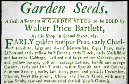
Going back a bit: because of course I’ve got to delve into the history of the seed packet, which seems to be an eighteenth-century innovation here in the United States. It is tied to, and illustrative of, the emergence and development of a commercial retail market for gardening supplies. Usually the D. Landreth Seed Company, founded in 1784 in Philadelphia by brothers David and Cuthbert Landreth and still very much in business, is given credit for the first seed packets, but a few years ago some packets were found in the eaves of the eighteenth-century Woodlands Mansion just up the river from the famous Bartram’s Garden in Philadelphia (clearly a horticultural nexus): whether they were for storage or sale is unclear. There were several seed shops in Salem in the mid and later 18th century, like Mr. Bartlett’s below, but I have no idea how they sold their seeds: perhaps people just came in and grabbed a handful? In any case, moving forward into the nineteenth century, there is no doubt that the entrepreneurial Shaker colonies were pioneers in the mail-order seed trade, to which many plain “papers,” or packets testify.

Essex Gazette 27 April 1773; Shaker, Landreth & Woodlands seed packets.


Decorating the “Little Room”

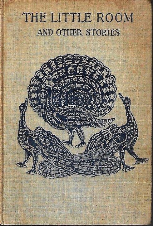
Happy June! I’m going to transition into a summer of lighter fare here: houses, gardens, non-academic books, events with people! In my contrary fashion, I’m going to start this transition with a spooky short story: one of the spookiest and shortest stories I’ve ever read. Madeline Yale Wynne’s “The Little Room” was first published in the August 1895 issue of Harper’s Magazine and then in The Little Room and Other Stories (1906). It’s a story about memories and perceptions, with a lot of ambiguity balanced by (in contrary fashion) very precise details, material details.

I’ll let you read it for yourself (it’s right here), but the basic problem is whether a certain space in an old Vermont farmhouse inhabited by two old maids was in fact a china cupboard or a “little room” complete with a green Dutch door exiting to the outside and a couch “covered with blue chintz—Indian chintz—some that had been brought over by an old Salem sea-captain as a ‘venture'” and given to one of the ladies when she was at school in Salem (yes, there is always a Salem connection). This chintz was described in more detail by those who saw the little room, and not the cupboard: it was “the regular blue stamped chintz, with the peacock figure on it. The head and body of the bird were in profile, while the tail was full front view behind it.” There were also hanging shelves with leather-bound books in the room, from which one bright red volume stood out, titled the Ladies’ Album, which “made a bright break between the other thicker books.” On the lowest shelf was a pink seashell, “lying on a mat of made of balls of red shaded worsted.” Not just a mat: a mat made of balls of red shaded worsted! Can we have any doubt that such a room, such a couch, such a shell, such a mat existed? Yes, we can. The room also contained several bright brass objects, a braided rag rug, and was wallpapered with “a beautiful flowered paper—roses and morning glories in a wreath on light blue ground.” How can this room not have existed? Wynne ensures that we will never know whether it did or not, but at least it can exist in some digital form with a bit of foraging and filtering.

The green Dutch door:

On the walls: I couldn’t find the wallpaper so precisely described by Wynne so I altered the color a bit from a 1960s floral paper on Etsy (which is the best place to find vintage wallpaper) and a watercolor possibly by John Hancock from the Carnegie Museum of Art (this is a lovely painting and I’ve really mucked it up with my filtering so make sure you see the original).

On the Settee: this first fabric looks very “stamped” but it’s really going to clash with my wallpaper, the second is softer but would still make for a very vibrant room!

On the Shelves: Wynne refers to hanging shelves very particularly, not a bookcase. I think of hanging shelves as more contemporary, but there are examples from the 18th and 19th century: the shelves below look appropriate to me, although with everything on them I think they would have to be bigger. These Waverly novels look weighty, but you can see how a slim red Ladies’ Album might pop out: perhaps it was Ladies Home Journal (which used red extravagantly) rather than Ladies Album? I’ve got lots of brass objects for this digital shelf/room (although maybe I should have polished them), and I stole the ultimate shell from my husband’s study. No mat though: I looked far and wide for a mat made of balls of shaded red worsted with no success, so the shell is sitting on a throw (but I used a “faded” filter). And finally, an amazing braided rag rug, which (hopefully) will pull this very interesting room together.

So that’s my “little room,” which was fun to put together. While this little story of a little room is an amusing diversion, it’s really not just about material stuff: it’s about the truth, and that awful scenario when two people, or three or four, or more, cannot decide or agree on what the truth is. This little story is a lot more timely now than when I first read it, maybe twenty years ago: then I think we all knew what the truth was.


The Mayflower Magazine

Happy Thanksgiving! Those of you who have followed the blog for a while know that I’m a big fan of graphic design and typography, especially from the earlier part of the last century. I love fonts from the entire era of print actually, and script as well now that I think about it, and paper: so when it all comes together in an integrated design, I’m pretty impressed. It’s been such a weighty few months, with the pandemic, and the election, and hours and hours of writing for me everyday: I think I’m going to get a bit lighter for the next month or so, to lift my spirits and yours! I’m beginning with this very festive magazine/catalogue from the late nineteenth and early 20th centuries, titled The Mayflower. It has nothing to do with the ship Mayflower, or Plymouth, or the Pilgrims: it’s all about flowers—and the most robust lettering and chromolithography I have ever seen.

The covers might be somewhat sedate (except for this last one above), but as soon as you delve inside: wow! color—so vibrant you need sunglasses. The magazine was an advertisement for the big botanical business of John Lewis Childs, one of several garden entrepreneurs of this era and the first to establish a mail-order seed business. He created an entire town on Long Island named for his product: Floral Park. The Mayflower was published from 1885 to 1906, offering gardening tips and seed packets to an international audience as well as 2 or 3 colored plates in each issue. Childs also issued seasonal seed catalogs with the same combination of flourishing lettering and vibrant plates of perfect plants, or perhaps I should say too-perfect plants.

The Mayflower magazine covers from Magazineart.org (a great website!); many more Childs seed catalogs at the Smithsonian.