Monthly Archives: March 2013

Easter Ambiance

I was writing a post about the computation of the date for Easter in the medieval period and after when it became clear that my technical text was taking the joy out of one of our most joyous holidays. Math:ย  what was I thinking? So I deleted all that dry stuff, and assembled some of my favorite Easter images, which hopefully are easy on both the eyes and the brain. This is a very random assortment: artistic and historical images, Easter advertising, items and scenes that caught my eye. To me, they just conjure up an Easter ambiance, with a bit of religiosity, a bit of whimsy, and a bit of spring.

Easter Nerius MS early 14th Met

Easter Decoration Krebs Lithograph Co 1883

Easter Sunday in Harlem Cartier-Bresson

The Letter A with images of Easter, northern Italian MS. by Nerius, early 14th century, Metropolitan Museum of Art, New York; “Easter Decorations” by the Krebs Lithography Co., 1883, Library of Congress; “Easter Sunday in Harlem”, 1950s, Henri Cartier-Bresson, Metropolitan Museum of Art.

Easter Hot Cross Buns Walter Crane 1890s

Eastertide Dora Batty

Easter 1936 ad Smithsonian

Delivering Hot Cross Buns on Easter Day, Walter Crane illustration, 1890s, New York Public Library Digital Gallery; Dora Batty advertisement for the London underground, 1934, Victoria & Albert Museum, London; Western Union advertisement, 1936, Smithsonian Institution.

Easter Ensemble Eggs

Easter Crosses At West End

Easter-esque accessories from At West End.

Easter 001

Easter 007

Easter 005

Easter Bunny at Hawthorne Hotel

Easter 015

Easter in Salem: Bunnies (and heads) in the PEM gift shop and the window ofย Beautiful Things on Essex Street; the Easter Bunny at the podium at the Hawthorne Hotel a couple of years ago (I loved this picture when I saw it in Northshore Magazine and found it online; could not find a photographer credit, sorry); first flowering, finally!


Characterizing the Continents

In my ongoing quest for anthropomorphic representations of just about everything, I have been assembling emblematic representations of the continents, or at least some of the continents: personifications of Antarctica and Australia remain elusive as the allegorical “Four Continents” became established in Europe in the early modern era. From the commencement of their global expansion in the sixteenth century to the dawn of the nineteenth, Europeans consistently crafted a vision of a primarily feminine,ย and therefore subordinate, world in their service. The sole exception to this perspective is offered by William Blake’s 1796 engraving Europe Supported by Africa and America, in which Europe is literally being propped up by the other continents, all still represented by women. This is a very modern view presented by the abolitionist Blake, and a rare contemporary acknowledgement that Europe’s prosperity was built on the backs of the “Dark Continent” and the “New World”. Much more representative of this era is the 1755 drawing of the four continents paying tribute to Britannia, a perfect piece of propaganda for the expanding British Empire. Yet this image departs from the traditional feminine portrayal of the continents by depicting the princely Europe and the turbaned Asia as male, and I think the kneeling Africa as well. The bare-breasted American Indian is stereotypically standard. More than a century earlier, these same four continents are bringing their gifts to the Louis XIII, the King of France, and this time is it Asia on bended knee.

Blake 1796

Britannia and Four Continents Anthony Walker 1755 BM

Louis XIII and the Four Continents

William Blake, Europe Supported by Africa and America, 1796, Victoria & Albert Museum, London; Anthony Walker, Britannia Receiving the Tribute of the Four Continents, 1755, British Museum, London; Title page to Les Estats Empires Royaumes et Principaites du Monde by Crispijn de Passe the Younger, 1635, British Museum, London.

Whenever or wherever Europa appears, she is always dressed (with the exception of the Blake print), in contrast to her continental counterparts, whose nakedness can convey their lack of civilization and/or morality. While the “Four Continents” allegorical tradition commences in the sixteenth century, I think the seventeenth-century images are the most vivid, and definitely the most Eurocentric in their attitude.ย The title page to Samuel Clarke’s Geographical Description of all the Countries in the Known World (1657) illustrates an inkling of this attitude, but I think the most flagrant examples are the prints published by John Stafford between 1625 and 1635, with accompanying verse by George Withers depicting the cannibalistic America, the chained Africa, and the faithless Asia. As you can imagine, these are particularly powerful images for teaching:ย  students are shocked into engagement.

Four Continent Gaywood

Four Continents America Stafford 1630

Africa

Four Continents Asia Stafford

Title page to Samuel Clarke’s A Geographical Description.., London: T. Newberry, 1657; John Stafford engravings, 1625-35, British Museum, London.

While I was searching through the sold lots archives of Northeast Auctions for some Salem items (a rather indulgent and time-consuming habit of mine) I came across some emblem mezzotints of Europe and Africa produced in London in 1800 but owned by a Salem family, so apparently admiration of the triumphant and bountiful Europa (as indicated by her ever-present cornucopia) extended over to the New World as well–even in the early years after the Revolution.

Emblem of Europe

“An Emblem of Europe” mezzotint, A. Testi, London, 1800, one of a pair sold at Northeast Auctions, 2009.


Seeing Triple

Two things turned my attention to triple portraits: a student essay on Renaissance portraiture as an expression of humanism, and the anniversary (today) of King Charles I’s accession to the thrones of England and Scotland in 1625. I was inspired to look (again) at one of my favorite portraits of the Stuart king, the one and only victim of regicide at the close of the English Civil Wars, and to explore the origins of the subgenre of triple portraiture, yet another Renaissance invention. The famous Van Dyck portrait of Charles, painted in 1635 as a study for a marble bust by Lorenzo Bernini, was both influenced by an earlier composition and influential to a future one:ย  Lorenzo Lotto’sย Triple Portrait of a Jeweler, the first triple portrait, was in the King’s collection at the time, and across the Channel, Cardinal Richelieu,ย l’eminence grise, was inspired to have his own triple portrait painted shortly thereafter.

anthony-van-dyck-triple-portrait-of-king-charles-i

Triple Portrait Lorenzo Lotto

731px-Philippe_de_Champaigne_-_Triple_Portrait_of_Richelieu_-_WGA4724

Anthony Van Dyck, “Charles I in Three Positions” (1635), Royal Collection, London; Lorenzo Lotto, “Triple Portrait of a Jeweler” (c. 1530), Kunsthistorisches Museum, Vienna; Philippe de Champaigne and studio: “Triple Portrait of Cardinal de Richelieu” (1642), National Gallery of Art, London.

It is interesting that Lotto’s portrait is of an anonymous jeweler, or goldsmith, rather than a “great” man like King Charles or Cardinal Richelieu. It is also more realistic and less impressionistic, and Lotto’s quest for the absolute essence of the jeweler (one perspective is not enough) ultimately gives him more dignity than either the King or the Cardinal, in my opinion. Or it might just be that I know much more about those two!

There is another sixteenth-century triple portrait that I want to include here even thought it’s a bit different–in several ways. It is not like the others in that it is a portrait of three different people, rather than just one person in different “positions” (to use the language of the day), although the artist is definitely playing up their similarity. And appearances are very deceiving in this collective portrait:ย  these profiles do not belong to women, but rather to rather fancifully-dressed (and -tressed) men:ย  the “favorites” of French King Henry III (1551-1589).

Triple Profile POrtrait of the Minions of Henry III
“Triple Profile Portrait” (c. 1570). Attributed to Lucas de Heere (Ghent, Belgium, ca. 1534โ€“ca. 1584), Milwaukee Museum of Art.

The triple portrait technique has been used intermittently in the succeeding centuries, to depict both single and collective subjects:ย  the Van Dyck portrait, in particular, has been copied and adapted numerous times, most recently by Hip Hop artist Kehinde Wiley–it really has a life of its own. Norman Rockwell rendered his own self-portrait in triplicate, and also that of Lyndon B. Johnson. Andy Warhol liked the multiple portrait, of course, though went for mere duplication rather than divergent profiles. And to return to royal portraiture (at least another kind of royalty): there were official triple portraits made of both Prince Charles (for the occasion of his 60th birthday) and Princess Diana (in 1987). The latter portrait hangs at Cardiff City Hall in Wales, and was apparently hastily (and temporarily) removed upon the occasion of a visit by Charles and his present wife, Camilla, the Duchess of Cornwall, in 2005. Just to avoid an awkward “encounter” of sorts.

Triple Elvis Warhol
Diana Princess of Wales
Andy Warhol, “Triple Elvis” (1963), Fisher Collection, San Francisco Museum of Modern Art; the portrait painter John Merton (who died just last month) with his triple portrait of Diana, Princess of Wales in 1987. Photo: UPPA/PHOTOSHOT.

Tea with White Rabbits

For a little tea party I was giving, I decided to go with an Alice’s Adventures in Wonderland theme, as I have quite a few of the necessary characters, including many white rabbits, who could do double duty for Easter. I looked around the web for some inspiration, found some cute cards on Etsy, and bought lots of flowers in an attempt to bring Spring indoors (because it is still not outdoors). Every time I entertain, I spend far more time cleaning and decorating than I do cooking, which I imagine must be somewhat disappointing to my guests. But I don’t think the expectations are really that high for tea (atย least my tea) and I did make some really delicious little sandwiches out of a cream cheese, hot pepper jelly, and pecan mixture (on Pepperidge Farm white bread, of course) if I do say so myself. No one was late!

Tea 8

Tea 2

Tea 4

Tea 5

I LOVE anemones, indoors and out.

Tea 7

Tea 10

Tea 051


Matrimonial Maps

Consider this post a follow-up to last year’s Maps of the Human Heart, the most popular post of my blog so far, byย far. I’m not tooting my own horn, but merely acknowledging how very popular maps are in general, and allegorical maps in particular. The other posts I have written about maps have been popular too, but artistic and metaphorical maps much more so than straightforward representations, historic or otherwise. The best allegorical maps fall in the period from the French Revolution to World War One; I think it’s really interesting that once the world was mapped scientifically there was a desire to distort andย playย with its representation for a variety of purposes, both political and personal.

Matrimonial maps fall right into this period; they are, for the most part, a nineteenth-century phenomenon. While I was searching through the archives of sold lots at Skinner’s site the other day, looking for recent prices fetched by fancy chairs, I came across a matrimonial map that I had not seen before, and that led to today’s post. This watercolor map was apparently painted in 1824, and its $400-$600 estimate was exceeded by a selling price of over $2000. People like maps.

Matrimony Skinner 1824 framed

Matrimony map Skinner

matrimony-map HBCA

The recently-sold Skinner 1824 map in its frame and close-up, and a similar hand-drawn Map of Matrimony from a nineteenth-century Canadian autograph book, Hudson’s Bay Company Archives.

United States of Agitation! Kingdom of Suspense! Land of Expectation and the Isles of Envy and Spinsters: the often-dangerous terrain and waters of matrimony. Let’s compare these early nineteenth-century matrimonial maps with those that came before and after. Everyone seems to agree that the first matrimonial map, or at least the first published matrimonial map was “A New Map of the Land of Matrimony”, dated 1772. The image below is from Katherine Harmon’s great bookย You are Here: Personal Geographies and Other Maps of the Imagination (2004), which is a fount of information, imagery and inspiration, but the original map is in the collection of Yale University Library. The matrimonial fan-map was published in London about a decade later: less treacherous waters here, though there is a desert on one border of the “Land of Matrimony”.

A New Map of the Land of Matrimony 1772 Yale

Matrimony Fan

Also from Great Britain is the “Island of Matrimony” charted and published by John Thompson around 1810. I’m not really getting all of the (classical) regional references on this particular map, but the various water bodies have pretty straightforward designations: the Lake Content, Disappointment Harbor, Turbulent Ocean in the south, Ocean of Delights in the north. Everything is measured on the scale of “80 love links to the mile”.

Matrimony Island 1810

A Map of the Island of Matrimony by John Thompson, Edinburgh (?), 1810. Jonathan Potter, Ltd.

Beware of Divorce Island on the undated Matrimonial Map below, which features a “Lake of Contempt” rather then a “Lake of Content”. The routes toward happy and unhappy marriages are indicated on Philadelphia lithographer John Dainty’s novel & interesting game of matrimony, a more original take on cartographical matrimony.

Matrimonial-Map-NLI

Matrimonial Map Dainty 1845

Nineteenth-century Matrimonial Map, National Library of Ireland; The Novel & Interesting Game of Matrimony, lithographed and published by John Dainty of Philadelphia, Library of Congress.

In the later nineteenth century chromolithography is going to make everything more vivid, including matrimonial maps. The “Map of Matrimony” below, published by C.S. Beeching in London about 1870, retains the regions, references and tone of maps from a century earlier: the island of matrimony lies halfway between the Land of Spinsters and the Country of Single Men, surrounded by wavering waters of introduction, admiration, doubt, and felicity.

Victorian Map of Matrimony circa 1870


Spring Fancy (Chairs)

The combination of the Metropolitan Museum’s current exhibition, Plain or Fancy? Restraint and Exuberance in the Decorative Arts and the onset of Spring (even though it looks very much like winter here) got my thinking about “fancy” chairs. I use this term very liberally, probably too liberally, to refer to any decorated chair with a vaguelyย  Sheraton and/or Empire profile produced in America in the second quarter of the nineteenth century. I have maybe 7 of these chairs, which represent the full spectrum of fanciness, from basic Hitchcock models with stenciling to hand-painted examples which I think are a bit more special. I have had more, I could buy more–they’re everywhere and I love them. I can’t imagine how many of these chairs were made:ย  certainly Lambert Hitchcock started the trend with his Riverton (then Hitchcockville), Connecticut factory in the 1820s, but he must have had many imitators because there are so many fancy chairs out there. Several of my fancy chairsย  (the ones that are less fancy) have cushions which I had custom-made, and it’s a spring ritual to take the cushions off for the warmer seasons, exposing the rush seats, just as I put slipcovers on some of my upholstered chairs.

The (English) Sheraton inspiration and some of my chairs, the American interpretation: from fancy to plain.

Fancy Chairs Sheraton

Fancy Chair Green2

Fancy Chair music

PicMonkey Collage

Fancy Hitchcock Chairs

You still see fancy chairs in Salem dining rooms today, but the photograph below shows a room from 1916 (not sure in which house; it’s from an article in the long-defunct Mentor magazine), well after the fancy craze was over. These chairs endured and became classic, and their style was revived multiple times in the twentieth century. Back in their heyday, the prolific New England folk artist Joseph H. Davis (active 1832-37) featured very fancy chairs in many of his parlor portraits, like that of Mr. Demeritt below.

Fancy Chairs Mentor 1916

Fancy Chair Joseph H. Davis

Joseph H. Davis, John F. Demeritt, probably Barrington, New Hampshire, 1836, American Folk Art Museum, New York.

Because of a number of factors–the sheer number of chairs that were made, both in the “fancy” period and after, the great variety of chairs, and the range of imperfections on their painted surfaces–you can find these chairs pretty easily in New England, and often for a very good price. I was looking through the sold lots of several auctions at Skinner this month, and found the groups of chairs below: the entire first lot, a set of 6 chairs made in Newburyport in 1825, went for a little over $1000, while the pair of grain-painted and gilt-stenciled chairs went for $615.

987293

987293_view 02_02

Fancy chairs grain painted and gilt stenciled 1825 Skinner 615

Then again, these are rather restrained examples of the “Fancy” style, which encompassed not only furniture but all of the decorative arts in the second quarter of the nineteenth century. One of my very favorite exhibitions at the Peabody Essex Museum here in Salem was American Fancy: Exuberance in the Arts, 17901840, on view in 2004 (curated by Virginia antiques dealer Sumpter T. Priddy III, who appears to have made the study and appreciation of “Fancy” his life’s work and who wrote the beautiful companion volume). Talk about exuberance! Chairs and settees were a big part of this exhibition, and it was clear to me that the most fancy chairs were not made in New England but in the mid-Atlantic, in Baltimore to be precise. The “Baltimore Fancy Chair” makes all others pale in comparison (and fetches prices that indicate its enduring appreciation) but I think I prefer my own chairs–less perfect, less brilliant, less valuable, but still fancy.

PicMonkey Collage

More variations on the fancy chair:ย  a Baltimore chair by the Finlay Brothers, c. 1815-20, Metropolitan Museum of Art, New York; Portrait of Mrs. Edgar Paschall (Martha Eliza Stevens) by unidentified artist, 1823, National Gallery of Art.


Cake and the Custom House

This weekend marked the 75th anniversary of the Salem Maritime National Historic Site, the first federal heritage site (as opposed to national park) in the nation. On Sunday, a spectacularly clear and cold day, the staff of Salem Maritime presented a program of commemoration and appreciation which included lovely succinct speeches, cake, and the opportunity to wander around all of the site’s buildings at leisure. As usual, I was short on time (with a stack of midterms waiting at home), so I went straight for the Custom House (after my cake, of course), which I had not been inside for quite a while. In retrospect I wish I had had time for the Derby House as well, as it has recently been restored. But that’s alright, I can easily go back at another time–I live here.

Custom House Cake

Custom House 012

Custom House 014

Salem has been a port of entry since 1649, so there have been a succession of custom houses:ย  this one, built in 1819, is the last, and while beautiful, it’s a bit of a white elephant really. It was built by a new American government that expected Salem’s dynamic trade to keep expanding, but it declined precipitously almost as soon as the cornerstone of the new building was laid. In his introduction to The Scarlet Letter, Nathaniel captures this decline better than anyone possibly could, as he was a first-hand observer working (or watching) from this very custom house. Writing in 1850, he observed:ย  The pavement round about the aboveโ€“described edificeโ€”which we may as well name at once as the Customโ€“House of the portโ€”has grass enough growing in its chinks to show that it has not, of late days, been worn by any multitudinous resort of business. In some months of the year, however, there often chances a forenoon when affairs move onward with a livelier tread. Such occasions might remind the elderly citizen of that period, before the last war with England, when Salem was a port by itself; not scorned, as she is now, by her own merchants and shipโ€“owners, who permit her wharves to crumble to ruin while their ventures go to swell, needlessly and imperceptibly, the mighty flood of commerce at New York or Boston.

Economic stagnation and historic preservation can often, ironically, go hand in hand, and as stately as it is, I’ve always thought that the Custom House has that air of a building that time forgot, where the front door was shut long ago and seldom opened afterwards. There is “minimal” interpretation, which I prefer, just old rooms without people–and the tools of the trade.

Custom House 049

Custom House 055

Custom House 057

Custom House 061

Custom House 062

The one room that doesn’t look like everyone just picked up their things and left has a HUGE gold eagle in it: this is the original eagle crafted by Salem woodworker Joseph True and installed at the front of the Custom House in 1826. When it was found to be seriously deteriorated, it was removed, restored, and replaced with a fiberglass copy in 2004. The rooms across the second-floor hall, with their period furniture on which are randomly-placed papers, really reinforce that abandoned ambiance.

Custom House 069

Custom House 075

Custom House 078

I particularly love the entrance of the Custom House, with its fanlight and sidelights, and then of course there’s the view, of Derby Wharf and the Friendship. Below, the Custom House in 1906 and this past weekend. It was a beautiful bright day, but as I write everything you see is covered with snow, again.

Custom House 1906

Custom House 010


Green with Envy

I have posted about green quite a bit on this blog:ย  green cards, green men, green rooms, the green fairy, my favorite shade of green. Yet it’s St. Patrick’s Day, so I’ve got to come up with something green–why not the emotion associated with the emerald hue? Shakespeare was specifically referring to jealousy with Othello’sย “green-eyed monster” line, but jealousy is just a subset of the more all-encompassing envy, one of the seven deadly sins and the one conspicuous for its complete lack of pleasure: it leads not to material wealth or power or drunkenness, but only to a festering illness in which one literally eats their heart out. This self-inflicted sickness–described as a form of moral rotting–could be one source of the sin’s connection with the color green, as could its association with snakes, either alone or in the form of an allegorical Medusa-like character, but emerald (or chartreuse) envy seems to be more of a modern conception than a medieval one.

Envy 2008 by Michael Craig-Martin born 1941

Michael Craig-Martin, Envy (from the Seven Deadly Sins series), 2008.ย  Tate Modern, London.

Medieval manuscripts illustrate envy (invidia) in several ways:ย  on the iconic “Tree of Vices”, accompanied by a demon and its “sprouts” (detraction, treachery, treason, homicide, conniving, pleasure in the suffering of others–what we would call Schadenfreude–resentment, jealousy) and as a woman looking at something or someone with daggers (sometimes literally). Pride is always the root of the tree–the root all the vices– but envy is just one branch up from the fall of Man. Pride, represented by a King-like character riding a lion, and Envy, a sword-bearing woman riding a wolf, are closely associated in the fifteenth-century edition of penitential psalms below, and Envy reveals her jealous nature in a fourteenth-century Roman de la Rose.ย Green is not her color, yet.

L0029366 Tree of Seven Vices

Envy and Pride 2

Roy19BXIII_royal_ms_19_b_xiii_f006v_detail2 Envy1

The Apocalypse of St. John, c. 1420-30, Wellcome Library, London; British Library MS Yates Thompson 3, c. 1440-1450, and MS Royal 19BXIII, the Roman de la Rose of Guillaume de Lorris and Jean de Meun, c. 1320-1340.

Beginning with Giotto, the Renaissance shifted Envy decisively towards jealousy and generally portrayed her as an aged woman, tearing at her heart and/or eating an apple to illustrate her complete capitulation to temptation, often grotesque and emaciated, clearly suffering and sometimes chained, almost always with snakes. There’s a rather striking similarity between the depictions of Envy and witches in the sixteenth and seventeenth centuries, before the conception of envy in particular and the seven deadly sins in general become secularized. A notable exception is Hieronymus Bosch’s famous table painting, The Seven Deadly Sins and the Four Last Things, which depicts envy with an illustration of a local proverb about two dogs with one bone seldom reaching agreement. Still no green.

Envy Giotto Arena Chapel 1306

Envy George Pencz

Envy Bosch detail

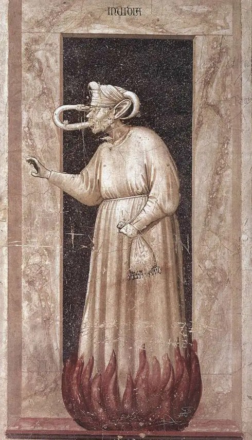
Giotto di Bondone, Envy panel from the Arena Chapel, 1306; Print by George Pencz, 1541, British Museum; Hieronymus Bosch, The Seven Deadly Sins and the Four Last Things detail, c. 1485.

Looking through allegorical images of envy from the seventeenth and eighteenth centuries, I still don’t see much green, but then again, prints predominate. Lots of snakes are in appearance, which is appropriate for a St. Patrick’s Day post as the cleansing of Ireland of snakes is part of St. Patrick’s mythology. At least the connection between women and this most miserable sin is broken, as envy appears in the form of both sexes and then only as a green snake.

Envy 17th century

Envy Snake 1796

Print by John Goddard, c. 1640, British Museum; “Envy” (perhaps a caricature of the Earl of Abingdon), Anonymous, 1796, British Museum.

Envy is depicted in all sorts of ways by modern artists and illustrators, though the aged-lady-turning-green (grotesque)-with envy certainly comes back with a vengeance! I don’t usually see things exclusively through the prism of gender, but it’s really interesting to me how this most self-destructive of sins is so often associated with women. In two twentieth-century Seven Deadly Sins series, the Belgian artist James Sensor envisions a christening in which the young mother (interestingly dressed in green) is looked on with envy by everyone around her, but by the middle-aged woman to her right with particular vehemence, and Paul Cadmus’s Envy definitely harkens back to the Renaissance. As before, envy does not make for a pretty picture; I think I prefer alternative associations for the color green!

Ensor Envy 1904

Envy Paul Cadums

James Ensor, L’Envie, from the 1904 portfolio The Deadly Sins, Art Institute of Chicago; Paul Cadmus, The Seven Deadly Sins:ย  Envy, 1947, Metropolitan Museum of Art, New York.

ย 


The Art of Letters

I wanted to follow up my Post Office post with one featuring the art of letters, but I’m not sure exactly how to categorize these images:ย  these are not examples of typographic art, as they feature script rather than print, or ephemeral art, because I’m including works of art which feature letters as well as a few letters that I believe rise to an artistic level.ย  I looked up “scriptural art”, but that category seems to be reserved for religious works, and scribal art for calligraphy.ย  So that leaves me with the rather bland title “the art of letters”.***ย  It happens that some of my favorite images have a focus on reading or writing letters, or present an assemblage of writing materials, or a scrap of paper, with writing, that makes us wonder what’s going on here?ย  what does that letter say?ย  The letter is a great device to draw us into the painting: we want to read it!ย  Look at the note in the hand of this Victorian governess in Richard Redgrave’s 1844 painting:ย  it–or rather her reaction to its contents–has separated her from the “lighter” children under her watch. The painting was exhibited with the quotation “She sees no kind domestic visage here”, indicating that the letter brought memories of a missed home at best, and news of a death in her family at worst.

Letter Governess

Richard Redgrave, The Governess (1844), Victoria & Albert Museum, London

My very favorite letter painting doesn’t really delve into the emotional aspects of letters and their reception, but rather it presents us with a trompe l’oeil display of printed and writing materials:ย  an early modern bulletin board!ย  This is a very ephemeral painting in several ways:ย  the newspapers and almanac represent the “news” of Queen Anne’s accession in 1702, as does the medal representing her grandfather, Charles I. The painter has included his “signature” on the folded sheet in the center. I love trompe l’oeil in general, but this particular painting has captivated me since the first time I laid eyes on it several years ago; I think that George Tooker’s 1953 painting, The Letter Box, is its perfect companion piece.

Colyer Tromp l'oeil

George_Tooker_The_Letter_Box

Edward Collier (Collyer), Trompe L’Oeil with Writing Materials, c. 1702, Victoria & Albert Museum, London; George Tooker, The Letter Box, 1953, Hirshorn Museum and Sculpture Garden, Washington, D.C.

Moving back to my period, I noticed a while ago that the Tudor court painter Hans Holbein the Younger often included scraps of paper with writing, tucked into a book, laying on a table, or even posted to the wall, in a number of his portraits. The well-known portrait of Thomas Cromwell (of whom I am a fan) is a good example, as is the amazing portrait of Georg Gisze, a German merchant stationed in London (like Holbein). I think the use of written and writing materials is a bit more straightforward here:ย  Cromwell wants to present himself as a pious public servant and a master of the (written) law, while Gisze is an equally-earnest man of business who holds in his hand a letter from his brother, back home.

Cromwell Frick Collection

Hans-Holbein-the-Younger-Portrait-of-Georg-Gisze-Oil-on-Wood-Panel-1532-Staatliche-Museen-Berlin--904x1024

Hans Holbein the Younger, Portrait of Thomas Cromwell, 1532-33, Frick Museum; and Portrait of Georg Gisze, 1532, Staatliche Museen, Berlin.

I’m including a few actual letters in this post, both because I spent quite a bit of time searching through the digital collection of the National Postal Museum at the Smithsonian for my last post and because many of the letter “covers” in this collection do rise to the level of art, in my humble opinion. The range is incredible, encompassing patriotic examples from all the American wars, letters from the prisoners of those wars which were delivered in specially-marked envelopes, and letters delivered by planes, trains, and zeppelins. These covers are also a way to look at print and script together. This first envelope, from my own collection, was issued by the Locke Regulator Company of Salem in 1899 (as you can see by the postmark), and then there’s a letter from a Union prisoner of war from 1864 and a letter carried out of Paris by balloon in 1871.

Scan0004p

Letter from Union Prisoner of War

Letter Smithsonian

Covers from 1864 & 1871, National Postal Museum, Smithsonian Institution.

These letters look like likely candidates for a John Derian decoupage tray to me: that man loves his fonts and scripts!ย  But letters moved to the foreground in the decorative arts a while ago, as exemplified by the beautiful silver cigarette case below, “postmarked” in 1903. I wish we could bring these cases back (with an alternative use), and while we’re at it, letters too!

LT-Script-Sampler_1_large

Silver Cigarette Case Albert Barker Ltd London

John Derian “Sample Script” decoupage tray; Silver cigarette case by Albert Barker, Ltd., London, Collection of the Victoria & Albert Museum.

***EPISTOLARY Art!!! As recommended by Secret Gardener, who has one of the most beautiful blogs out there.


Preservation and Post Offices

The fundamental challenges facing the U.S. Postal Service as an agency are beginning to trickle down to our local post office buildings,ย creating ripple-effect challenges for preservationists across the country. The New York Times ran an article last week highlighting the issue (with great comments), and the National Trust for Historic Preservation placed “Historic Post Office Buildings” on its Most Endangered List last year.ย Apparently the agency has identified nearly 3,700 buildings as likely candidates for closure, about 200 are soon to go on sale, and eleven are on the market right now. There are several concerns from the preservation perspective:ย  not only do these buildings serve as community centers, but that they are often the most architecturally significant structure in many towns. And like so many federal buildings, many post offices are also surviving legacies of the New Deal policies designed to put Americans back to work during the Depression. The adaptive reuse of these buildings is the logical answer, but that is always a tricky business, and even if the exteriors of those buildings with landmark status are preserved historic interiors remain threatened:ย  murals, marble, and metals could be ripped out and sold to the highest bidder.

berkeley_ext

Berkeley PO Jim Wilson NY Times

08POSTOFFICEjp5-popup

Three photographs of the 1915 Renaissance Revival Berkeley, California Post Office, on the short list for closure:ย  interior murals of by Suzanne Scheuer, exterior, and protester Josh Kornbluth in character as Benjamin Franklin, the first Postmaster General. Jim Wilson/New York Times.

I checked out several of the post offices that are on the market now (on this great blog) and was immediately drawn to two in particular:ย  another Renaissance Revival building in Gulfport, Mississippi and the beautiful Greek Revival post office in the Georgetown section of Washington, DC.ย  The DC building has been sold to a developer who is apparently going to adapt it for office space while retaining the post office on the first floor; this deal seems to have been years in the making and illustrates just how difficult the redevelopment process can be.

Gulfport PO

Gulfport_Post_Office

georgetown_post_office

Georgetown post office by Young

The Gulfport, Mississippi Post Office today and shortly after its construction in 1910,ย  postcard courtesy of the Mississippi Department of Archives and History; the Georgetown Post Office, built in 1858, and a 1856 rendering by architect Ammi B. Young, Library of Congress.

I must admit that I have never really appreciated Salem’s Post Office, which I walk by nearly every day with little more than a passing glance. It is a classic WPA project, designed by local architect Philip Horton Smith and constructed in 1932-33 in the Colonial Revival style.ย  It definitely has presence, but I always thought it was a bit boring, until I recently started noticing the details, inside and out:ย  there certainly is a lot of marble and bronze in there, and the tables and radiator grates–even the mailboxes–are really lovely, as I now can see. To emphasize its centrality–as well as its connection to the outside world–this building was sited right across from Salem’s grand and gothic railroad station, whose destruction in 1954 is lamented to this day.

Post office 2 049

Post Office PC 1940s

Post Office Interior

Post office 2 003

Post office 2 004

The Salem Post Office today and in the 1940s, downstairs interior and mailboxes, the former Post Office in Salem, adapted for reuse as shops in the 1930s and still serving in that capacity.