I’ve long admired the prints of Bohemian-born Rudolph Ruzicka (1883–1978), both pictures and fonts—both are characterized by the “optical ease” which he sought for all of his work. Ruzicka migrated to the United States as a child, and received his art training in Chicago and New York City before launching his career as an engraver and designer: he operated his own shop but also worked for the Mergenthaler Linotype Company for his entire professional life, as well as for Merrymount Press in Boston. His body of work includes several portfolios of prints of New York City, Newark and Boston, at least four typefaces (including the classic Fairfield which I use a lot), and a beautiful book of calligraphic fonts titled Studies in Typeface Design (1968). Ruzicka’s pictorial work looks to my untrained eye like the perfect combination of early to mid-twentieth-century central European and American aesthetics (they have that WPA look before the WPA!), and I love that he obviously loved New England: he moved to Massachusetts in 1948 and then to a farm in Brattleboro, Vermont. While he portrays an obvious appreciation for the “pictorial aspects” of New York (and Newark as well) his scenes of greater Boston are beautiful. And as a bonus, the series of greeting cards designed by Ruzicka and produced by the Merrymount Press from 1911-1941 include several prints of notable Salem landmarks, which you can see below.

![]()
![]()


 Ruzicka’s views of Boston (including the old Cornhill and swimming in Frog Pond) above, and of greater Boston (including Peacefields in Quincy, Walden Pond in Concord, McIntire’s Gore Place in Waltham and Derby summer house in Danvers, and the House of the Seven Gables and Old Town Hall in Salem) below.


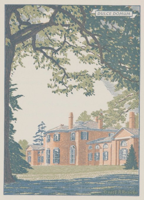


 All images from the collection of the Carnegie Museum of Art; the Harvard Museums also have a large collection of Ruzicka prints.


January 5th, 2019 at 5:00 pm
alway loved his work…..goes way back to my spending much time at Carnegie Museum of Art.
January 5th, 2019 at 5:25 pm
I’ve never been there–but unlike another institution we know well–they have made much of their collection accessible!
January 5th, 2019 at 5:34 pm
I wonder why he chose Latin as the language for most of the text in his prints, if he was living in the U.S.? He chose French for the House of the Seven Gables print.
January 5th, 2019 at 5:47 pm
Apparently it was Merrymount Press founder Daniel Berkeley Updike who provided the inscriptions for Ruzicka’s prints–more here: https://masshist.org/object-of-the-month/december-2013
January 5th, 2019 at 7:32 pm
Interesting! In a way though, it prevented the masses from comprehending his inscriptions. Quel dommage!
January 6th, 2019 at 8:28 am
Hi Donna,
Thanks for such a lovely selection of Rudolph Ruzicka’s drawings. He certainly was prolific in his 95 years, eh? I presume that the first one is of Louisburg Square on Beacon Hill at the corner of Mount Vernon Street.
I particularly enjoyed “Peacefields,” the ancestral home of the Adams family in Quincy, often called “the Old House” where they lived for four generations. Wow, it’s been so long since I studied Latin, but I think that the legend reads aptly “Let us praise great men.” The Adamses would agree.
Wonderful Salem scenes too. Thanks so much or should I say “gratias tibi” – I had to look that one up!
January 6th, 2019 at 10:12 am
Peacefields is my favorite too!
January 6th, 2019 at 9:32 am
How did he define “optical ease” these photos certainly are lovely to gaze at. Also a question on a comment above, is the Mr. Updike mentioned on a comment above, a relation to author John Updike?
January 6th, 2019 at 10:13 am
I’ll let him speak for himself on optical ease: https://www.linotype.com/756/rudolf-ruzicka.html. I had the same question about the connection between Daniel and John, but so far I can’t find one!
January 6th, 2019 at 7:14 pm
Thanks so much for sharing. His work is beautiful.