A is for…adultery, or Athenaeum? I was at a meeting of the trustees of the Salem Athenaeum the other night at which we were discussing a new logo for this venerable library. The design which we were considering featured a very prominent red capital letter A, and all I could think of was The Scarlet Letter. My concern was that we were tying ourselves too exclusively to Hawthorne, but our discussion quickly revealed that my fellow trustees just didn’t connect the A to the book (or adultery); it was a literary Rorschach test, and all they saw was a letter, not a Scarlet Letter.
Scarlet letters were etched in my mind, so I went in search of some more; I thought it would be interesting to see how an assortment of book illustrators took this simple letter and ran with it. Surely the illustrations for The Scarlet Letter—most especially the cover—would be a lot more interesting than those for The House of the Seven Gables or any other Hawthorne title. I was not disappointed, and it was a red letter afternoon.
My very favorite Scarlet Letter cover is that of the Vintage Classics edition published by Random House UK in 2008; it is simple, clever and textured. Below that cover is the Ruben Toledo illustration for a Penguin edition from the following year. I like the relatively recent (1994) Dover Thrift Edition as well; this one got me wondering about a field of A’s so I made my own “fabric” via Spoonflower with a cropped image of a seventeenth-century commonplace book.
Earlier editions of The Scarlet Letter are a bit less overt with their A’s. The first edition was published in 1850, and an illustrated edition was not published until a generation later, with a discreet A on the title pages. Rather than a badge of shame, the A of the 1878 James R. Osgood edition looks rather heraldic, while those of the editions of 1905 (Grosset & Dunlap), 1920 (Methuen Press, London), 1931 (Cheshire House), and 1941 (my spoonflowered version of the Limited Editions Club cover) look a bit more creative, and also reflect their eras.
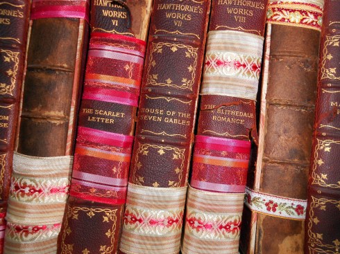
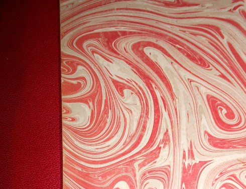
I’m afraid to even look for the A in my version of The Scarlet Letter, one of the 22 volumes in the Houghton Mifflin/Riverside Press Complete Writings of Nathaniel Hawthorne (1900), because I fear it might fall apart if I do so! I found the complete set in a box in a Maine antique shop several years ago and bought it very cheaply because of the books’ deteriorated condition; they had been in a basement for many years, and their leather bindings were (and still are) cracked and their pages mildewed. I’d like to restore them, but that goal is pretty low on my priority list for now, so I’ve tied them up with ribbons and put them on the bookshelf. The cloth covers and endpapers are still very beautiful, as you can see.
Hester Prynne bears badges of various designs in the various editions of The Scarlet Letter, but let’s face it, the A has to be pretty prominent. One of the earliest and most illustrious illustrators, George Henry Boughton, gives the demure Hester a large A patch in 1881, but it is not scarlet. Hugh Thomson’s more romantic Hester, from 1920, wears her scarlet A with nurse-like calm, as does Lillian Gish in the film version from a few years later.
There’s a lot of places that I could go from here because The Scarlet Letter has become so allegorical and the striking scarlet A so…….adaptable, for lack of a better word: political cartoons (anti-American!), the Atheists‘ Speak Out campaign, Emma Stone in Easy A. But I think I’ll stick to the scarlet letter, and end with another textual image, from the New Orleans artist Scott Campbell.


February 27th, 2012 at 8:53 am
What a startling collection, I paused the longest while looking at your own books, I also would love them like they are. Gorgeous colours. c
February 27th, 2012 at 8:20 pm
Thanks Celie; they are beautiful, but also….crumbling.
February 27th, 2012 at 9:13 am
Thanks for this. Fascinating :)!
February 27th, 2012 at 11:30 am
I love these as well. And I am astounded that you were the only person. If I saw a red A anywhere I’d think of The Scarlet Letter (and I’ve never even read it), and if in Salem, especially!
February 27th, 2012 at 8:22 pm
Well, Susanna (Oh, Susanna–I bet you’re sick of that), to be honest, we also viewed a mock-up of what a tee-shirt would look like with a big letter A on it, and several people commented that it would take a brave woman to wear that!
February 27th, 2012 at 8:42 pm
There must be some tourists out there who would buy A-marked tees.
February 29th, 2012 at 6:49 pm
Oh Donna, my husband Brian is on our town’s library committee and he could relate very well to your first paragraph.
Your design is very fine in dead.
Enjoyed your previous post as well.
A 🙂
XX
March 1st, 2012 at 4:28 am
Great post, don’t overlook the Scarlet A that Dawkins uses to symbolize Atheism. Just a thought.
March 1st, 2012 at 4:29 am
Whoops, sorry ,you didn’t miss it!! I skim read, I am ashamed to say. regards, anne
April 24th, 2012 at 10:16 am
[…] Scarlet Letters (streetsofsalem.com) Rate this: Share this:ShareLinkedInDiggFacebookStumbleUponEmailPrintLike this:LikeBe the first to like this post. Posted in Religion | Tagged Congregational Church, Hawthorne, Hester Prynne, Jeremiah Wright, New England, Puritan, Scarlet Letter, United Church of Christ […]
April 24th, 2012 at 12:41 pm
Thinking of the Scarlet Letter, I took the concept to another level. Check out the Scarlet Letter Challenge: http://wp.me/p2lwB8-1n