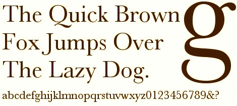
I read a really interesting article entitled the “The Typeface of Truth” by Michael Beirut yesterday that set me off on a typographical odyssey. It was hot (or humid, actually) and I really didn’t want to get off the couch, so I dug a bit deeper into the subject of the article: the enduring influence of the font invented by John Baskerville (1706-1775). Actually, Baskerville the man was only briefly mentioned by Beirut, who was summarizing a series of posts in the New York Times Opinionator blog by writer and filmmaker Errol Morris which attempted to ascertain whether there are “certain fonts that compel a belief that the sentences they are written in are true?” To ascertain an answer to this question, Morris devised a quiz which implicitly compared the Baskerville, Computer Modern, Georgia, Helvetica, Comic Sans, and Trebuchet fonts as to the credulity of their passages. Baskerville was the big winner, the “typeface of truth” in Beirut’s words.
Baskerville was a man who loved letters. He loved to look at them, write with them and engrave them so much that changed his career path in his 40s and became a typefounder and printer. In the preface to his 1758 edition of Milton’s Paradise Lost, he reflects on this transition: “Having been a great admirer of the beauty of Letters, I became insensibly desirous of contributing to the perfection of them.” Not content to be a mere craftsman, he effected innovations in every associated typographical endeavor: design, casting, paper and ink production, printing. He respected the dominant typefounder of his day, William Caslon, but clearly thought that there was room for improvement–especially in spacing and layout. Baskerville produced about 60 beautiful books (including several bibles even though he was a proclaimed atheist), but had little commercial success in his adopted professions and probably would have faded into obscurity if not for the advocacy of Benjamin Franklin in his day and the great American book designer Bruce Rogers in the twentieth century.
Because Baskerville’s type survived, it looks conventional to us today, and obviously credible.
Below: a Baskerville bible from 1769, a a neat type specimen poster (one of many) from Typography Today, and a close-up of a letterpress Baskerville print from Blush Publishers in Wales.
Chasing down Baskerville led me down many paths, including one that led to a special Salem font! (and a very un-Baskerville design) Local (Winchester, MA) designers The Walden Font Co. have resurrected and revived many old historical typefaces, including those with very distinct gothic, western, and Shakespearean vibes, and a “magickal” font named Salem 1692. Here it is, on its own, and superimposed by me on an actual seventeenth-century document, Cotton Mather’s 1693 Wonders of the Invisible World.


